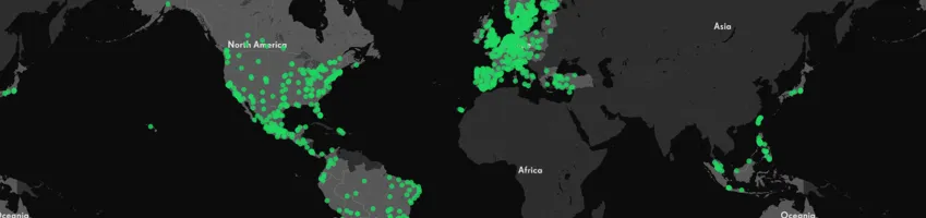
80 Data Visualization Examples Using Location Data and Maps


As the importance of location data continues to grow so do the ways you can visualize this information. We've scoured the web in search of data visualizations showing the value of location data in its many varieties and have compiled this mega list to bring you the very best examples. The 80 entries below surprised us taught us inspired us and drastically changed the way we understand location data.
We grouped these 80 data visualizations into thematic categories and then listed each entry (click on the name of the visualization to open it). The six categories include:
- Conflict Zones
- Connectivity
- Environmental
- Sites Sounds and Smells of City Living
- Social Media Maps
- Transportation
From data visualizations on global breathing patterns to fan reactions to the latest episode of Game of Thrones to international diplomacy and humanitarian crises these 80 data visualizations are only a small glimpse into the different ways location data is being used around the world.
Enjoy!
Want to try some of these visualizations for yourself? Sign up for a free two-week trial!
Conflict Zones
Reprojected Destruction
Hans Hack's Reprojected Destruction uses satellite imagery showing city-wide damage to buildings and infrastructure in Aleppo, Syria that he then projected onto figure-ground maps of Berlin and London. "The overall aim of the exercise " as stated on the website "is to help viewers imagine the extent of the destruction that might have been visited upon the UK and German capitals had these cities stood at the centre of Syria's current conflict." In using location data to relocate the destruction wrought by the Syrian civil war Hack reminds us that data visualizations are not only beautiful but powerful communication tools.
Conflict Urbanism: Colombia
The causes behind the unsustainable increase in global urban migration are many, but this data visualization shows how armed conflict has caused mass migration in Colombia from 1985 to 2015. Built with a recently released open dataset Conflict Urbanism uses location data from displaced populations to chart routes from Colombia's countryside to its urban centers. These routes can be enriched with municipal location data and population demographics provided from NASA satellite imagery and the Colombian National Department of Statistics respectively.
World Migration Map
With open data on worldwide net migration between 2010 and 2015 provided by the United Nations Population Division, Max Galka set out to visualize this large volume of data in one map. The result? An incredible resource charting migration flow patterns from origin-to-destination spanning five years. In visualizing this location data the "World Migration Map" provides a transparency tool that can help fact check politicians flaming fears with heated rhetoric about walls and what not. You can read Galka's full analysis here.
Missile Threat: CSIS Missile Defense Project
As relations among NATO member states cool, Russia continues to flex its militaristic might and increased geopolitical presence. In response, the Center for Strategic and International Studies’ (CSIS) Missile Defense Project built MissileThreat an interactive data visualization providing a broad (but admittedly not exhaustive) overview of the A2AD situation in Europe. Location data was used to map military bases throughout the area and then an area of influence analysis was applied to approximate the radius of areas at risk from different missile launch capacities.
Peter Aldhous' "Spies in the Sky" data visualization reveals flight track patterns of the U. S. government's airborne surveillance using aircraft location data provided by flightradar24. Individual aircraft flights are represented by animated dots while dense circles indicate regularly monitored areas. The data visualization color palette--red white, and blue--reinforces Aldhous's point and perhaps explains why National Geographic ranked "Spies in the Sky" among its best maps of 2016.
Syria After Four Years of Mayhem
Before and after pictures can seem gimmicky, but Sergio Pecanha Jeremy White, and K. K. Rebecca Lai reminded us of this genre's effectiveness in "Syria After Four Years of Mayhem" (2015). Leveraging satellite imagery location data from IHS Energy Data Information Navigator and data from several humanitarian relief agencies the authors show the devastation of the Syrian civil war by visualizing how in two years "the country is 83 percent darker at night than before the war."
The Executive Abroad
Did you know that until Theodore Roosevelt, no sitting United States President traveled outside the country? This is just one of the many historical insights made accessible thanks to the University of Richmond's [Digital Scholarship Lab] and specifically its data visualization of every executive trip from Roosevelt to Obama. We especially love the customized basemap's interactive compass that makes use of location data's temporal and spatial dimensions.
The Refugee Project
Hyperakt's The Refugee Project reminds us that art is a medium for political protest. This data visualization is both a resource that uses United Nations' refugee data to enable comparative studies on refugee migration and a work of art that New York's Museum of Modern Art selected for its "Design and Violence" exhibit.
The Shape of Slavery
Michelle Alexander's The New Jim Crow a major source for Ava DuVernay's 13TH identified Jim Crow legislation as the origins of the "school to prison pipeline." In The Shape of Slavery Bill Rankin and Matt Daniels distill the location component of historical data related to slavery and incarceration rates to provide visual proof that America far from being a "post-racial" society "is only recently a post-slavery one."
United States Sanctions Tracker
Enigma's Sanctions Tracker, which monitors U. S. sanctions from 1994 to the present and updates each day, is one of the first resources to map this data despite the inherent spatial aspect of sanctions. The tracker uses time-series analysis to show the rise in sanctions across four different presidencies and its interactive design allows viewers to click on animated dots to learn more about the specific type of offense being sanctioned.
White Collar Crime Risk Zones
The New Inquiry is bucking a data visualization trend that maps open data from police reports that tend to focus on "street crime" prevention. Instead, this data visualization uses machine learning to locate white collar crime risk zones (and provide some uncanny facial profiles!). Brian Clifton Sam Lavigne and Francis Tseng explain their methodology here, and we're excited to enter this brave new world of data visualizatons!
If you’re changing the world with Location Intelligence, then you may be eligible for a CARTO grant!

Connectivity
A Day in the Life of an American
Nathan Yau over at Flowing Data takes a creative spin on location data in his simulation of movement patterns among Americans. With data from 1 000 people's daily activities as reported in the United States Department of Labor's American Time Use Survey Yau's simulation represents each person as an animated dot whose color changes en route from one activity to the next over the course of twenty-four hours to locate behavioral patterns. It's meta. It's beautiful. It's a must see.
Connectivity Atlas
John Donne told us that "no man is an island entire of itself " but what, exactly, connects everyone to "a piece of the continent"? Luckily, Connectivity Atlas has an answer with its data visualizations that shows how "[i]nfrastructure connects and defines us." Built entirely with open data this data visualization maps all the connective threads powering your day to day activities including telecommunication transportation and energy.
Global Diplomacy Index
The Lowy Institute for International Policy a nonpartisan Australian think tank, created the Global Diplomacy Index to visualize diplomatic networks. At the same time this map exposes gaps in network coverage as well as high concentrations of diplomatic resources around the world. The map's interactive design allows viewers to see the global reach of diplomacy at both the city and country level as serene blue lines are drawn across a basemap reminding us all to keep a cool head.
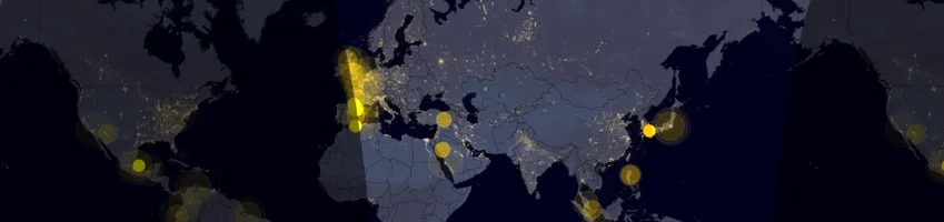
Live Cyber Attacks
If 2016 taught us anything, it was the threat posed by cyber attacks. Norse provides threat attack intelligence, and its mesmerizing Cyber Attacks data visualization uses location data to show, in real-time, the origin and destination of security breaches.
Chicago's Million Dollar Blocks
Millions of dollars are being invested in low-income neighborhoods across Chicago, but not to (re)invest in these neighborhoods. Instead, as Chicago's Million Dollar Blocks project reveals a war on neighborhoods is being waged as more money is spent policing low-income neighborhoods across the city. This data visualization is more than an expose of wasteful spending. In fact, Chicago is reimagined from the perspective neighborhoods whose low-income status is perpetuated by large infusions of tax dollars that fund disproportionate policing which leads to higher incarceration rates despite declining crime levels.
Every Active Satellite Orbiting Earth
David Yanofsky and Tim Fernholz provided some much needed "edutainment" in Every Active Satellite Orbiting Earth. This data visualization gives viewers a sense of the location and orbit perimeter of the 1,300 active satellites. Satellites, represented as individual bubbles whose color indicates its use, are compressed into a column indicating altitude position above the earth. Make sure to turn on the orbit feature to get a sense of each satellite's orbit!
Twenty Years of India at Night
A picture may be worth a thousand words but how many data points can a picture provide? Twenty Years of India at Night may have the answer! Using pictures from the Defense Meteorological Satellite Program that were taken each night between 1993 and 2013 researchers extracted location data on light output from 600 000 villages and then mapped these points on the India Lights map. The time-series analysis feature shows both the volume of data collected and reveals the large rural areas still lacking access to electricity across India.
What Powers the World?
GoCompare's What Powers the World? is an interactive visualization built with location data provided by the International Energy Agency displaying how reliant each nation is upon fossil fuel, nuclear, and renewable energy. What we love about this data visualization is its use of a dark matter basemap, a subtle use of color theory illuminating what really does keep the lights on around the world.
World's Biggest Data Breaches
David McCandless founder of information is beautiful and Tom Evans created World's Biggest Data Breaches an interactive timeline of data leaks from 2005 to the present including interactive bubbles for each entry. Oh by the way each bubble represents breaches of at least 30 000 records and provides detailed information on the leak type the industry in which the leak occurred and links to detailed reports covering the breach. Locating data on data leaks has never been easier (…or scarier!).
Need some tips on how you can build these types of visualizations yourself?
Request a live personalized demo
Environmental
Breathing Earth
John Nelson's Breathing Earth used satellite images from NASA's Visible Earth catalog to create an animated data visualization showing the earth's pulse through a year's seasonal transformation. The map was a huge hit and has spawned many noteworthy follow-ups including Nadieh Bremer's A Breathing Earth (2016) and an entry included a little further down on our list!
Cloudy Earth
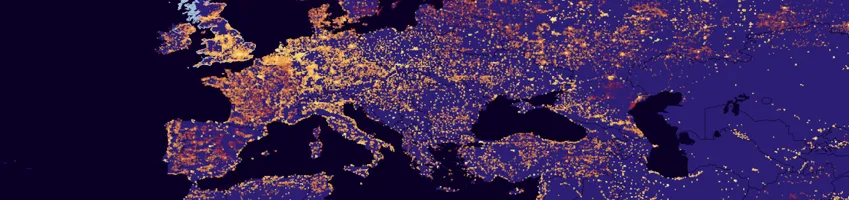
We've looked at clouds from both sides, but NASA Earth Observatory has us beat with its visualization of cloud data between July 2002 and August 2015. Cloudy Earth attempts to visualize data on clouds one of the least understood components of our climate in order to study its role in global climate change. NASA's Aqua satellite and its MODIS sensor, provided imagery and location data for this visualization whose cool-blue color palette and time-lapse animation enables viewers to easily identify patches of high cloud density around the world.
Ecoregions 2017
RESOLVE's Ecoregions 2017 data visualization displays the earth's 846 ecoregions in a stunning example of biogeography. The map contains a host of interactive features that not only use location data to identify areas of biological diversity, but also to track global progress on Nature Needs Half's commitment "to protect half of all the land on Earth as a living terrestrial biosphere."
Eruptions Earthquakes and Emissions (E3)
The Smithsonian's E3 data visualization is a time-lapse animation of volcanic eruptions, earthquakes, and carbon emissions around the world since 1960. Using data from its Global Volcanism Program, earthquake data from the United States Geological Survey and data from the Deep Carbon Observatory this map uses location data to better understand our environment.
Global Historical Emissions Map
Similar to the Smithsonian's E3 data visualization, Aurélien Saussay's Global Historical Emissions Map surveys environmental changes over time. However this data visualization displays location data on fossil-fuel burning and gas flaring as well as cement production between 1750 and 2010. You can read more about Saussay's methodological approach to mapping the industrial revolution's historical impact as well as his decision to use a gridded dataset here.
GlobalView: Climate Change in Perspective
Data visualizations are a great way to tell a story, and that's exactly what the editors at Bloomberg View do in GlobalView: Climate Change in Perspective. This story map works with location data related to climate change to present a clear, concise message about the urgency of this global crisis. Following the recent announcement about the Trump administration's decision to leave the Paris Agreement we need more of these types of data-driven stories.
The Lead Map
We've mentioned the pressing issue of water insecurity, which is why we're thrilled to include SimpleWater's latest data visualization. The Lead Map uses location data related to the ages of homes in a given county as well as the average corrosiveness of that state's groundwater to predict the level of lead exposure in a neighborhood's water. We love this data visualization not only for drawing attention to the pressing issue of access to clean drinking water but also for its innovative use of different types of location data used for risk assessment. Check out your neighborhood's lead exposure today!
London Atmospheric Emissions Inventory
Similar to the previous two entries Parallel's data visualization uses location data to map emissions across London England. What's different, however, are the 3D interactive features showing the levels of concentrated atmospheric emissions across the city.
Migrations in Motion
We've mentioned that climate change is contributing to increased urban migration, but how are animals reacting to these changes? This is the question that Dan Majka member of The Nature Conservancy's North America Region science team set out to answer with Migrations in Motion a data visualization charting the average migration routes for mammals, birds, and amphibians. Inspired by our next entry, this map distills location data on the migratory movement of nearly 3,000 different animal species into a macro-level view. Check it out today!
The Earth Wind Map
In 2013 Cameron Beccario created The Earth Wind Map, a data visualization showing global weather conditions as forecasted by supercomputers with updates every three hours. The project was originally inspired by Hint.fm's Wind Map a data visualization of wind patterns that automatically updates based upon available weather data. The Earth Wind Map's use of location data is nothing short of revolutionary which you'll discover by interacting with the data visualization. See what the same location data looks like using a stereographic projection! In the words of Florence and the Machine: "So big so blue so beautiful!"
Five Years of Drought
The widely-celebrated Five Years of Drought, John Nelson's second appearance on our list, visualizes 285 weeks of drought data as reported by the United States Drought Monitor in a single view. Despite its static design, the results as Nelson writes was "a map that accidentally characterizes the movingness of droughts over five years by using opacity to represent motion." A great example of the role perceptual color theory plays in spatial analysis and data visualizations both static and interactive!
The True Size Of…
James Talmage and Damon Maneice created this app to dispel geographical misconceptions resulting from map projections like Mercator that distort the size and shape of land masses and most notably the size of the African continent. Similar to Reprojected Destruction, we love this data visualization for its re-visualizations! Check it out!
What Is Missing?
Maya Lin's What Is Missing? is a wake-up call for a world on the brink of the sixth mass extinction. Unlike other entries on this list whose primary aims also can show gaps in network coverage this entry is entirely premised on using location data to visualize degradation and absences.
Treepedia
MIT's Senseable City Lab's Treepedia maps location data related to tree canopies for cities around the world including Paris Frankfurt and Cape Town. Instead of mapping each individual tree in each city, these data visualizations are built with an analysis method that uses location data to show the "amount of green perceived while walking down the street."
Meteor Showers
How can data visualizations represent abstract concepts without distorting or reducing the data's spatial design? That was the problem facing Ian Webster while working with meteor shower data collected by astronomer Peter Jenniskens in Meteor Showers. The solution? Create a 3D visualization providing viewers a 360 degree view of meteor showers moving through the solar system.
World Population Density
The accelerated rate of global urban migration is cause for alarm for elected officials tasked with providing city-wide services. But where exactly are these population increases happening? To answer this question, Duncan Smith over at CityGeographics built this World Population Density map with location data from the European Commission JRC and the Center for International Earth Science Information Network at Columbia University. What's stunning about this data visualization is its ability to dispel a reductive urban-rural understanding of geography as dense pockets of human settlements are found beyond traditionally recognized urban centers around the world.
Working to protect our world against climate change?
Click here to find out more & see more use cases
Sites Sounds and Smells of City Living
3D Model of New York City
CESIUM's data visualization brings together features discussed in other entries--like mapping city-wide shadows and historical development--in one 3D model of New York City. This data visualization uses 3D Tiles to represent location data in a responsive manner leading the way to fulfilling the Digital Earth vision.
50 Years of Concerts of The Rolling Stones
This data visualization commemorating the 50th anniversary of The Rolling Stones maps moonlight miles traveled while touring for half a century. The location data for this data visualization was extracted from Wikipedia which we know can sometimes be like playing with fire but luckily fans know their facts!
A New View of the Housing Boom and Bust
The Urban Institute's Bing Bai and Taz George originally published A New View of the Housing Boom and Bust in September 2013 but this interactive data visualization continues to be updated each year with open data made possible by the Home Mortgage Disclosure Act. What we love about this data visualization is the annual time-lapse animation set against a static line graph enabling viewers both a macro and micro glimpse of the housing market's travails.
Block by Black Brooklyn's Past and Present
Thomas Rhiel built this data visualization in 2013 with historical location data provided by New York City's Department of City Planning to chart the uneven evolution of Brooklyn's look and feel. More specifically Rhiel plotted and shaded over 320 000 Brooklyn buildings according to construction year to see why certain areas of the city are more developed whereas some neighborhoods seem not to have been modified at all.
Breathing City: Manhattan's at Work and Home Population by Hour
Inspired by John Nelson's Breathing Earth discussed above, Joey Cherdarchuk's Breathing City visualizes Manhattan's respiratory motion over a single day. This dot density map charts Manhattan's population both at work (red dots) and at home (blue dots) which as Cherdarchuk explains was harder than expected as obtaining the appropriate location data was difficult.
Count Love
Sometimes, less is more. We love Nathan Perkins and Tommy Leung's understated visualization of location data related to resistance protests titled Count Love. When asked about their inspiration Tommy and Nathan said that they "created Count Love in the hopes of historically documenting protests related to civil rights immigration racial injustice and other important societal issues across the United States." In addition to Count Love's interactive data map check out the use of proportional bubbles scaled to the size of each demonstration on the statistics page!
Every Shot Kobe Bryant Ever Took
To commemorate former Los Angeles Laker Kobe Bryant's final game the Los Angeles Times created a data visualization featuring a custom basemap displaying a basketball court on top of which are 30 699 dots representing the location from which Bryant took every shot of his career. An innovative approach to indoor mapping to say the least!
Fans on the Move
Are you willing to travel internationally to attend your favorite band's concert? Your favorite sports team's big game? Ticketbis an international subsidiary of StubHub examined 36 months of location data on attendees purchasing international tickets through its service and the results are interesting. Spoiler: the Superbowl and 2012 Summer Olympics rank pretty high but check out which countries of origin are home to some of the world's most diehard groupies!
How Music Taste Evolved: The Billboard Top 100 from 1958-2016
Matt Daniels over at The Pudding, visualized data for 22 000 songs ranked among Billboard's Top 100 over nearly six decades. This time-lapse animation shows the top five songs each week while the audio plays clips from each number one song. Yes this visualization uses data to locate cultural trends at a certain moment of time but what really caught our attention was the audio component that scaled the length of time a number one hit played to the length of its time in the top spot!
Mapping the Shadows of New York City: Every Building Every Block
Manhattanhenge is great but for the rest of the year New Yorkers take access to sunlight very very seriously. In "The Struggle for Light and Air in America's Largest City" (2016) Quoctrung Bui and Jeremy White built a data visualization of New York City that maps building shadows. Using location data on Manhattan buildings Bui and White used ray tracing to simulate the effect of sunlight on each building and its surrounding area. The results are stunning as "dark" neighborhoods in the shadows of nearby skyscrapers are easily spotted. Location data can cast a long shadow it turns out!
Musical Map of the World
Eliot Van Buskirk Data Storyteller at Spotify, built this data visualization using location data extracted from customers’ streaming preferences. As such Musical Map of the World curates "distinctive playlists" each week for cities around the world featuring that city's top 100 streamed songs. Map viewers become map listeners with this data visualization as each dot can stream that city's playlist. Check it out!
Netherlands Building
Inspired by Thomas Rhiel's data visualization mentioned above Bert Spaan and the Waag Society created this data visualization representing all 9 866 539 buildings in the Netherlands. The qualitative color scheme shades each buildings by construction year and the use of a dark matter basemap adds a contrast that catches the eye. The Waag Society in fact has been selling reproductions of this beautiful visualization of location data!
Population.io
The World Data Lab's Population.io may be both the most comprehensive and informative visualization of location data on our list. One of our favorite interactive features is the visualization of demographic data based upon a map viewer's date of birth a neat way to show how in your own life span the world's population has increased. Another interesting feature is the interactive map that estimates the remainder of your life expectancy based upon current location that can be compared to other countries around the world.
Smellmap: Amsterdam
Entries on this list so far have used location data to map a given city's visual sites and audible sounds but our next entry takes data visualizations to a whole new level: visualizing a city's smell. Kate McLean, artist and designer working on urban smellscapes, created Smellmap: Amsterdam a sensory map whose animated dots indicate over 50 smell types whose wafting radius is represented by concentric circles.
Spain in Figures
We've mentioned in the past how open data enhances transparency around a local government's smart city projects and Spain in Figures is a great example of what that means. This visualization of location data across Spain provides proof of changes across the country over the last four years. As an open source tool moreover this data visualization encourages local residents to contribute data on their municipality a great method to hold elected officials accountable.
The Geographic Divide of Oscar Films
Inspired by Josh Katz's cultural divide maps, Matt Daniels, Ilia Blinderman and Russell Goldenberg over at The Pudding decided to see if cultural and geographical divides corresponded in relation to 2017 Oscar-nominated films. The maps are gorgeous the methodology rigorous and the widespread popularity of Arrival undeniable!
Underworlds
How can location data from your city's wastewater system help public health officials better understand urban epidemiology in near real-time? This is the question behind Underworlds which is the second entry on our list from MIT's Senseable Lab. We love this data visualization for providing a twenty-first century take on John Snow's cholera map and look forward to seeing whether this project can improve a city's health one neighborhood at a time.
Ungentry
Ungentry a Code for America Brigade project wanted to know if Beantown would follow a similar pattern of gentrification as that of San Francisco California and New York New York. This data visualization uses a choropleth map to highlight changes in data for each Boston neighborhood between 1990 and 2010 to determine a baseline for gentrification which will enable further analysis helping to identify factors contributing to this change in city demographics.
Why Measles May Just Be Getting Started
Keith Collins Adam Pearce and Drew Armstrong's Why Measles May Just Be Getting Started is a great example of journalism and one of our favorite visualizations of location data without a geographical basemap! Instead of plotting the geographic coordinates of an outbreak of measles this entry visualizes each state as a post-it note whose size proportionally corresponds to the number of reported outbreaks.

Social Media
Gay Happiness Index
PlanetRomeo Europe's leading gay social network created the Gay Happiness Index using location data retrieved from their online dating app. Based on data from over 115 000 users this data visualization provides a happiness score for each country that is then ranked to determine the best place for gay men to date. Find out how your country scored below and scroll down to learn some interesting facts too!
How Every #GameOfThrones Episode Has Been Discussed on Twitter
For a twist on location data check out Krist Wongsuphasawat's interactive How Every #GameOfThrones Episode Has Been Discussed on Twitter data visualization. Using social media data from Twitter this data visualization forgoes geographical location and instead locates thematic interest in each new episode of HBO's Game of Thrones. More specifically, this data visualization depicts statistics on fan reactions shared on Twitter in the twenty-four hour period following each episode's premiere. Find out when exactly winter arrives using this website! #Longmayshereign
Inequaligram: Measuring Social Media Inequality
You've probably seen a lot of public Instagram images of midtown Manhattan shared by both tourists and residents but what about Fort Tryon Park? The answer is likely "No " and the reason for this disparity the team behind Inequaligram: Measuring Social Media Inequality finds, relates to economic inequality across New York City. These dot density data visualizations were built with location data extracted from 7 442 454 public Instagram images shared by visitors to and residents of Manhattan and you'll note that the volume of images for both visitors and locals drastically trails off after 110th street.
Sunrise around the World
Are you a morning person? Well as this visualization of location data extracted from global tweets demonstrates you're not alone! This time-lapsed dot density map shows geotagged tweets containing "sunrise" in different languages from around the world on April 6 2014. Make sure to zoom in to see just how many Twitter users tweeted about the rising sun!
The Food Capitals of Instagram
We know foodies love posting images of their meals on Instagram but what location data can the images themselves provide? The Food Capitals of Instagram adds a twist to social media data visualizations in mapping not restaurant locations but rather the geograpical orgins from which the food served orginates. The visual's location data was extracted from more than 100 000 photos posted on Instagram between March 10 and March 15 2015 and bubbles are sized in proportion to the volume of photos.
The Louvre on Instagram
This entry is "meta" to say the least. Tin Fisher's created a data visualization featuring a basemap representing the floorplan of the Louvre one of the world's premiere art museums located in Paris France and mapped Instagram images of the images on display in the Louvre. Fisher downloaded geotagged photographs of Louvre images from 2014 using the Instagram API and mapped each image as a data point according to its actual positioning within the Louvre. It wasn't too surprising to see the high volume of foot traffic around the Mona Lisa. It was surprising however to see how many people looked at art pieces through a screen at the Louvre!
Twitter Tongues
The wealth of location data provided from social media platforms is staggering and in this data visualization James Cheshire mapped 3.3 million geo-located tweets collected by Ed Manley featuring different languages spoken across the city of London during summer 2012. That London hosted the 2012 Summer Olympics accounts for the high density of dots of different languages found in and around Olympic Park. Check it out (and make sure to see the difference the basemap slider makes)!
Locals & Tourists
We were impressed with the previous entry's visualization of 3.3 million data points but a year later Eric Fischer mapped 3 billion tweets in Locals & Tourists. This data visualization breaks down the tourist-local divide by mapping social data provided by GNIP.
Wikipedia Recent Changes Map
Stephen LaPorte and Mahmoud Hashemi's data visualization tracks global updates to Wikipedia made by unregistered users. Although this population only amounts for approximately 15 percent of total Wikipedia updates it is pretty cool to see how LaPorte and Hashemi used IP addresses to extract the geograhical location of unregistered users.
Wikiverse
Have you ever gone down a Wikipedia rabbit hole? Well imagine if that were a black hole and you'd begin approximating Wikiverse a self-proclaimed "galactic reimagining of the Wikipedia universe." What we love about this data visualization is its treatment of location data wherein spatial "proximity" is rendered as semantic "similarity " a move reminiscent of Tobler's first law of geography. Check it out today!
Visualizing Global Blog Activity
If you work in marketing then you've probably heard the phrase "content is king." And you’ve probably been warned about the volume of quality content being produced around the internet too. Well Twingly's data visualization offers quantitative proof of at least the amount of blogging around the world in near real-time. Make sure to turn on the sidebar showing each post's language to get a better sense of what all those expanding lines really mean!
Want to use Geosocial data in your own analysis?
Check out the Location Data Streams available

Transportation
A Tale of Twenty-Two Million CitiBikes
In his almost Dickensian break down of location data extracted by CitiBike riders, Todd Schneider details the hidden story behind 22.2 million Citi Bike rides across New York City. We love the time-lapse animation tracking the route of each and every bike in use over the course of a day. Make sure to check out what rush hour looks like for bikers starting around 5:30pm for a whole new take on "it was the best of times it was the worst of times."
Average Commute Times
The grass may seem greener on the other side but is the commute time shorter too? Thanks to this data visualization you can now dispel the belief that other commuters have it easier using AutoAccessoriesGarage's interactive data map. Built with open data on commuting from the United States Census Bureau this data visualization allows viewers to check their average daily commute against zip code and state average in a beautiful choropleth map. Check your commute score today!
Every A380 Route
The Airbus A380 the world’s largest airplane carrier has fallen out of favor as airlines attempt to cut costs. Today as David Yanofsky reports only 13 out of 57 airlines even fly the A380! Read more of Yanofsky's report here and check out the rotating globe visualizing A380 flight routes using location data from PlaneStats and OpenFlights.
Glasgow in Motion
Glasgow is Scotland's largest city, but with Glasgow in Motion you can glimpse the pulse of this thriving metropolis in real time. The Urban Big Data Centre has created more than a transportation app with real-time alerts as this location app even visualizes the city's air quality using data from World Weather Online. Check it out today!
The Ship Map
Kilns The Ship Map winner of a 2016 Information is Beautiful Award displays the 2012 movement of the global merchant fleet using location data provided by Julia Schaumneier and Tristan Smith of the UCL Energy Institute. By cross referencing location data on each ship's geographical coordinates and speed with other databases this data visualization determines characteristics of each ship in order to calculate the hourly rate of carbon emissions. This is a great example of using accessible location data to estimate missing variables!
Hubway
The second entry on our list from Nathan Perkins and Tommy Leung's of Count Love. Hubway charts over five million hubway trips taken in Boston to measure station traffic in order to identify outliers that are being underutilized. We loved this cyclist take on route optimization!
In Flight
Kiln created this data visualization for The Guardian using data provided by FlightStats. This data visualization tracks individual flights in near real-time as well as flight routes identifying areas with high traffic volume each and every day. Watch the video before exploring the map for yourself!
New Europe
Benedikt Groß Philipp Schmitt and Raphael Reimann over at Moovel Lab set out to determine whether all roads do, in fact, lead to Rome. Similar to other entries on our list New Europe undertook a route optimizaton but on a whole new level as they determined which of the nearly 500,000 roads leading to Rome was the best option. These data visualizations definitely weren't built in a day but we're grateful for all the time and energy that went into mapping the routes from each of the 486 713 starting points! Learn more about the project here.
Night Lights Map
We've been told the night is dark and full of terror but luckily there's a Night Lights Map for that. NASA's Earth Observatory created this dazzling data visualization which is "the clearest yet composite view of the patterns of human settlements across our planet " using location data extracted from satellite imagery. In addition to beautiful images this data visualization will help researchers investigate how cities around the world expand in the coming years in response to global urban migration.
Sensing Vehicle: The Car As An Ambient Sensing Platform
There's been a constant buzz around driverless vehicles for some time but did you know that our current fleet of cars contain upward of 4 000 sensors already? Sensing Vehicle the third and final entry on our list from MIT's Senseable City Lab's provides one of the first interactive car model maps that locate the sensors making our cars smarter and smarter each day.
The Megaregions of the U.S.
Based upon their research related to economic geography across the United States Garrett Dash Nelson and Alasdair Rae visualized this work in The Megaregions of the U.S. This data visualization participates in growing efforts to map beyond static boundaries and instead see what the U.S. "might look like if we based our regions on the pattern which commuters weave every day between cities suburbs and rural areas." With more than four million lines this data visualization weaves together beautiful digital cartography and innovative spatial analysis. A must see!
Travel Time to the Closest Primary Airport in the U.S.
City-Data built Travel Time to the Closest Primary Airport in the U.S. This data visualization calculates commute times with the help of machine learning specifically using Open Source Routing Machine (OSRM) that is applied both to public and private data to calculate spatial distance and your optimized route to and from the airport. Check it out!
Visualizing 24 Hours of Subway Activity in New York City
Will Geary takes a different approach to visualizing a day in the life of New York City's subway system by forgoing a static basemap altogether. Instead Visualizing 24 Hours of Subway Activity in New York City displays a day's worth of location data related to train travel beyond the customary NYC Transit Map. Geary's data visualization provides a brand new way of seeing how the subway runs in the city that never sleeps.
Optimizing transport infrastructure spatially is key to the future of mobility
Check out some more key use cases
We hope you found these data visualizations as beautiful as we did. Feeling inspired to create your own?