How The New York City Mayor’s Office takes a real-time pulse of the city with its interactive dashboard
Deeply understanding and visually exploring the complex data of a city is key to understanding how to make timely and effective decisions. It is essential to how we improve the lives and well-being of residents. Data visualization allows for insights into the progress being made the challenges that remain and where important decisions must be made.
New York City has been a long-time champion in data management and civic innovation regularly pushing the envelope for building a better future through leading data collection and optimization practices. Because of rapid advances in government and technology it has become increasingly important for decision makers and their teams to rapidly make sense of and act on the data being generated across agencies and by its residents.
The rapidly changing nature of today’s data challenges and New York City’s commitment to leading the pack in data and analysis for government is in part why Vizzuality Xentity and Hyperakt have developed New York City’s new real-time data dashboard powered by CARTO. The dashboard puts key city indicators from a wide range of data sources at the fingertips of City Hall.
Showing a wide variety of city indicators including up-to-date crime statistics service provision performance health figures infrastructure project updates public works 311 data environmental indicators housing and homelessness statistics and many others the dashboard allows for easy monitoring of changes to these indicators across both spatial and temporal dimensions.
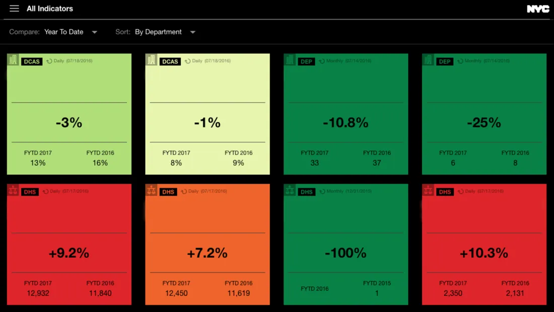
Created in partnership with the New York City Mayor’s office the dashboard is tailored to tackle the increasingly complex data needs of modern government. This includes features that enable the city to add update and synchronize social political human development environmental and economic indicators in an easy and efficient manner.
Using location intelligence platforms enables the Mayor's Office of Operations to generate actionable dashboards to manage NYC more efficiently; building on our robust performance management and data collection practices to offer a better service to our citizens
James Perazzo NYC Mayor’s Office of Operations
In order for the New York City Mayor’s Office to have a clear understanding of the city day to day it was important for the dashboard to pull in data from a wide range of city agencies. Agency data available in the dashboard includes indicator data for everything from the New York City Housing Authority to the NYPD to the Department of Housing Preservation & Development and many others.
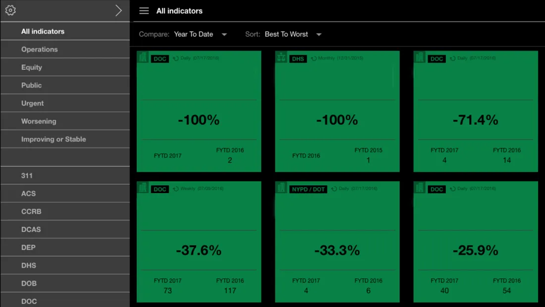
This powerhouse of up-to-date data and indicators is now available in one place in a variety of visual formats. From anywhere city hall officials can understand the city numerically in charts and in dynamic interactive maps. Versatility in how the data is presented allows for the visual language of the dashboard to quickly convey clear insight to decision makers and City Hall employees.
This insight can quickly be translated into action that saves the city large amounts of both time and money while establishing a common ground to measure and improve how the city operates. Residents of New York are positioned to benefit from these improvements massively as the city can now identify and act on important situations in specific parts of the city unlike ever before.
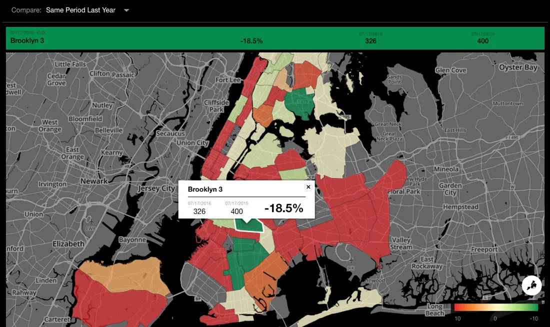
In addition to the near real-time insight presented the interface enables officials to take a deeper look into data trends and progress on specific agency goals. With a few clicks officials can compare the current state of the city across various time intervals. From trends this year to understanding how the city currently compares to last year to quickly identifying short-term changes by day week or month the New York City Mayor’s dashboard makes it easy for patterns and trends to be discovered and acted upon rapidly.
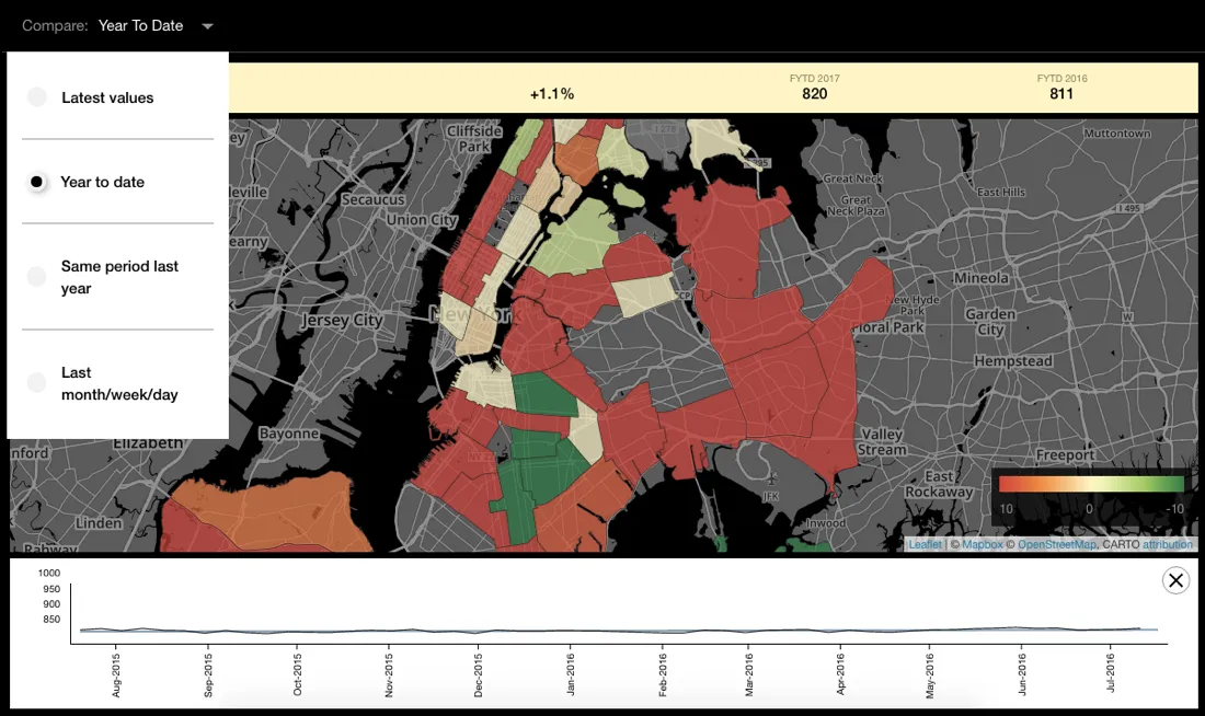
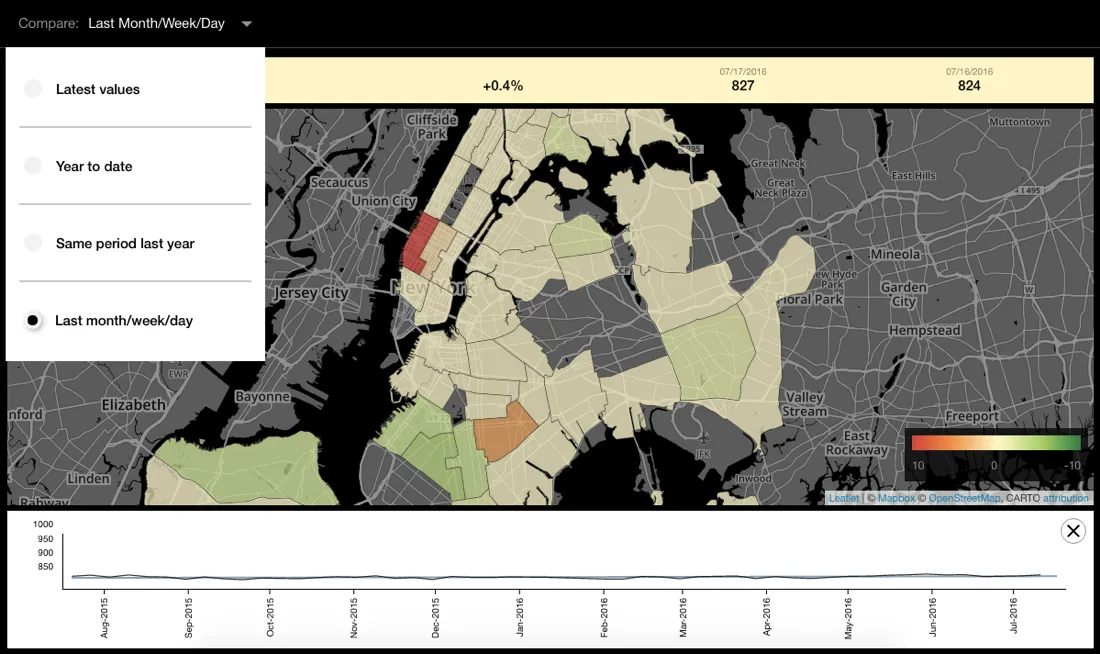
Included in the dashboard are numerous features such as the option to set up notifications at various indicator thresholds and the ability to click and send indicators to other city officials in a matter of moments. Temporal trends are now easily accessible in indicators and include graphs of past city performance indicators at both a city and district/borough level. These features help officials understand and share insight quickly drastically improving communication workflows and efficiency. Residents of New York are positioned to benefit from these improvements as the city identifies and acts on important situations in specific parts of the city as they happen.
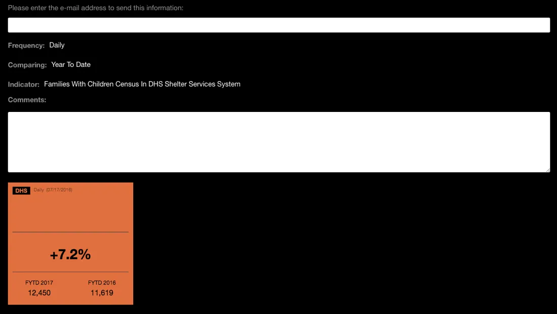
The functionality and design of the dashboard powered by CARTO allows for degrees of insight and communication that allow us to streamline city operations like never before.
James Perazzo NYC Mayor’s Office of Operations
The New York City Mayor’s Office dashboard allows for previously difficult levels of urban understanding to be reached. This solution is leveraging NYC’s already robust performance management and data collection practices in incredible ways and the impact of these innovations shape the ways in which we think about and define the next iteration of modern government. As we strive to create the future of location intelligence we also become the instruments that shape our urban futures.
Happy Data Mapping!


