The Wall Street Journal's 2012 election map done with CartoDB


The Wall Street Journal (WSJ) published today its first interactive map on the 2012 election. The map is part of an ongoing regularly updated full election coverage. All data analysis and storage is done with CartoDB. The final election map is built through CartoDB API's and the Leaflet map library.
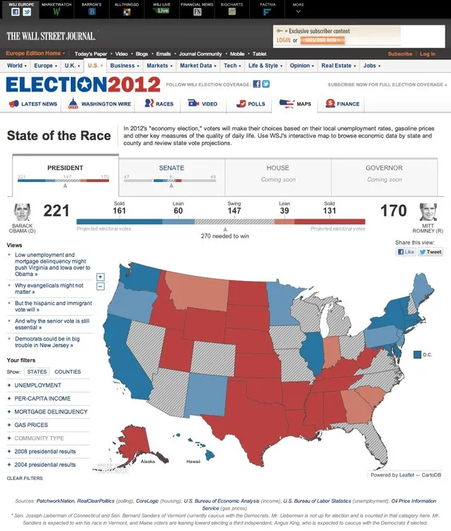
Here is a screenshot of the map as featured in the WSJ's website:
And a detailed showing data by counties:
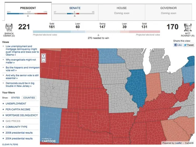
The map summarizes the state of both the presidential and the Senate race. There's more data coming soon on the House of Representatives and the governors elections. A bar shows the projected electoral votes for each state which candidate is estimated to be ahead and the leaning and swinging states data.
Also readers can filter data by State and County browse economic indicators and review state projections. The idea is to be able to turn on and off the economic and political variables to guess why each candidate is projected to be ahead in each State and County and identify their possible weaknesses and strengths. There are also special filters that show in a map the editor's pick i.e. why the senior vote is still essential or what's the role of evangelicals in the election.
We are happy to collaborate with CartoDB's partner WSJ on this data journalism project.