
Data Viz Hacks We Learned While Mapping Drought Data


When California went on record as experiencing one of the most exceptional droughts in history even "untouchable" movie stars were fined for watering their lawns.
For the first time since 2014 news outlets reported that no area in California was designated as experiencing “exceptional” drought conditions.
Sensors beacons GPS data and satellites have been able to generate a deluge of big data for state officials and scientists. However organizations are finding more meaningful value in “small data” because of its ability to be acted upon immediately.
Mamata our senior cartographer created an interactive data visualization built upon data from the US Drought Monitor to show how anyone can find meaningful insights by taking a “small data” approach to location data.
1. Small data’s immediate impact
Although big data provides the raw material for small data data visualizations can keep you afloat while searching for smaller subsets across multiple layers of information.
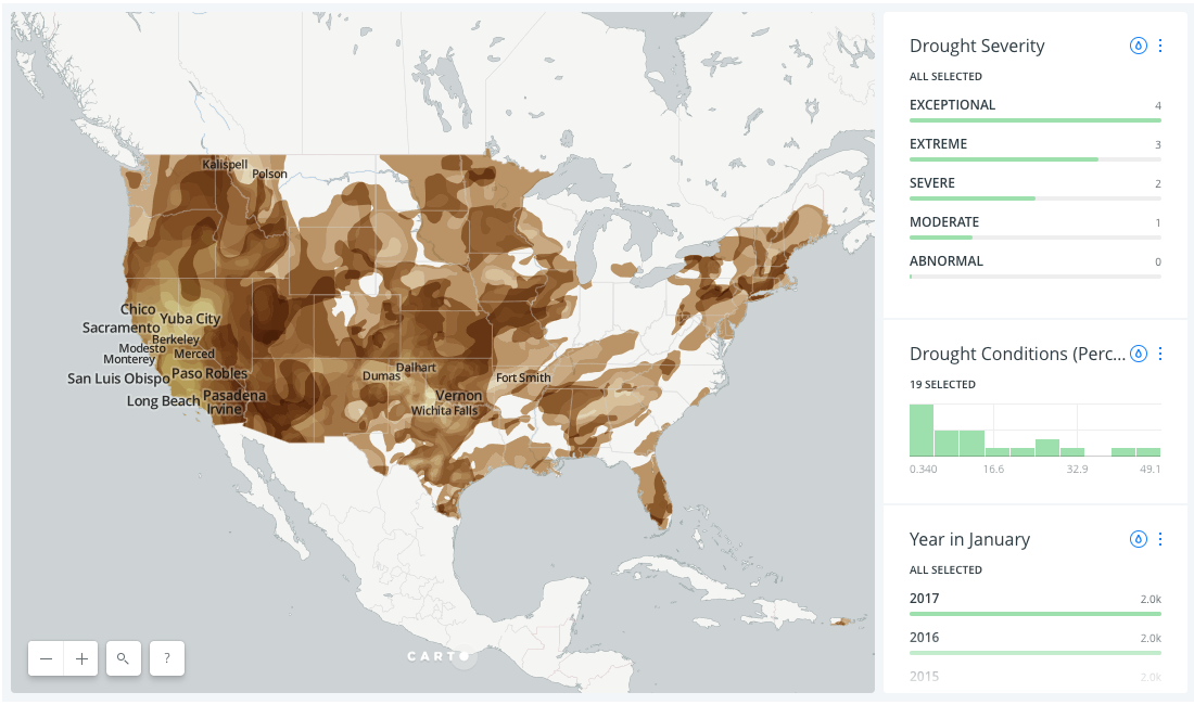
Below are two images from the drought data visualization. The image on the left hand side displaying national data for all severity levels since 2014 presents so much information that local trends can be hard to spot.

The image on the right hand side however has been filtered only to display conditions for the final week of January 2017. The visualization confirms that California did not exhibit “exceptional” drought conditions but also locates national occurences of each drought category.
Subsequently you can now start to consider how local officials in cities like Santa Barbara California and Fort Smith Arkansas have responded to “severe” drought conditions while also identifying shared climate conditions between the two cities.
Small data provides this type of local insight that is not always available when talking about national trends in terms of statistics percentages and figures. Visualizing a data category is a great way to translate an abstract space to a meaningful place for further exploration.
2. Spatialize trends not territory
Another benefit of visualizing location data is the ability to spot areas of interest that fall beyond the purview of traditional performance metrics.
If you’re running a year-over-year report for instance measuring profit increases and decreases may not account for valuable information contributing to annual performance.
When working with small data however spatial analysis can be applied to non-spatial patterns trends and occurrences to expand your understanding of the situation.
Droughts present a similar challenge as cartographers equipped with geospatial tools confront unpredictable temporal occurrences. John Nelson for instance has discussed these cartographic limitations for visualizing the “movingness” of droughts but let’s see how styling trends can help visualize changes that move over time.

The map above displays drought data from the final week of January in both 2015 and 2016. The blue areas represent 2015 data the yellow areas represent 2016 data and the mixing of the two produce the green areas which represent locations experiencing drought conditions in both years.
This map’s categorical color scheme helps locate areas otherwise unnoticed were you only to measure for statistical increases and decreases. Moreover the data visualization features responsive labeling to draw attention to cities like Twin Falls Idaho and Klamath Falls Oregon whose drought conditions have not received as much national as metropolitan areas.
Small data enables this more expansive approach to spatial analysis which can help you see occurrences beyond previously defined geographic boundaries.
3. Smaller comparisons can reveal bigger stakes
The only business intelligence buzzword more overused than “big data” is “predictive analytics.”
While big data can help build models to locate an unknown value for future planning small data helps build descriptive models that present information on current conditions.
The added value attracting businesses to small data and descriptive analytics more generally is found in providing insights on present conditions that can be acted upon immediately.
In the map below for example “exceptional” and “extreme” drought conditions are represented for the final week of January from 2014 through 2017.

While the map above locates a high number of areas within California experiencing exceptional and extreme drought conditions the data visualization also locates areas in New England such as Hartford Connecticut and Springfield Massachusetts. That western and central states have experienced extreme or exceptional drought conditions is far less surprising than seeing that this trend has occurred in the northeast as well.
Visualizing this small subset of data can provide an impetus for local officials across the nation to begin collaborating on sustainable solutions that better prepare cities counties and municipalities for future water shortages.
{% include icons/icon-demo.svg %} SEE THE POWER OF LOCATION INTELLIGENCE Request a live demo
Conclusion
Instead of plunging into the sink-or-swim waters of big data business analysts are finding more success working with small data. Whether you are mapping drought data or not smaller data sets help you ask smarter questions whose answers can be acted upon in the present.
Happy (Small) Data Mapping!


.png)

