The Top Trends in Data Visualization for 2018


Data science is a rapidly growing career path and leaders across all industries fields and governments are putting their best minds to the task of harnessing the power of location data.
As organizations seek to derive greater insights and to present their findings with greater clarity the premium placed on high quality data visualization will only continue to increase.
Here are some of the trends related to data visualization that we are keeping an eye on in 2018.
1. Data visualization is not just for data scientists anymore.
IBM projects a 39% increase in demand for data scientists and data engineers over the next three years. But employers are coming to expect a familiarity and comfort with data across their organizations not just from their scientists and engineers.
Because of this trend we can expect the continued growth of tools and resources geared towards making the data visualization field and its benefits more accessible to everyone.
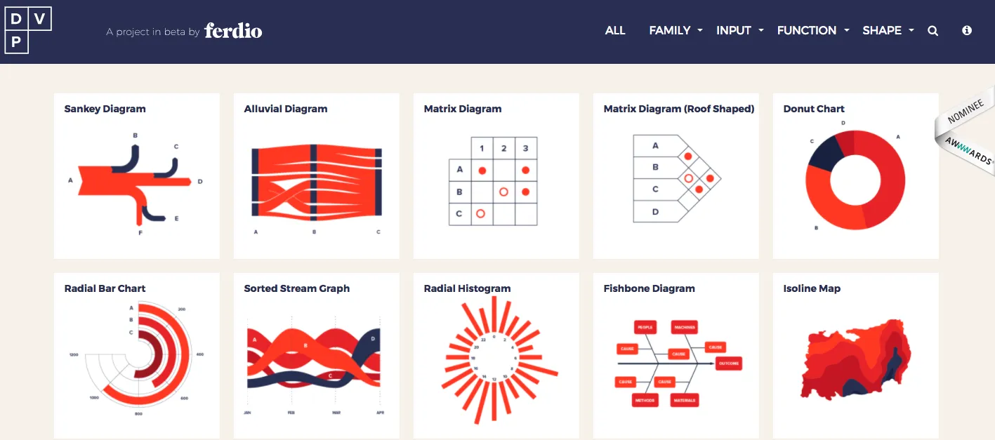
For example someone new to the field may turn to Ferdio’s DataVizProject.com a compendium of over 100 visualization models. The infographic agency put this resource together to "inform and inspire" those looking to build their own data visualizations. Other services like Google’s Data Studio allow users to easily create visualizations and dashboards without coding skills.
2. The increase of both open and private data helps enrich data visualizations.
In order to gain greater insight into the actions and patterns of their customers and constituents organizations need to turn to sources outside of their own proprietary data.
Luckily for data scientists more and more data becomes available every day and we can expect the trend of increased availability to continue into 2018.
Data.gov the United States Federal Government’s open data site boasts data sets from 43 US states 47 cities and counties and 53 other nations. In June Forbes identified 85 US cities that have their own data portals.
We recently published a list of 40 open data projects from transportation and accountability to performance management and IoT.
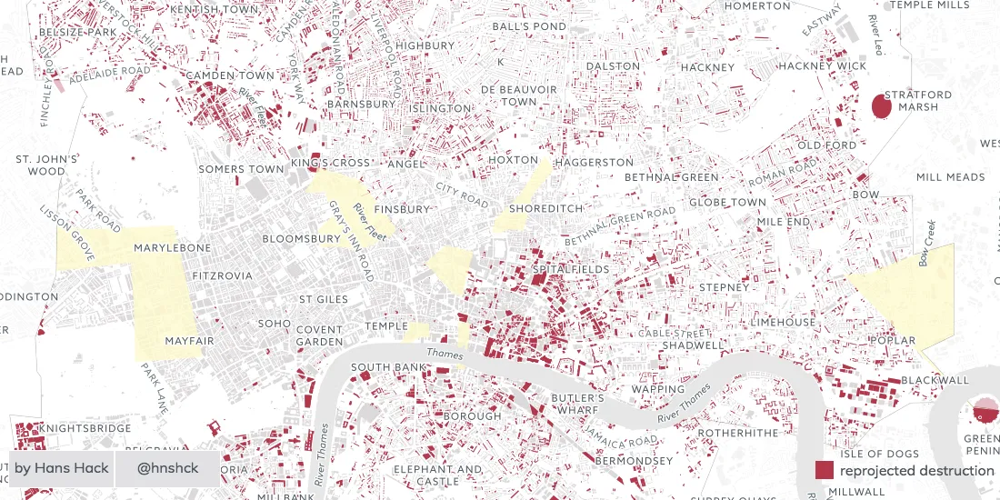
The example above visualizes open data about Cholera outbreaks from WHO using custom iconography and color palette.
In addition to open data sources new marketplaces data exchanges such as the new Salesforce Data Studio (announced in September 2017) as well as resources such as CARTO’s Data Observatory will provide data scientists and visualizers even more opportunities to enhance their data and draw new and actionable insights.
Want to see this in action?
Request a live personalized demo
3. Artificial Intelligence and Machine Learning allows data professionals to work smarter not harder.
Artificial Intelligence and Machine Learning are the buzz words du jour in the tech world and that includes their use in the field of data science and visualization.
Salesforce has certainly highlighted their use advertising their Einstein AI which will aid users in discovering patterns in their data.

Microsoft has recently announced similar enhancements to Excel expected in 2018. Their "Insights" upgrade includes the creation of new data types in the program. For example the Company Name data type will automatically pull in such information as location and population data using their Bing API. They are also introducing Machine Learning models that will assist with data manipulation. These updates will empower Excel users already familiar with the programs data visualization tools with data sets that are automatically enhanced.
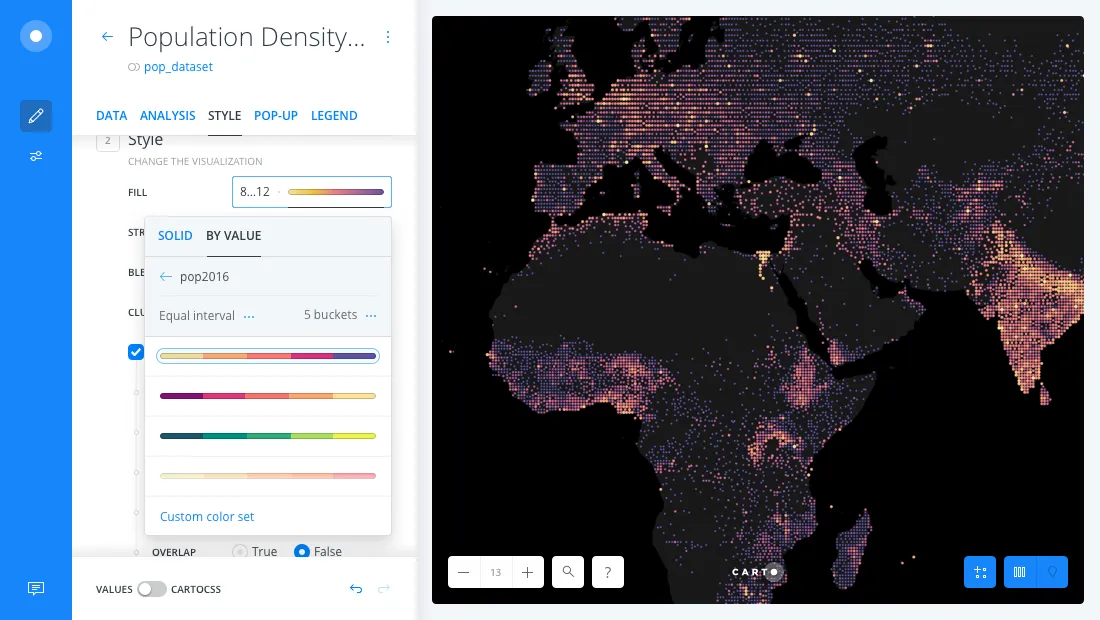
4. The "interactive map" is becoming a standard medium for data visualizations.
Data visualization as a term can refer to any visual representation of data. However with the growing amount and prevalence of location data more and more data visualizations require an interactive map to fully tell a story with data.
We recently shared 80 examples of data visualizations using location data and maps.

5. There is a new focus on "data stories."
Creating a single data visualization can have great impact. But more companies are beginning to create custom website experiences that tell a more complete story using many types of data and visualization methods.
Enigma Labs released the world’s first Sanctions Tracker earlier this year a data story that contextualizes and communicates over twenty years of U.S. sanctions data as meaningful information. Look in 2018 for more custom experiences that use maps and other mediums of data visualization to communicate complex issues.
6. New color schemes and palettes for visually impaired.
The color of 2017 according to Pantone is "Greenery " a lighter shade of green conveying a sense of rejuvenation restoration and renewal. The long-term color forecast however is a return to primary colors like red green and blue colors often appearing in country flags because "[i]n complex times we look to restricted uncompromising pallets."
Regardless of trends it’s important to understand the fundamentals of choosing color palettes for your data visualization. Once you understand the fundamentals you can start exploring other palette options and incorporating design trends. Check out Invision’s post on Finding The Right Color Palletes for Data Visualizations.
CARTO also offers an open-source set of colors specifically designed for data visualizations using maps called CARTO Colors.
It's important to consider that about 4.5% of the world’s population is color-blind. Data visualization designers especially need to considering building visualizations with color-blind color palettes like those provided by ColorBrewer.
7. Data visualizations around current events are dominating the social conversation.
Data visualizations for social sharing will also take a "less is more" approach for the remainder of the year.
Interactive data visualizations and maps specifically offer a new format that is great for social sharing. Marketers can quickly build maps using available location data from social platforms or open data portals.
Below one marketer created a data visualization using Twitter traffic from the Game of Thrones season seven premiere and generated thousands of views:
In focusing in on the three main contenders for the Iron Throne this data visualization quickly and efficiently tells the viewer that Cersei Lannister drove the most twitter activity in the twenty four hours following the premiere. A marketer could do a similar analysis using branded keyword data.
8. Journalists are striking back with data visualizations.
The Oxford English Dictionary selected "post-truth" as the word of 2016. Indeed following the U.S. presidential election data analysts and journalists have been on the defensive from opponents labeling their reporting "fake news."
But 2017 is the year data analysts and journalists strike back with the help of data visualizations.
The editors of the Columbia Journalism Review (CJR) released an editorial titled "America’s Growing News Deserts " in spring 2017. The article featured the interactive data visualization below that maps the dearth of local newspapers across the country.
This data visualization exhibiting the first trend discussed above is not merely a pretty representation of data. The editors are soliciting readers to contribute to this living resource on "news deserts."
"We think that a complete accurate map of America’s news deserts is important " the editors explain "as we ponder the future of local news and we want to build on what we’ve started here."
Expect to see many many more data visualizations from media sources throughout 2017 and beyond.
Want to get started?