What Online Retailers Can Learn by Mapping Sales Data


Online retailers have become experts in tailoring consumer experiences building stronger relationships with customers and launching targeted ad campaigns by collecting data.
Yet marketers and online retailers still struggle to prove ROI of their advertising campaigns and to know how to leverage the data about their customers in meaningful ways.
We'll show you one company that's doing it right.
Recently an ecommerce site based out of New York City shared with us all of the data from its latest advertising and product campaign.
The company was rolling out a new product line and had launched Facebook ads in a 25-mile radius of what they believed to be the metro areas in the U.S. with the highest concentration of past customers.
While their overall campaign was a success visualizing and analyzing their sales data allowed them to do three key things:
1. Identify highly concentrated locations of customers.
A city is more than an address.
When predicting customer behavior one of the most common attributes for marketers to consider is the street on which they live. In reality though a company should be looking at the entire metropolitan area.
Cities are designed to accommodate flows of people whether they're driving to work going out to a restaurant or shopping at a mall.
The ecommerce company asked: What are the largest metropolitan areas where my customers live?
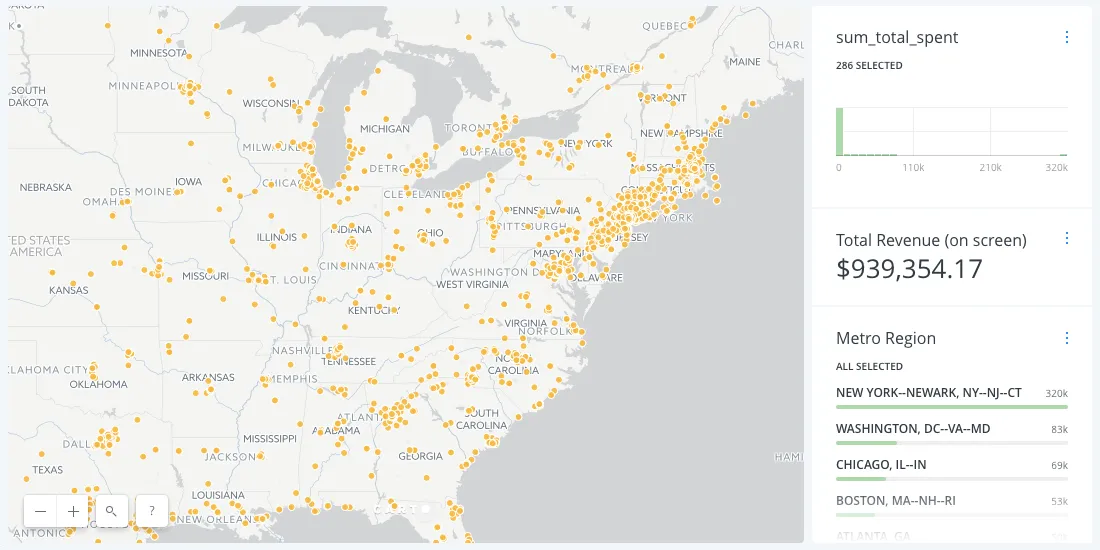
Within CARTO we plotted yellow dots to represent all of the individual sales for their product campaign as shown in screenshot above. (We're including some screenshots and some interactive map embeds to protect individual privacy).
We then intersected those dots with a layer of urban areas (obtained through Census and stored in our Data Observatory). This provided an incredibly accurate view of sales by city (in the interactive map below) as it aggregated suburban areas that might have a different city shipping address listed into the major metro area.
As you can see from the widget next to the map if the user zooms or adjusts the map the highest revenue cities automatically update. They could also adjust the sum_total_spent to show only cities with sales over a certain threshold.
2. Measure the ROI of location-based Facebook ad campaigns.
Every marketer needs to show the impact of their ad campaigns and attribution tracking can be challenging to get 100% accurate.
The ecommerce company asked: How are my ad campaigns influencing total revenue for this product launch?
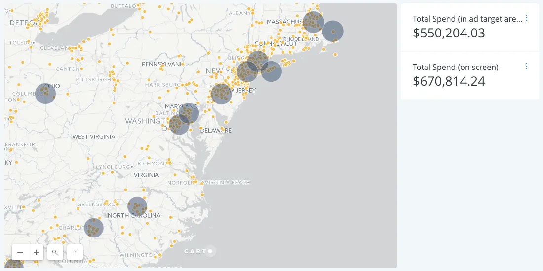
As a reminder this ecommerce company's Facebook ad campaign targeted 25 miles radius' of over a dozen cities. By mapping those radiuses and intersecting them with sales over the duration of the ad campaign the marketer in charge of the ad campaign can show all of the sales that their ads influenced. In this part of the United States 82% of sales (550k out of 670k) came from within ad-targeted regions.
That's valuable information for a marketer looking to optimize and report on their ad campaigns.
3. Identify potential new markets for ad campaigns and stores.
Birds of a feather shop together.
The ecommerce company asked: Where are there new areas that I should focus my marketing efforts to increase total revenue for the company?
Like every retailer the ecommerce site is looking to expand its business and they were shocked to see many customer-rich regions that they had not included in their advertising campaigns. By overlaying the Facebook ad targets with the highest value metropolitan areas we can see a couple of things:
- Minneapolis is one of the biggest metropolitan areas in terms of total revenue but it is not part of the Facebook ad campaign.
- Several smaller cities are included in the Facebook ad campaign though they aren't in the top 20 most valuable metropolitan areas. That doesn't necessarily mean they aren't good targets but the digital marketer running the campaign may want to shift ad budgets to areas with more spending.
Additionally by looking at the individual sales data we can see additional potential ad areas outside of the urban zone. For example the marketing targeted at San Francisco missed both the bulk of customers living in San Jose and all those living in Sacramento and the targeting in Los Angeles missed a bulk of people in northern counties.
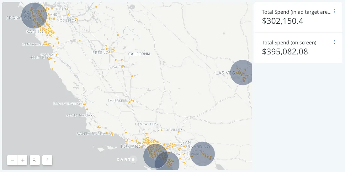
By plotting shipping addresses on the map the ecommerce site could see the deficiencies and also draw surprising insights.
Location Intelligence for Online Retailers
Online retailers have the data necessary to make insightful strategic decisions — but only when the analyses are as good as the data. Visualization and location intelligence can reveal clear actionable insights that help businesses fully engage with every customer.
Are you looking to execute more effective online ad campaigns and grow your retail business? Schedule a call with one of our ecommerce specialists to get started.