Where Should World Cup 2026 Sponsors Activate? A Spatial Analysis of All 16 Host Cities


The World Cup 2026 kicked off today at Estadio Azteca in Mexico City. It is the biggest edition in the tournament’s history: 48 teams, 104 matches, and 16 stadiums spread across the USA, Mexico, and Canada. It is also the most sponsored. For the first time ever, FIFA filled all 16 global sponsorship positions before the opening match.
Those brands have paid record sums for visibility. Now their media teams face a much more concrete question: where, physically, should that investment show up? Billboards, pop-ups, sampling teams, and branded fan zones all need an address.
The stadium is the obvious answer. It is also mostly the wrong one.
Sponsorship rights are global. Activation is local.
On match day, the audience is not standing at the stadium gates. Fans spread across an entire metro area. They watch in bars, gather in retail corridors, ride transit hubs, and fill hotels and restaurants for days around each fixture. The budget question is not “how close to the stadium can we get?” but “which blocks within reach of the stadium concentrate the most people, retail, and food and drink activity?”
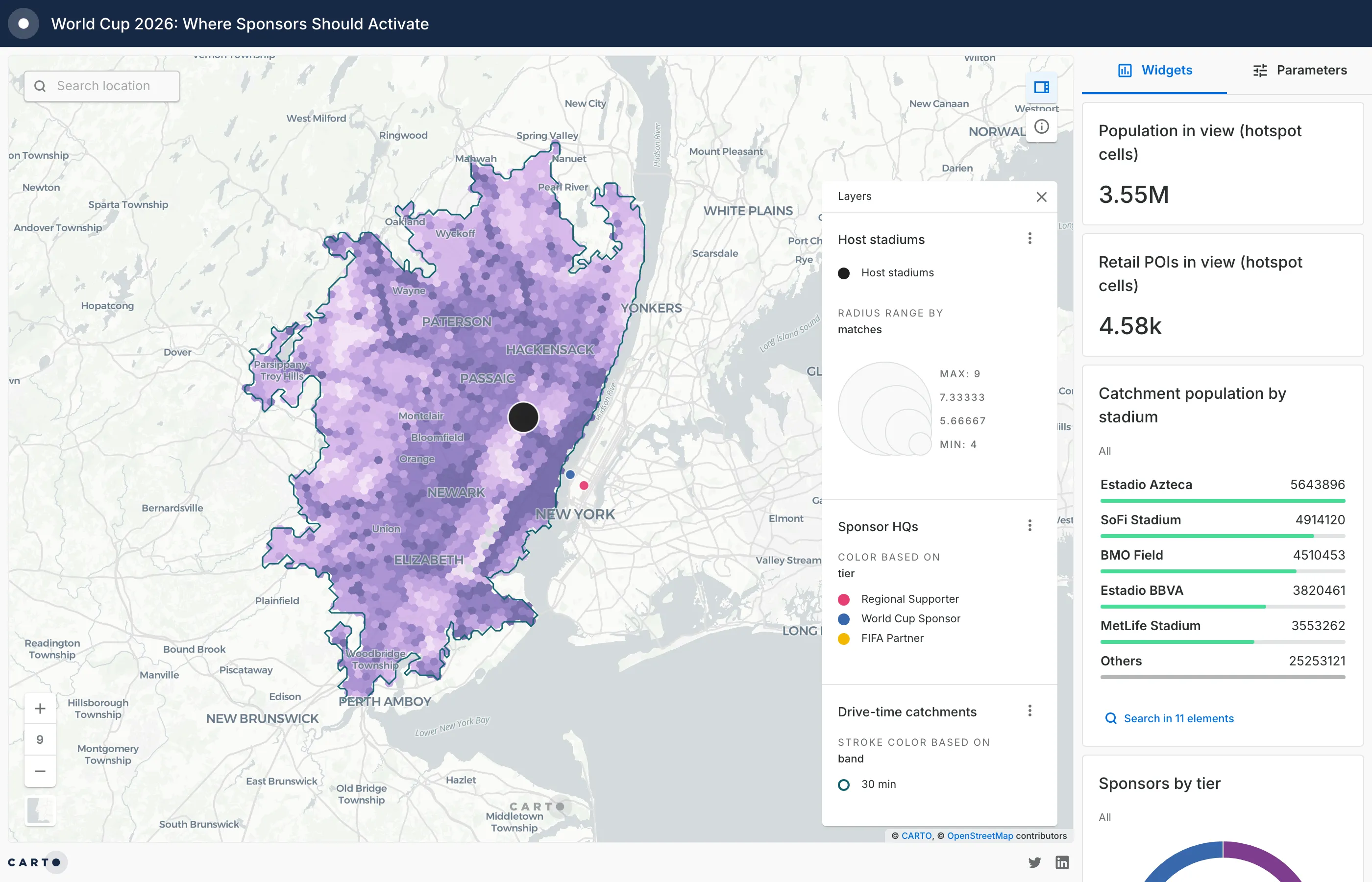
That is a trade area problem, the same one retail analysts solve when they plan a new store or media planners solve when they buy out-of-home inventory. So we treated it exactly that way, and built an interactive map that scores every ~0.7 km² cell within a 30-minute drive of all 16 stadiums.
Open the full screen version to use the widgets, switch between 30 and 60 minute drive times, and click any stadium or hexagon for its numbers.
What the map scores, and how
The map combines four layers:
- The 16 host stadiums, sized by the number of matches each one hosts. AT&T Stadium in Dallas leads with 9; MetLife Stadium hosts the final on July 19.
- Drive-time catchments at 30 and 60 minutes, computed on the real road network with isolines rather than simple radius circles.
- Activation hotspots: every catchment is broken into H3 hexagons (a spatial index of roughly 0.7 km² per cell) and scored by blending retail density (30%), food and drink venues (25%), human activity (20%), tourism POIs (15%), and transport hubs (10%). Scores are normalized within each host city, so a dark hexagon means “one of the best blocks in this metro,” not a comparison across cities.
- Sponsor headquarters for the 24 brands behind the tournament, colored by tier: FIFA Partners, World Cup Sponsors, and Regional Supporters.
Population, retail, and POI variables come from CARTO Spatial Features, available through the Data Observatory. For the two Canadian host cities we rebuilt the same variables from WorldPop population and OpenStreetMap POIs, since the analysis only compares cells within each city.
Three patterns worth a sponsor’s attention
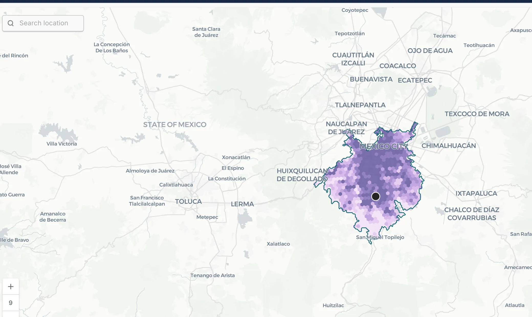
1. The biggest audience of the tournament is not in the USA. Estadio Azteca’s 60-minute catchment holds close to 20 million people, the largest of any venue, ahead of MetLife (16.8M) and SoFi (13.3M). And the strongest activation cells are not next to the stadium: they run along the corridor between Azteca and the city center, where retail and food and drink density peak.
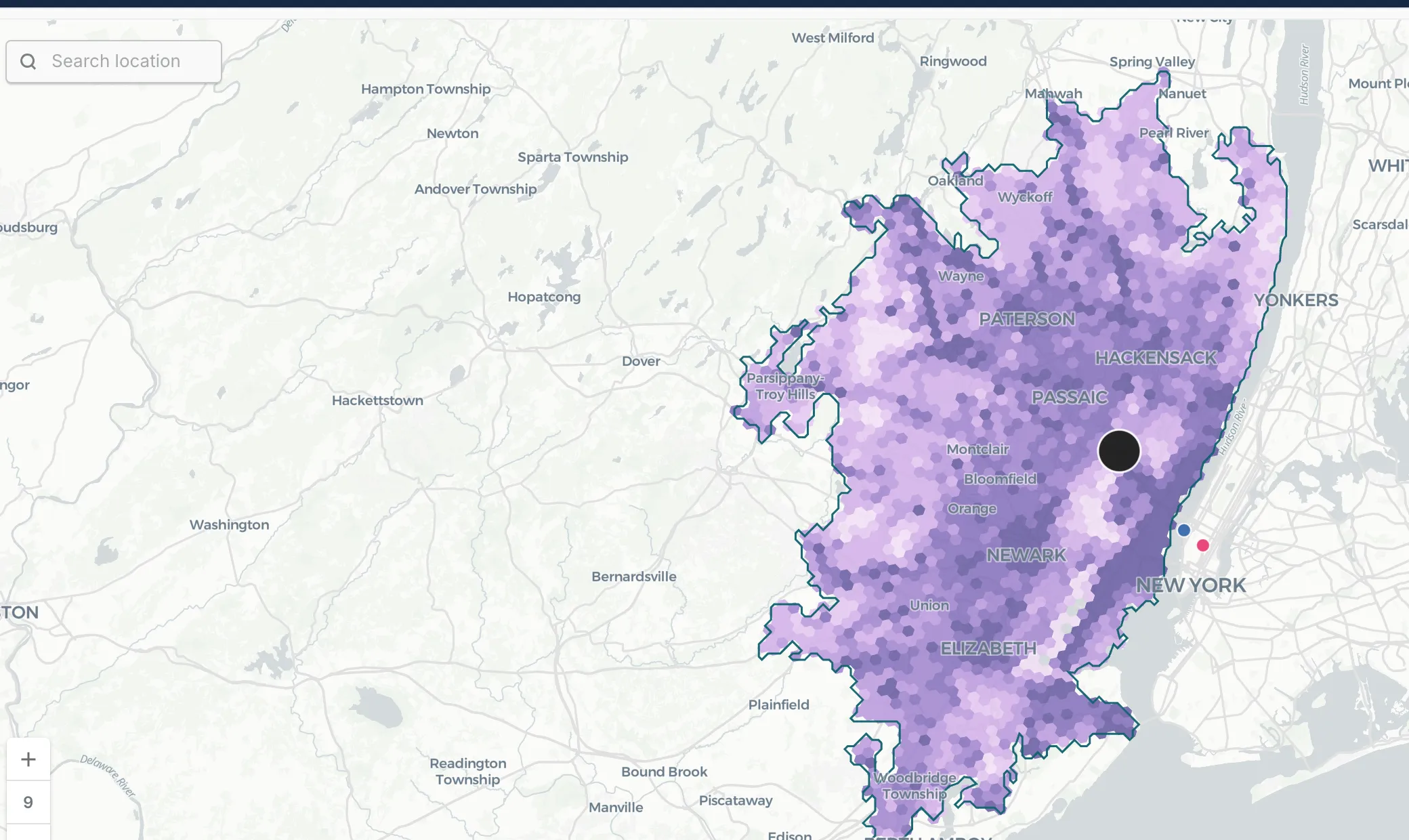
2. The final’s street-level audience is in New Jersey, not Manhattan. Cross the Hudson by car and you are quickly past the 30-minute mark: Manhattan sits outside MetLife Stadium’s 30-minute drive catchment. A brand planning activations around the final on skyline instinct alone would miss where match-day crowds can actually reach. The high-scoring cells cluster around Newark, Jersey City, and the corridors feeding the Meadowlands.
3. Match count and audience size are two different rankings. Dallas hosts the most matches (9), but its catchment population is roughly a third of Mexico City’s. Toronto hosts 6, yet its strongest cells form one of the densest activation corridors in the tournament, running through downtown rather than around BMO Field. Weighting a media plan by fixtures alone, without catchment data, misallocates spend in both directions.
How we built it in one working session, with CARTO for Agents
Here is the part that would have been hard to believe a year ago: this entire analysis was built from a terminal, in a single working session, by an AI agent using the CARTO CLI and CARTO agent skills with Claude Code.
The agent:
- Verified the stadium list, match counts, and sponsor tiers against public sources, then loaded them as tables with SQL.
- Wrote and ran a CARTO Workflows DAG to generate the 30 and 60 minute car isochrones for all 16 stadiums.
- Enriched more than 31,000 H3 cells with population, retail, POI, and activity variables from the Data Observatory, and computed the weighted scores in the data warehouse.
- Authored the Builder map as a JSON configuration: layers, color ramps, popups, widgets, and the drive-time parameter control. It validated the configuration, published the map, and took its own screenshots to check the cartography.
No data left the warehouse at any point, and nothing here required clicking through a UI. This is what we mean by Agentic GIS: the analyst sets the goal and reviews the output; the agent runs the spatial workflow.
The full build took under two hours. About 45 minutes from a blank terminal to the published map, including data checks, isochrones, enrichment, and scoring. The rest went into this article, the images, and the pull request for our website. Assembled by hand, the same analysis would have cost days of data preparation and cartography.
Methodology note
Everything on this map comes from public data. The stadium list, match counts, and sponsor tiers come from public reporting. Population figures are modeled estimates from WorldPop, and POIs come from OpenStreetMap, unified in CARTO Spatial Features. Public sources are a strong starting point, and they have limits: POI coverage varies from city to city, modeled population is an approximation, and some inputs lag reality by a year or more.
We built this as a demonstration of a workflow, on purpose, in under two hours. Treat the scores as a way to ask sharper questions about each market, not as a finished media plan. A real activation strategy would test these patterns against fresher sources before committing budget.
It would also use richer inputs. The Data Observatory catalog includes licensed foot traffic, consumer spending, and travel data from premium providers. With those, this same workflow could answer where visiting fans stay, how they move to the venue on match day, and how spending shifts around fixtures. That is the version we would build for a production decision.
CARTO is not affiliated with or endorsed by FIFA. This article is an independent analysis of publicly available information.
Run this analysis on your own market
Swap the stadiums for your store network, venues, or billboard inventory and the pattern is identical: build catchments, enrich them with demographics and POI data, score the cells, and put the result on a map your team can interrogate. The same workflow answers site selection, out-of-home planning, and event operations questions every day.
Want to try it with your own locations? Start a free trial and build your first catchment analysis this week.