Detect Outliers and Clusters
Describes how to use Moran's I to find high (HL) and low (LH) outliers, and high (HH) and low (LL) clusters, with CARTO Builder.
This guide describes how to find regions in your data where high or low values are spatially clustered, and where values on opposite sides of the mean value are adjacent to one another (outliers). This analysis also indicates if the clusters or outliers are statistically significant (not due to chance). For example, use this analysis to find connected regions of high poverty, and isolated places of high poverty adjacent to areas of low poverty.
This technique finds these correlations by looking at a geography’s attribute value, and the values in its geographical neighborhood, as compared to the entire dataset.
Detect outliers and clusters is primarily used as an exploratory data analysis tool to uncover statistically significant patterns in data. In the field of geostatistics, this technique is called Moran’s I. It often is used to build inferences about the underlying data, and is usually a stepping-off point for other analyses, such as regression, or simply to highlight significant areas in a dataset.
Example
An example of the Detect outliers and clusters analysis was used in the CARTO blog post, The L Train Closure – What data can tell us. For this guide, let’s apply the analysis to find the clusters of high and low rates of poverty in Brooklyn.
-
Import the .carto file available from the “Download resources” of this guide. Builder opens displaying Brooklyn Poverty as the first and only map layer. This layer contains data from the Data Observatory on poverty and total population at the block group level from the American Community Survey.
Click on “Download resources” from this guide to download the zip file to your local machine. Extract the zip file to view the .carto file(s) used for this guide.
-
Select the Brooklyn Poverty map layer.
-
Click the ANALYSIS tab.
-
Apply the Detect outliers and cluster analysis, entering the following parameters:
- For the TARGET COLUMN, select
povery_per_popas the numerator column. - For SIGNIFICANCE, enter
1, in order to get back all of the geometries. - For NEIGHBORS, keep the default selection of
5. - Click APPLY.
The calculation is the ratio of the number of poverty within the total population, and the result detects patterns of poverty in Brooklyn. You can now visualize clusters of high and low rates of poverty.
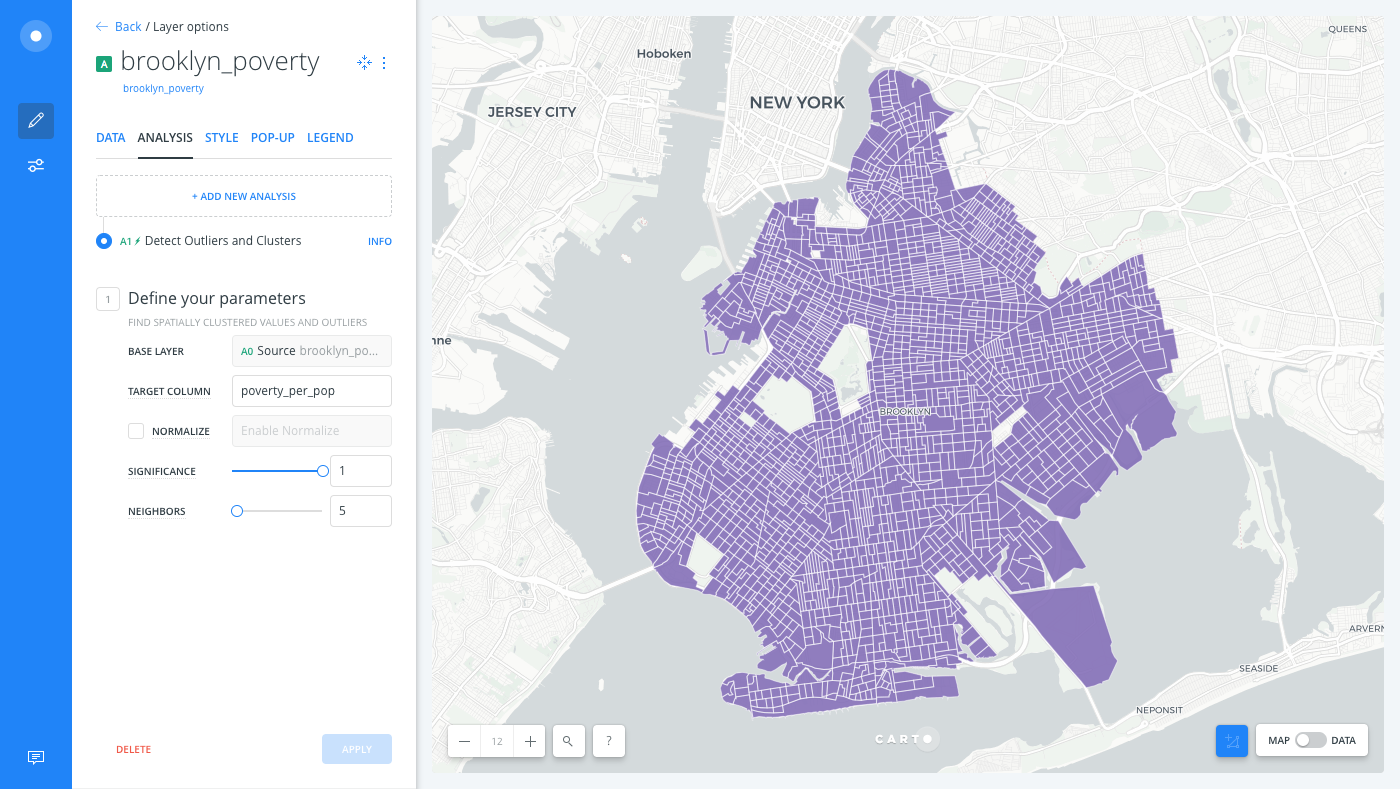
- For the TARGET COLUMN, select
Analysis Output
The quads and significance values are the most important outputs of the Detect outliers and clusters analysis. Let’s add these column values as widgets on our map, to explore our data.
| Column Value | Description |
|---|---|
quads |
Contains the following values: HH, LL, HL, and LH, where H is for high, L is for low. The interpretation of these is as follows:</br>- The first letter is the unit compared to the rest of the dataset (i.e., is it high or low compared to the dataset’s average).</br> - The second letter is how the average of the neighbors of the geography compare to the entire dataset.</br> |
significance |
Measures whether the pattern of values in the geography could be better attributed to random chance. The lower the significance value, the more likely the geography’s quads designation is not due to random chance (i.e., there is an underlying process driving the spatial arrangement of values). |
For example, if a county has a value of 10, neighboring counties have an average of 6, and the dataset as a whole has an average of 2, then the classification would be HH.
-
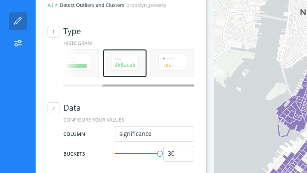
From the Brooklyn Poverty map layer, click the DATA tab to access the widget shortcut options.
-
Click the checkbox next to Add as a widget for the
quadscolumn and for thesignificancecolumn. -
Edit the significance histogram widget and set the number of buckets to
30.
-
Filter the significance Histogram widget to 0.05 and less, to ensure that you are looking at highly significant patterns.
Any time that you filter a widget connected to a layer that contains analyses, the analysis is rerun and recalculated!
-
Apply Auto style to the quads widget. This allows the widget to act as a legend, so that you can highlight the different patterns of poverty.
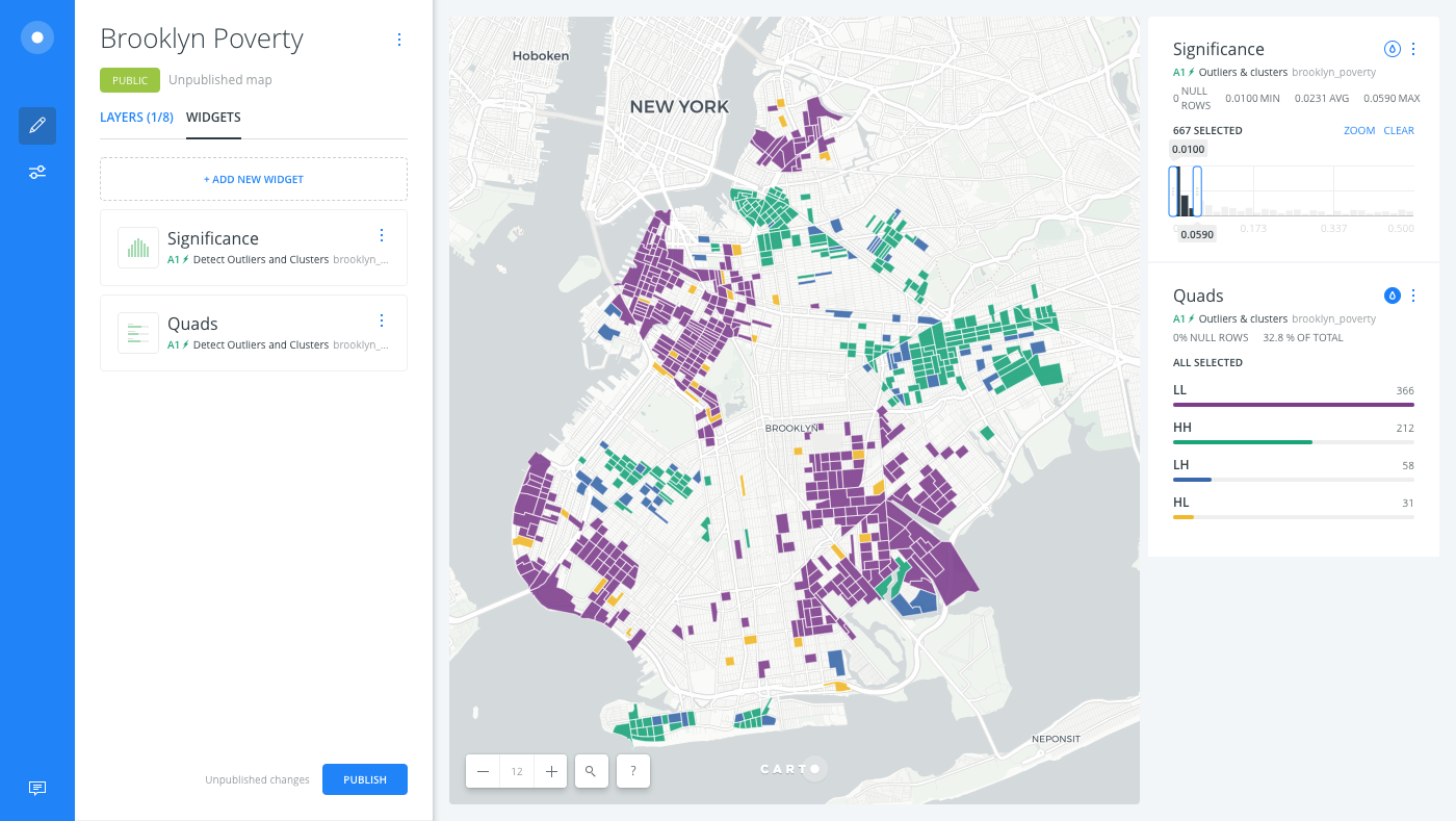
Based on the filters applied, the following clear patterns arise:
- Large clusters of low poverty in the northwest (Greenpoint), west (Brooklyn Heights through Prospect Heights), and southeast
- Large clusters of high poverty south of Greenpoint, near Broadway Junction in the central east, and elsewhere
- The outliers (
LHandHL) tend to lie adjacent to the larger clusters.
Advanced Cartography Tips
A default color scheme differentiates the quads values. Alternatively, the following CartoCSS code can be applied in Builder, as a best practice for styling Detect outliers and clusters data.
CHEATSHEET: Color Schemes
Choosing the right colors for your data aids storytelling, engages the map reader, and visually guides the viewer to uncover interesting patterns that may otherwise be missed. When styling by value, different types of color schemes appear, based on the selected data column from your map layer. Builder provides you with CARTOColor and ColorBrewer schemes, and enables you to customize your own color schemes.
- Sequential Scheme: Color schemes that use variations in lightness make these ideal for displaying orderable, or numeric data. The variations progress from low to high, using colors that range from light to dark (or vice versa).
- Qualitative Scheme: Color schemes that demonstrate categorical differences in qualitative data, which use different hues, with consistent steps in lightness and saturation.
- Diverging Scheme: Color schemes that highlight values above and below an interesting mid-point in quantitative data. The middle color is assigned to the critical value, with two sequential type palettes at either end, assigned to values above or below.
-
Click the STYLE tab of the Brooklyn Povery map layer.
-
Switch the slider button, located at the bottom of the STYLE tab, from VALUES to CARTOCSS and apply the following custom styling.
 #layer {
   polygon-fill: ramp([quads], (#ac4166,#df749d,#6ba3d9,#3c6ea9), ("HH", "HL", "LH", "LL"));
   polygon-opacity: 0.9;
   polygon-gamma: 0.5;
   line-width: 0.5;
   line-color: #FFF;
   line-opacity: 0.25;
 }
Limits
This analysis has a limit on the time that it takes to execute the analysis. If the analysis takes more than 30 minutes, CARTO will return a timeout error.