Improve the Message of your Map through Styling
Learn how to select the right basemap, separate signal from noise and communicate effectively with Builder maps.
Introduction
This workshop will demonstrate how Builder map default cartography can be adjusted to be more meaningful with a few customizations.
CARTO Builder maps are a holistic experience, so their elements should be balanced visually. We will cover examples of how to do that, and topics like assigning widget names, custom legends, and popups…all with the goal of not using Builder style defaults as-is.
Which basemap to use?
Which basemap should you use?
- Consider labels on top or under geometry
- Consider Voyager, Positron, Dark Matter
Consider symbology + basemap
- How can you make symbology emphasize the data’s insights?
Before:
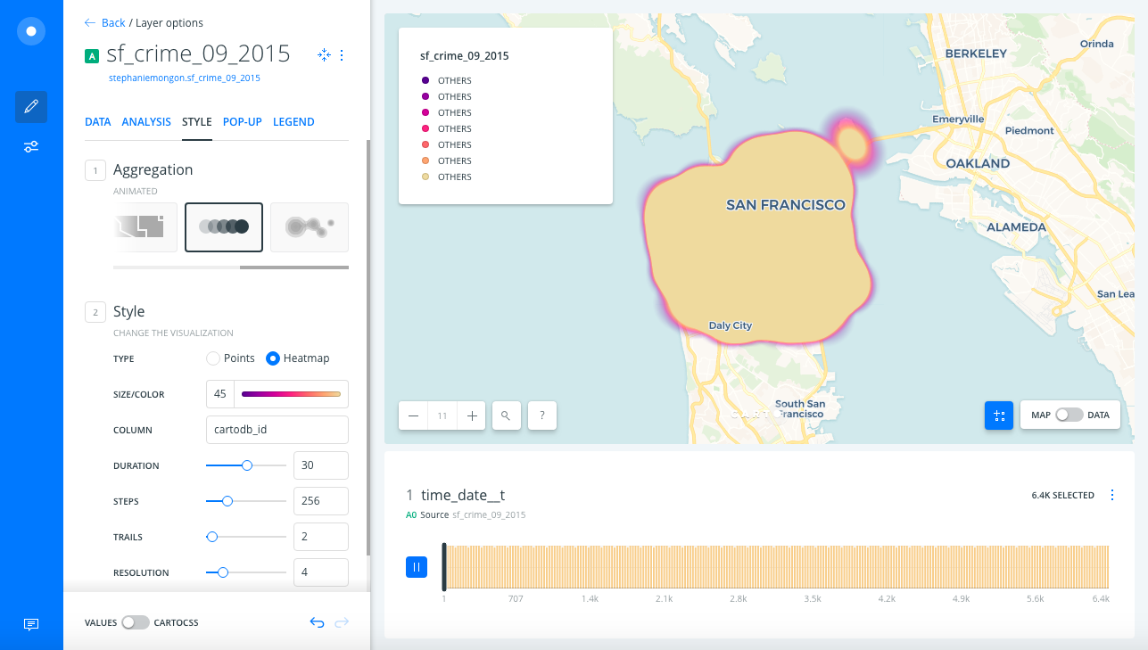
Problems to consider:
- When you are using point data basemap labels can cover them.
- See if using Labels Below versions of Voyager, Positron, or Dark Matter works better for your use case.
- Heatmap default settings = one big “blob” of heat.
- Can we choose a color scheme that better represents the theme of this data?
- Grays of Positron basemap are closer in color to low crime/green heat, so high crime/red heat is emphasized even more.
- Don’t forget you can customize the Legend!
After:
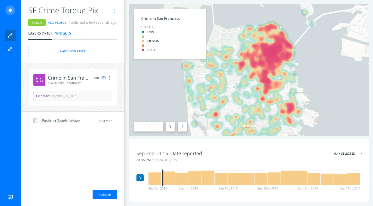
Adjustments:
- Adjust heatmap size, duration, steps & resolution to make the data legible
- It’s more legible when you can see smaller areas of heat
- We emphasized the “crime” theme of the map by changing the color scheme
- Conventionally “red” can = danger, so we showed the high crime values in red
- To show the opposite “low” values we chose a color that contrasts with red, a cooler green
- Overall seeing where the high crime areas are is more important for our use case than seeing the low-crime areas, so we also chose a green shade that doesn’t stand out against gray Positron basemap as much as red does
- CARTOColors
Tempsdivergent scheme
How to separate signal from noise
How can you pick out information from this many lines?
- Use classed line symbology
- Use a CARTOColor scheme
- Use redundant symbology
- [Again] Consider the symbology + basemap
Before:
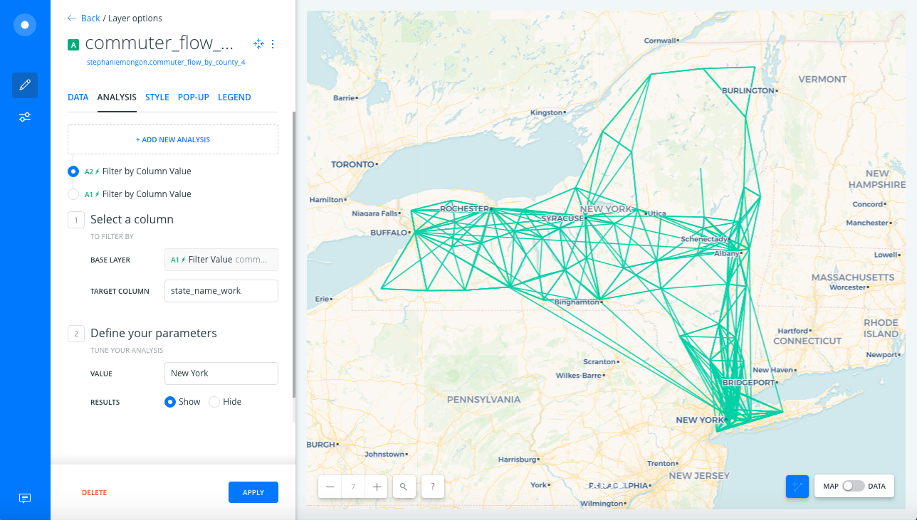
Problems to consider:
- All lines look equal by default
- It’s nearly impossible to pick out one line from another where many are located, for example New York City
After:
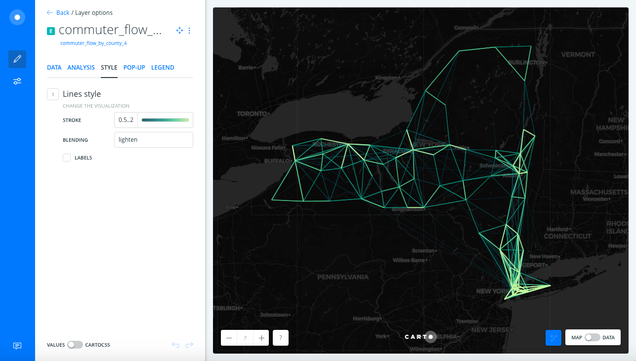
Adjustments:
- We tried different classification methods and class breaks based on the data’s distribution. We chose the classification that showed the most difference between lines, to bring out the patterns
- We tested different CARTOColor schemes
- Depending on the variation in the data, a color scheme that has a strong difference between light and dark and/or multi-hue might be best suited
- For this data we chose a color scheme that would let high-flow lines show up prominently against the Dark Matter basemap
- Since Voyager basemap uses more colors it would compete more with these line colors
- Use redundant symbology to reinforce the map’s message
- Notice that we used BY VALUE styling to categorize lines by color and by width
- Use a blending mode to highlight areas where many lines overlap
- Tips when using a dark basemap
- Flip the color scheme so light represents “more” — you will achieve a higher contrast this way against the dark basemap
- Since we can’t control the drawing order of an analysis node with custom SQL, take advantage of other symbology tricks
- We want the lines with more flow to look more prominent than lines with less flow
- If you flip the color scheme and lighter colors are still drawing under darker (“less”) values, use a blending mode like lighten to bring the lighter pixels to the foreground
Leverage Autostyling
Demographics of the United Kingdom Map
Before:
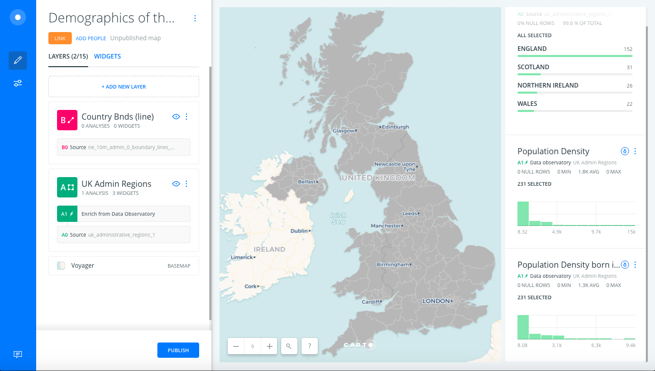
Problems to consider:
- The polygons are the same color, so they do not indicate which area has more or less of an attribute
- We can use a Population Density attribute to style the map, but each polygon has more than one kind of Population Density. Default styling only lets us use one, so we’re not seeing as much information as the data provides.
After:
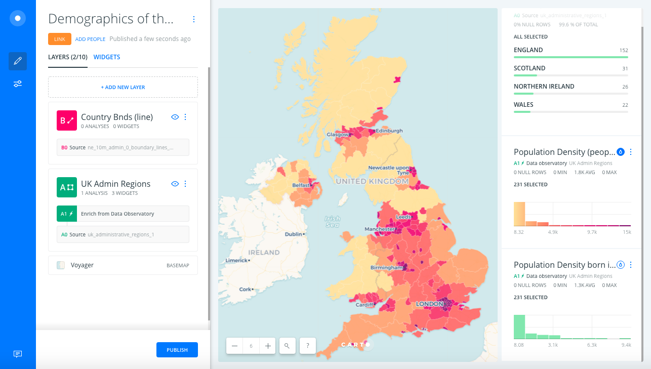
Adjustments:
- Take advantage of Autostyle
- You can use a widget for each attribute your data contains, then use Autostyle to let your users see a widget’s attribute on the map.
- Use the widget option to customize the color scheme for a thematic variable
- If you are showing two related variables like population density and density born in the UK, keep the color schemes and classification methods consistent so people can visually compare the two variables more easily
- Autostyle acts as your legend
- Make widget titles descriptive
- What are we measuring? (people/sqkm)
Communicate Effectively
Before:
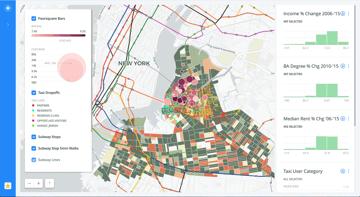
Problems to consider:
- This map is not communicating effectively because:
- Overlapping markers obscure data
- Too many default colors distract from one another when a user is trying to interpret meaning
After:
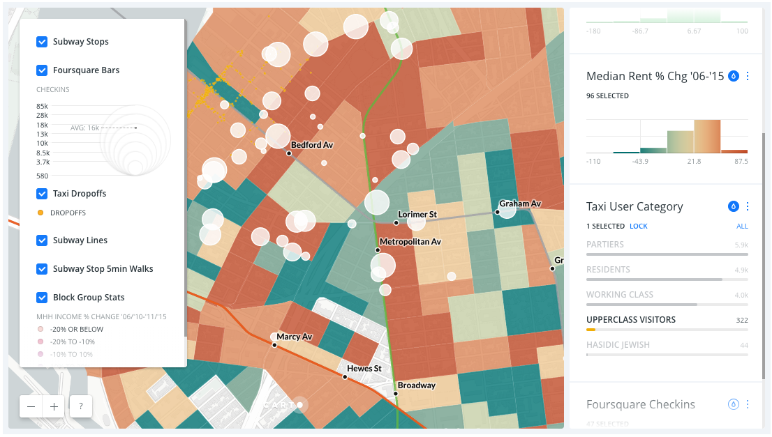
Adjustments:
- Rely on a Layer Selector and Autostyles to declutter the map, so you don’t need to use too many colors by default
- For example we used one default color for taxi drop offs to minimize the amount of default color on the map
- Because we can use auto-styling to color the drop offs by category when we need to differentiate them
- Notice we used size only to style Foursquare bars by value
- So the marker color does not distract from other data
- Center the map on the area of interest where the story is taking place
- When you are zoomed in you are more easily able to see detail relevant to the story