Introduction to Map Design - Part 3
In the last lesson, we talked about how you can use color as a tool to present your data, and to highlight your message. The second tool we’re talking about in this Course, is how to control your data in order to highlight the message you want to communicate. In well-designed maps and visualizations, you can pack in a lot of complex data, and still leave your audience with a clear understanding of what you wish to communicate. But a lot of data can sometimes become too much data. It can get overwhelming and distracting, perhaps ruining what you are trying to communicate. We can see some of this in our bad map. There’s just too much.
An important tactic, then, is focusing on the message you wish to convey. Think about what data you need on your map, and which you can go without. Are there other ways you can play with the hierarchy of how data is displayed so that you can communicate a clearer message? Unfortunately, there is no definitive, simple rule for how much data you “need” or “should have.” There are, however, some tools in CARTO that will allow you to work with the data you have, highlight important subsets of it, and create a clear communication. Let’s get started looking at these tools!
Zoom-Based Styling
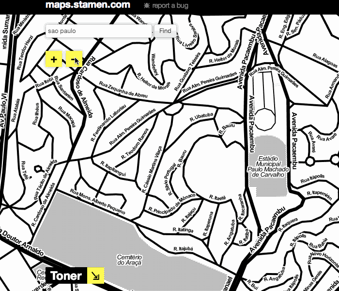
The first tool we will look at is zoom-based styling. Zoom-based styling refers to the ability to change what is displayed on a map, or how it is visualized, based on the zoom-level. Let’s start by looking at Stamen’s map tiles, which we’ve mentioned before. As you zoom in and out, you can notice that some features or data (like streets, buildings, or waterways) appear or fade away. While there is a ton of data in the map, it is simplified when you’re zoomed out, and made more complex at closer scales, when a viewer is able to process more data. The map never becomes overly complex, but also manages to provide a very data-rich view of a city.
Before we start making changes based on our zoom level, it’s important to note that online maps using Mapnik to build the map visualization will default to having marker widths stay the same, regardless of the level of zoom. In order to style your maps based on zoom level in these online maps (including CARTO, OpenStreetMap and MapBox), we’ll be using CartoCSS, which we started learning about in our last lesson.
To start working with zoom-based styling, let’s go back to the Simple visualization, and reduce the marker size to around 3 so that we can see more of our data points. In the CartoCSS window, we’ll add some new styling so that at different zooms, the size of the marker gets bigger. Here, we want the markers to get bigger the more zoomed in we are. We want to tell CARTO that if the zoom is equal to a certain level, the marker-width should be larger than the original 3. We could also tell CARTO to change marker width at all zoom levels larger than a specified level. Take a look at the last three lines of our code block here.
#cartodb_query_{
  marker-fill-opacity: 0.9;
  marker-line-color: #FFF;
  marker-line-width: 0;
  marker-line-opacity: 1;
  marker-placement: point;
  marker-type: ellipse;
  marker-width: 3;
  marker-fill: #FF6600;
  marker-allow-overlap: true;
  [zoom = 4] {marker-width: 6}
  [zoom = 5] {marker-width: 12}
  [zoom > 5] {marker-width: 16}
}
We can see that CARTO will read this as all markers should have a width value of 3. If the zoom equals 4, the marker width value should be 6. If the zoom equals 5, the marker width value should be 12. Finally, if the zoom is larger than 5, the marker width value should be 16. This means that as we zoom in, the markers become bigger. Go ahead and play around with this to see what kinds of visualizations you can make based on zoom.
Filter, Filter, Filter
Another tactic that you can use to control how your data is displayed is filtering. By using filters, you can reduce what data is shown on your map.
Looking at the map of earthquake data, and pulling out the Filters section of the pull-out tray, we can see that there are some interesting columns by which we could filter: time and mag. Selecting either one of these will pull up a small graph showing the distribution of the data in accordance to the column selected. You can drag the sliders to restrict which portion of the data is visualized on your map.
Starting with the “time” field, we see that most of the recorded quakes occurred recently. This is kind of interesting, but makes sense, and is not the story we want to tell right now.
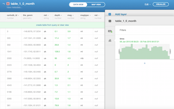
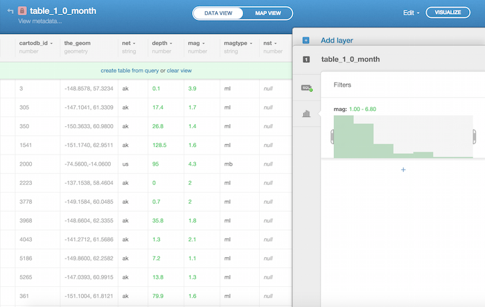
Perhaps filtering by mag, which is the severity of the earthquake, will be a more interesting story. Filtering by mag, we see that many quakes have a low mag, and many fewer have an mag value above 7. We can filter what data is shown to highlight only these more severe quakes, as you see in the screenshot below.
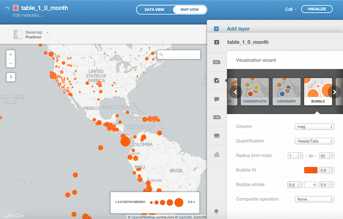
Using Bubbles
We can also change the sizes of our markers based upon a column we’re interested in. For example, if we want markers representing a very intense earthquake (a data point with a high mag value) to be bigger than those of less intense earthquakes, we can use the Bubble Visualization. This creates a size hierarchy based on an attribute of the data. Here, we’re interested in the attribute of quake intensity (measured by the column mag).
To do this, just select the Bubble Visualization in your Visualization Wizard. You can play with the largest and smallest sizes to emphasize the variation in sizes. We went ahead and made our marker radius range go from 1 to 50.
You can also change the “Quantification Method” to affect the way that the data is displayed. The Quantification Method basically decides how the data should be cut up in to groups, or bins, and each one is different in how it displays your data. It is great to understand what each of these means in terms of interpreting your data, and you can read more here and here.
We went with Heads/Tails to emphasize the biggest quakes, and assign the lowest hierarchy to the smallest quakes.
All Together, Now!
These tools and tactics that we’ve covered - changing marker size based on zoom, filtering your data, and changing marker size based on a column of data - can also be combined with one another to highlight patterns.
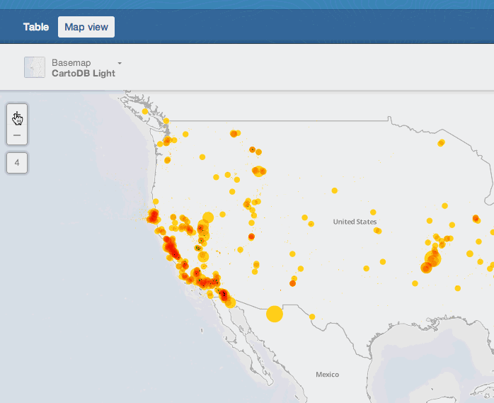
Here, we’ll start with the bubble map we left off with. We have a simple visualization which highlights the more intense earthquakes by making their marker bigger. If we change the composite operation to multiply (which we started discussing in Lesson 2), we can also visualize the intensity of the quakes by region. Now, when there are multiple markers in the same area, they will darken. This highlights areas with high concentrations of quakes, as you can see below.
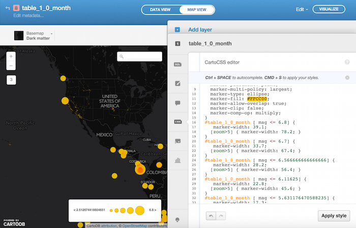
Once we have this, we can add the zoom-based styling. Remember that your sizing is already based upon the column mag since we’re using the Bubble Visualization. This means that when you add the zoom-based styling, you’ll need to apply it to each “bin” of data created by your Bubble Visualization. Overall, we will want to make markers larger as we zoom in, especially at the closest levels of zoom. This will help viewers interact with the map at close zooms. Take a look at the code below to see how this is done.
/** bubble visualization */

#table_1_0_month{
  marker-fill-opacity: 0.9;
  marker-line-color: #FFF;
  marker-line-width: 0.5;
  marker-line-opacity: 0.5;
  marker-placement: point;
  marker-multi-policy: largest;
  marker-type: ellipse;
  marker-fill: #FFCC00;
  marker-allow-overlap: true;
  marker-clip: false;
  marker-comp-op: multiply;
}
#table_1_0_month [ mag <= 6.8] {
   marker-width: 39.1;
  [zoom>5] { marker-width: 78.2; }
}
#table_1_0_month [ mag <= 6.7] {
   marker-width: 33.7;
  [zoom>5] { marker-width: 67.4; }
}
#table_1_0_month [ mag <= 6.566666666666666] {
   marker-width: 28.2;
  [zoom>5] { marker-width: 56.4; }
}
#table_1_0_month [ mag <= 6.11625] {
   marker-width: 22.8;
  [zoom>5] { marker-width: 45.6; }
}
#table_1_0_month [ mag <= 5.631176470588235] {
   marker-width: 17.3;
  [zoom>5] { marker-width: 34.6; }
}
#table_1_0_month [ mag <= 4.757179487179487] {
   marker-width: 1;
  [zoom>5] { marker-width: 2; }
  [zoom>6] { marker-width: 4; }
  [zoom>7] { marker-width: 8; }
  marker-line-width: 0;
}
#table_1_0_month [ mag <= 3.586822429906542] {
   marker-width: 0.5;
  [zoom>5]{marker-width: 1;}
  [zoom>6]{marker-width: 2;}
  [zoom>7]{marker-width: 4;}
}
When we’re zoomed out, then, we are not overwhelmed by feeling as if there is too much data. When we are zoomed in, we are able to see what points are in our area of interest, and they’re not too small. Play around with these interactions of size to see what you can come up with.
Ultimately, the goal in styling and filtering based on your data is to show a lot of information, but in such a way that viewers are not overwhelmed. These tools will get you started on doing exactly that!