Style Point Data with Marker Images
If your map layer contains point geometries, you can display a marker image for each point of your data by applying a SVG file as the marker file. CARTO provides a selection of marker images to choose from, or you can upload your own marker files through the STYLE options in CARTO Builder. If you are an Enterprise user, the organization owner can add and manage marker images for the whole organization.
You can apply marker images using solid color properties, display multiple marker images to represent category data, and adjust the size of the marker images.
Your data must contain point geometries and you cannot add marker images when an analysis is applied to a map layer.
Marker Images with Solid Color Properties
For this guide, apply a marker image to appear for each point geometry.
-
Import the template .carto file packaged from the “Download resources” of this guide and create the map. Builder opens with NYC Public Schools as the first map layer, and Library Locations as the second map layer.
Click on “Download resources” from this guide to download the zip file to your local machine. Extract the zip file to view the .carto file(s) used for this guide.
-
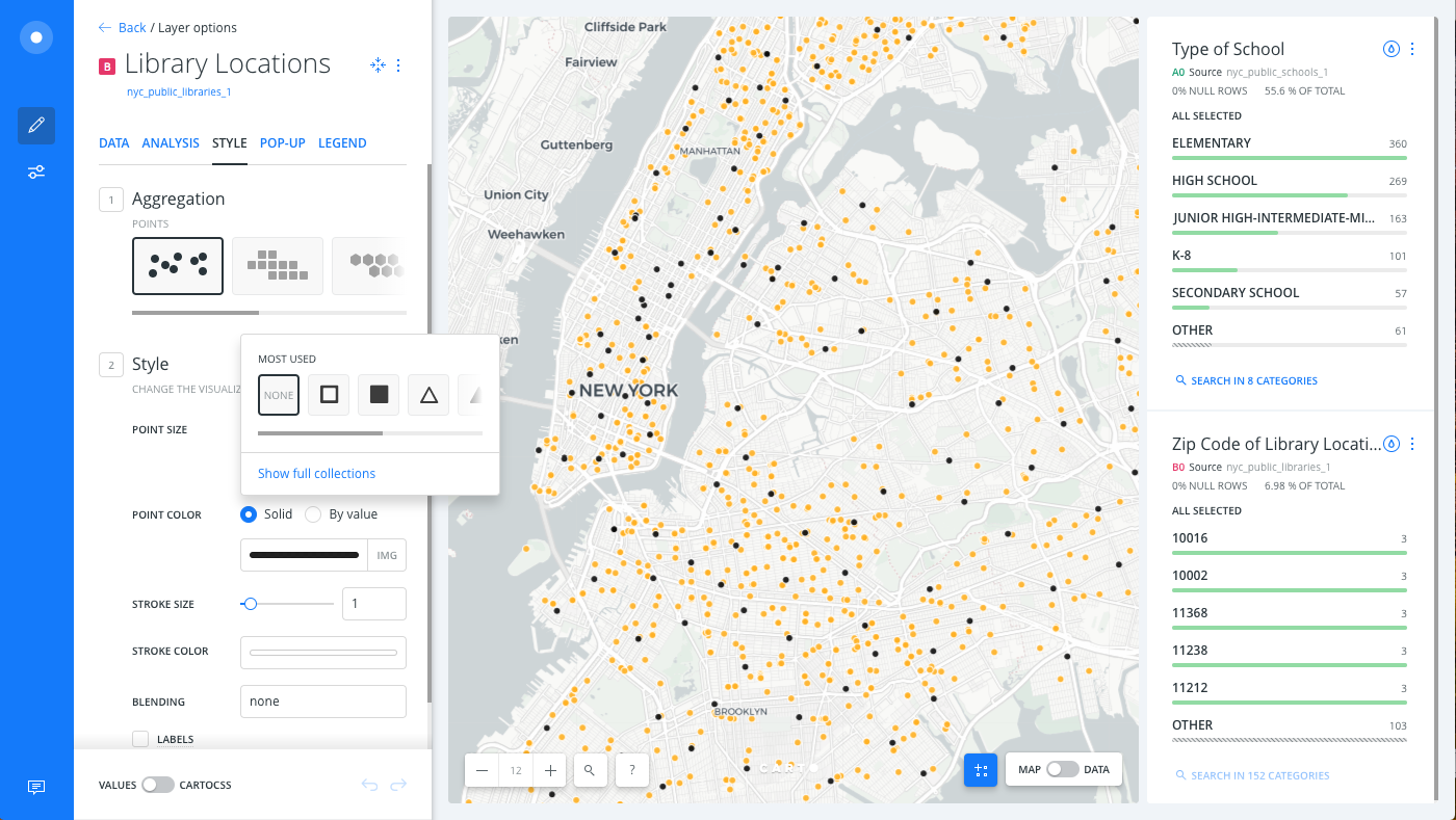
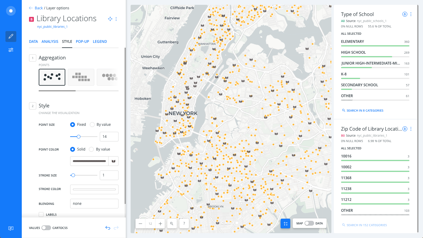
Select the Library Locations layer.
-
Click on the selected POINT COLOR to view the color picker.
-
Click the IMG subtab.
A list of the most used marker images appear.
-
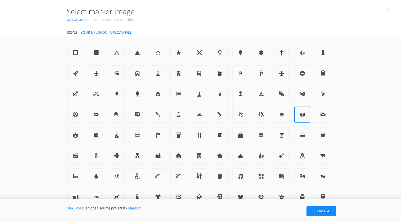
Click Show full collections.
The Select marker image options appear.
You can upload and select your own icons to be used for marker images through the UPLOAD FILE and YOUR UPLOADS options.
-
Select the library icon (which looks like a book).
-
Click SET IMAGE.
The Map View displays the selected image as the marker.
If you switch to the CartoCSS view of the STYLE tab, note that the
marker-fileCartoCSS property was applied behind the scenes. -
Click on the selected POINT COLOR to view the color picker, and enter
645b5bin the HEX input field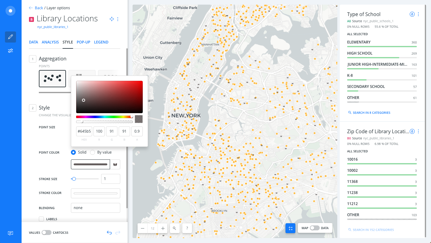
The marker image displays the solid color applied.
-
To modify the size of the marker image, change the POINT SIZE to 14.
Marker Images for Categorical Data
If your map layer contains point geometries, and you are styling the layer BY VALUE using a string value to represent categories of data, you can apply unique marker images for each category of data.
-
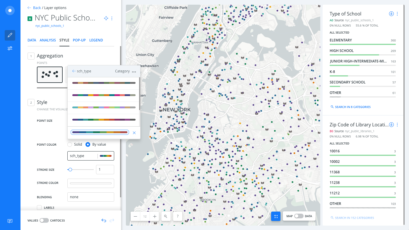
Select the NYC Public Schools layer.
-
Click the By value option for POINT COLOR.
-
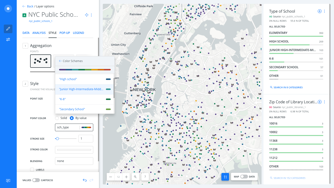
Select the
sch_typecolumn. Builder assigns a default qualitative CARTOColor scheme for each category of data.
CHEATSHEET: Color Schemes
Choosing the right colors for your data aids storytelling, engages the map reader, and visually guides the viewer to uncover interesting patterns that may otherwise be missed. When styling by value, different types of color schemes appear, based on the selected data column from your map layer. Builder provides you with CARTOColor and ColorBrewer schemes, and enables you to customize your own color schemes.
- Sequential Scheme: Color schemes that use variations in lightness make these ideal for displaying orderable, or numeric data. The variations progress from low to high, using colors that range from light to dark (or vice versa).
- Qualitative Scheme: Color schemes that demonstrate categorical differences in qualitative data, which use different hues, with consistent steps in lightness and saturation.
- Diverging Scheme: Color schemes that highlight values above and below an interesting mid-point in quantitative data. The middle color is assigned to the critical value, with two sequential type palettes at either end, assigned to values above or below.
You can use the color picker to modify any of the color properties for the selected value, and add a marker image for each category.
CARTO Builder allows you to style up to ten categories of data.
- Click img next to the Elementary value and select the playground image marker for this value.
- Apply marker images for the rest of the school types and experiment with the BLENDING options.
CHEATSHEET: Blending Overlapping Geometries
Blending values are style options that effect the way colors of overlapping geometries interact with each other on the Map View. Color blending is applied to the specific symbolizer property, depending on the blending mode you are trying to achieve.
- none: No color blending styling is applied to the map layer. This is the default option.
- multiply: Multiply literally multiplies the color of the top layer by the color of each layer beneath, which typically results in the overlapping areas becoming darker.
- screen: Similar to Multiply, screen multiplies the overlapping areas. Unlike multiply, it subtracts the multiplied color channel numbers from their added value to invert them. This makes the overlapping areas brighter. If white is used, it will not change appearance. Black areas will disappear. Use this when you want to lighten overlapping areas in your map.
- overlay: Overlay is a color blend mode that combines multiply and screen composite operations. Black appears as dark, as it originally is in its layer; white appears as bright, as it originally is in its layer. How purely other colors are rendered depends on how close they are to white or black. The closer a color is in value to pure midtone gray, the less it will appear. Use this when you want to show both light and dark in your overlapping layers.
- darken: Darken has a similar effect to multiply, but is more extreme. As it applies the color from the base layer to the target layers, it compares each to find the darkest-colored pixels and keeps those.
- lighten: Lighten works the same way as darken, but inversely. The lightest-colored pixels from each layer are kept, and if pixels are darker than the base layer, then the base layer color replaces them. This can be useful when you want to change the color of your overlapping areas shadows.
- color-dodge: The color-dodge color blend mode is similar to screen but the overall effect is more extreme. Your elements become much brighter (except if your base layer is black). Darker areas are tinted towards the source color. Use this when you want to have a major lightening effect with extreme contrast between your layers, without much detail showing.
- color-burn: Color-burn works similarly to color-dodge, but has a darkening effect. It increases the contrast between base and target layers, with pixels in your overlapping area tinted towards the source color. Use this when you want a darkening effect with more contrast than multiply or darken.
- xor: Xor is an alpha composite operation that shows both the base and target layers, but only the parts that do not overlap each other.
- src-over: Source-over is also an alpha composite operation that keeps the full transparency of both the base and target layers. The visual effect is that the base layer shows on top of all layers involved in the overlap area.
Additional blending options can be applied with CartoCSS syntax. View the complete list of CartoCSS values and see example effects of these blending options.
- For both map layers, switch to the CartoCSS view and change the value for
marker-allow-overlaptofalse, which prevents markers from overlapping. Change the basemapto Positron (labels below), so that markers are not conflicting with any basemap labels.
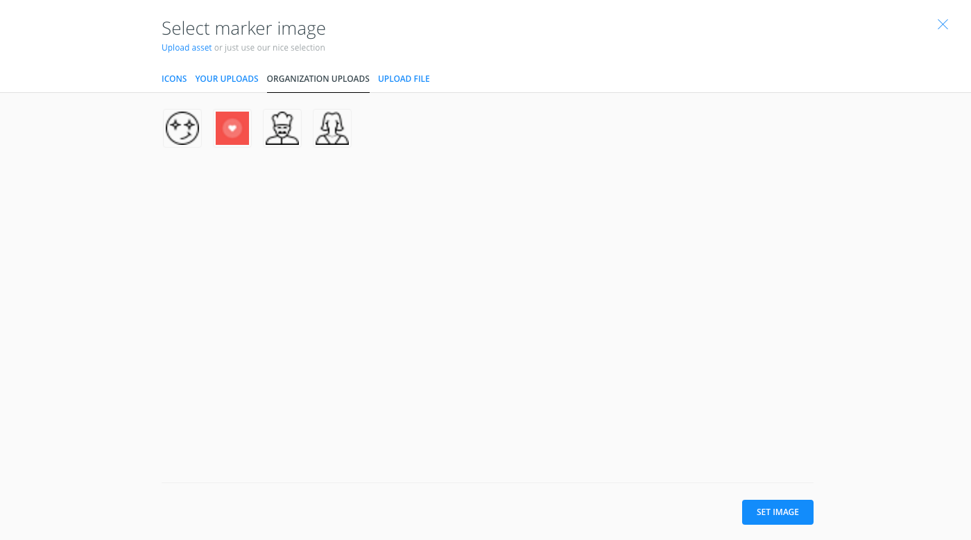
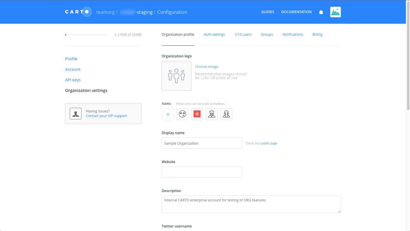
Shared Organization Markers
If you have an Enterprise account, the organization owner can define which markers appear from the Select marker image options for all users.
These markers are defined through the Icons section of the Organization profile of the organization settings.
If you are an Enterprise user, the following example shows the additional ORGANIZATION UPLOADS when selecting marker images for point data.