Understanding Auto-Styling
Auto style widgets to view dynamic data with CARTO Builder.
Widget auto style empowers you to create an agile map that reflects color based distributions of data. A single click on the Auto style button (located directly from an embedded widget) applies a temporary color scheme, lets you filer by selected columns, and styles the map. This intuitive tool provides visual cues that pinpoint key insights about your data.
View the blog, Re-thinking Data-Driven Design for Maps with Auto Style, to learn more about the value behind auto style in the location intelligence industry.
Auto style is dynamic and interactive. Each time you filter data with widgets, zoom or pan the map, CARTO recalculates the distribution of data, and applies automatic styling. Auto style can be turned on and off, without modifying any of your original style settings.
Auto style is only available for Category and Histogram widgets.
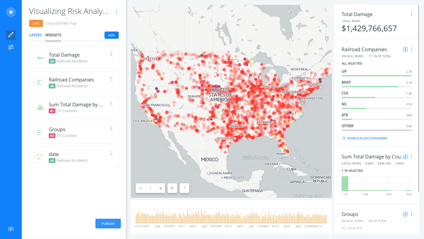
Visualizing Risk Analysis with Widgets
This guide provides an example of a map with multiple widgets, allowing you to visualize how auto style is applied.
-
Unzip the template .carto file packaged from “Download resources” of this guide.
-
Import the .carto file to your account and create the map. Builder opens with US Counties as the first map layer and Railroad Accidents as the second map layer.
The US Counties layer has an analysis workflow applied to the layer, where Intersect second layer and Detect Outliers and Clusters is applied. Map layers are rendered in the order that they appear, from bottom to top, with basemaps being the bottom layer.
-
Click the WIDGETS list to view all of the widgets applied to the map.

Each widget clearly identifies which map layer it is filtering data from. You can rename the widget titles, click and drag to reorder how the widgets appear on your map, and edit any of the details for each widget from the WIDGETS list.
Auto Style a Category Widget
When you apply Auto style to a category widget, a qualitative color scheme is applied to demonstrate categorical differences in qualitative data. The color scheme applies different hues, with consistent steps in lightness and saturation.
-
From the category widget, Railroad Companies, click Auto style.
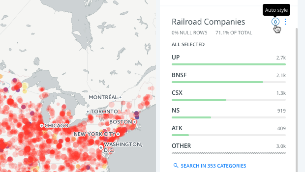
A qualitative color scheme temporarily overrides any custom styling that you applied. This makes it much easier to visualize the railroad companies that were involved in railroad accidents, by applying different hues to categorical difference in data.
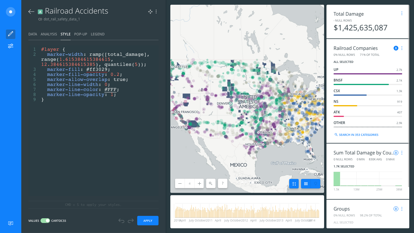
Are you curious how auto style works behind the scenes? From the Railroad Accidents map layer, switch to the CartoCSS view of the STYLE tab to see how auto styling was triggered. However, the style was not actually applied. Click Remove auto style from the widget to see how the original styling reappears!
-
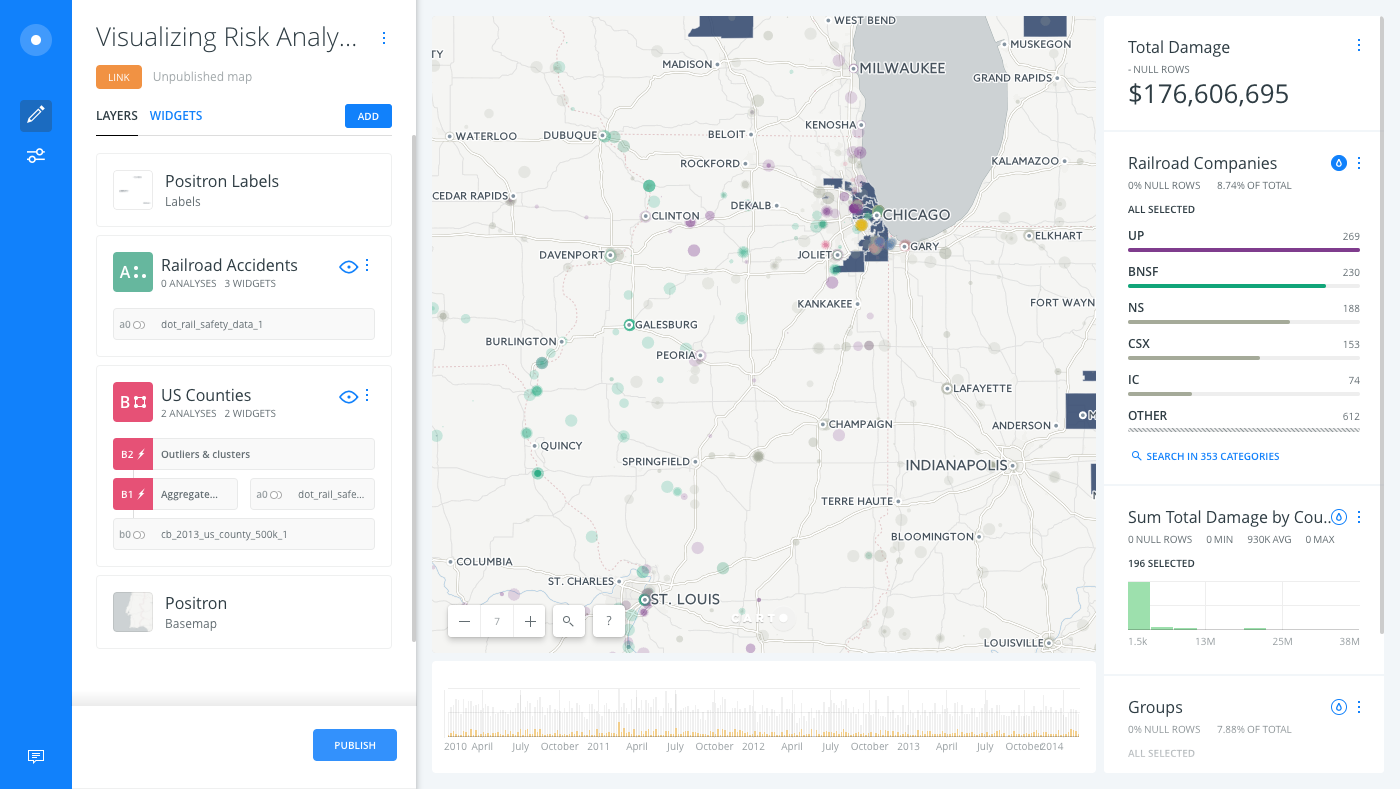
To visualize more dynamic triggers of your map, zoom in and pan the Map View. All of the widget values refresh, based on the visible data of your visualization.
Auto Style a Histogram Widget
When you apply Auto style to a histogram widget, a diverging or sequential color scheme is applied, depending on your data. For more details about using histogram widgets, see Filter a Range of Numerical Values with Histogram Widgets.
-
From the histogram widget, Sum Total Damage by County ($), click Auto style.
A color scheme is temporarily applied to your data. In this scenario, you can apply Auto style for both the Railroad Companies and the Sum Total Damage widgets.
CHEATSHEET: Color Schemes
Choosing the right colors for your data aids storytelling, engages the map reader, and visually guides the viewer to uncover interesting patterns that may otherwise be missed. When styling by value, different types of color schemes appear, based on the selected data column from your map layer. Builder provides you with CARTOColor and ColorBrewer schemes, and enables you to customize your own color schemes.
- Sequential Scheme: Color schemes that use variations in lightness make these ideal for displaying orderable, or numeric data. The variations progress from low to high, using colors that range from light to dark (or vice versa).
- Qualitative Scheme: Color schemes that demonstrate categorical differences in qualitative data, which use different hues, with consistent steps in lightness and saturation.
- Diverging Scheme: Color schemes that highlight values above and below an interesting mid-point in quantitative data. The middle color is assigned to the critical value, with two sequential type palettes at either end, assigned to values above or below.
Auto-style is supported for multiple widgets only if both styles are compatible, or if you are using a category and a histogram widget for the same map layer. -
Switch to the CartoCSS view of the US Counties map layer to see how auto style was applied to your data.
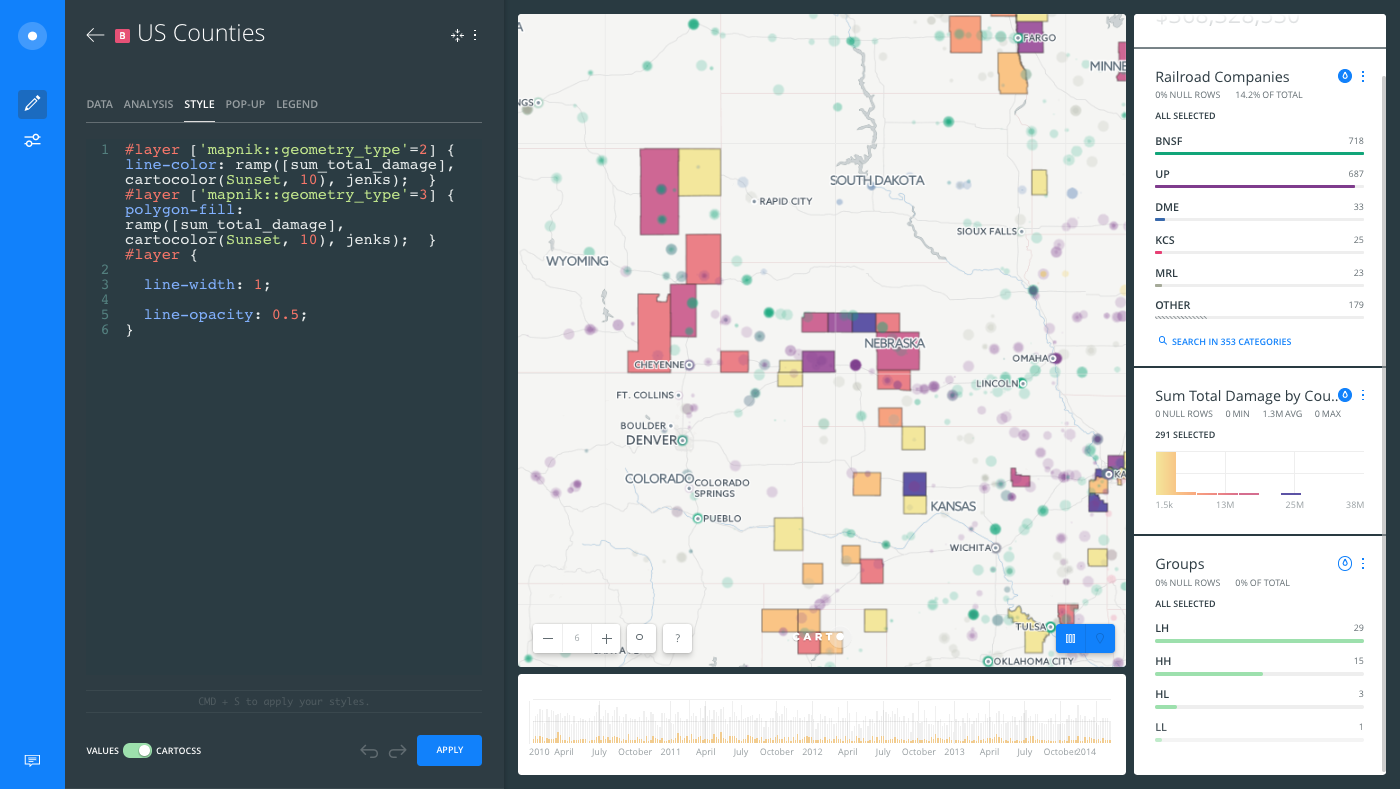
Auto style has already highlighted some key insights about your data. You can filter values from the widgets to gain an even deeper understanding about your data.
If you publish a map while auto style or widget filters are selected, the default view of the published map displays the filters and automatic styling applied.
Dynamic Filtering of Widgets
By default, all widgets are dynamic and automatically update when your map visualization changes, analyses are run, or when map layers are modified. Optionally, you can disable dynamic filtering and keep your widgets static, preventing any filters from updating when your data changes.
-
From the WIDGETS list in Builder, edit a widget to view the options.
-
The DYNAMIC option indicates that the data (and analysis, if applicable) will dynamically update when your data changes. This is the default option,
YES.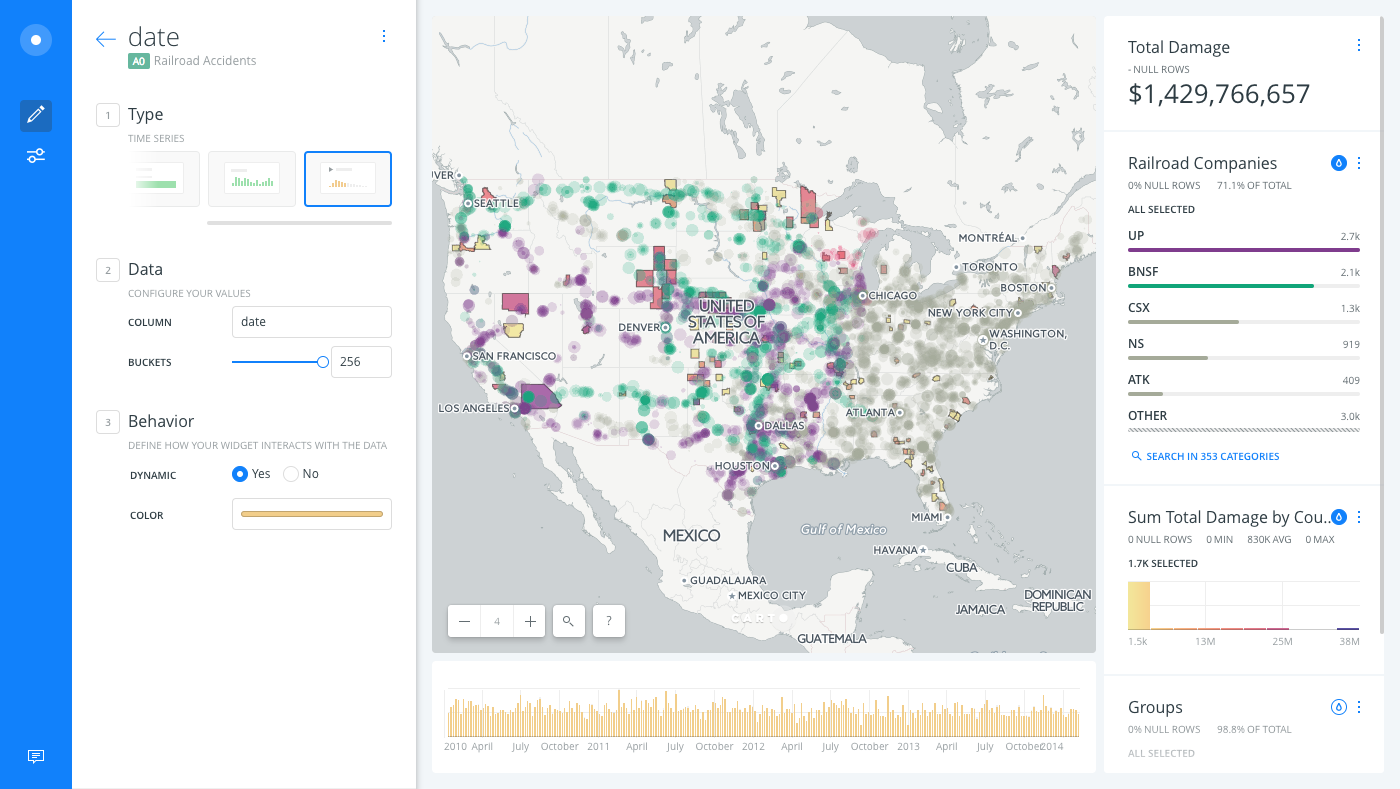
-
When DYNAMIC is set to
NO, the widget filters remain static and do not update based on your visualization.
Note that this guide described examples of the default color schemes that were applied to widgets. Optionally, you can customize the colors that appear when auto style is selected with the widget behavior COLOR option.