22 of the best maps, visualizations & analysis from 2022


Welcome to our round-up of our favorite analysis maps and data visualizations created with CARTO throughout 2022!
Before you dive into the list, please note that the latest version of our best analysis, maps, and data visualizations created with CARTO throughout the year 2023 is now available. Explore them now!
2022 was another FANTASTIC year for geospatial! The data keeps getting bigger and the technology to analyze and visualize this is enabling users to go further than ever before. Meanwhile, ever more exciting Spatial Data Science techniques are emerging to draw insights with. All of this combined has resulted in another amazing year for maps and data visualizations!
If you feel inspired by these creations, make sure you sign up to a free trial of CARTO - who knows you might create one of our 23 maps of 2023!
So, here’s our round up of 22 of our favorite maps created in 2022! In no particular order… 🥁🥁🥁
Retail hospitality & CPG
01: How has Covid affected customer spend in the hotel industry?
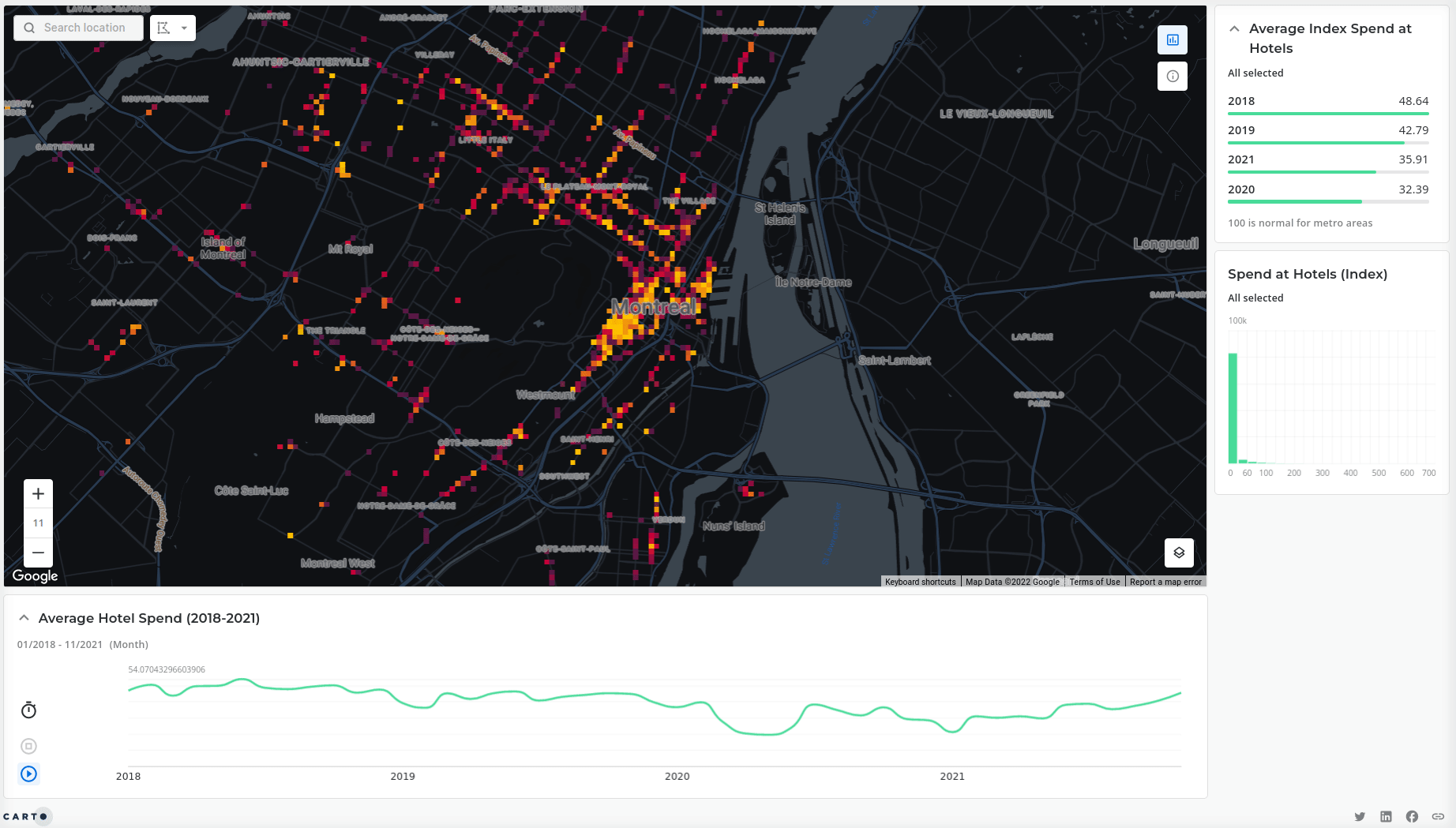
2022 has been a reflective year for many as organizations have examined the impacts of the Covid-19 pandemic. This visualization - created by our Solutions Engineer Eva Estrada-Adler - explores the change in spend in the hotel sector in Montreal from 2018-21, highlighting the series of “dips” across 2020.
This visualization is based on financial spend data (available from our Spatial Data Catalog), aggregated to the global Spatial Index Quadgrid which is designed for the fast analysis of big spatial data. Explore this visualization in more detail here.
02: Where can I walk to a Tim Horton’s?
Torontonians can feel safe in the knowledge that they’re rarely more than a 10-minute walk from a Tim Horton’s - as this map shows! Isochrones - i.e. catchments which reflect the real transport network - are a crucial part of understanding and monitoring a store’s customer base. Want to have a go? Check out our full guide to isochrones here.
Like the coffee cup symbol used in this map? CARTO Builder now supports fully customisable icons - choose from our own library or upload your own! Find out more in our full map styling guide.
03: Where does London need more brunch locations?
Things Londoners love: tube etiquette, giving directions and brunch. For Big Data LDN we built this visualization to highlight parts of the city which are crying out for more brunch spots for food delivery! This takes into account brunch affinity, total market (brunch affinity x total population) and number of brunch locations.
The areas with a large total market but small number of local brunch facilities are those with a strong market opportunity!
Want to know more? Watch our Geospatial Advocate Helen McKenzie presenting this live to Big Data LDN or explore the map yourself here!
04: How can mobile data be monetized?
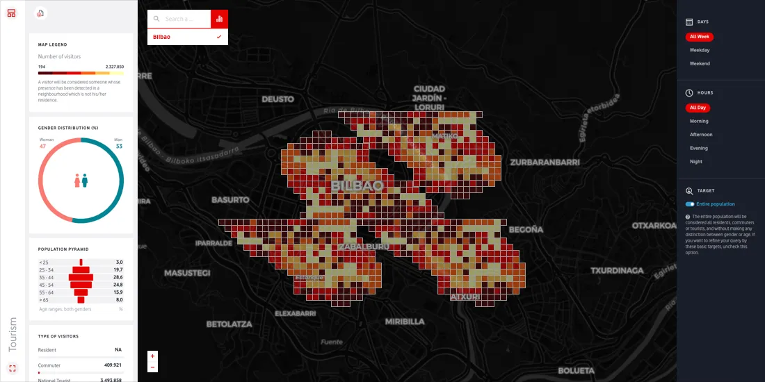
Did you know the average mobile user consumes 1.7GB of data each month!? Vodafone wanted to capitalize on the vast amount of data generated from their network and so worked with CARTO to build this data monetization solution. By sharing metrics and visualizations of aggregated and anonymized human mobility data, it allows users to answer questions such as:
- Where are visitors coming from?
- Which are the areas with more local or foreign visitors? Or older vs younger visitors?
- When does a location receive more visitors of a specific profile?
05: Which stores should I stock my product in?
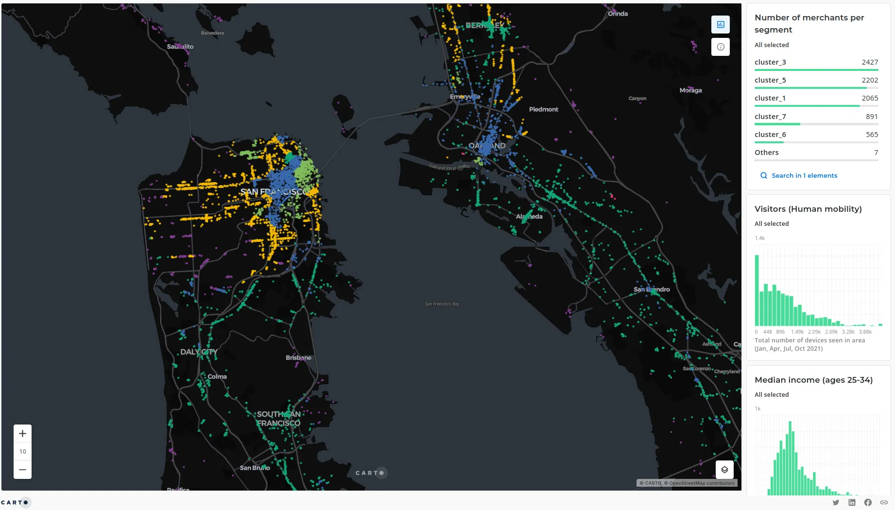
Understanding merchant characteristics and prioritizing which are the best points of sale to place products (commonly known as merchandising) is as important now as ever for brands, and in 2022 we launched a series of CPG-focused tools to help our users do just that.
In this visualization (explore the full screen version here), factors such as demographics, human mobility, consumer spend and resident behavior are used to divide stores into segments such as “Health and spending conscious premium” or “Focus on essentials.” This allows CPG companies to pinpoint the stores most relevant to their products. Read the full story behind this map here.
06: How can I replicate the success of high-performing stores?
As retailers strive to de-risk the site selection process, one way of doing this is by replicating the characteristics of a high-performing store. Say you have a store that’s highly performant you could look into the market conditions at that store and try to find similar conditions elsewhere.
As part of our 2022 launch of CARTO for Retail we developed a series of retail-specific tools in our Analytics Toolbox, one of which is Twin Areas which does exactly this.
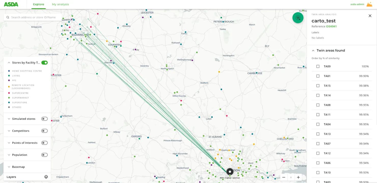
One organization which is taking advantage of this is ASDA, a British supermarket chain with over 600 stores. In the example above, you can see they’re investigating locations in Birmingham with similar characteristics to a high performing site in London.
Want to learn more about how ASDA are using Location Intelligence to drive growth, such as through diversifying with adding click-and-collect locker locations? Read their story here.
Transport & mobility
07: What is the distribution of ride-hailing services?
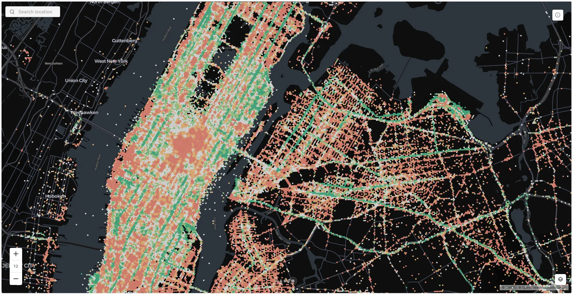
When you think of New York, what do you picture? Maybe the Empire State Building, Central Park… or cabs! They seem to be everywhere, but - as Tomas Ehrenfeld’s fantastic visualization shows us - there are clear spatial patterns to their movements. Red points show drop-off locations, whereas green points show pick-ups.
This map shows data during the morning, and we can see a clear commuting pattern; there are more pick-ups across Brooklyn (particularly major streets) as well as the Upper East and West Side. Conversely, the less residential Midtown has more drop-offs.
08: Car ownership
Did you know that 72% of global carbon emissions come from road vehicles? Because of this, car ownership is an unavoidable part of the Net Zero conversation.
This map (open full screen here) highlights spatial trends in car ownership across London, with higher levels (both in terms of percentage and raw numbers) in Central and Inner London, as well as around key public transport hubs like Croydon and Richmond.
09: What makes a 15-minute city?
While we’re in London and on the theme of Net Zero, let’s take a look at 15-minute cities! 15-minute cities are a concept which grew in popularity in the Covid pandemic and are based on the notion that residents should have everything they need to survive within a 15-minute walk of their home. That includes grocery stores, doctors surgeries, schools and so much more!
Simon Wrigley’s analysis of London as a 15-minute city shows how utopian this concept is, with much of the city missing some key services. Explore the map here!
10: How can companies optimize their deliveries?
2022 marked a return to in-person events, and what a year it was! In May, CARTO’s Founder Javier de la Torre was the keynote speaker at the Spatial Data Science Conference London, and shared his perspective on how delivery companies can optimize their routing with Location Intelligence.
The cornerstone of this optimization is using Spatial Indexes to enable the management and analysis of the absolutely huge amounts of data generated by delivery companies.
Head over to our YouTube channel to watch the whole talk or explore the story map here.
11: How can I identify optimal locations for EV charging stations?
Electric vehicles are becoming one of the true success stories in sustainable transport both environmentally and commercially. One of the key barriers that remains to them becoming more widely adopted is concern over availability of charging stations. Organizations are seeing an opportunity to pinpoint charging station locations which have a strong local market and can therefore be expected to generate a strong revenue.
This solution shows how Location Intelligence can be used to monitor and predict charging station performance, as well as grow the network through identifying whitespace and replicating high performing locations. Read the full story here!
Real estate & insurance
12: How can I adapt insurance policies to wildfire risk?
Between 2015-2021, 15 705 fires occurred in Los Angeles County. This accounts for 7.5% of all fires in the United States in this time period. This obviously represents a significant risk to insurers - but also an opportunity if they can build enough evidence to decide whether to insure buildings against wildfires when competitors cannot.
This visualization (explore this in full screen here) aids with this by rating individual buildings by their risk from wildfire, based on factors such as temperature, wind and land cover.
13: How can I understand infrastructure exposure to hurricanes?
Moving from fire to wind and water, this visualization examines the risk that hurricanes pose to airports across the US. Using a selection of widgets, users are able to investigate the risk level to airports of different sizes and insured values.
Explore the map in full screen here.
14: How can I share spatial data with non-technical users?
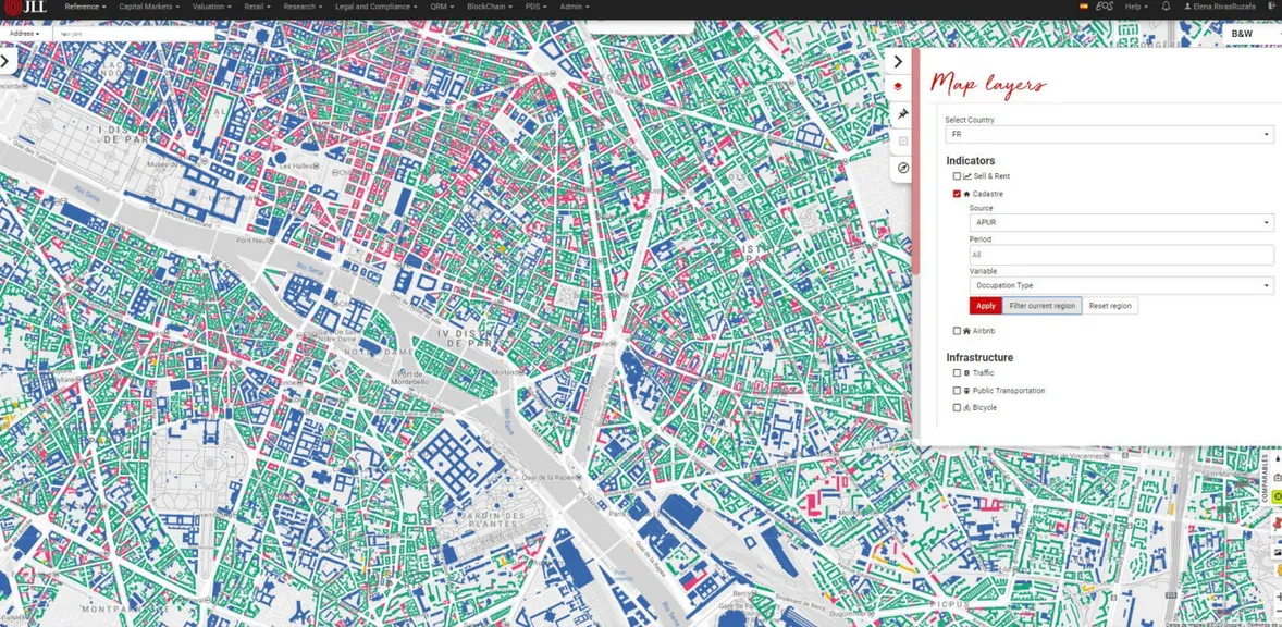
JLL - a global real estate company - leverages huge amounts of data for more efficient and data-driven portfolio management. To help its consultants use and share insights both internally and externally they make use of an intuitive business-user-friendly geospatial solution (see above). This puts data and insights in the hands of the people who need it to make decisions regardless of their technical spatial skills.
This solution includes the processing of over 50 million data points per year! The use of CARTO’s tech stack has allowed for a 52% reduction in the time taken to refresh the solution, better serving the 1,500 JLL employees who rely on it! Find out more about this here.
Climate & sustainability
15: Where will be most affected by climate change?
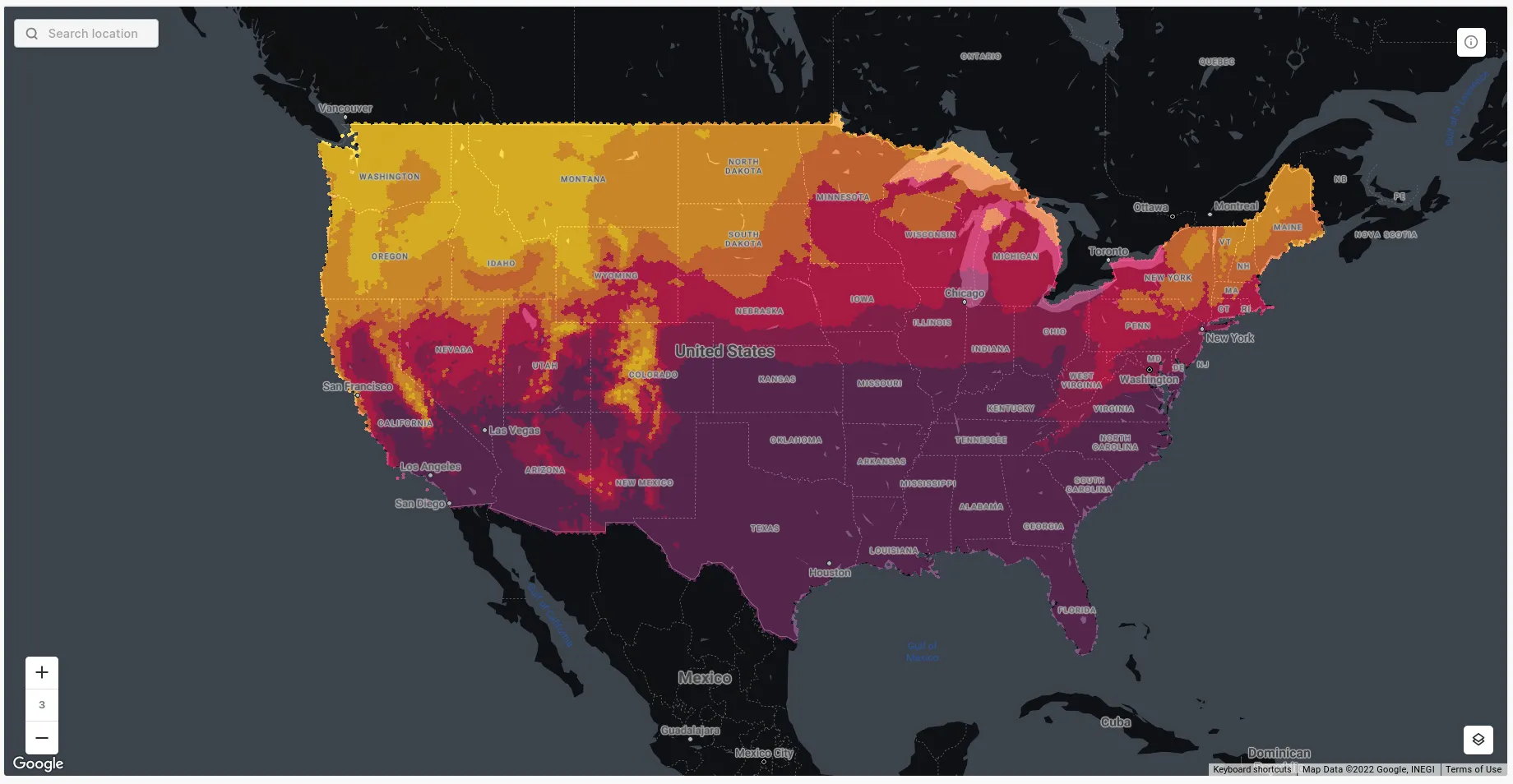
Earlier this year the Climate Data Factory data suite landed on the Spatial Data Catalog. Consisting of 651 datasets covering most of the world, users can now access future climate projections based on different time periods and emissions scenarios. In this example we can see areas of high (yellow) to low (purple) percentage change in July, between medium (2021-50) and long (2071-2100) term projections.
16: Which transport infrastructure is most at risk to climate events?
This solution for the Hawaii Department of Transport allows users to identify parts of the transport network which are exposed to different climate-related hazards such as flooding, landslides and sea level rise. It also pinpoints where climate hazards could impact the most vulnerable members of the community, as well as the economy and environment.
Society & economy
17: How can I consider unemployment rates as part of my site selection strategy?
In the past two years, employers have been faced by a new challenge: the Great Resignation. This is where employees have been leaving their jobs in enormous numbers fuelled by a desire for more flexible and remote working practices low wage growth vs a rising cost of living.
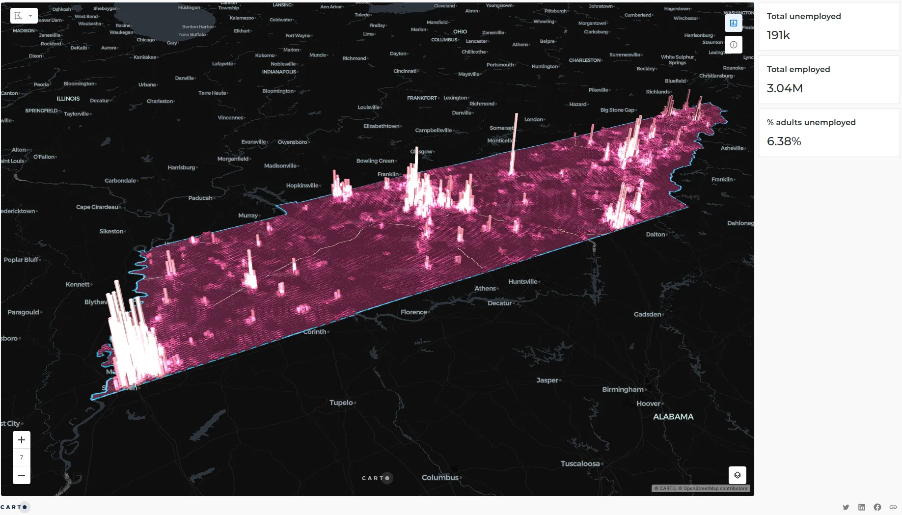
Some employers - particularly those in highly-impacted industries such as logistics - have been starting to factor levels of unemployment into their site selection decisions to better enable recruitment and talent retention. Check out our full post about this in the context of Tennessee’s employment landscape (mapped above) here.
18: Is location a factor in the Cost of Living Crisis?
We’ve talked about a lot of trends in this post, but if there’s one that you’re hearing about probably every day, it’s the Cost of Living Crisis.
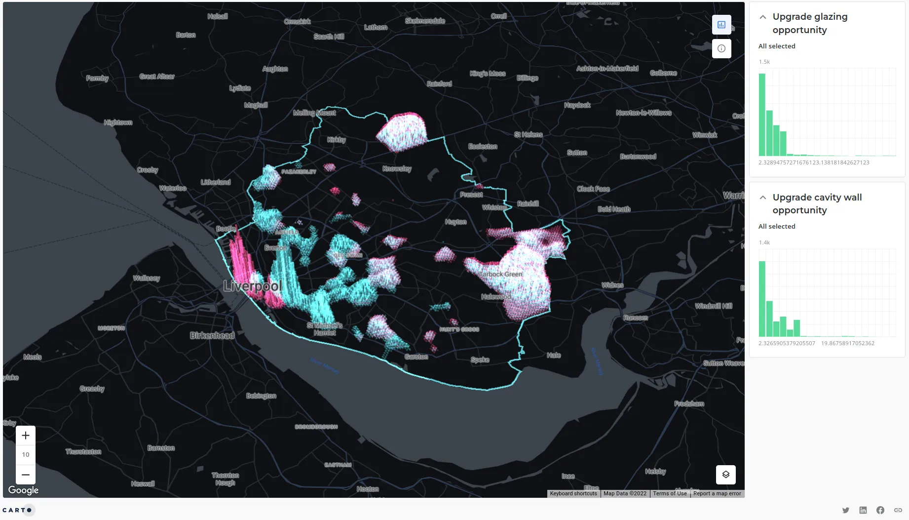
Our data partners Doorda have recently published Residential Energy Performance data which allows analysts to - amongst many other use cases - pinpoint areas for targeted improvements. In this example we identify hotspots of areas where homes would most benefit from upgraded window glazing or cavity wall opportunities - check out this tutorial to understand how we did this.
Miscellaneous
19: How can we map everything in the world?
A simple challenge right? That’s not rhetorical - it actually is. OpenStreetMap - a global, crowdsourced dataset - contains 7.8 BILLION points making it an absolutely enormous dataset. However, thanks to the power of cloud data warehouses and our tiler functionality accessing all of that data in one go becomes completely feasible as the video below from Matt Forrest, our VP of Solutions Engineering, shows.
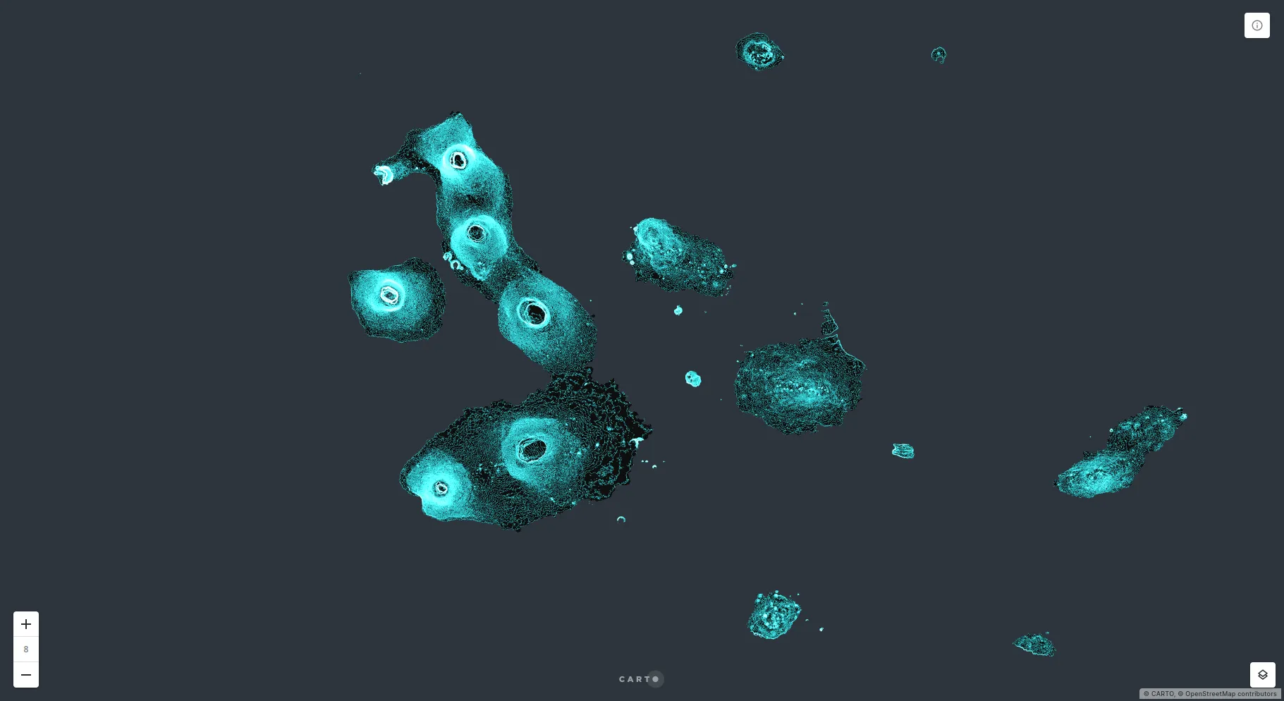
20: What is the topography of the Galapagos Islands?
Most of these maps were created to solve business problems or answer questions, but this next one… well it’s just plain beautiful. Ernesto Martínez Becerra’s map shows contours of the Galapagos Islands. The use of the “addition” blending mode creates the stunning glow effect.
21: How can Location Intelligence help emergency services?
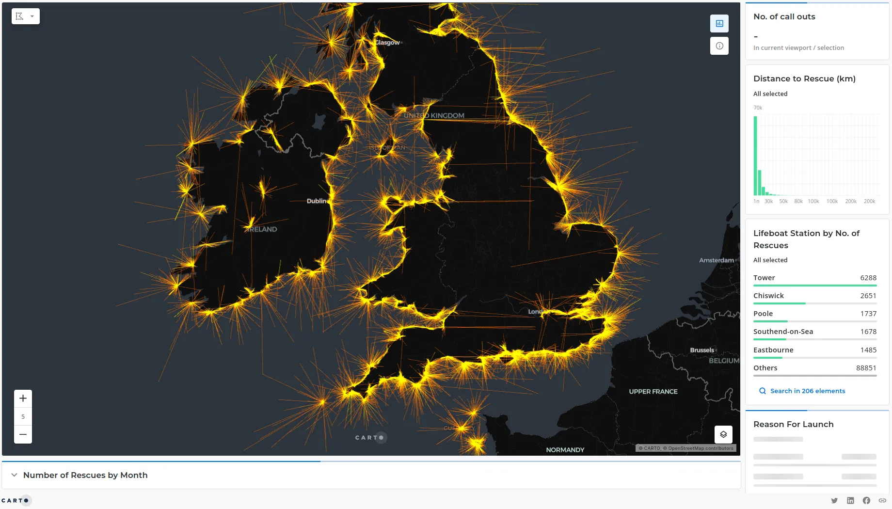
Another fantastic example of geospatial analytics at work from our Solutions Engineer Simon Wrigley! This time he’s exploring rescues from the UK lifeboat organization RNLI looking at the spatial distribution of rescues lifeboat stations and the relationship between the two. How interesting is it that the busiest station (Tower, in London) is one of the furthest in-land?
Explore the visualization here!
22: How does footfall vary across the US?
Thanks to CARTO Builder product updates this year you can now visualize Spatial Index data in more detail than ever before. And what better example than this!? This visualization shows footfall data (from our data partners Unacast) across the US. The detail is spectacular - you can pick out an individual service plaza complex on the i75! Oh and that enormous towering peak? Disneyworld!
Explore in full screen here.
Thanks for reading!
We hope you enjoyed our maptastic round up of our favorite spatial data visualizations from 2022! Hopefully you’re now feeling inspired for a new year of amazing analysis and visualizations - and who knows, maybe one of your maps will be on this post next year!