

4 ways catastrophe analysts can use spatial analytics


There is no denying the growing impact of climate change on the frequency and intensity of extreme weather events across the globe. For both insurers and reinsurers, this presents a number of serious business challenges. With the average insured losses resulting from natural catastrophes reaching more than $110 billion, the need to analyze, understand and accurately predict catastrophe risk and exposure of insured assets is fundamental for longer term profitability.
In the coming decades, hazards are set to intensify and become even more frequent. However, with easier access to relevant hazard related datasets and a more modern, scalable approach to catastrophe analytics, insurers are now in a position to better understand natural hazards, vulnerabilities and manage their financial exposure more profitably.
In the following post, we explore some of the key spatial analytics techniques Catastrophe Analysts can use to improve their understanding of the key climate-related perils, and use these insights for better decision-making.
As seismic activity continues to pose a significant threat - with around fifteen earthquakes each year with a magnitude of 7 or greater - earthquake analysis is incredibly important for catastrophe analysts seeking to predict and mitigate the financial impact of these events. Location Intelligence proves indispensable in assessing seismic risks, offering insights crucial for designing resilient structures, setting insurance premiums, and optimizing response strategies in earthquake-prone regions.
USA earthquakes since 2019; explore in full screen here.
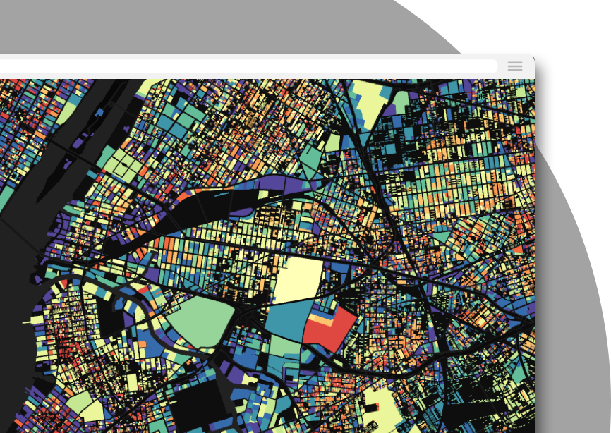
The map above visualizes every earthquake in the USA since 2019. You can really see the strong spatial patterns of this hazard, with many more earthquakes occurring to the east of the US around the San Andreas Fault.
Catastrophe analysts can utilize visualizations like this to dynamically explore and analyze the spatial distribution of earthquakes. This tool empowers analysts to identify high-risk zones, assess the frequency and intensity of seismic activity, and make informed decisions that are crucial for developing comprehensive strategies to mitigate the financial impact of earthquakes on insured portfolios.
Data used: Earthquake locations from the USGS, boundary data (counties and states) from our Spatial Data Catalog.
Make this map: a series of dynamic widgets have been leveraged to allow users to pinpoint the most significant hazards, as well as a time series widget to enable an animation of these events occurring through time (click play to watch this in action!). Administrative boundary data has also been added to each earthquake location using Spatial Joins to provide the user with more contextual information - this can be accessed via the feature pop-ups. Finally, the addition of the blending mode causes overlapping features to “glow,” making it clear to the user where high levels of seismic activity have occurred.
The frequency and intensity of wind-related storms, including hurricanes and tornadoes, continue to escalate due to the impacts of climate change. Catastrophe analysts face a pressing need to refine their analytical approaches to better understand the intricate dynamics of these storms in order to navigate the financial implications of such catastrophic events. By identifying spatial patterns and vulnerabilities associated with wind hazards, analysts can better assess risk, optimize insurance strategies, and enhance disaster preparedness.
Airport infrastructure affected by hurricanes in the North Atlantic; explore in full screen here.
This map visualizes the relationship between airport infrastructure and hurricanes in the North Atlantic ocean. Users can explore the proximity of airports to different levels of storm severity, and the insured value of affected infrastructure.
Catastrophe analysts can harness visualizations like this to pinpoint high-risk areas, evaluate the frequency and severity of wind hazards, and mitigate the financial impact of these storms on insured portfolios.
Data used: The hurricane tracks are available from NOAA and accessed via the Google Cloud Public Data Marketplace. Natural Earth Airport locations can be accessed on the CARTO Spatial Data Catalog.
Make this map: We shared a tutorial on how to turn raw hurricane point locations into tracks (like in the map below) in this edition of our monthly LinkedIn newsletter, “Spatial Perspectives.” You can then use the Distance to nearest component in Workflows to calculate the distance from each airport to the nearest hurricane, and then employ a series of widgets to allow users to filter to the most relevant data points.

In 2022, floods and flash floods caused nearly 2.8 billion U.S. dollars worth of property and crop damage across the United States. Flood hazards can result from several factors, including heavy rainfall, storm surges, hurricanes, snow melt, dam breaches, and poorly planned urban expansion.
Flood damage is not only structural, such as the destruction to homes, commercial buildings, bridges, roads, and other infrastructure, but also creates significant damage to contents with the loss of personal belongings and severe interruption to businesses and communities.
For the catastrophe analyst, understanding past flooding activity and predicting flood events, mapped to the portfolio of insured assets or built environment is a powerful mechanism to evaluate risk, effectively decide premium pricing and also uncover fraudulent claims activity.
Data used: In this analysis we have mapped building footprints using OSM data. In addition, we have integrated modeled flood depth levels for both river and flash flooding at different return periods provided by our data partner Fathom, a global leader in flood and climate risk analysis and modeling.
Understanding this visualization: The visualization shows the built assets that are at risk from future flood damage, based on the modeled data. An average risk score has been calculated for each building asset based on elevation, with a prediction of average flood depth across the city, giving catastrophe analysts powerful insights to better assess the risks posed to the built environment due to future flooding events.
Analysis of flood risks in the city of Valencia, Spain. Explore in full screen here.
2023 has seen extremely high levels of wildfire activity around the world. Utilizing location intelligence, catastrophe analysts can identify spatial patterns and vulnerabilities related to fire hazards. This enables thorough risk assessment, aiding in the optimization of insurance strategies, implementation of effective mitigation measures, and enhancement of disaster preparedness in wildfire-prone regions.
For instance, the visualization below employs a Wildfire Risk Index (WRI), which calculates the likelihood of fires to occur based on temperature, wind levels and vegetation. Catastrophe analysts can use this score to understand risk levels, both for wider neighborhoods as well as individual properties.
Wildfire risk to properties in Los Angeles; open in full screen here.
Data used: Temperature and wind levels were sourced from CARTO Spatial Features; a global dataset which includes a wide range of climate, demographic and economic variables in a lightweight Spatial Index format. Land cover was sourced from Microsoft Planetary Computer and property parcels were sourced from Los Angeles County.
Make this map: Learn how to recreate this analysis in our webinar with Snowflake! Some of the key features include zoom based styling.
—
Want to see how organizations are putting Location Intelligence for catastrophe analysis into practice? Check out g-Xperts’ story here! Start your own journey with a free 14-day trial and check out this quick-start guide to getting started, from accessing datasets to building a visualization.