

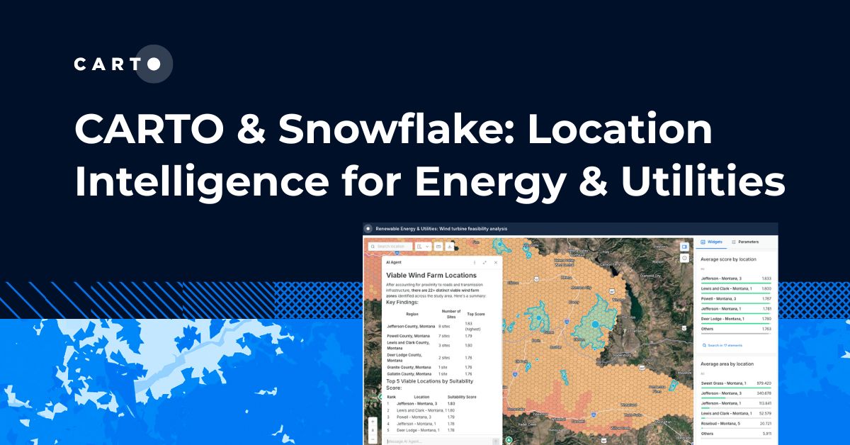


CARTO & Snowflake: Location Intelligence for Energy and Utilities
CARTO and Snowflake expanding cloud-native Location Intelligence for Energy and Utility organizations, unifying IoT data for resilient operations.
Nagarro & CARTO: Advancing Enterprise AI Transformation
CARTO and Nagarro partner to help enterprises move AI from pilots to production, embedding Location Intelligence into existing workflows and systems.
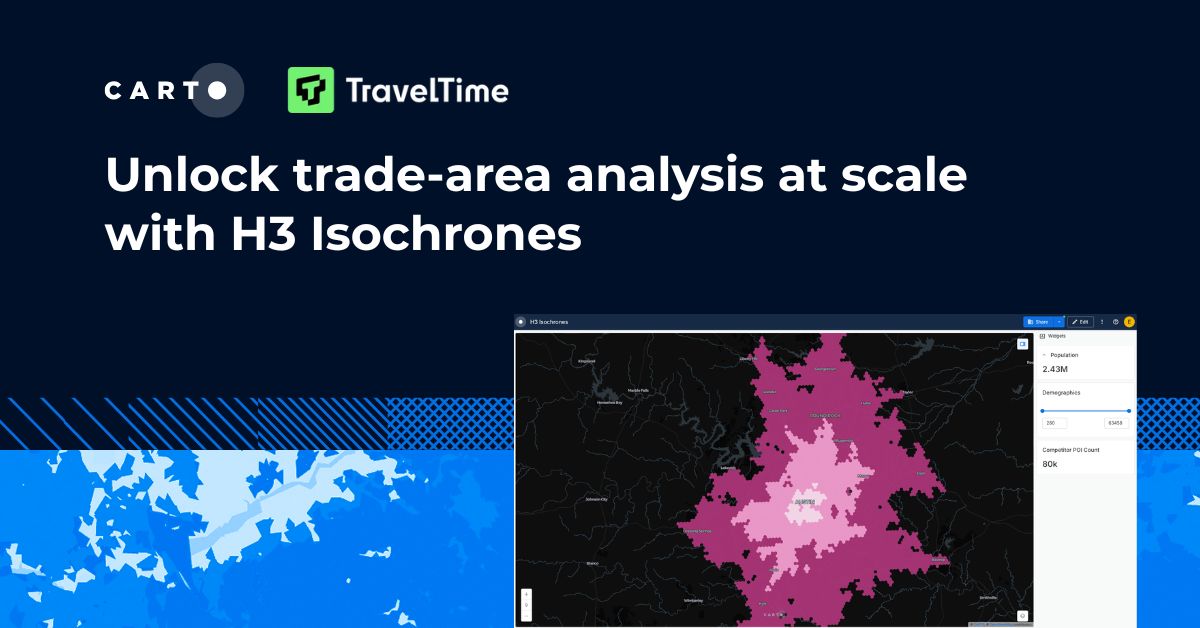


Unlock trade-area analysis at scale with H3 Isochrones
Scale travel-time analysis with H3-based isochrones in CARTO. Faster joins, overlap insights, and 96–99% time savings powered by TravelTime.
.jpg)

Geospatial Foundation Models: Workshop Takeaways
Explore the state of geospatial foundation models, from representation learning to population dynamics, with insights from the CARTO & BSC workshop.

CARTO AI Agents now integrated with Oracle Generative AI
CARTO AI Agents are now integrated with Oracle Generative AI, enabling secure, governed Agentic GIS and scalable geospatial AI in Oracle Cloud.


Spatial Analytics in 2026: What's Changing?
Explore how AI, cloud-native tools, and evolving skills are reshaping spatial analytics in 2026, based on insights from 200+ geospatial experts.
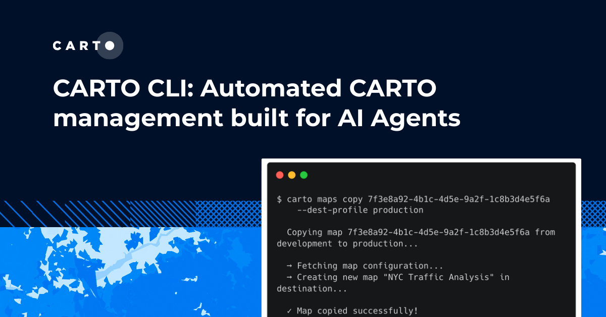


CARTO CLI: Automated CARTO management built for AI Agents
Meet the CARTO CLI: a command-line interface that unifies human expertise, automated pipelines & AI agents into one geospatial operating model.
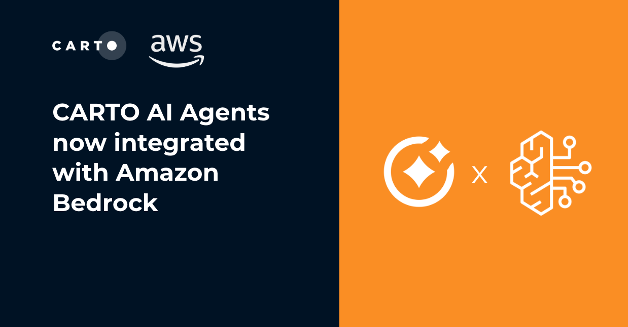
CARTO AI Agents now integrated with Amazon Bedrock
Unlock secure, AI-powered geospatial analysis in your AWS environment. Learn how CARTO's Agentic GIS and Amazon Bedrock integration makes spatial insights accessible to everyone.
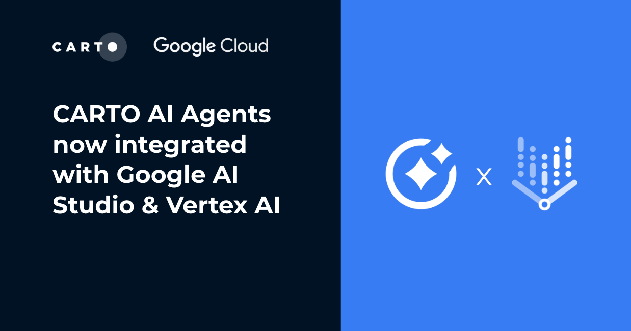
CARTO AI Agents now integrated with Google AI Studio & Vertex AI
Unlock AI-driven spatial analysis. CARTO's Agentic GIS now integrates with Google AI Studio & Vertex AI to run secure geospatial workflows on BigQuery.
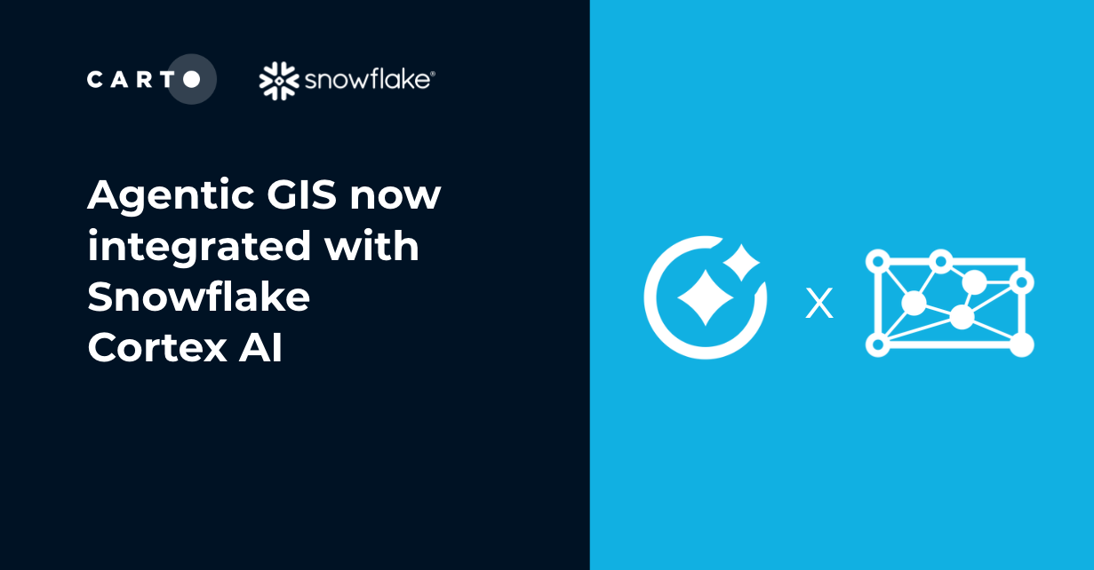
Agentic GIS now integrated with Snowflake Cortex AI
Unlock Agentic GIS in Snowflake. CARTO's native integration leverages Snowflake Cortex AI for secure, powerful, and AI-driven spatial analysis.

CARTO now integrated with Databricks Spatial SQL & Mosaic AI
Unlock powerful geospatial analytics in Databricks. CARTO's native integration leverages Spatial SQL and Mosaic AI for high-performance, AI-driven insights.


Geospatial Sovereignty: Why it requires both Law and Architecture
Unlock true geospatial sovereignty. This guide explains why a modern tech stack is not enough and how to build a legal and governance framework for your data.
.png)
5 best spatial analytics and visualizations of 2025
Discover the best spatial analytics of 2025. Learn how industry leaders use CARTO to analyze historical risk, manage real-time operations, and plan for growth.

Academy
CARTO & Snowflake: Location Intelligence for Energy and Utilities
CARTO and Snowflake expanding cloud-native Location Intelligence for Energy and Utility organizations, unifying IoT data for resilient operations.
Nagarro & CARTO: Advancing Enterprise AI Transformation
CARTO and Nagarro partner to help enterprises move AI from pilots to production, embedding Location Intelligence into existing workflows and systems.
Unlock trade-area analysis at scale with H3 Isochrones
Scale travel-time analysis with H3-based isochrones in CARTO. Faster joins, overlap insights, and 96–99% time savings powered by TravelTime.