

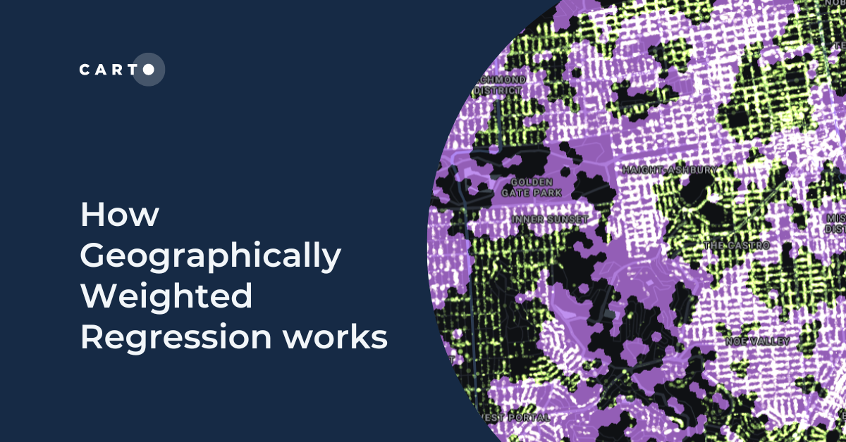
How Geographically Weighted Regression works


Welcome to our spotlight on one of the most useful spatial statistics tools; by the end of this Geographically Weighted Regression tutorial, you will:
- Know exactly what Geographically Weighted Regression (GWR) is, how it works and when to use it.
- Know how to use Spatial Indexes to optimize the use of spatial statistics.
- Have tried this out with an example!
Please note there will be some functions which will require you to write data to a table, for which you’ll need access to a Cloud Data Warehouse.
This exercise is aimed at beginners to CARTO, Spatial SQL and Spatial Indexes. If you’re looking to run Geographically Weighted Regression in R or Python, many of the concepts from this tutorial will be applicable to you.

GWR quantifies the strength of relationships between a target and correlation variables. Unlike non-spatial regression, these relationships are also tested - and weighted - spatially. In this way, it adds more insight to your analysis and helps you ascertain if trends are global or local.
Some examples of use cases would be:
- How does the presence of different infrastructure relate to traffic accident rates?
- Is there a relationship between CPG revenue and socio-demographic characteristics of different areas?
- Do house prices increase based on mobile data coverage?
GWR performs a local least squares regression for every input cell in a continuous grid. Each regression will be calculated based on the data of each cell and its user-defined neighborhood. Within that neighborhood, the data of the neighboring cells will be assigned a lower weight the further they are from the origin cell. The weights are assigned based on a user-defined kernel.
The output of this analysis is a coefficient variable for each cell. Positive coefficient values indicate a positive relationship between the coefficient and target variables, whilst negative values indicate a negative relationship. A value of 0 indicates no relationship.
Let’s illustrate this with a real-life example. We’ll be looking at whether the number of street trees in San Francisco have any relationship with demographic variables such as population density, income and rent prices.
To follow this example, you’ll need a CARTO account - if you don’t already have one, you can sign up for a free 14-day trial here.
Our first step is to load our data. CARTO provides all users with the San Francisco street trees dataset as a demo dataset. When signed into your workspace, you can access this under Data Explorer > Connections > CARTO Data Warehouse > Demo data > Demo tables > san_francisco_street_trees.
Alternatively, you can access the data directly from DataSF.
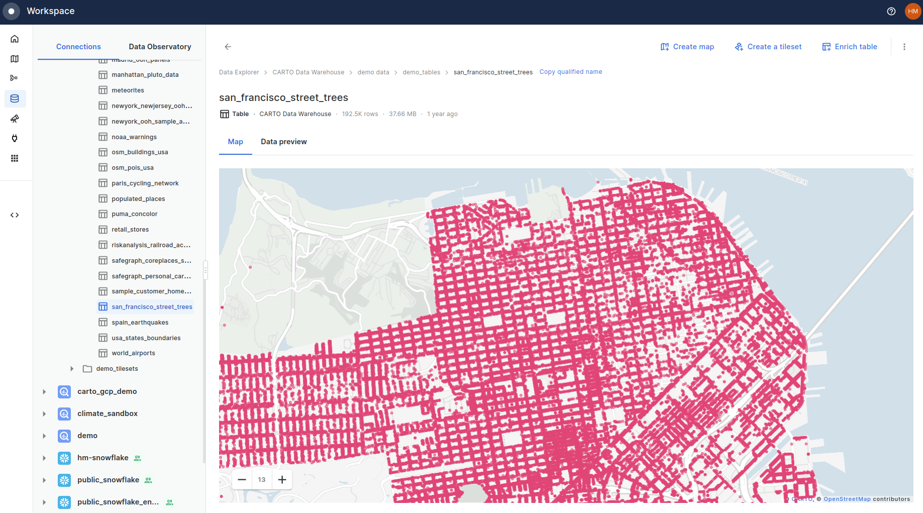
As you can see, this is quite a large dataset with nearly 200K records. Let’s map this in CARTO Builder, but limit the query to only select geometry, tree_id and dbh (Diameter at Breast Height) fields.
To do this, open a new map (Maps > Create Map) and under sources, select Add a source from > Custom query. Copy the below query to load this data into your map.

In the Spatial Data Catalog, navigate to the “Sociodemographics - United States of America (Census Block Group, 2018, 5yrs)” table and subscribe to this. This will be the dataset that we extract our demographics variables from.
We’ll also want to subscribe to the “County - United States of America (2019)” (with CARTO as the source - this is the version of counties clipped to the coastline). We’ll use this as the extent for our analysis.
In order to run Geographically Weighted Regression, we need to first convert all of our data to a continuous grid. We advocate using Spatial Indexes such as H3 or Quadbin for this. Spatial Indexes are multi-resolution grid systems, which differ from conventional geometries in that they are geolocated with a short reference string, rather than a long list of vertex coordinates. This makes them small to store, and super fast to analyze.
We’ll be creating a Spatial Index H3 grid for this example; its hexagonal shape gives it a huge range of advantages for spatial analysis. We’ll do this using the command H3_POLYFILL which can be used either as an analytical component in CARTO Workflows or as a SQL function. We’ll be generating a grid with a resolution of 10 which has an average area of 0.007 km². This is a good level of detail for the data, extent and outcomes we require.
For more information of which type and scale of Spatial Index to choose, refer to our full guide Spatial Indexes 101.

Please note you will need to replace “xxxxxxxx” with your personal Data Observatory Connection ID, which you can find under CARTO Workspace > Data Explorer > Data Observatory, then click “Access in” under any table you have a subscription to or sample of. You should see a string which starts “ac…” which will precede your Data Observatory connection ID.
Now you should have a H3 grid covering San Francisco!
The first step here is to use DATAOBS_ENRICH_GRID will be used to aggregate the below demographic variables from the “Sociodemographics” layer we subscribe to earlier:
- Total_pop
- Median_income
- Income_per_capita
- Median_rent
A code template for running this is below.
You may need to make the following changes to this SQL code:
- Your region (in our example we’re using the US; see the list of region codes in the documentation).
- Your output table.
- Your data observatory connection ID (see above in “Create a Spatial Index grid” for how to find this).
Make sure you use the correct type of aggregation, which will depend on whether your enrichment variable is extensive or intensive. Extensive variables will vary as the size of a feature changes - such as total population. You will typically wish to sum these. Conversely, intensive variables do not vary with the size of a feature and are often rates; an example would be population density. In these cases, you will typically wish to “avg” the data.
Let that run for a short while… ours took just 17 seconds!
The second step here is to aggregate the tree count data to the grid, for which we’ll use the similar function ENRICH_GRID which can be used for first-party datasets.
And now you should have a H3 layer which contains variables for all of our demographic information, as well as a street tree count.
Open this map in full screen here.
Now we have all of our data compiled, it’s time to run GWR!
We’ll be using our tree count variable as the “target variable,” and our demographic variables as the “correlation variables.” You can see we’ve used the kernel ‘gaussian’ here, which indicates a gradual decrease in weighting as cells are further from the central cell. Other kernels available are 'uniform', 'triangular', 'quadratic' and 'quartic.' You can learn more about these functions here.
Execute the code below from your BigQuery console.
The output of this process will be a H3 grid with a coefficient variable for each correlation variable, indicating the strength of its relationship to the target variable. Positive coefficient values indicate a positive relationship between the two (e.g. higher rents = more trees) and negative values indicate a negative relationship (e.g. lower rents = more trees). A value of 0 indicates no relationship.
Load this into CARTO Builder to see your handiwork! Top tip: join the results of this data back to your input data and use tooltips to help you understand what’s driving the results.
Open this map in full screen here.
This example shows the relationship between median income and tree count. Purple areas are areas with a positive correlation between the two; income and tree count are both either high, or low.
Geographically Weighted Regression is just one of the many types of scalable data science techniques unlocked with Spatial Indexes. Make sure you check out our ebook Spatial Indexes 101 for a full guide to this next generation of spatial data.


.png)

