4 solutions to common problems when making location data maps


The recent releases of CARTO VL and Airship presented the opportunity for a post on solving common mapping problems.
Below are four problems many users encounter when visualizing location data. Each can be solved in Builder CARTO.js or CARTO VL.
1. How to visualize coincident points?
One of the questions we frequently get is “What should I do when I need to visualize overlapping points that share the same coordinates?”
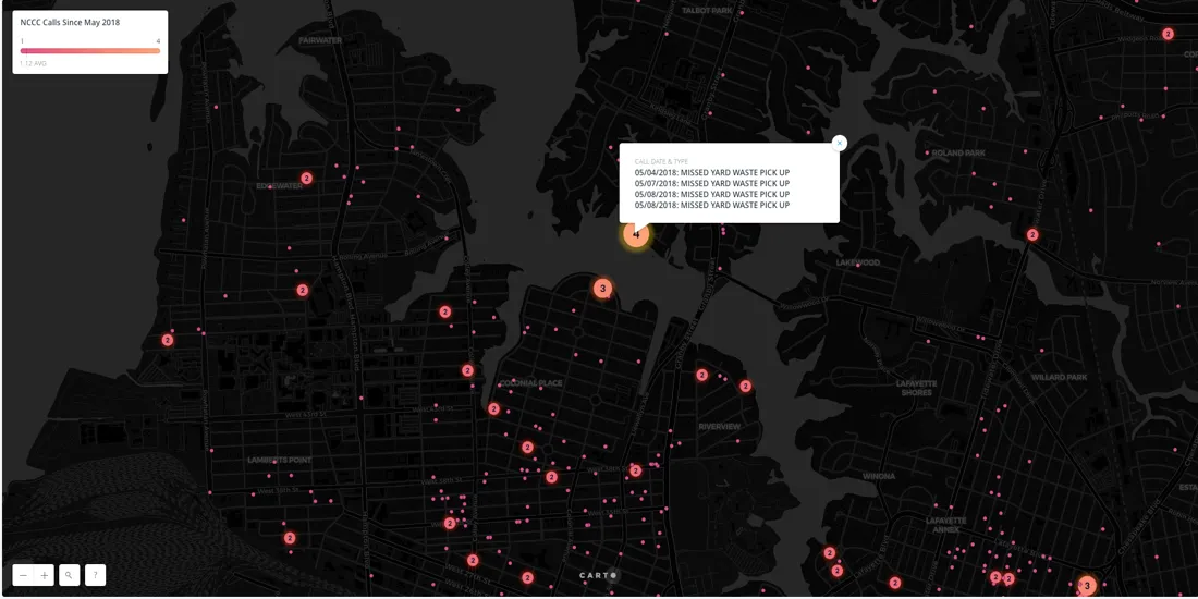
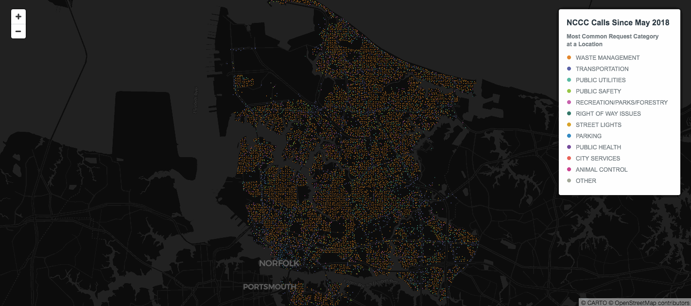
This map was made with a dataset of calls to the Norfolk Cares Call Center from May 2 to June 1 2018.
From running two SQL queries we see that there are 1224 points in this dataset but that 150 of those are duplicates.
From looking at the map alone we wouldn't be able to see that some of these points are duplicates so we need a way to visualize our data that conveys to the viewer that multiple calls were made at the same location. There are two ways to solve this problem: 1. aggregate point data or 2. use symbology to spread out markers.
Aggregation
One way to aggregate overlapping data is to run a CARTO Builder analysis that creates centroids. In the analysis settings we can choose to categorize by the_geom column. That will aggregate the points according to their coordinates so multiple points with the exact same latitude and longitude will be aggregated into one centroid marker.
Running this analysis generates two columns in our map layer's Data View: the first is called "category" which provides each centroid's coordinates and the second is called "values " which provides the count of points that were aggregated into that single marker. We can use this for marker size color & label styling.
Separately we opened the original dataset in CARTO's Datasets dashboard then used SQL to aggregate all of the calls for each coordinate. We created a new dataset from that. Then in our map layer we chained a second analysis to the centroid one called Add Columns from 2nd Dataset. That allowed us to join the centroids to the aggregated calls dataset so we were able to add pop-up windows displaying information for all calls represented by each cluster marker.
Symbology
For this option we’re not aggregating the coincident points but rather we’re giving them marker graphics that are rotated in such a way to indicate that there’s more than one call at each location. This time the map was built with CARTO.js which uses CartoCSS.
Both options provide solutions for parsing and presenting information to the map viewer from coincident points in your dataset. But even if we solve the coincident point issue sometimes there are still too many overlapping points for our data to be legible…
2. How to visualize overlapping data points that are non-coincident?
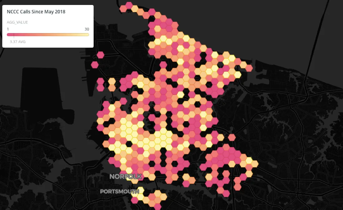
Even if the coincident points issue is solved you can still have too many non-coincident points overlapping for your map viewers to understand how many points are really in the areas of overlap or other information about them. For example look at the southern central area in Norfolk:
Again the answer is to aggregate. In the CARTO Builder map below we've aggregated overlapping data using hexbin aggregation style to display the volume of calls across the city:
For users building maps with code CARTO VL offers additional aggregation methods. You can create a Cluster map in CARTO VL like we did in Builder but in CARTO VL you have more control over it's settings and the clusters change on zoom.
For example in CARTO VL you are not as limited when choosing a number for the resolution of your clusters. If you picture a grid laid over your map the resolution would be the grid cell size and all of the points in a grid cell would be aggregated into a single marker. As you zoom in and out on the CARTO VL map the clusters are re-calculated on the fly based on how many points fall into each grid cell at that zoom level.
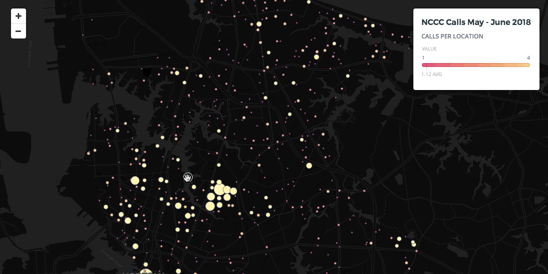
CARTO VL also offers cluster functions so you can define how the markers get aggregated. For example in our original dataset we have a "call_count" value for each point. In CARTO VL we can represent this with a data-driven variable "$call_count" and then use that in a function like clusterSum. ClusterSum will add up the "call_count" for each of the points being aggregated into a single marker so we have a final total of all calls for each cluster.
What’s great about CARTO VL is that you can base your cluster marker width on the result of this function in order to create a proportional symbol map.
You can also use it with CARTO VL ramp and buckets functions to automatically color the markers sequentially according to how many total calls they represent. CARTO VL is doing all the size interpolation and color calculations for you.
Interested in putting CARTO VL to use? Find out more here!
3. How to style maps with too many categories?
Many of our users create category maps but styling qualitative maps featuring a large number categories presents a unique problem: how can they be presented so that no one category appears to be more important than any other one?
To illustrate this problem and in keeping with our Virginia theme let's take a look at Elementary School Attendance Areas in Fairfax County:
There are over 100 areas in this map. In a qualitative map each is considered a unique category. The problem here is that you can’t pick over 100 colors that are easy enough to distinguish from one another with the map still appearing as if each category had equal importance. In this type of situation grouping data into larger categories is the best bet.
One way to recategorize our data in CARTO Builder is (1) to add a second layer of open data on Fairfax School Regions and then (2) run some spatial analysis to intersect and aggregate the two layers to find the attendance areas that intersect with each larger school region.
The analysis is aggregating the attendance area polygons into the region polygons. We could easily create a category map now based on these region polygons since fewer unique colors are needed.
If we wanted we could also make a [choropleth map]. That's because analysis settings let us choose how we wanted to aggregate the data. Since we chose COUNT the analysis returned a count of how many attendance areas are included in each region. It also automatically generated a second normalized "value—for" measure showing the density of elementary attendance districts per school region. We can use that with Builder's Style By Value feature to create a choropleth.
CARTO VL gives you other ways to deal with too many categories: functions to automatically calculate mode (the most commonly occurring value per polygon) or top values.
In the map above the top function was applied to the "school type" column in the elementary school attendance areas dataset. As a result the map finds the top 3 most common school types for each polygon.
4. How can maps be styled by zoom in CARTO VL?
"How can interactive maps maintain data hierarchies with viewers changing zoom levels?" This is an important question since it's critical to render features that are appropriate for the zoom level you're viewing and to visually rank them according to importance.
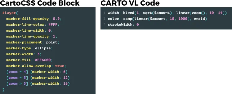
CartoCSS we use in Builder maps lets you style for different zoom levels using conditional code blocks. In comparison CARTO VL powered by Web GL lets you define styles for certain zooms and automatically interpolates between them ensuring proper color and size calculations with one line of code.
Now with CARTO VL it's easy to change thematic map type according to what’s most appropriate for the zoom level. The aggregated dot map below for instance is at zoom level 11.3. Since we're viewing the entire city at that level we have the opportunity to see overall patterns across the region.
But when we zoom into a level where we can see more detailed information about an area like block level there's an opportunity to show more than category data:
CARTO VL seamlessly styles as the zoom level changes so we can add proportional symbology to our category map at zoom levels where size differences are visible. We're using clusterMode to indicate the most common category in each cluster by color but at large-scale zooms we're also using clusterSum to size the markers according to how many calls were made.
Next Steps
These are only a few ways to solve common problems when mapping location data. Our Help Center offers a wide range of material--from step-by-step guides for beginners to tips hacks and best practices for advanced map makers--and the Developer Center is updated regularly with the latest additions to our libraries APIs and data services offerings.
For more on getting started with CARTO VL don't miss our upcoming webinar featuring Mamata Akella and Jeff Ferzoco who will demonstrate building maps with VL as well as answer questions from attendees.