Why doesn't my Time Series slider animate to bar edges?
FAQs about animating layer points in Builder.
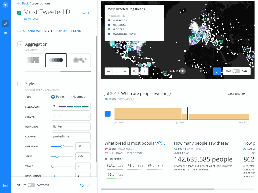
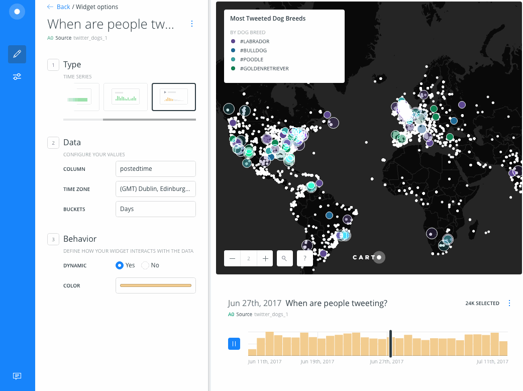
The bars in a Time Series widget represent your data bucketed by days, weeks, months, quarters, years or decades. For example, the data used below contains timestamps ranging from June 2017 to August 2017 (two months). Notice how the bars below change when we change the Buckets from Days to Months.
This is independent of the number of steps you set in the animated layer’s STYLE panel. If you specify 256 steps, that will divide the time range in your dataset into 256 bins. The beginning and end of each step will not necessarily coincide with the beginning and end of each bar graphic. For example, the two months of data above broken into 256 steps means that only a fraction of time each month falls in a step bin. The time slider animates to the edge of a step and does not take the bar graphics into account.