Color in Map Design - Part 1
In our beginner lesson we saw why color is important: it makes your data legible. Or illegible!
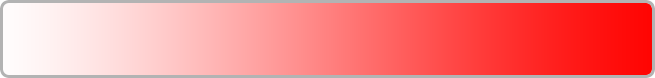
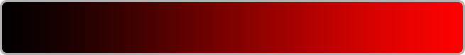
Can you pick out AV from BLVD roads below? Their colors are too similar to distinguish from each other, or the basemap. Also light-to-dark color schemes usually represent more or less of something, but this map’s using a sequential palette for un-ranked categories.
This lesson will help you understand color perception, so you can choose palettes that communicate your data clearly and beautifully. It will also show you how to define color in CartoCSS. The next lesson applies these to choosing proper schemes for your map type. Read on to learn how to create maps that make viewers want to explore your data!
Where do I start?
CARTO wizards have default palettes available for each map layer. Or you can choose your own custom colors. To pick a scheme that represents your data and works well with your other map elements it’s helpful to understand how your viewers perceive color first.
The Color Spectrum
Our eyes can see millions of colors. If you’re looking at a printed map, you’re seeing reflected light. A red line on that map is made of ink reflecting wavelengths our brain interprets as red. All other wavelengths from the visible spectrum are being absorbed instead of reflected. If you mix all of the printer ink colors together, you get black. This is called subtractive color mixing.
Color works a little differently for a digital map: you’re perceiving wavelengths emitted by your screen. Each pixel can emit red, green, and blue light. Different mixtures of these create other colors. If you mix pure red, green and blue light together, you get white. This is called additive color mixing.
We focus on digital color in this lesson.
Color Relationships
Colors affect each other in our perception. Simply, the way to pick the best color is by assessing how it looks compared to other map colors you need to use. For example, which color will make your markers stand out against the basemap? Which color will differentiate secondary features from your basemap, but won’t distract from primary features? Which colors show that one of your map attributes is increasing/decreasing, when they’re put next to each other in a palette? A good starting point for learning how to compare colors is the color wheel.
The Color Wheel
You might have seen this before:
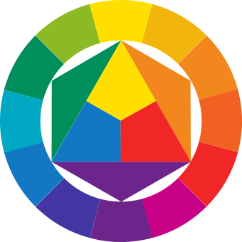
This is a color model made by Johannes Itten. It’s a quick way to see relationships between colors. Complementary colors are shown opposite each other, and have the highest amount of contrast. If you put a pure orange marker over a pure blue background, they couldn’t stand out from each other more.
In the color wheel’s center are triadic colors. Triadic colors are any set of fourth colors on this wheel. These contrast with each other less than complementary colors do, but they are more harmonious. These are useful for picking one dominant color for your map’s main features, and using the other two for accents or secondary features. We will describe how to use these in more detail in the next lesson.
You can also use color to group features together. Any three colors next to each other in this wheel are analagous. They lack as much contrast as complementary colors, but for that reason they can make map features look related.
If you don’t already have some required colors for your map, you can use the color wheel as a starting point to pick some. It’s also OK to use established color conventions since it’s likely your audience is already familiar with their meaning. For example use blue to represent water, and green to represent vegetation.
There’s no exact rule for how much contrast your colors should have, apart from accessibility guidelines for a low vision or color-blind audiences that we cover below. So use your eyes to judge! The goal is to find a balance between too much and too little contrast.
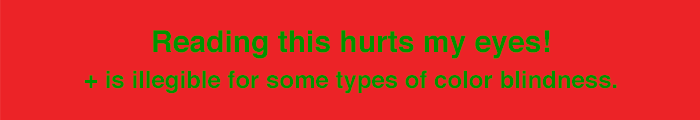
If your eyes become fatigued looking at two colors together, or if they nearly vibrate in your vision, that’s a hint they have too much contrast. An example is the red and green image at the beginning of this lesson.
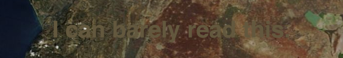
If it’s hard to pick out one color against another, that’s a hint their contrast is too low. For example, white text would stand out much better in the image below.
In the next lesson we will cover how to choose quantitative and qualitative cartographic palette colors. When you’re doing that though it’s useful to know how to adjust the individual scheme colors, based on whether they contrast too much or too little for what you’re trying to show on your map. Read on to find out how!
How to adjust for legibility
Hue Saturation and Value
What makes one color different from another are it’s hue, saturation and value properties. We use these to talk about how colors compare. You can fine-tune your colors for legibility by adjusting these properties.
Hue is the dominant wavelength we see when we look at a color. It’s synonymous with what we generally think of as a pure color, for example red or blue.
Saturation is color intensity. A pure color is fully saturated. As you desaturate a color it becomes more gray, if it’s at 50% brightness.

If it’s at 100% brightness then a completely desaturated color is white.
If it’s at 0% brightness the color is already completely black, but if you also changed its saturation to 0% it would stay black.
Value is also called Brightness. It’s how light or dark a color is.
If you find that your colors aren’t working well together, you can use a free online color picker to change these properties. For example with Adobe’s you can enter your starter color, then click on HSB below it’s swatch. Then the top slider will let you change the swatch’s hue, the middle slider will let you change it’s saturation, and the bottom slider will let you make it darker or brighter.
There’s no one amount that you should increase or decrease hue, saturation or value by. In fact even if all of your colors have the 100% saturation and 100% value some would still look more visually prominent than others because of how we perceive their hues. Experiment and use your judgement. Here are some suggestions: if your colors contrast too much, explore a less saturated version for at least one of them. If changing saturation isn’t reducing the contrast enough, you can try using a lighter or darker version of one of the colors. If that’s still not reducing the contrast enough you can try changing one color’s hue altogether.
Changing the hue is also an option if your colors don’t contrast enough. Use the color wheel as a guide to other colors that should be used with this new hue. If you like the hue you have but need to pump up the contrast, play with increasing the saturation or using a lighter or darker version of at least one color.
We toned down the first image in this lesson by decreasing the red’s saturation and brightness. We decreased the text’s brightness too, and changed it’s hue slightly.
Here’s another solution:

Pickers output your color in terms of different color models. For example a fully-saturated pure red at maximum brightness is defined with 255,0,0 in the RGB color model. The same color is represented as #FF0000 in hexidecimal code. You can use these values in your map’s CartoCSS code, just click on the CSS button in the Map View page to access it. You can even adjust your colors there without using a color picker by changing the CartoCSS values!
How to specify color in CartoCSS
There are a few different ways define color in CartoCSS. Here we’re demonstrating them by styling a line, but you can use them to color polygons and points too.
- HTML Color Names
You can paste these color names into your CartoCSS or into a CARTO wizard’s color picker:
line-color: aquamarine;- Hexadecimal Code
Hexadecimal code uses a unique series of numbers and letters to define each color. Earlier in the lesson we described how digital color is made up of red, green and blue light. The first pair of hex characters controls the intensity of red, the second pair controls green, and the last pair controls blue. Keep in mind that different intensities of these form different colors. For example, yellow is #FFFF00. There are many free online resources to help you pick color hex codes. These can be pasted into a CARTO wizard’s color picker also.
line-color: #ffcc00;The hex code above has three pairs of characters. If characters are the same within each pair like above, you can abbreviate them this way:
line-color: #fc0;- RGB
RGB notation is another way you can specify the intensity of red, green and blue color channels. The red channel is the first number in parentheses, green is second, and blue is third. The values for each channel can range from 0 to 255. Black is rgb(0,0,0), white is rbg(255,255,255). You can experiment with changing these numbers on your own, or get them from one of the online color pickers we mentioned above.
line-color: rgb(255, 255, 0);- RGBA
RGBA is the same as RGB, but with the ability to control color transparency. The fourth number lets you set the color’s alpha channel to be completely transparent (0) to completely opaque (1).
line-color: rgba(255, 255, 0, 1);- HSL
HSL stands for Hue, Saturation, and Lightness. Lightness is the same as Value described above. The first number in parentheses lets you control Hue, and can range from 0 to 360. You can think about it as choosing a color from the wheel above based on degrees, since a circle has 360 degrees. The second number is Saturation, and can range from 0 (totally desaturated) to 100 (totally saturated). Lightness can also range from 0 (completely black) to 100 (completely white).
line-color: hsl(100, 50%, 50%);- HSLA
HSLA is the same as HSL but with the ability to control the color’s alpha channel. Like RGBA, the fourth number in parentheses can range from 0 to 1.
line-color: hsla(100, 50%, 50%, 1);There are also some more advanced ways to specify color in CartoCSS that we’ll cover in the next lesson.
Designing Accessible Maps
Good use of color contrast is important to make your maps legible for people with color blindness or limited vision. Accessibility guidelines offer standards for contrast ratios, but an even easier way to make sure your map can be seen well is to use an online contrast checker. Here’s one that lets you look at your map while simulating different visual impairments. Here’s another that lets you enter pairs of hex values to check if their contrast ratio is high enough. Check out what our first red and green image above looks like in these tools!
Another great resource to use is ColorBrewer. ColorBrewer provides complete cartographic palettes, and there is an option to only show ones that are colorblind-safe.
Other considerations
Here are other things to keep in mind when you’re adjusting colors:
Simultaneous Contrast
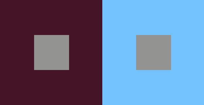
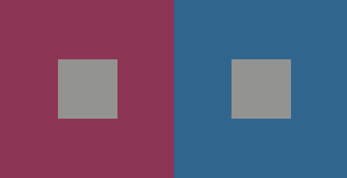
Look at the smaller squares below. Do they look like different colors?
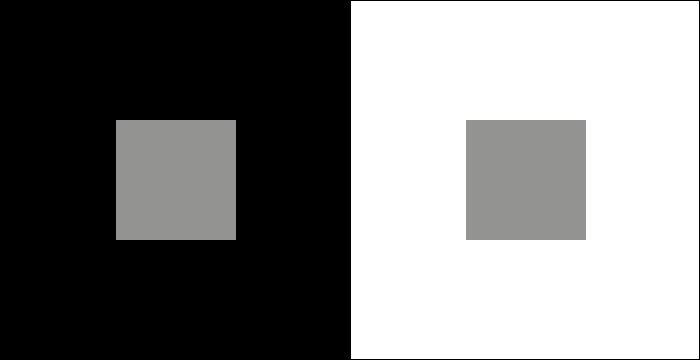
Actually they are the same color, it’s just that we perceive a color shift in them due to the colors they’re seen against.
There is no one formula to reduce simultaneous contrast since it depends on the colors you’re using, but to lessen this effect try changing the contrast between foreground and background by changing hue, saturation and/or value.
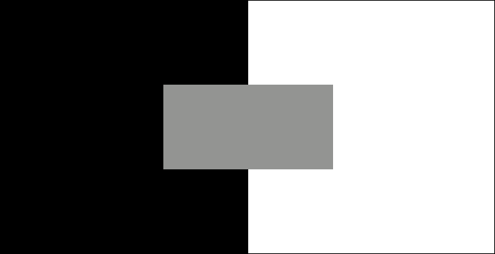
Contrast of Extension
Check out how these complementary colors contrast:
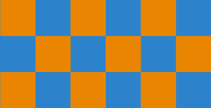
Now look what happens when we make the dots smaller. The contrast isn’t as hard on your eyes:

Because the dots and background are using opposing hues from the color wheel, they still have a maximum amount of complementary color contrast. However, changing the proportion of the color areas affects contrast too.
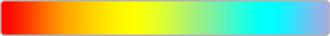
Rainbow Palettes
Be careful when using rainbow colors in your map, because they can make us perceive features that aren’t really there! Read more about that here.
Creating color schemes
Now that you know what to be aware of when picking map colors, learn how to put them together into complete palettes. In the next lesson we’ll show you how to choose the right ones for your map’s data!