A Million Walks in the Park
Scroll Down >

Using mobile GPS data to understand spatio-temporal public space usage and social interactions in the NYC public parks.
In 2020, there will be 20.4 billion connected “things” in use, up from 8.4 billion in 2017. From smartphones to sensors to appliances to stoplights, the exponential growth of connected devices is creating an overwhelming amount of data about what we do, how we do it, and where it happens.
We believe in the power of big spatial data + analysis to create meaningful discoveries of how people use and interact with spaces in their communities. In this project, we wanted to show how mobile GPS data can be visualized + analyzed to understand public space. However, these types of questions can be asked of almost any space, commercial or non-commercial, where big spatial data exists.
We visualized and analyzed over a million anonymized data points from mobile GPS data, looking specifically at how people spend time and interact with other people in New York City’s public parks.
Where are Shared Experiences
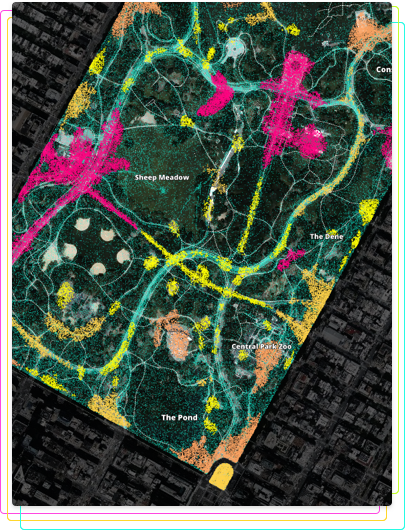
Mobile GPS data, and big spatial data in general, has the potential to identify shared experiences in spaces. By clustering spatial data, we are able to understand different regions of activities within two of the most popular public parks in New York City One, Central Park in Manhattan and Prospect Park in Brooklyn. The visualization below shows clusters of people based on what % of their time is shared with other people in that space. We then identified unique points of interest near each cluster that may have brought those groups of people together.
Explore the data yourself by clicking on the widgets to the right of the map.
What's Going on in Your Neighborhood Park?
Big spatial data can also help us explore and understand smaller public spaces, like local parks and natural areas. Below, we chose several local neighborhood parks and created similar clusters of points to identify hot spots and travel patterns. This type of data is vital for urban planners trying to understand how the park is used and what investments should be prioritized to make improvements.
Select the borough, park name, and whether you want to sort by hotspots or travel mode. Hover over the chart to filter data.
Borough
Park Type
Park Name
Map Type
Unique Visitors (in May)
Unique Visits (in May)
Most Popular Day to Visit
Average Dwelltime (min.)
Weekly Travel Patterns
Travel patterns
A few notes: Didn't find your park here? We included only those parks where there are more than 100 data points. The size of the dots in "hotspots" represents the overall dwelltime during that trip. Also, these stats are reflect of the data that we are using.
Which Parks Offer the Most Bang for Your Buck?
There are hundreds of parks in New York City’s five boroughs, ranging in size and number of visitors. While park size and park area are correlated, we found that the park sizes scale sublinearly to its visitor count. What does this mean? This means that, when the size of a park increases 10-fold, the number of visitors it sees increases only around 8-fold.
We’ve classified four different classifications of parks: Overachievers, Reliable Favorites, Hidden Gems, Big and Beautifuls.
Explore below to see where your favorites fall:
Overachievers do more work than they should. These smaller parks see more visitors per square foot than other parks. Well-known overachievers include: The High Line Park and Madison Square Park.
Reliable Favorites are the biggest, most well-known spots. These popular spots draw tourists from around the world and are favorite destinations for NYC residents. They include: Central Park, Prospect Park, and Coney Island.
Hidden Gems are smaller parks that may not get a lot of buzz of traffic, but are near and dear to their community’s heart. Think community playgrounds and other small community spaces.
The Big and Beautifuls are expansive areas that may not be as crowded as the reliable favorites. These include: Spring Creek Park and Bushwick Inlet Park.
About
How did we do the analysis?
Using mobile GPS data and open-source data from New York City Department of Parks and Recreation, we were able to extract individual trips within each park from mobile phone users that allowed us to generate spatial-temporal information such as travel speed, trip duration, hotspots, number of visitors, and shared experiences. We used several techniques to extract this information, such as a 1-dimentional range search to identify our trips, and the HDBSCAN algorithm to create our clusters.
How can I get similar data?
Our data came from LiveRamp, a mobile advertisement company. This data, however, has gone through some processing to be what you see here. Also, we'd also like to point out that this data does not represent all park-goers.
Team
- Lead Data Analysis and Visualization:
- Wenfei Xu
- Data Engineering:
- Stuart Lynn
- Maps:
- Mamata Akella
- Marketing:
- Devon Hopkins
Special thanks to our data provider Liveramp
Interested in learning more? Request a demo!