Hexagons for Location Intelligence: Why, When & How?


You’ve probably seen hexagon grids on maps, and maybe even created some of your own. But have you ever stopped to think about why? This is CARTO’s definitive guide to hexagon grids - what they are, why they’re so powerful, as well as how to use them.
The Basics of Spatial Grids - Regular vs Irregular Zoning
When you’re mapping with contiguous spatial polygons, there are two main zoning types: regular and irregular.
Regular zones retain the same shape and size over space (although this can vary slightly for global grid systems - keep reading to learn more!). These may be squares triangles or hexagons. Irregular zones are the opposite, with varying shapes and sizes - census tracts, counties and even countries fall into this category.

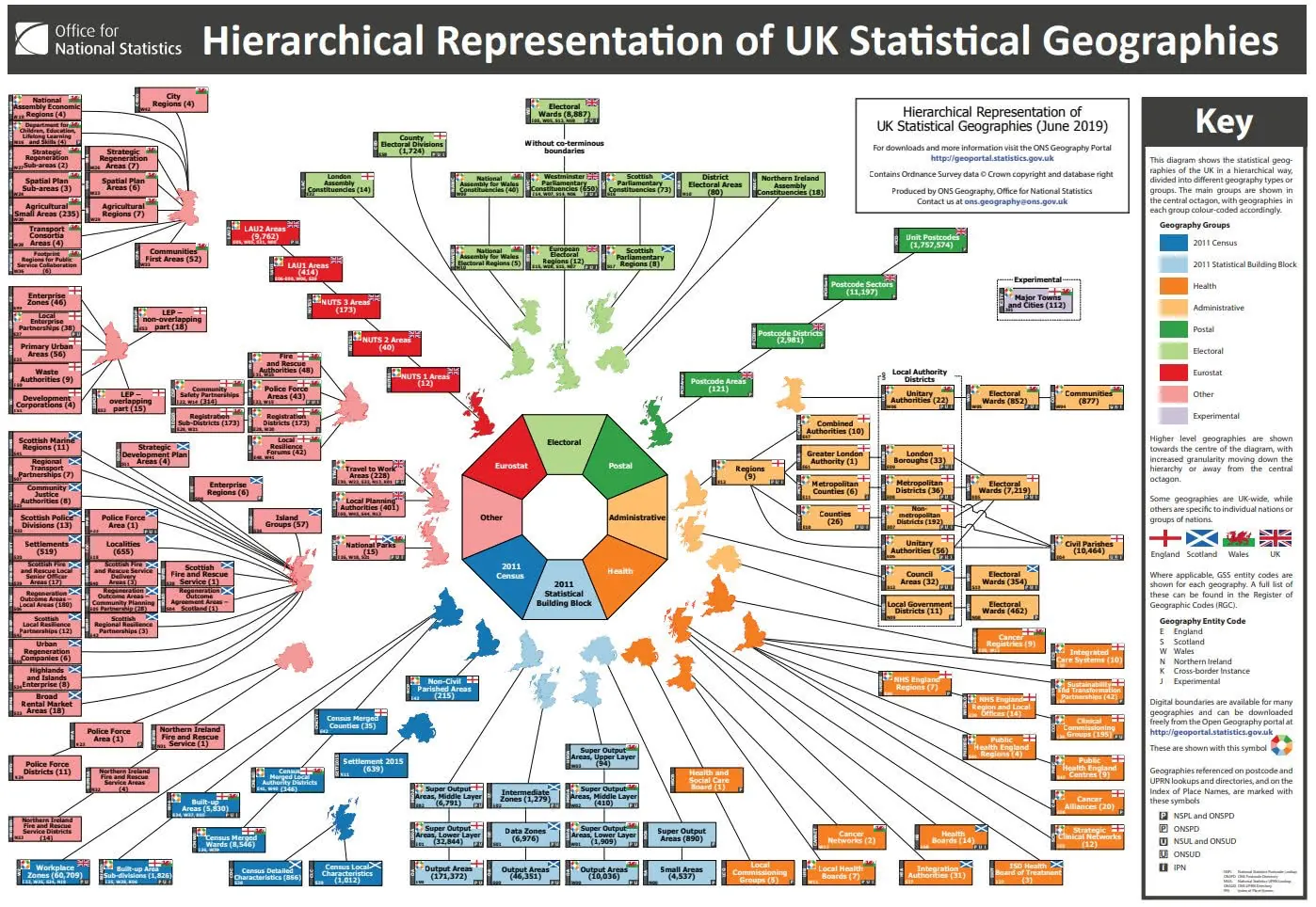
Most data in its raw form is collected at aggregated to and shared as irregular administrative zones. One of the immediate problems with irregular zones is, well… they aren’t all the same! The graphic below from the UK’s government statistics body the Office for National Statistics perfectly illustrates how complex administrative geographies can be. Regular zones are far easier for data scientists to work with as they are a great way of neatly collecting data from multiple zones into just one geography.
Another issue with irregular zones is that they don’t always make for “good” cartography. There are two main reasons why irregular zonal maps can be misleading - data boundary and perceptual bias.
Data Boundary Bias
Data boundary bias relates to skews in the data that can be caused by where boundary lines are drawn. Irregular data zones are not typically created or generated in an objective way but drawn and selected for specific objectives.
You may have heard of “gerrymandering” - where boundaries are manipulated with the intent of creating undue advantage for a party or group. This method could also be used to justify or evaluate policy. A boundary placed in “just” the right location could mean make-or-break for a new train station school or housing development. If you’re interested in learning more about the intricacies and quirks of administrative geographies (who isn’t!?) then you may enjoy CARTO’s blog on Census Oddities.

Perceptual Bias
Perceptual bias relates to how choices made by a cartographer can change the way the user understands the map’s message and data.
Let’s illustrate with an example. The maps below show the retail landscape of Inner London. Darker pink areas are where residents have better access to retail services as defined in the Access to Healthy Assets and Hazards dataset available to all CARTO users via our Spatial Data Catalog. This dataset also contains information on access to health services green and blue space as well as air quality ratings. This makes it an excellent source for understanding quality of life. Explore the interactive version here.
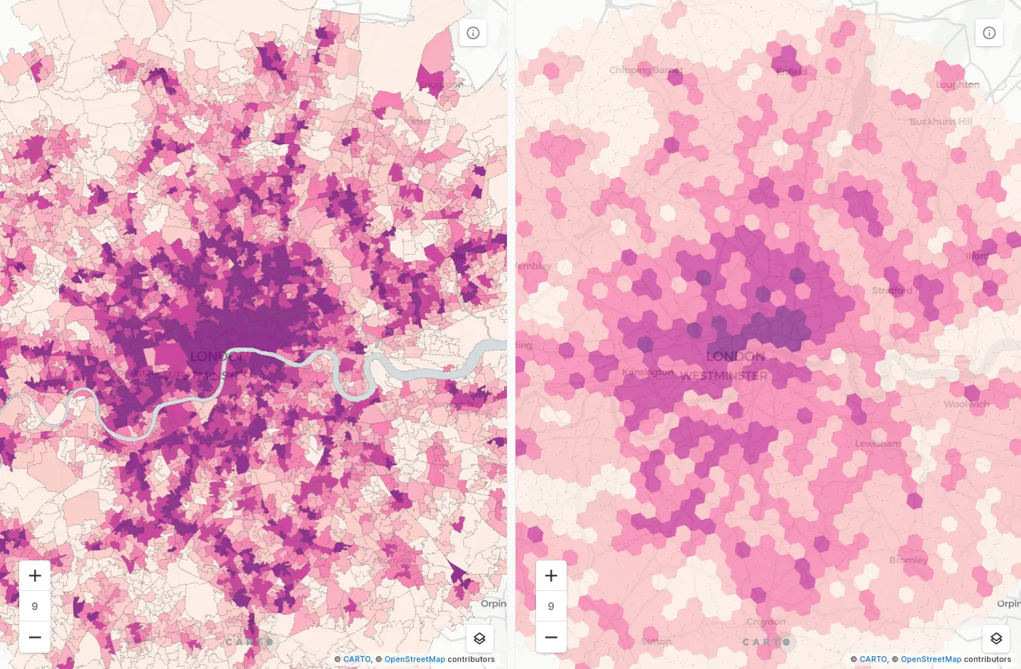
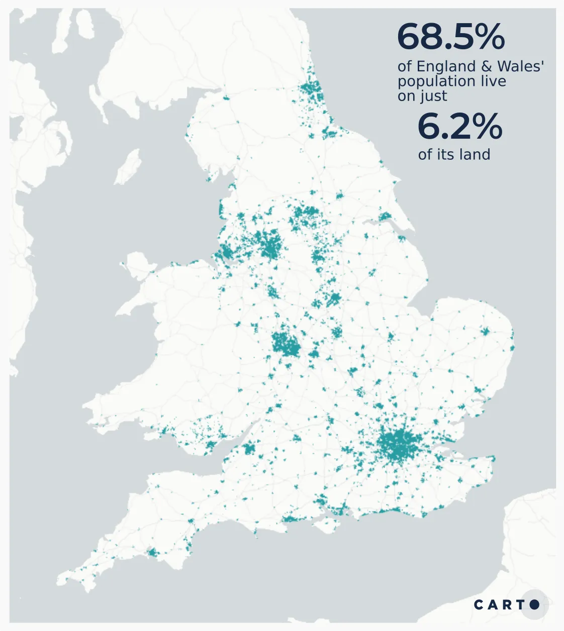
The map on the left shows the data in original irregular zones known as Lower Super Output Areas (LSOAs). These are one of England’s smaller administrative geographies, generally formed of around 1 500 people or 650 households. This means they vary massively in size: 69.4% of England & Wales’ LSOAs (equating to 68.5% of its population) cover only 6.2% of its total area. In this map it’s harder to see the data in smaller areas with high population densities whilst larger sparsely populated areas - such as parkland and industrial areas - dominate the map.
This perceptual bias is mitigated in the hexagonal map where we’ve enriched H3 resolution 8 grid cells, with the original retail access data to transform the data into a regular hexagon grid using tools from CARTO’s Analytics Toolbox - you can read more about how to achieve this later on. Learn more about regular vs irregular zones in our previous blogpost Stop Using Zip Codes for Geospatial Analysis.
Why Hexagons?
So now you’ve had some background on how using regular zones can be beneficial, let’s talk about hexagons in particular.
A key benefit of them is that they tessellate to form a regular, contiguous grid. Only two other shapes are capable of this; squares and triangles. However, hexagons have a number of advantages over these other shapes:
- The distance between the centroid of a hexagon to all neighboring centroids is the same in all directions.
- The lack of acute angles in a regular hexagon means that no areas of the shape are outliers in any direction.
- All neighboring hexagons have the same spatial relationship with the central hexagon, making spatial querying and joining a more straightforward process.
- Unlike square-based grids, the geometry of hexagons are well-structured to represent curves of geographic features which are rarely perpendicular in shape, such as rivers and roads.
- The “softer” shape of a hexagon compared to a square means it performs better at representing gradual spatial changes.
What Should You Consider When You Map with Hexagons?
Despite us professing the benefits of hexagons for mapping in this blog post, regular grids - and hexagons - aren’t always the optimal solution for your map. Some things to consider when deciding whether to use a hexagonal grid include:
- Loss of raw data. Aggregating data into a hexagon grid from its raw form means you may lose the raw values of the data. A census block will have an exact surveyed number of residents assigned to it whereas transformations to a different geography will be modeled.
- Boundary effects. A hexagonal map of a coastal area may show that population density is low along the coast. However the hexagon cell may actually contain large areas of sea, and the land-based population density may actually be very high. This could be mitigated by clipping the hexagon grid to the extent of the land or using a compact visualization with higher resolution hexagons located along the coast.
- Precision of data. Say you wanted to count the number of universities - represented as points - in each of your hexagon cells. Universities often cover large areas; it could be that your point feature sits in one hexagon cell but the university actually falls across multiple cells. It’s important to consider how precise your raw data is when performing these aggregations.
- Cell size. The size of your hexagons should be innately tied to the story you’re trying to tell with your map. What questions answers and - ultimately - decisions do you hope they’ll be reaching when using your map? If your map reader is interested in accident causality at a specific street junction, for example, there’s no point presenting them with a grid with 1,000 meter-wide cells.
A Global Hierarchical Grid System
One of the grid systems available via CARTO is H3: a multiresolution hexagonal global grid system with hierarchical indexing developed by Uber. Unlike standard hexagonal grids H3 maps the spherical earth rather than being limited to a smaller plan of an area. H3 grids provide a direct relationship between grid cells at different resolutions enabling extremely performant spatial operations. H3 grids are extremely well suited to machine learning and are ideal for users wishing to model flows and movement. The grids are available at 16 different resolutions, with the length of a single side measuring at its smallest 0.5 meters reaching to 1 108 meters at its largest.
Global grid systems like H3 provide a workaround to the longstanding geospatial problem of the storage of raster data. Storing raster data (as opposed to vector data - see our blog post here to understand the difference) in data warehouses is generally not possible. Utilizing continuous grids like H3 allows for a similar geographic model as raster data but whilst still being able to take advantage of more performant cloud-based data storage solutions.
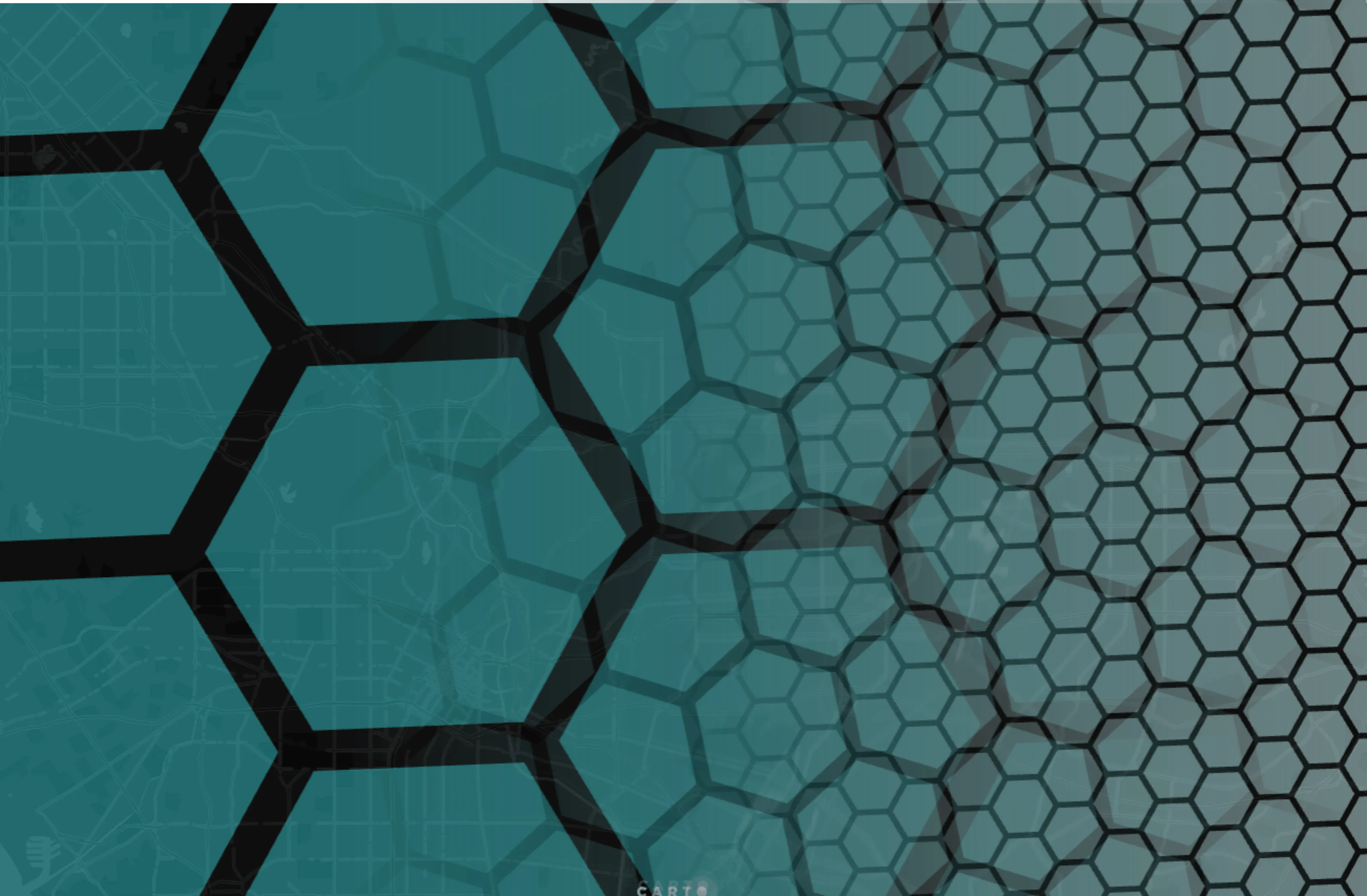
Hierarchical spatial indexing for multi-scale spatial analysis with H3 grids.
There are multiple methods of accessing H3 grids in CARTO for example the query below extracts all resolution 9 H3 polygons which cover the extent of Los Angeles county.
WITH
  LA AS (
  SELECT
    geom, do_label
  FROM
    `carto-data.ac_7xhfwyml.sub_carto_geography_usa_county_2019`
  WHERE
    do_label IN ("Los Angeles"))

SELECT
  h3
FROM
  UNNEST(`carto-os`.carto.H3_POLYFILL( (
      SELECT
        ST_UNION_AGG(geom)
      FROM
        LA) 9)) h3
CARTO users can access pre-enriched H3 grids with a wide range of variables including:
- Population by age band and gender
- Elevation
- Average monthly temperature precipitation solar radiation wind speed and vapor pressure
- Number of POIs by theme including retail transportation food & drink healthcare and tourism
Users of CARTO can also take advantage of our Analytics Toolbox to perform complex, reproducible and scalable analysis on their gridded data. We have developed a variety of H3-specific functions - keep reading to see this in action!
Want to know more about Spatial Indexes like H3? Download our free ebook Spatial Indexes 101!

Aggregating Data to Hexagon Grids
Methods for aggregating data to regular grids are numerous and depend on a variety of factors such as whether the aggregate variables are extensive (e.g. total population in a hexagon) or intensive (e.g. average population income). Methods may include counting summing or averaging the feature/variables based on their spatial relationship with each hexagon. This could include being within intersecting or being within a distance threshold.
Traditional aggregation methods would typically be performed with tools that involve multiple processes and even software packages. They would also commonly generate a lot of “dump” data i.e. data files which represent the output of one stage of the analysis but once that stage is complete are no longer useful.
These downsides are eliminated when working with cloud-native location analytics and Spatial SQL.
Using Spatial SQL for Web-Based Aggregations
Spatial SQL is a “rising star” in GIS, offering a versatile ,efficient and scalable way of analyzing data - you can read more about the benefits and use cases for Spatial SQL in our “The State of Spatial SQL” report. CARTO’s Location Intelligence solutions allow for in-app, in-browser SQL querying eliminating the time-consuming error-ridden process of export-transform-load - read more.
CARTO has developed a series of enrichment tools for easy and seamless transfer of data from irregular geographies to regular grids. This eliminates the need for multiple processes, software or “dump” data.

You can see this in action below. We’ve used the DATAOBS_ENRICH_GRID() functionality from our analytics toolbox (available for BigQuery and Snowflake warehouses) to enrich our resolution 9 H3 grid with some relevant data. This functionality allocates these variables to our grid based on the % area of the raw dataset which falls within each hexagon. There are multiple versions of this enrichment tool available depending on the type of geometry you’re enriching and whether the source data is derived from our data catalog or your own data sources.
We can also use this tool to enrich our grid with data from multiple layers at one time; here we’re taking the total population and number of financial services from the Sociodemographics dataset and average retail services score from Access to Healthy Assets and Hazards.
CALL `carto-un`.carto.DATAOBS_ENRICH_GRID
('h3',
R'''
SELECT * from `myproject.CARTO.h3_res9`,
''',
'h3id',
[('total_pop_2e5ab6bf', 'sum') ('financial_3e704873', 'sum') ('r_exp_a715e17a', 'avg')],
NULL,
['`myproject.CARTO.h3_output`'],
'carto-data.ac_rpvavroy')
Both of these datasets were originally in Output Area format, of which there are 118,408 in total. So that’s a calculation of 118,408 x 2 aggregated to 16,906 H3 cells.
In 26 seconds…

Full documentation on our analytics toolbox, H3 and enrichment capabilities can be found here - you can also follow this tutorial for more in-depth, step-by-step enrichment instructions.
Thanks for Reading About Using Hexagons for Location Intelligence!
I bet you never thought there was so much to know about hexagons! If you’re completely hooked and cannot WAIT to make your first hexagonal map, sign up for a free two-week trial to get started!