How to calculate spatial hotspots and which tools do you need?


As someone who works with spatial data, one of the most common types of questions you'll be asked will be about spatial trends or patterns. This is typically framed as the question "where is variable X highest and lowest?" - variable X being a quantitative variable such as population density, pollution or revenue. While these questions can be explored cartographically - such as through choropleth maps which depict the value of a variable through color - it is often important to go beyond this with a quantitative measure of these spatial trends; hotspot analysis.
What is hotspot analysis?
Hot spot analysis identifies and measures the strength of spatial patterns. This is the difference between being able to say "generally population density looks higher near the river" to "there are statistically significant levels of high population density near the river." What this means is that you can be confident that this hotspot is significant enough to draw conclusions from - relative to patterns in the overall dataset and sample size.
While hotspots are an incredibly useful tool across all sorts of Location Intelligence users and industries, they can be confusing to calculate and - importantly - interpret. One of the areas of confusion can be exactly which hotspot tool is most appropriate for your use case - as many are available.
In this post we're going to explain the differences between two of the most common and popular spatial hotspot tools - Getis-Ord* and Local Moran's I - as well as guide you through how to calculate and interpret these. Make sure you sign up to our free trial to have a go yourself!
Getis-Ord* vs Moran's I: what do they do and which do I need?
First - let's start with Getis-Ord. Normally if you hear the words "hotspot analysis" then what is really being referred to is Getis-Ord. Getis-Ord* computes hotspots by taking the user-defined neighborhood of each feature in a table and calculating whether the values within that neighborhood are significantly higher or lower than across the entire table. The result of this analysis is a GI* value.
Positive values indicate that the neighborhood values are significantly higher than across the entire table - i.e. it is a hotspot - and negative GI* values indicate the reverse.
Local Moran's I - sometimes referred to as cluster outlier analysis - takes this further. Like Getis-Ord* this process starts by looking at whether the values of a feature's neighborhood are significantly higher or lower than across the entire dataset. However, what happens next is slightly different.
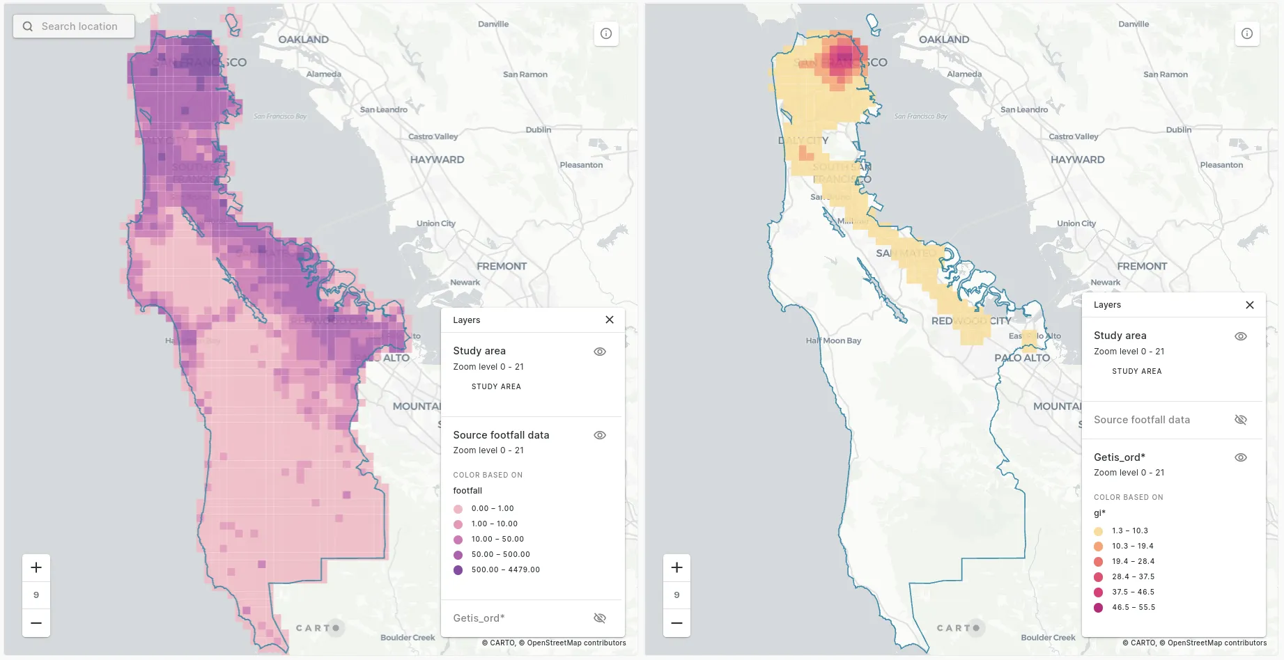
Hotspots of footfall in Los Angeles. Source: Unacast.
Open the map in full screen here (recommended for mobile devices). Local Moran's I then compares each cell to the values just within its neighborhood, to see if its values are significantly different than its neighbors. This allows you to identify not just hotspots and coldspots but outliers within these.
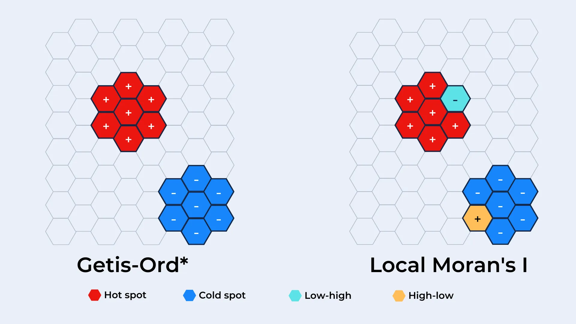
Each cell is then sorted into a quad; high-high and low-low quads are cells with similarly high or low values to the rest of their neighborhood. High-low features have unusually high values compared to their neighbors, while low-high is the reverse.
So which do you need?
Well if you just want to know where there are clusters of high and low values - such as a high number of traffic accidents - then Getis-Ord is for you. If - in addition to this - you want to identify outliers within these trends (such as areas with a high number of traffic accidents in areas where these are typically fewer) then you will want to use Local Moran's I. If this is the case then you may be thinking "well I may as well always just use Local Moran's I then." However, Local Moran's I takes a much longer time to process - so it's not always worth running if you don't need that extra level of insight.
Open the map in full screen here (recommended for mobile devices).
The visualization above is a comparison of the results of Getis-Ord* (left) and Local Moran's I (right) for the same dataset; Unacast human mobility data in San Francisco. Want to learn how to run this analysis? Keep reading!
How to hotspot
In the following examples, we're going to be investigating patterns of footfall across the counties of San Francisco and San Mateo, California. This data from UnaCast can be accessed as a premium subscription for over 80 countries from our Spatial Data Catalog or small sample areas are available free of charge.If you'd like to follow along make sure to sign up for a free CARTO trial too!
Preparing your data
Prior to running either Getis-Ord* or Local Moran's I data should first be converted to a regular geography i.e. where all features are broadly the same shape and size. This means that the analysis won't be skewed by the size or shape of the original features - you can read more about the benefits of doing this here.
Our hotspot tools are geared up to take advantage of Spatial Indexes; these are global hierarchical grids which use numerical references to geolocate them, rather than long geometry strings. This makes them much more efficient for analyzing and storing big data - and ideal for complex calculations like hotspot analysis!
You can convert your data into a Spatial Index such as H3 or Quadbin using the enrichment tools in our Analytics Toolbox. Our footfall data is already in a Quadbin format so we're good to proceed with the analysis!
Running Getis-Ord*
Both of these hotspot tools leverage the power of Spatial SQL for performant and iterative analytics. If you're new to SQL check out CARTO Academy for resources to help get you started!

The query below runs Getis-Ord in three steps.
- Selects the input table created in the previous section - "input."
- Runs Getis-Ord - "getis_ord."
- The result of step 2 is a nested table so to be able to visualize this on a map we need to unnest it.
--Select input data
 input AS (SELECT quadbin  footfall FROM yourproject.yourdataset.footfall_quadbins)
–Run the Getis-Ord* function
getis_ord AS (SELECT
  carto-un.carto.GETIS_ORD_QUADBIN(
    ARRAY_AGG(STRUCT(quadbin, footfall)),  3, ’triangular’) AS output
FROM input )
–Unnest the results
SELECT unnested.INDEX AS quadbin,  unnested.p_value,  unnested.gi
FROM getis_ord,  UNNEST(getis_ord.output) AS unnested
WHERE p_value <=0.1
There are two parameters you need to be aware of in step 2 (the “getis_ord” CTE).Firstly, there is the k-ring - here we’ve used 3. This is the size of the neighborhood - the area around each cell which will be taken into account to compute the Gi* value. This is measured in “k-rings.” A k-ring value of 1 includes the 8 cells (or 6 for a H3 index) which immediately border that cell. A value of 2 includes the cells which border those immediate cells, and so on.
Secondly, there is the kernel function (in the example we’ve used “triangular”). This function describes the spatial weights given to cells across the k-ring; you can define how much their proximity to the input cell affects the outcome of the analysis. The options are:
- Uniform - all cells within the k-ring have the same weighting.
- Triangular quadratic quartic and gaussian - for all of these the cells closest to the origin cell have the highest weight, with cells further away having lower weights. The most extreme of these is triangular whilst gaussian has more gradual changes to the k-ring weights; the others lie in between.
Learn more about kernels here or check out the full Getis-Ord* documentation here.
Interpreting the results of your Getis-Ord* analysis
Your output table will include two variables, both of which you’ll need to use to interpret your results.
- Gi - this is the GI* value. Positive values here indicate a strong spatial clustering of positive values relative to the wider dataset while negative values indicate the reverse.
- P_value - this is the significance value which may allow us to reject (or forces us to accept!) the null hypothesis of our analysis. So if our null hypothesis was “there is no spatial clustering of footfall levels in San Francisco” then where cells fall under a set threshold we can reject this. Typically that threshold will be 0.01 or 0.05 associated with a confidence level of 99% or 95% that we are right to reject this hypothesis.
What does this mean? If a cell’s p value is lower than your confidence threshold, then you can use that value to determine how intense the cluster is (with values closer to 0 being more intense). The GI* score can be used to determine if your location is a hot or cold spot.
Our top tip? Use a LEFT JOIN to join your output index back to the source data, so you can easily interpret what is driving the results. Check out the results of our example below!
Open the map in full screen here (recommended for mobile devices).
Running Local Moran’s I
The syntax for Local Moran’s I is pretty similar to Getis-Ord. You’ll want to select your input data, run the Local Moran’s I function (structuring your input data as an array) and then unnest the results to visualize this. However, there are a couple of different and additional parameters to select.
WITH
–Select input data
input AS (SELECT quadbin, footfall FROM yourproject.yourdataset.footfall_quadbins)
–Run the Local Moran’s I function
getis_ord AS (SELECT
  carto-un.carto.LOCAL_MORANS_I_QUADBIN(
    ARRAY_AGG(STRUCT(quadbin footfall)),  3, ’exponential’, 5) AS output
FROM input )
–Unnest the results
SELECT unnested.INDEX AS quadbin,  unnested.psim,  unnested.value,  unnested.quad
FROM getis_ord, UNNEST(getis_ord.output) AS unnested
WHERE psim <=0.1
The four required parameters are:
- The input (e.g. quadbin.footfall).
- The k-ring distance (e.g. 3).
- The distance decay function - similar to the kernel function in Getis-Ord*, this dictates the spatial weights assigned across the k-ring. The options are uniform inverse inverse square and exponential.
- Number of permutations Even if a dataset exhibited complete spatial randomness (CSR), some degree of clustering is likely to be observed. Here, a permutation is where a Local Moran’s I value is calculated for one randomly generated datasets. This value is compared with the value for your input dataset and a simulated p-value (psim) is generated. A low psim value means that the proportion of random datasets that display more clustering than your input dataset is small. The higher the permutation value the more precise the outcome. However, there is a significant trade-off here with processing time.
Interpreting the results of your Local Moran’s I analysis
Like the Getis-Ord* p-value, the psim value generated for Local Moran’s I allows you to accept or reject the null hypothesis of your analysis. A low value allows you to conclude that there is more significant clustering in your dataset than in all of your permutations of randomly generated datasets.
In addition to the psim value, the following outputs will be generated for each cell of your dataset:
- The Local Moran’s I Spatial Autocorrelation Value - positive values here indicate neighboring cells which have similarly high or low values, whilst negative autocorrelation values indicate dissimilar neighboring inputs.
- The results of randomization tests: Conditional randomization null - expectation (EIc) Conditional randomization null - variance (VIc) and Total randomization null - expectation (EI).
- The Quad; this value (from 1-4) indicates the cell’s similarity or dissimilarity to surrounding cells, where High-high = 1 Low-low = 2 Low-high = 3 or High-low = 4.
Open the map in full screen here (recommended for mobile devices).
Did you enjoy learning about how you can use the different types of hotspot analysis to enhance your Location Intelligence workflows? Why not check out the rest of the statistics module of our Analytics Toolbox for further Spatial Data Science techniques or head over to CARTO Academy to learn more?