Upcoming and most watched webinars
BI & Analytics
Making mobility analytics accessible: Unlocking insights with Agentic GIS
Simon Wrigley, Senior Solutions Engineer at CARTO
Sumesh Jagtani, AI GTM Lead at Google Cloud
Tim Rains, Lead Geospatial Data Scientist at BT Group

.png)
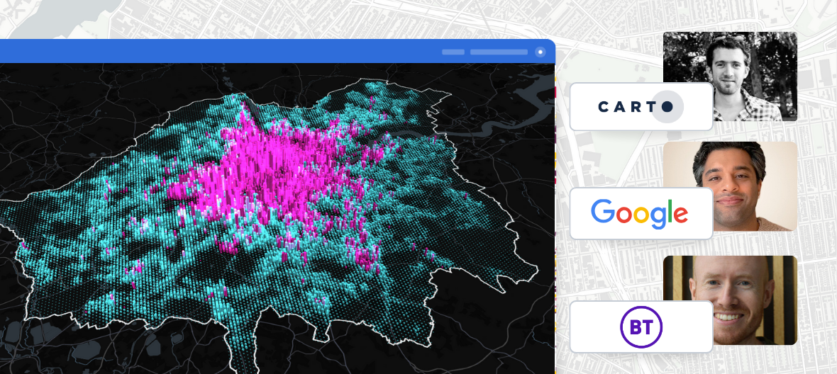
Cities & Government
Smarter Government, Safer Citizens: The Power of AI in Geospatial Analytics
Ryan Miller, Solutions Engineer at CARTO
Jeremy Malczyk, Cloud Geographer at Google Public Sector
Data Science
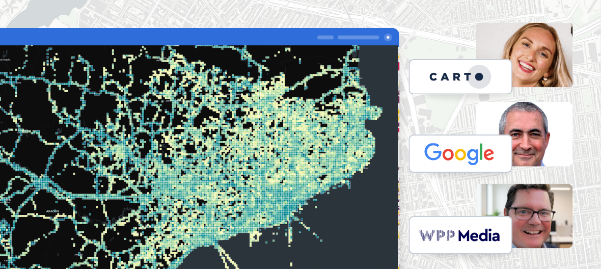
OOH Advertising
Elevating Ad Targeting with CARTO and Google BigQuery: How WPP Media Canada Boosted Precision and Productivity
Eva Adler, Product Marketing Manager at CARTO
Tom Cannon, Head of Data Ecosystem Innovation at Google
Patrick Booth, Director of Insights & Solutions at WPP Media
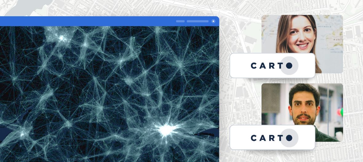
Data Science
BI & Analytics
Agentic GIS: Turning CARTO Workflows into MCP Tools
Ana Manzanares, Senior Product Manager at CARTO
Ernesto Martínez Becerra, Principal Product Manager at CARTO
Data Science
BI & Analytics
Pixels to Predictions: Geospatial AI with Google AlphaEarth Foundation Models and CARTO
Lucía García Duarte, Data Scientist at CARTO
Katelyn Tarrio, Earth Engine Solutions Scientist at Google

Financial Services & Insurance
BI & Analytics
Beyond the Balance Sheet: Using Geospatial AI to De-Risk Investments, Select Sites & Value Assets
Eva Adler, Customer Success Engineer at CARTO
Anand Singh, VP, Location Intelligence and GenAI Property Insights at Cotality
Sully McConnell, Head of Insurance at Snowflake

Data Science
BI & Analytics
Building More Accurate Spatial Models with Google PDFM Embeddings in CARTO
Miguel Alvarez, Lead Data Scientist at CARTO
Gautam Prasad, Staff Software Engineer at Google Research

BI & Analytics
Transport & Logistics
Final Verdict: Data Lake vs Delta Lake When Performing Geospatial Analytics with Overture Maps
Michael Johns, Geospatial Specialist Leader at Databricks
Gideon Singer, Solutions Engineer at CARTO
Drew Breunig, GERS Evangelist at Overture Maps


Transport & Logistics
Werner's Geospatial Revolution: Enhancing Fleet Safety with Advanced Spatial Analytics
Kirsten Mickow, Customer Success Engineer at CARTO
Jeff Walters, Sr Director Business Analytics at Werner

BI & Analytics
Financial Services & Insurance
Mapping Financial Services: 5 Ways to Use Spatial Analytics
Helen McKenzie, Geospatial Advocate at CARTO
Ryan Miller, Solutions Engineer at CARTO

BI & Analytics
Financial Services & Insurance
It’s time to go real-time: live spatial analytics with CARTO
Helen McKenzie, Geospatial Advocate at CARTO
Ryan Miller, Solutions Engineer at CARTO

BI & Analytics
Financial Services & Insurance
Analyzing the Earth at Scale
Gennadii Donchyts, Cloud Geographer at Google
Helen McKenzie, Geospatial Advocate at CARTO
.png)
Development
CARTO for Developers: Building Custom Maps and Widgets with Ease
Alex Tena, Senior Product Manager at CARTO
.png)
BI & Analytics
Best Practices for Stunning Geospatial Analysis with CARTO in Snowflake Native App
Javier de la Torre, CSO & Founder at CARTO
Fawad A. Qureshi, Global Field CTO ST Snowflake
.png)
BI & Analytics
CARTO and Databricks Unveil the First-Ever Geospatial Native Lakehouse Integration
Milos Colic, Lead Software Engineer at CARTO
Michael Johns, Geospatial Specialist Leader at Databricks
.png)
BI & Analytics
Data Science
GenAI to GeoAI: Using LLMs in Geospatial Analytics
Dr. Ali Arsanjani, Director of Applied AI Engineering at Google
Nahid Pervez, Director, Mapping and Localization at Ford
.png)
Data Science
Decision Making With Spatial Statistics: 5 Top Techniques
Helen McKenzie, Geospatial Advocate at CARTO
.png)
BI & Analytics
Visualizing Massive Data: 5 Tips for Impactful Maps & Dashboards
Helen McKenzie, Geospatial Advocate at CARTO

BI & Analytics
Beyond Tableau and Power BI: Elevating Spatial Data Analytics
Matt Forrest, Field CTO at CARTO

BI & Analytics
Master Raster Data Analytics with CARTO & Snowflake
Jaime Sánchez, Technical Lead at CARTO
Fawad Qureshi, Global Field CTO at Snowflake

BI & Analytics
Databricks & CARTO: Exploring Enhanced Geospatial Capabilities
Javier de la Torre, CSO & Founder of CARTO
Milos Colic, Platform APIs Lead at CARTO

Development
Building scalable, cloud native geospatial apps with CARTO and deck.gl
Alex Tena, Product Manager

Utilities & Telco
BI & Analytics
No code spatial analysis with CARTO Workflows templates
Matthew Pazoles, Technical Account Manager

BI & Analytics
Boosting Geospatial Analysis: H3 in CARTO & Snowflake
Marta Bescansa, Solutions Engineer at CARTO
Oleksii Bielov, Product Manager at Snowflake


Utilities & Telco
Enhancing Data Accuracy for Broadband Providers with Geospatial Analytics
Matt Forrest, Field CTO at CARTO


BI & Analytics
Data Visualization & Storytelling with Maps: Tips, Tricks & Best Practice
Helen McKenzie, Geospatial Advocate
CATEGORIES
Highlights
Thank you! Your submission has been received!
Oops! Something went wrong while submitting the form.


Most recent webinars
.png)