Builder Pop-Ups Overview
Describes how to enable pop-up information windows for select data in CARTO Builder.
A pop-up information window provides overlay interactivity on your map visualization, enabling you to display select columns from your dataset when a point, line, or polygon is selected. This is a useful way of communicating data with a viewer. This guide describes how to enable pop-ups for a map layer.
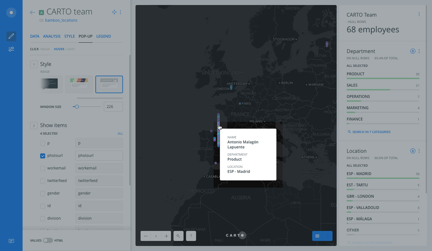
The example visualization above displays where CARTO employees are located around the world, and includes widgets to explore the data. Both click and hover pop-ups are applied.
- When you hover over points, a pop-up information windows appears and displays information about the employee.
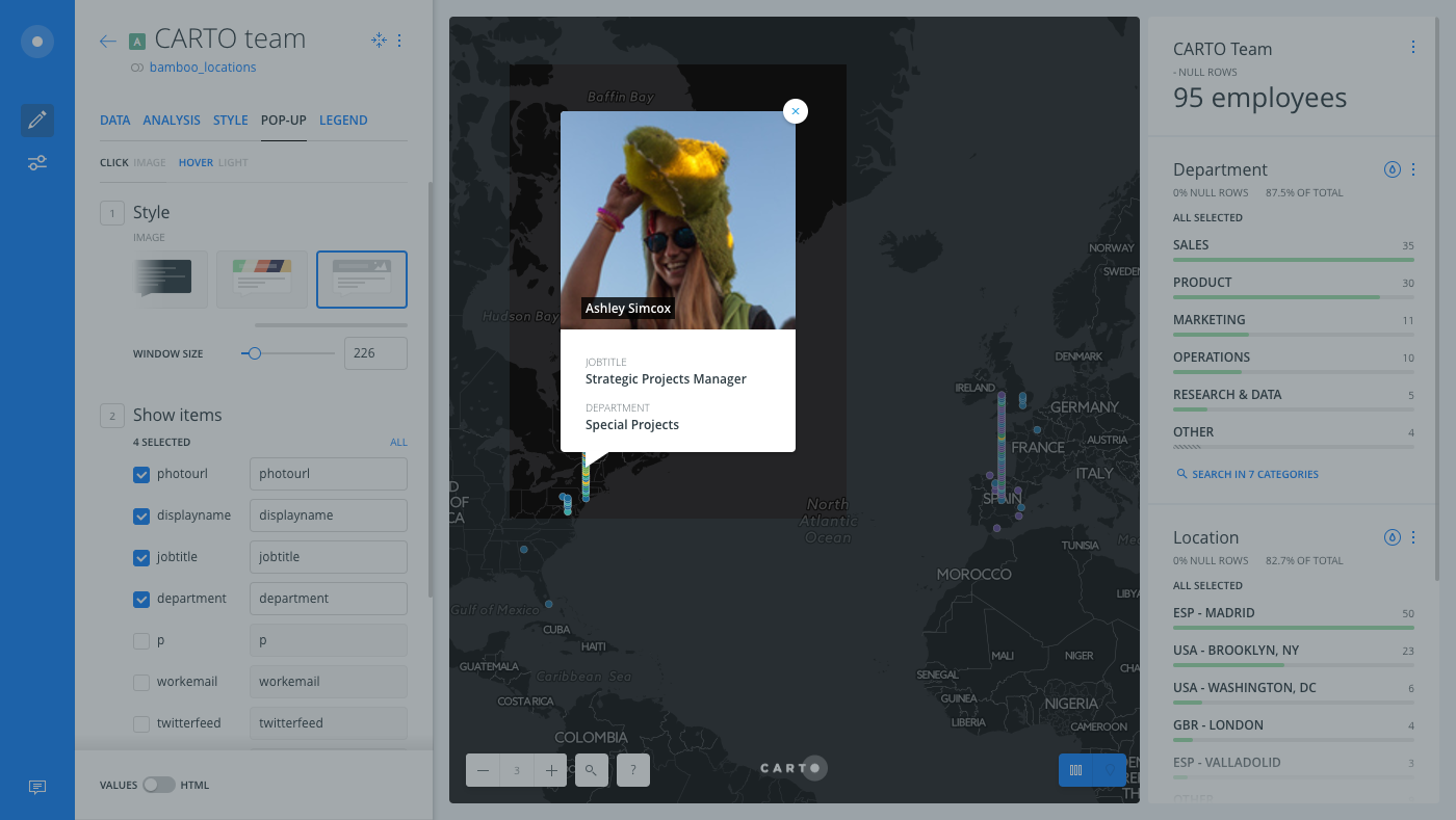
- When you click on a point, the pop-up information window displays an image of the selected employee.
Selecting Pop-Up Styles
You can define whether the pop-up appears with the click or hover action, choose what data appears in the pop-up information window, rename the items that appear, and style the pop-up color and width.
This guide displays an example of how to apply pop-ups to a map layer. CARTO applied our own internal, human resources data to create this map. Try creating pop-ups with one of your own imported datasets.
-
From the selected map layer, click the POP-UP tab.
There are two subtabs, CLICK and HOVER, which display the selected pop-up style applied. You can define which action to use, or apply both click and hover pop-up information windows for one map layer. CLICK pop-up options appear by default.
For this guide, both actions will be applied to the layer.
-
Select the HOVER subtab.
-
Select the LIGHT style for the pop-up.
There are several different pop-up styles to choose from. The LIGHT and DARK pop-up styles contain predefined background colors. The COLOR pop-up style is the same as the LIGHT style, except that you can apply a custom color to the header of the pop-up information window. The IMAGE pop-up style is the same as the LIGHT style, except that you can apply an image url to the header of the pop-up information window.
-
Use the checkbox next to the name of the column that you want to display in the pop-up information window.
Double-click next to the column name to rename how the item appears in the pop-up.
The following image shows some of these options selected, and how the hover pop-up appears in the Map View of Builder.

Pop-Ups with Images
You can include an image in the header of your pop-up window, as long as the map layer includes a column with valid image urls. This is useful if you want to include a company logo, or a customized image in the header of the pop-up information window. For this guide, we will show a picture of the selected employee when clicked.
-
From the POP-UP tab, select the CLICK subtab.
-
Choose IMAGE as the pop-up style.
-
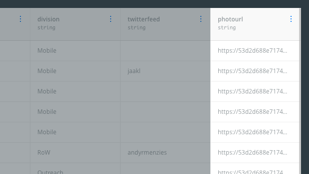
When using images in pop-ups, select the checkbox next to the column that contains the image url.
- `NON-VALID PICTURE URL` appears in the pop-up if there is no image associated with the selected data. Image URLs need to be stored as a column in your table. Ensure that the map layer contains a `string` column in the dataset, and define the column with the URL of the image you want to show in the pop-up header.
- View the properties of the image to get the valid image URL. For example, right-click on an image and _Copy Image Address_, or _Open Image in New Tab_, to view and copy the image url to be used as the pop-up image value. (Depending on your browser, options to access image properties may vary).

The following example shows the pop-up image that appears when you click on a point.

If multiple columns are selected for an IMAGE pop-up information window, the selected image URL column must be the first item selected on the POP-UP tab. You may need to click and drag to reorder how the selected columns appear.</ul>
Custom Pop-Ups with HTML
For advanced users who are comfortable using HTML, you can edit the layout of the pop-up information window, write static content, and embed external resources directly in the HTML code for the selected map layer.
-
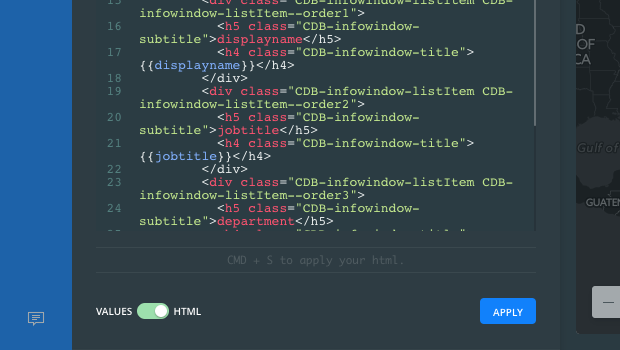
From the POP-UP tab, click the slider button from VALUES to HTML.

The default CARTO pop-up styles are predefined in the stylesheet code and are based on Mustache templates. By accessing the HTML templates directly, you can use the full power of the library to create custom pop-ups. Reference the open source CSS library for the latest CARTO stylesheet code for pop-ups. Optionally, you can include your own CSS as part of the stylesheet.
Pop-Up Behavior
Note the following behavior when using pop-up information windows.
-
Pop-up information windows are not available when map layers are animated.
-
When enabling pop-ups for multiple layers, the order of the layers reflects the order in which they are rendered. You may need to adjust the styling for each layer to accommodate conflicting features, and/or change the hierarchical order of how layers appear. For example, if you have pop-ups enabled for two layers, only the top layer pop-up is displayed in areas where the bottom layer is covered.
-
If you have the HOVER pop-up action enabled, the hover feature is automatically disabled when viewing visualizations on mobile devices. This is intentional by design, so as not to interfere with the scrolling behavior on phones.
-
If you are including an IMAGE style pop-up information window, your connected map layer must include a column with valid image urls in order to work. The image values must be public image URLs, not the website URL that the image is located on. For details, see Pop-Ups with Images.
-
If you are working on your application through a connection that is behind a firewall or proxy, some requests may be blocked and the pop-up information window may not appear. Ensure that you are using an HTTPS connection, which encrypts your data so that your firewall or proxy will not block these specific CARTO requests.