Builder Widgets Overview
Describes how to add interactive widgets for viewing your map data in CARTO Builder.

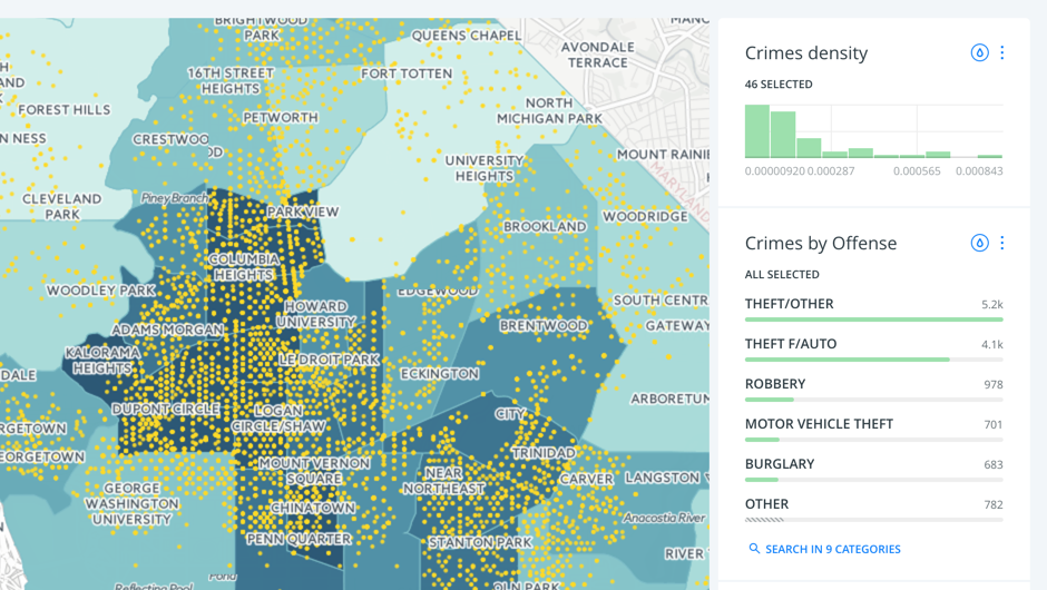
This guide describes how to add interactive widgets for viewing your map data in CARTO Builder. Widgets are embedded with your visualization and do not modify your original data, they simply allow you to explore your map by selecting targeted filters of interest.
Widgets are an integral part of CARTO Builder’s workflow. Widgets not only filter data but they also update the styling of your visualization, and initiate analysis.
Add Widgets
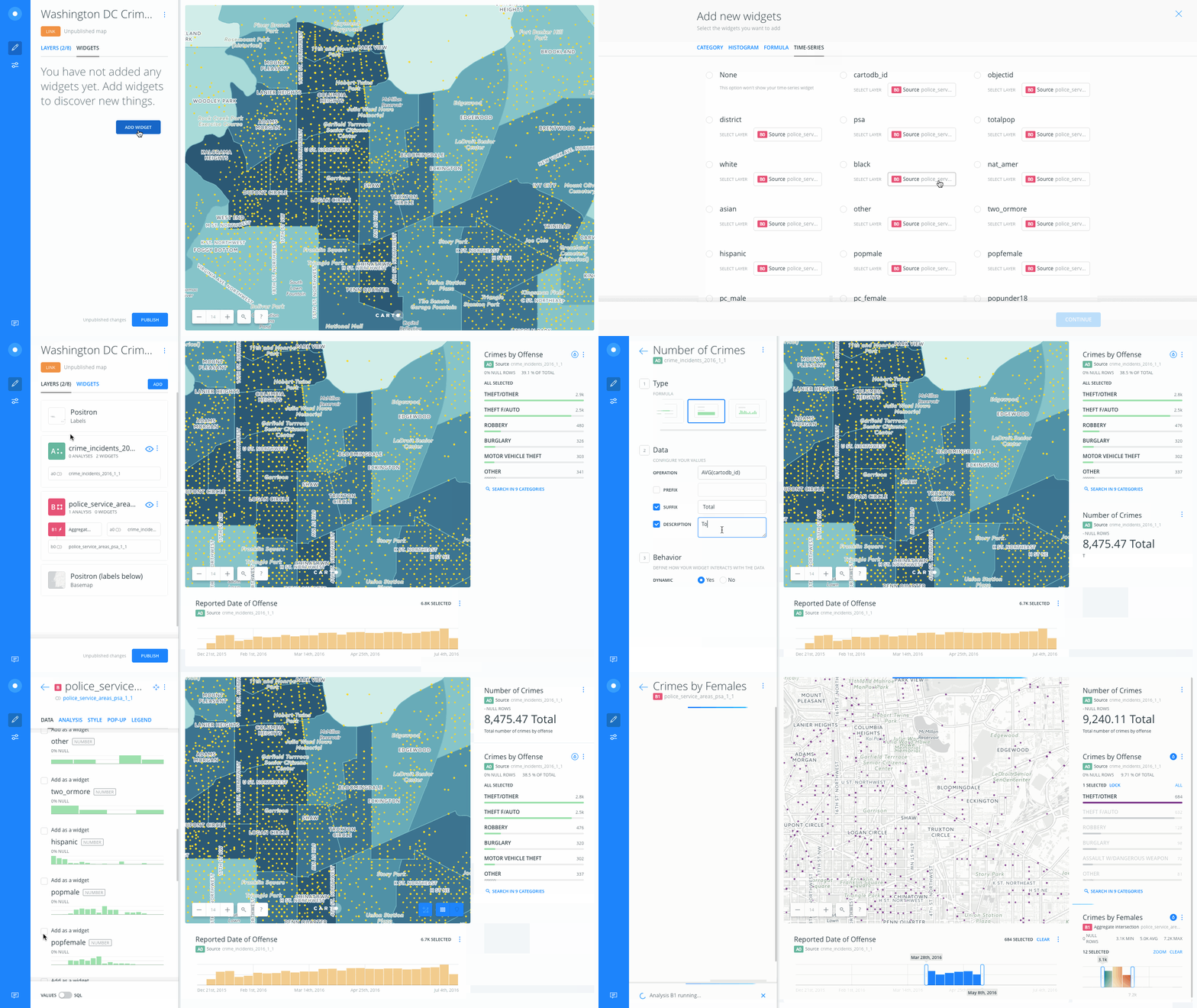
You can add widgets through the WIDGETS list of Builder, or by clicking on one of the available columns that appear under the DATA tab for a selected map layer.

Widget Types
The following types of widgets are available to customize:
-
Formula widgets calculate aggregated values from numeric columns in AVG, MAX, MIN, SUM, and COUNT. These are useful for viewing analysis results.
-
Histogram widgets examine numerical values within a given range, distributed across your data map. You can configure values by a data column and define the number of buckets.
-
Category widgets enable you aggregate the data following different methods, and create categories.
-
Time-Series widgets enable you to display animated data (by aggregation) over a specified date range, or display and filter a static widget of numbers over time.
You can apply temporary auto styling from the widget, to better visualize your selected results. Click Auto style to apply a new temporary color scheme to the widget data. As you continue to filter your data by using widgets, the color scheme applied during the auto styling is maintained as the map recalculates, and renders based on the parameters you set with the widgets.