CartoCSS Compositing Operations
How to Use Composite Operations in CartoCSS
In the last lesson we saw how colors are used to explain your map’s data. We learned about contrast, which is used well in this London crime incident map to make markers stand out against the basemap:
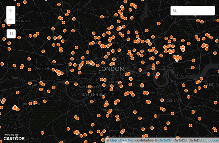
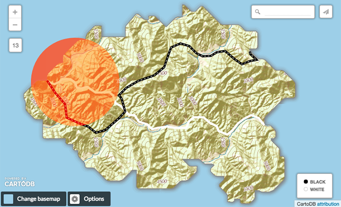
This dataset has a lot of overlapping markers though. The default marker strokes show us that overlaps exist, but because a solid fill color is used with markers of this size it’s unclear how many are overlapping. That makes it harder for our map readers to compare areas and get a sense of which has more crime incidents.
We can use color in an even better way to fix this though. Look what happens when we choose multiply from the simple wizard’s composite operation pulldown menu:
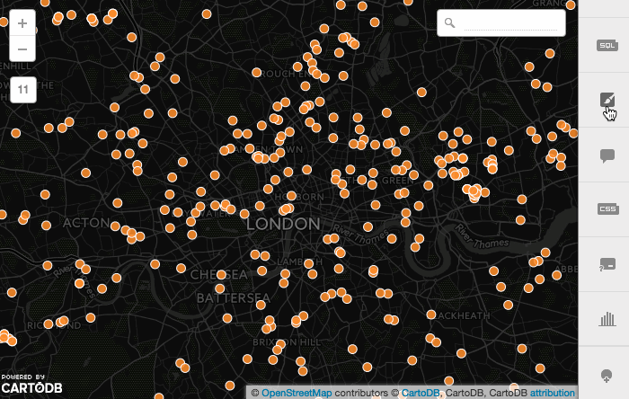
The areas of greatest density stand out easily because they’ve become red. In the first map above overlapping colors were kept separate, like laying one piece of opaque colored paper on top of another. In the second map the overlapping parts effect each other. Hue, saturation and brightness change in the denser areas based on a blend of color information from each overlapping layer.
Composite operations are blending modes for your map layers. They fall into two main categories: color and alpha, and can be applied to all non-basemap elements in your CARTO map by adding a line like this to your CartoCSS code:
comp-op: multiply;Comp-ops can also be applied to different elements individually, like markers, polygons, lines or text:
marker-comp-op: multiply;
polygon-comp-op: color-burn;
text-comp-op: screen;
The layer (or text) that you choose the composite operation in is called the source. It’s composite operation is applied to each layer beneath, which are called destination layers. In CARTO the source layer itself needs to have a color fill, but it’s composite operations apply to destination layers with color or texture fills, even raster ones. In this lesson we will apply composite operations to a marker source layer, that’s on top of one destination layer containing lines and another destination layer containing a polygon with raster fill.
CARTO gets these composite operations from Mapnik. There are over 30 comp ops. The ones you can use in CARTO are below. This lesson explains their visual effects and a little bit about the math behind them. For more technical documentation, check out the SVG Compositing Specification for the ones in normal font, and GNU Image Manipulation Program (GIMP) for the ones in italics:
| alpha comps | color comps | color comps |
|---|---|---|
| src | plus | difference |
| dst | multiply | exclusion |
| src-over | screen | minus (as ‘subtract’) |
| dst-over | overlay | value |
| src-in | darken | grain-merge |
| dst-in | lighten | grain-extract |
| src-out | color-dodge | invert |
| dst-out | color-burn | invert-rgb |
| src-atop | hard-light | hue |
| dst-atop | soft-light | saturation |
| xor | contrast | color |
The comp-op clear affects both color and alpha.
Many CartoCSS comp-ops have Photoshop blend mode equivalents. For easier comparison, we used Adobe’s categories as a starting point to group them below by visual effect. The best way to learn about how comp-ops work is to try them out! You can use any of these in your map’s custom CartoCSS panel, but some of our wizards also give you menu options for the most popular ones.
The main reason to use composite operations is to fine-tune how much some features in your map stand out compared to others. They’re a great way to control your map’s legibility. We give you some use case examples below, but we’d also love to see the reasons you use them! Share your comp-op maps with us in the comments below.
Color Composite Operations
DARKEN
Multiply
Multiply literally multiplies the color of the top layer by the color of each layer beneath, which usually means overlapping areas become darker.
A layer’s color is made of a mix of red, green and blue color channels. Each channel is assigned a percentage decimal value from 0 to 1. If all channels had a 0 value the color would be completely black; if they all had a value of 1 the color would be completely white. Multiply takes these channel numbers for one layer and multiplies them with the channel numbers of another. Your colors will often get darker because multiplying two decimal numbers together gives you a smaller decimal, which is therefore closer to 0 (black). Multiplying 1 (white) by another value will give you that other value, so the area where white mixes with another color will become that other color. Multiplying any color by 0 (black) will always render black.
You can picture it like layering colored sheets of cellophane over one another; white disappears, black stays black. Use this when you want to darken overlapping areas in your map.
Choosing multiply from the Simple Wizard’s composite operation menu, like in the animation above, adds this to our map’s CartoCSS:
marker-comp-op: multiply;Darken
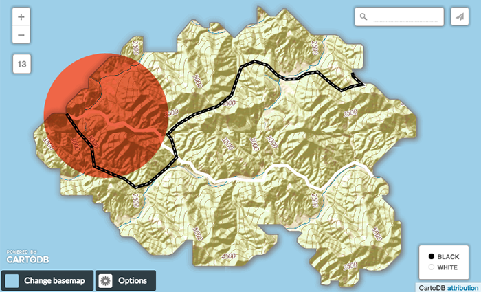
Darken has a similar effect to multiply, but is more extreme. As it applies the color from the source layer to the destination layers, it compares each to find the darkest-colored pixels and keeps those. In the example below, we chose the darken composite operation in the top circle layer. Notice how only the hillshade shadows and black line show through from the destination layers, because all other elements have lighter-colored pixels than the circle. All pixel colors that are lighter than the top circle take on the circle’s color. Use this when you want a darken effect that shows original color in the darkest areas of overlap, or when you want less detail than is shown in multiply.
marker-comp-op: darken;
Color-Burn
Color-burn works similarly to color-dodge, but has a darkening effect. It increases the contrast between source and destination layers, with pixels in your overlapping area tinted towards the source color. Use this when you want a darkening effect with more contrast than multiply or darken.
marker-comp-op: color-burn;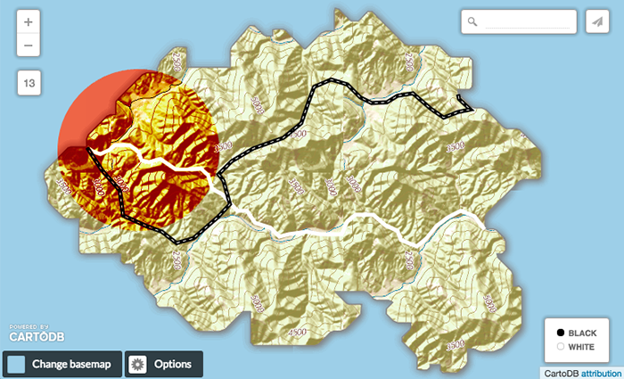
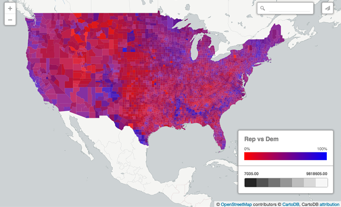
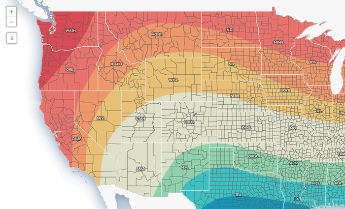
For a good reason to use darkening effects, check out this election map. Its lower layer shows population density with gray scale colors, and its upper layer shows U.S. political parties in red and blue. When you use a darkening composite operation, the polygons show voting results by political party, modulated by the population density.
LIGHTEN
Screen
Like multiply, screen multiplies the overlapping areas. Unlike multiply, it subtracts the multiplied color channel numbers from their added value to invert them. This makes the overlapping areas brighter. If white is used, it won’t change appearance. Black areas will disappear. Use this when you want to lighten overlapping areas in your map.
marker-comp-op: screen;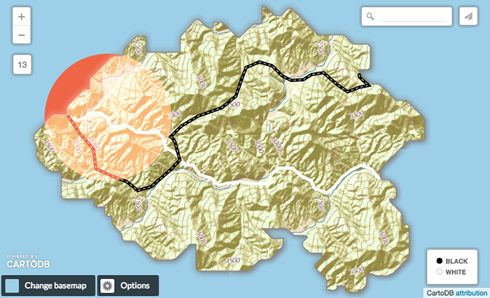
Lighten
Lighten works the same way as darken, but inversely. The lightest-colored pixels from each layer are kept, and if pixels are darker than the source layer they source layer color replaces them. This can be useful when you want to change the color of your overlapping area’s shadows.
marker-comp-op: lighten;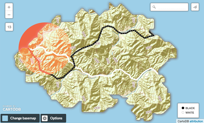
Color-Dodge
The Color-dodge color blend mode is similar to screen but the overall effect is more extreme. Your elements become much brighter (except if your source layer is black). Darker areas are tinted towards the source color. Use this when you want to have a major lightening effect with extreme contrast between your layers, without much detail showing.
marker-comp-op: color-dodge;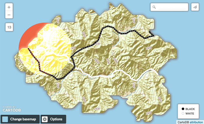
A good reason to lighten a map element is to reduce how much it visually competes with more important map features. For example, check out what graticules look like over polygons in this map, when Screen is applied:
CONTRAST
Overlay
Overlay is a color blend mode that combines multiply and screen composite operations. Black appears as dark as it originally is in it’s layer; white appears as bright as it originally is in it’s layer. How purely other colors are rendered depends on how close they are to white or black. The closer a color is in value to pure midtone gray, the less it will appear. Use this when you want to show both light and dark in your overlapping layers, for example if you’re using a textured polygon fill and want the highlights and shadows to appear through another layer. Notice in the example below how the gray-equivalent areas take on the color of the source layer.
marker-comp-op: overlay;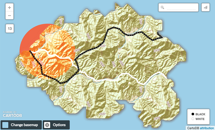
Soft Light
Soft Light isn’t one of the choices in the wizard Composite Operation pulldown. You can still use it! Just click over to the Custom CartoCSS panel and add this into the default CartoCSS code block:
marker-comp-op: soft-light;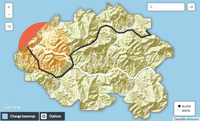
Soft Light will either screen or multiply the destination layer colors, depending on the color of the source layer. If the source color is darker than 50% gray, the multiply effect will be used. If it’s lighter than 50%, then screen will be used. Soft-light’s effects are not applied as strongly as multiply’s or screen’s though, so the resulting colors are less extremely tinted. Usually darks won’t be pure black and highlights won’t be pure white.
Hard Light
Hard Light is another color comp-op that you can use with CartoCSS:
marker-comp-op: hard-light;It works similarly to soft light, but is more extreme. Instead of using screen and multiply it uses color-dodge and color-burn, although not applied as strongly as with those comp-ops.
Contrast
Contrast magnifies the difference between the dark and light areas of your overlapping layers. If the source layer color is lighter than 50% gray, the destination layers will show through the source layer with decreased contrast. If the source is darker than 50% gray, the destination layers will show through the source layer with increased contrast. Besides making lighter areas brighter and darker areas darker, this has the visual effect of erasing fine detail.
marker-comp-op: contrast;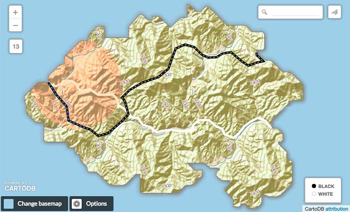
Use contrast effects when you’re trying to control how both dark and light elements in your map stand out from the other elements, or blend in with them better. For example, compare the dark red and blue areas to the lighter colored areas in the the map below. Notice how the gray county outlines don’t stand out as well against the darker red and blue backgrounds.
Now look how much more evenly the county lines blend with background colors in this map. We’ve also kept the white state outlines.

INVERSION
Difference
The difference blending mode compares the source to the destination layers and finds the brightest color areas for each color channel. It gets the difference between color channel numbers by subtracting them from each other, and taking that absolute value. Using pure white inverts the colors it’s blending with; black has no effect. In areas where the colors being compared are very close in value, the result is black.
marker-comp-op: difference;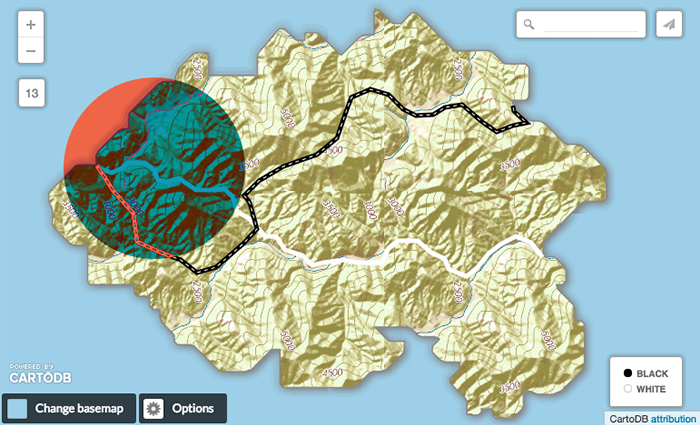
Exclusion
Exclusion is similar to difference, but less extreme. In areas where the colors being compared are very close in value, the result is lighter than black. For example, notice the gray areas where the circle is the same color as the layers beneath in this map:
marker-comp-op: exclusion;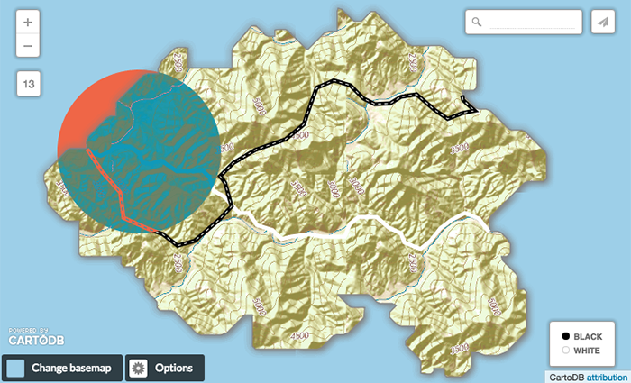
Invert
Invert turns each RGB channel color into its opposite. Areas that look black originally will turn white, areas that look red will turn green, blues will turn orange, yellows will turn purple.
marker-comp-op: invert;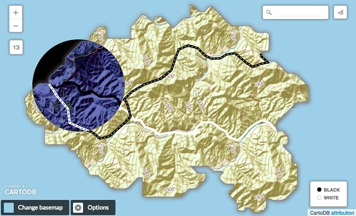
Invert-RGB
Invert-rgb also inverts color channel colors, but then tints them towards the source color.
marker-comp-op: invert-rgb;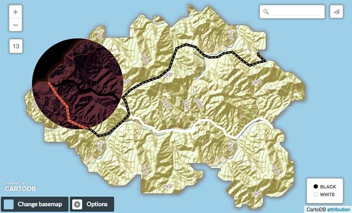
COMPONENT
These focus on blending different components that make up a color, like hue, saturation, and brightness levels. We’ve expanded this to include plus and minus.
Hue
Hue keeps the color brightness and saturation levels of the destination layers, but renders a result with the same hue as the source layer.
marker-comp-op: hue;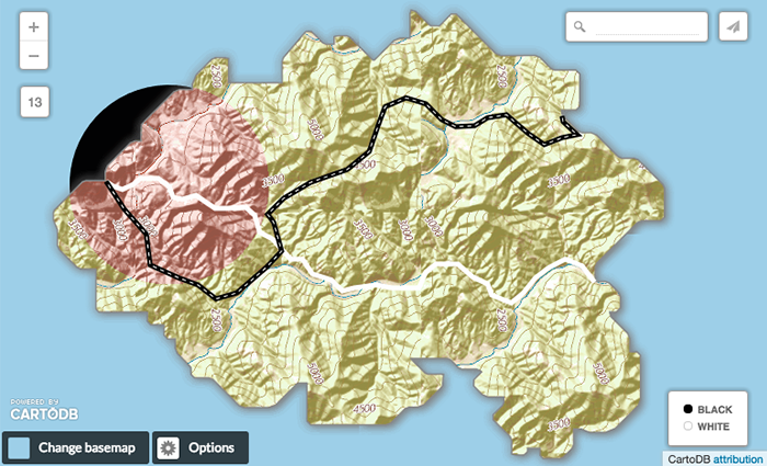
Saturation
Saturation keeps the hue and brightness levels of the destination layers, but renders a result with the same level of saturation as the source layer. If you’re using white in the source layer, there will be less saturation in the result. Black will render the highest level of saturation. Color half way between them, gray, will not have an effect.
marker-comp-op: saturation;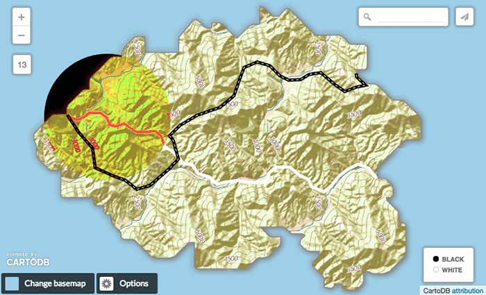
Color
Color keeps the source layer’s hue and saturation levels, but renders a result with the brightness of the destination layers.
marker-comp-op: color;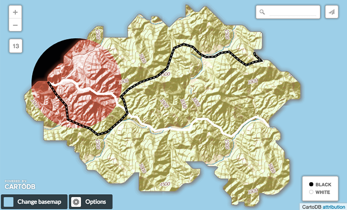
Value
Value keeps the brightness levels of the source, but renders a result with the hue and saturation levels of the destination layers.
marker-comp-op: value;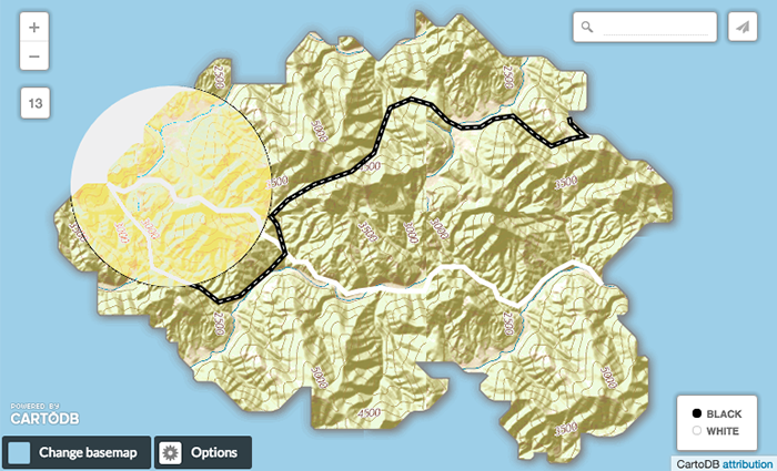
Plus
The plus composite operation adds the color channel values of the source with the destination’s. Visually it adds the source’s color to the darkest parts of the destination, and brightens the lighter parts, but tinted towards the source color. If you add a source color where red is the dominant color channel to the destination’s red green and blue color channels, the dominant color in the result will be red. The overall effect is brighter than color-dodge. Lighter source colors effect the destination layer more than dark ones. A black source layer will have no effect; a white one will paint the whole destination layer white in the area of overlap.
marker-comp-op: plus;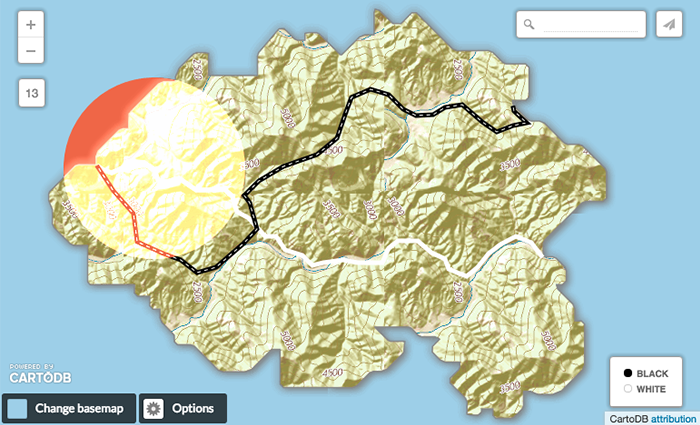
Minus
Minus works the same way as plus, but instead of adding the color channel values it subracts them. For example, if your source layer is mostly red, it will subtract this from the destination layers so the overall color is mostly blue and green. This darkens the destination layer more extremely than color-burn, and is also more tinted towards the source color.
marker-comp-op: minus;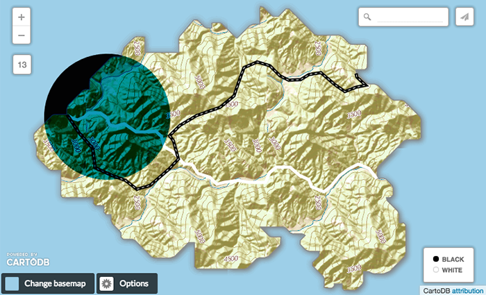
OTHER COLOR COMPOSITE OPERATIONS
Grain-Extract
Grain-extract subtracts destination layer color channel values from the source layer, and then adds 128. When used with textured destination layers, the overall visual effect shows the destination layers texture in the source layer overlap area, but with a brightened film-negative effect.
marker-comp-op: grain-extract;
Grain-Merge
Grain-merge is the opposite of grain-extract. It adds the source and destination layer color channel values together, then subtracts 128. When used with textured destination layers, the overall visual effect shows the destination layers texture in the source layer overlap area, but with colors tinted towards the source layer’s.
marker-comp-op: grain-merge;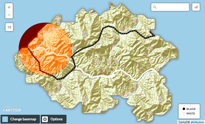
Alpha Composite Operations
Alpha composite operations work combine different levels of source transparency with destination layers. These are useful for masking parts of one layer with another.
Src
Src is an alpha composite operation that keeps the full transparency of the source layer. Whether the source layer is above or below layers using other composite operations, it will show through completely opaque.
marker-comp-op: src;
Dst
Dst is an alpha composite operation that keeps the full transparency of the destination layers. The source layer becomes invisible in areas where it’s overlapping with the destination layers.
marker-comp-op: dst;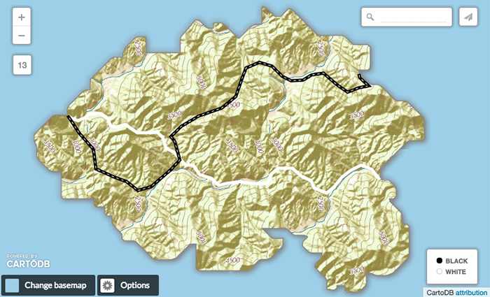
Src-over
Src-over keeps the full transparency of both the source and destination layers. The visual effect is that the source layer shows on top of all layers involved in the overlap area.
marker-comp-op: src-over;
Src-in
Src-in only shows the part of the source layer that intersects with the destination layer.
marker-comp-op: src-in;
Src-out
Src-out only shows the part of the source layer that does not intersect with the destination layer. The destination layers are also not drawn within the area of overlap.
marker-comp-op: src-out;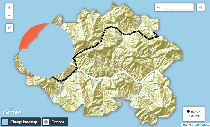
Src-atop
Src-atop makes sure that the source layer is shown at the top of all layers involved in the composite operation, within the area of overlap.
marker-comp-op: src-atop;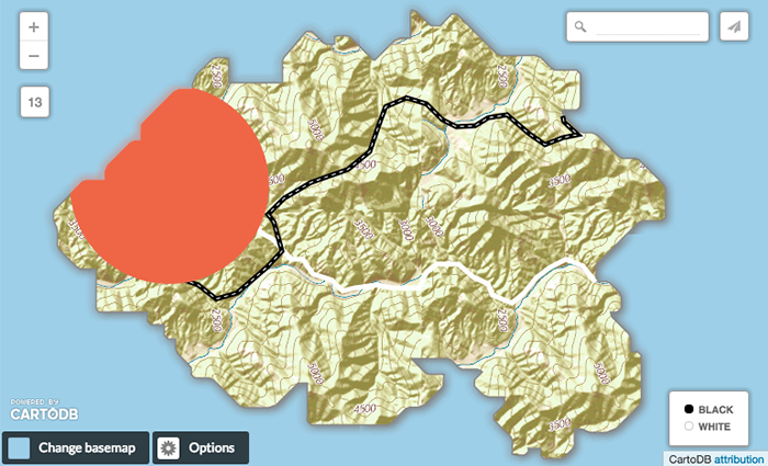
Dst-over
Dst-over also keeps the full transparency of the source and destination layers, but it’s effect is that the source is shown beneath all destination layers.
marker-comp-op: dst-over;
Dst-in
Inside the overlap area, dst-in only shows the destination layer.
marker-comp-op: dst-in;
Dst-out
Dst-out only shows the part of the destination layer that does not overlap with the source layer. It also removes the source layer’s color.
marker-comp-op: dst-out;
Dst-atop
Dst-atop shows the destination layers on top of the source layer, in the places where they overlap.
marker-comp-op: dst-atop;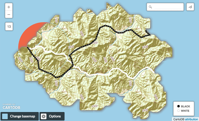
Xor
Xor shows both the source and destination layers, but only the parts that do not overlap each other.
marker-comp-op: xor;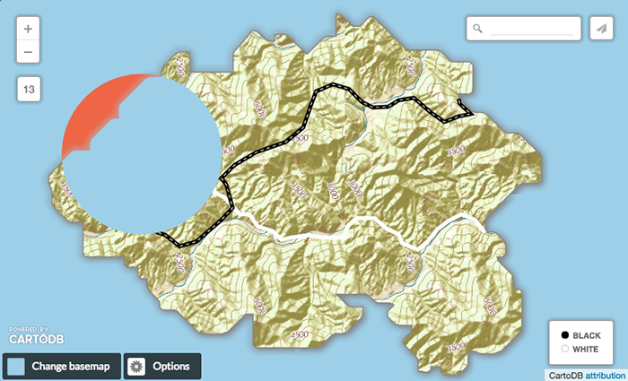
Clear
The clear composite operation acts as an eraser. It makes all pixels transparent in the area where source and destination layers overlap.
marker-comp-op: clear;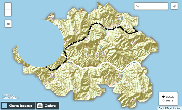
*Contains public sector information licensed under the Open Government Licence v3.0.
- Null Island topography taken from USGS National Map. Map services and data available from U.S. Geological Survey, National Geospatial Program.