Create Lines from Points
Describes how to connect points into lines with CARTO Builder.
This guide describes how the Create Lines from Points analysis joins points into lines, based on user input. The commuter flow map above uses US Census Journey to Work data, Create Lines from Points enables you to build visualizations from your point data to visualize underlying connections between points.
Types of Create Lines from Points Analysis
The data suitable for this analysis can come in many forms, but the input must be a set of points. CARTO Builder has multiple types of options for connecting points into lines:
-
To Source: Connect two point columns, in two different tables, based on an optional matching condition, and apply it to both the target and the source tables.
-
Sequential: Sequentially join points, subject to optional conditions: grouping by a category and ordering by a value. For example, animal movement data or GPX data. You can visualize the movement as a track, grouping by species, and ordering by time.
-
To Single Point: Join all points in your dataset to a single point, by defining the location attributes (latitude and longitude) of a focus point. This is useful when connecting multiple points to a single point of interest. For example, if you want to visualize the route from a distribution center to all of its delivery locations.
For example, this map displays how the Create Lines from Points analysis was used to display the Colorado County to County Commuter Flow.
Connect to a Single Point
For this guide, let’s use the Create Lines from Points analysis to visualize the most popular Google Flight Search destination (and its origins for Thanksgiving) with data provided from The New York Times’ Upshot.
-
To visualize flight data, download the template .carto file and import it to your account. Builder opens with flight destination as the first map layer and origin cities as the second map layer.
Click on “Download resources” from this guide to download the zip file to your local machine. Extract the zip file to view the .carto file(s) used for this guide.
-
Select the Origin City map layer.
For this example, the origin city data contains a column of airport locations to be used for your analysis. The .carto file already filtered the origin cities that connect to the most popular destination for that year, Miami, FL. </div> -
Click the ANALYSIS tab.
-
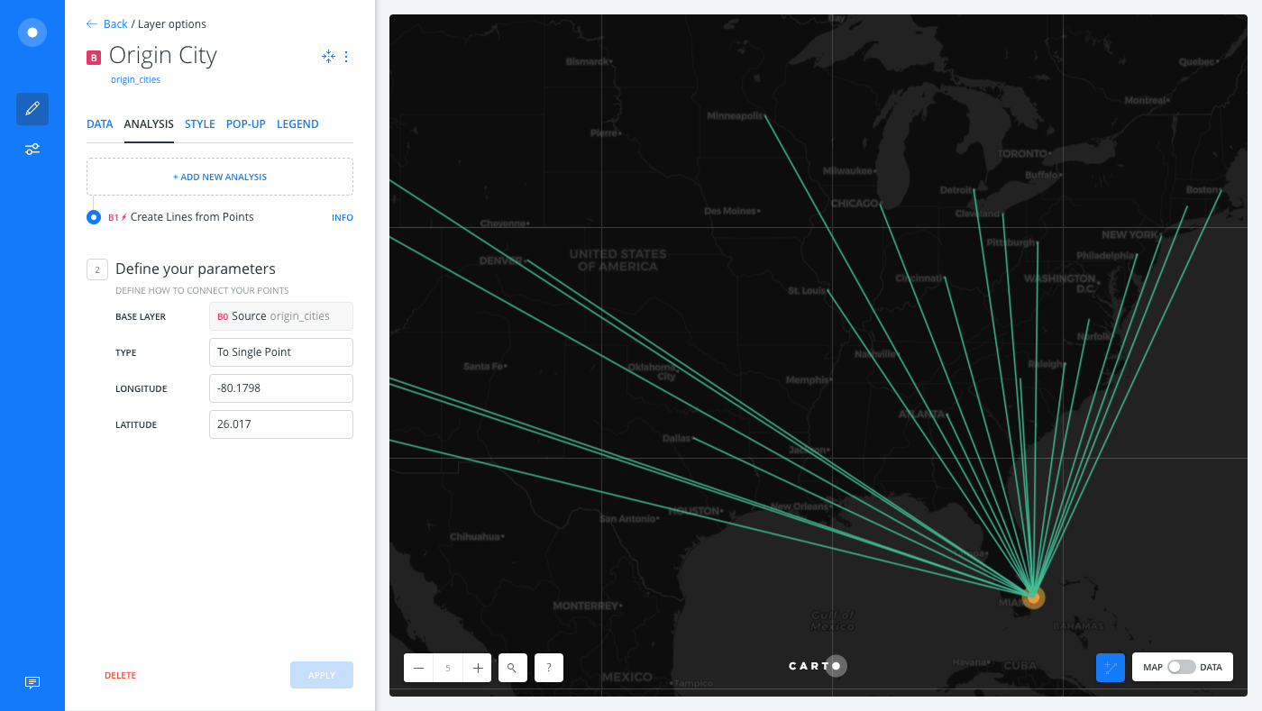
Click Create Lines from Points and apply the following options to indicate Miami, FL as the point of origin:
- For the TYPE, select To Single Point.
- For LONGITUTUDE, enter
-80.1798. - For LATITUDE, enter
26.017. - Click APPLY.
The result displays the crow-flight distance between the airports, from the origin cities to the destination.
-
Click the DATA tab and select Add as a widget for the
weightcolumn and thelengthcolumn.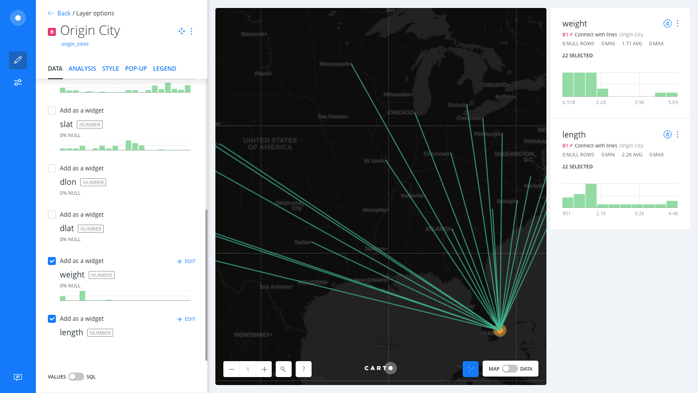
- The
weightcolumn defines the ratio of flight searches during Thanksgiving week, compared to an ordinary week of the year. - The
lengthoutput column was created as a result of the Create Lines from Points analysis, and displays the distance between the airports from the origin cities to the destination.
- The
-
Click and drag the original source of data from a map layer to create a new layer.
- From the LAYERS list in Builder, click on the original source file(origin_cities) from layer B.
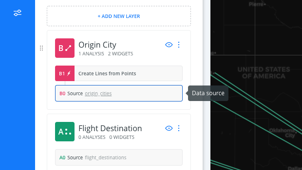
- Drag it above layer B.
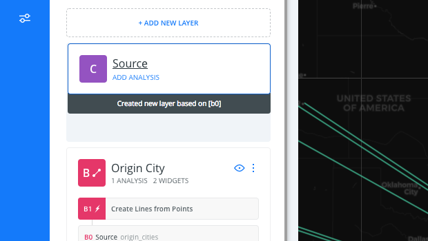
A new layer (layer C) is created and displays the end points of the destination on your visualization.
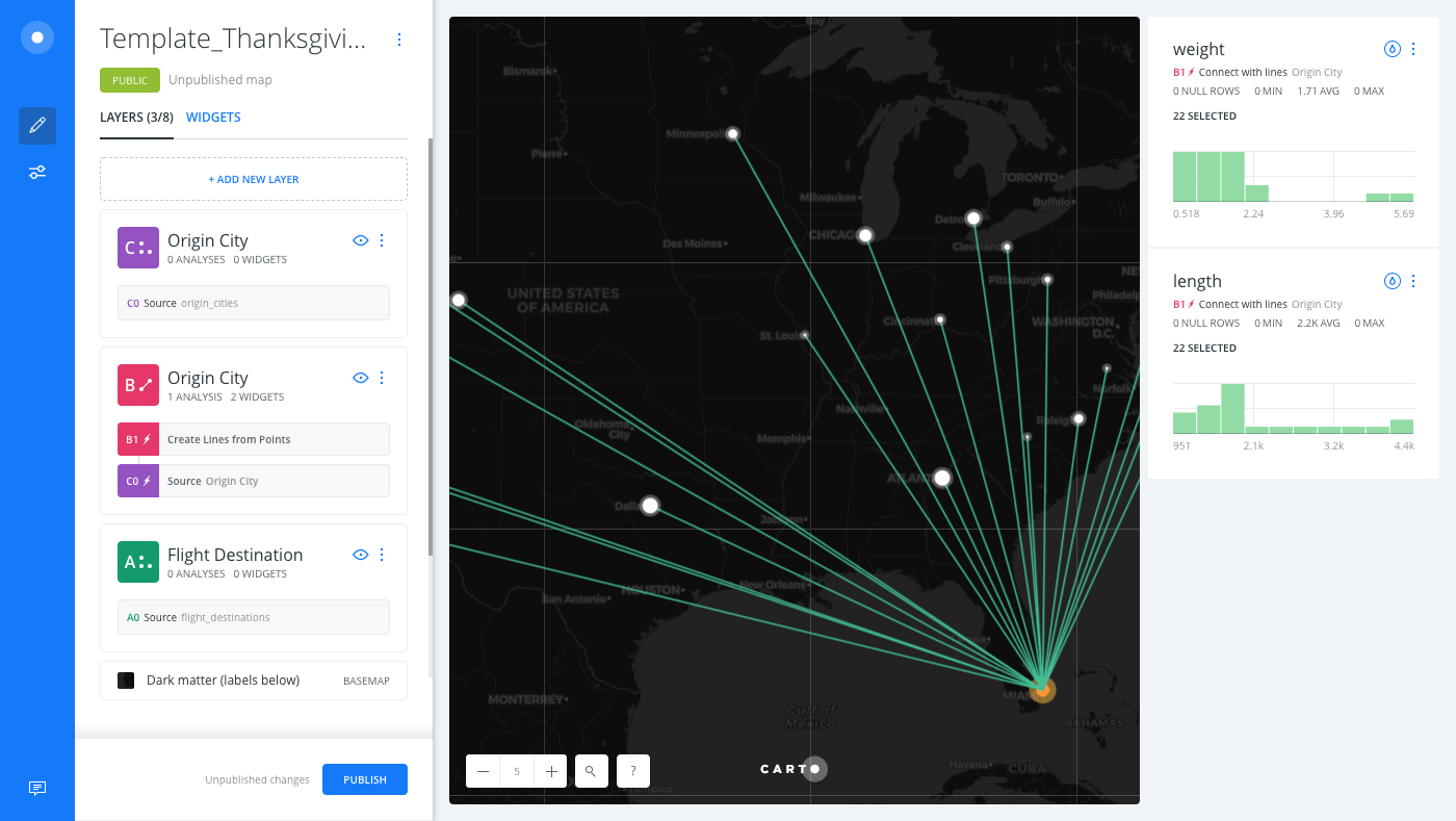
Download the final .carto file from the “Download resources” of this guide, and explore all of the cartography applied to each map layer.</div>
Limits
| Type | Row Limit | Point per line Limit | Time Limit |
|---|---|---|---|
| To Source | 1000000 | - | 5 min |
| Sequential | 1000000 | 100000 | - |
| To Single Point | - | - | - |
External Resources
If you are interested in using the underlying functions in the SQL view of Builder, view the PostGIS documentation for ST_MakeLine. All analyses in Create Lines from Points use various forms of the ST_MakeLine function.