Customizing Pop-ups with HTML
Customize pop-up information window styling with HTML.
As described in the Enabling Pop-Up Information Windows Guide, a pop-up information window provides overlay interactivity on your map visualization when you click, or hover, over data.
This guide describes how to customize the styling of pop-up information windows by modifying the HTML code for a map layer.
Enable Pop-Up Interactivity
This section guides you through the process of enabling pop-up interactivity for a map layer. The objective is to enable both a CLICK and HOVER pop-up information window for our data and view the HTML templates that get created behind the scenes. For this guide, let’s use Twitter data based on dog breed search terms from June - July 2017.
-
Import the template .carto file packaged from “Download resources” of this guide and create the map. Builder opens with the Most Tweeted Dog Breeds as the first and only map layer.
Click on “Download resources” from this guide to download the zip file to your local machine. Extract the zip file to view the .carto file(s) used for this guide.
If you click on the Most Tweeted Dog Breeds layer and navigate to the POP-UP tab, note that pop-ups are not allowed since this layer is animated. No problem, let’s add a second map layer (using the same data) in order to enable pop-up interactivity!
-
Add a second map layer using the same Twitter dog data:
- From the LAYERS list in Builder, click ADD.
- Add
twitter_dogsas the second map layer. - Click the
twitter_dogslayer. - Navigate to the POP-UP tab.
There are two subtabs, CLICK and HOVER, which display the selected pop-up style applied. Let’s apply both actions for this map layer.
-
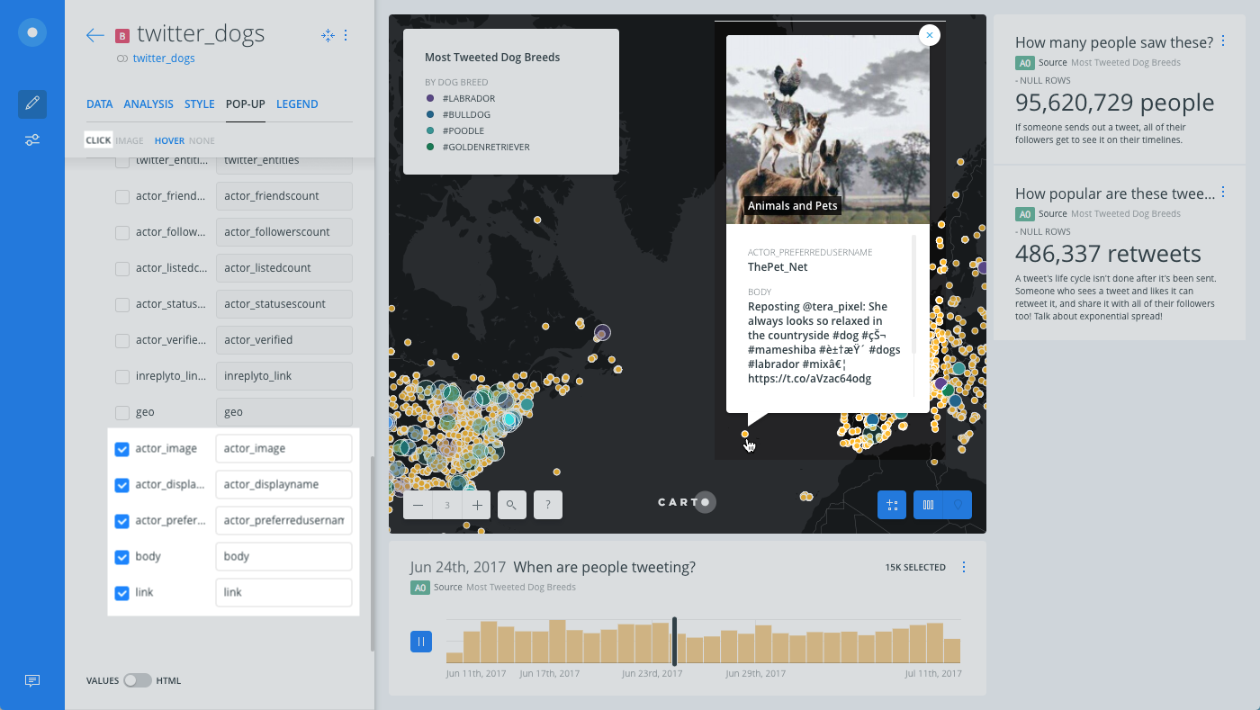
Enable CLICK interactivity to display an image of the Twitter user when you click on a point:
- From the CLICK subtab, select IMAGE as the pop-up style.
- Select
actor_imageas the name of the column to appear in the image header. This is the profile image of the Twitter user from the Twitter account.
To avoid errors, the selected image column must contain valid image URLs and be the first item selected on the POP-UP tab. For details, see POP-UPS WITH IMAGES.
- Use the checkbox next to the name of the columns that you want to display in the pop-up information window. For this example, select the following columns (and ensure they appear in the correct order underneath
actor_image):actor_displaynameactor_preferredusernamebodylink
These are all common Twitter columns.
-
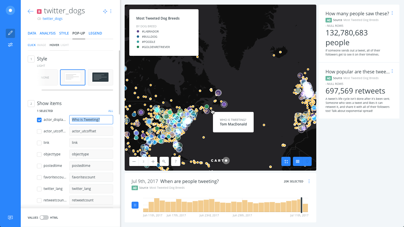
Enable HOVER interactivity to display details about who is tweeting when you hover over a point:
- Click the HOVER subtab from the POP-UP tab.
- Select the LIGHT style for the pop-up.
- Use the checkbox next to
actor_displayname. - Edit the name of how the column appears in the pop-up by renaming it Who is Tweeting?
Modify the Subtitle and Title for Pop-Up Columns
Let’s modify the style for how data appears in the CLICK pop-up information window by editing the HTML code for the subtitle and title.
Note: Before you edit the HTML of your pop-ups, make sure that all the columns that you want to use in the pop-up are enabled through the Builder UI first. If you use a non-initialized variable in your pop-up, it will appear blank.
-
From the
twitter_dogsmap layer, click the POP-UP tab.There are two subtabs, CLICK and HOVER, which display the selected pop-up style applied.
-
From the CLICK subtub, click the slider button from VALUES to HTML.
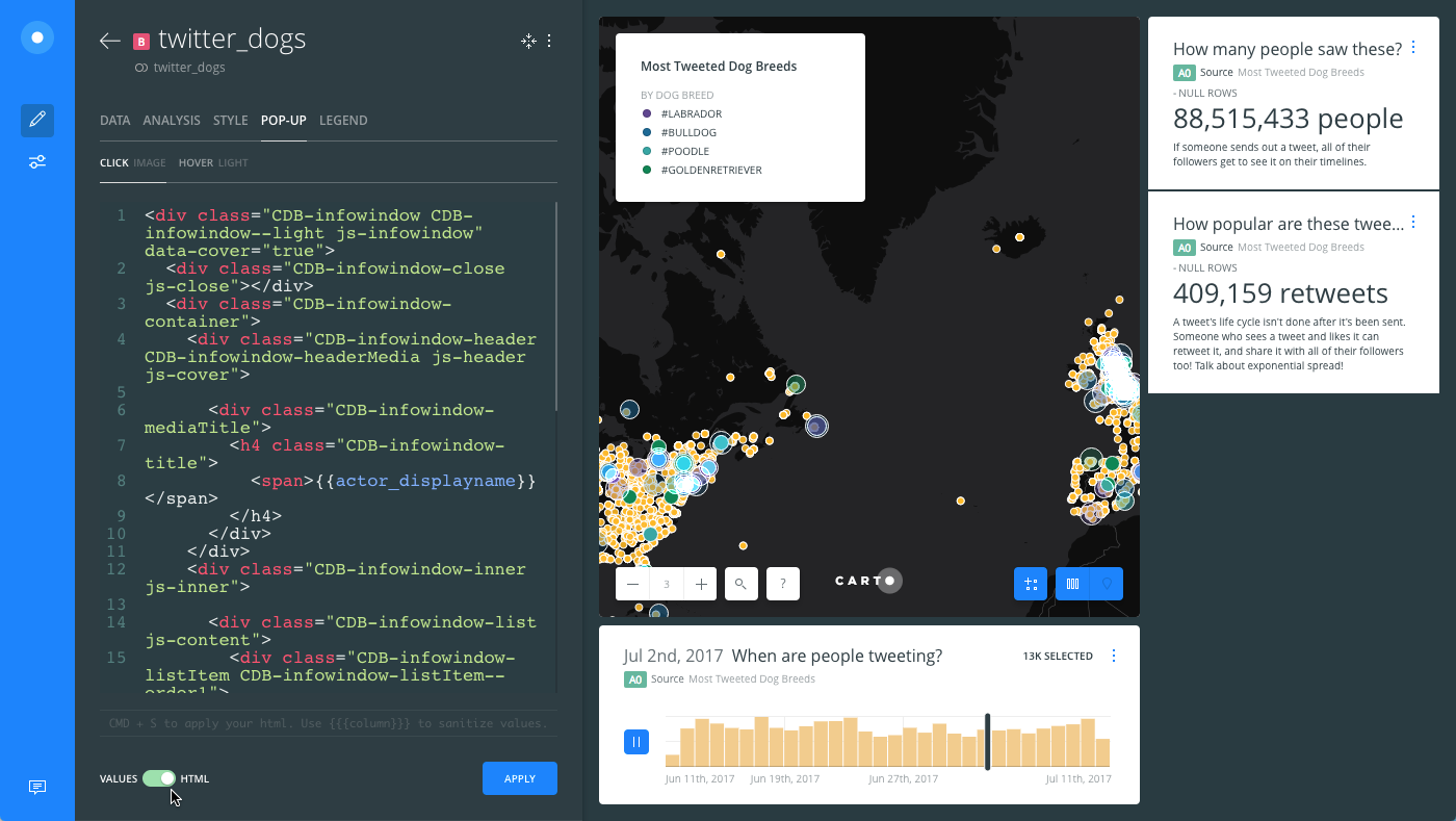
CARTO pop-up styles are predefined in the stylesheet code and are based on Mustache templates. The styling is included within the
infowindowcontainers of the code, which allows you to modify any of the HTML elements of the template. Use the\elements to apply styling changes related to selected items from the POP-up tab. -
Modify the subtitle and title for the Twitter username.
Instead of displaying the
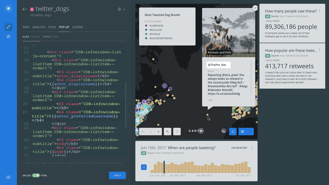
actor_preferredusernamecolumn in the pop-up, let’s remove the column subtitle and display the values as @username.- Lines 19-22 of the HTML template contain the subtitle
<h5>and title<h4>for the `` column.
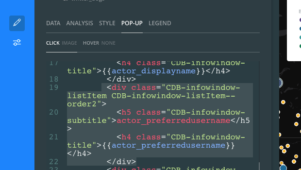
- From line 20, delete the subtitle text
actor_preferredfrom the<h5>element. This will remove the column subtitle from the pop-up information window.
<h5 class="CDB-infowindow-subtitle"></h5>- From line 21, add the
@symbol before the column name for the<h4>element. This appends the @ symbol before each twitter username in the pop-up information window.
<h4 class="CDB-infowindow-title">@</h4>- Click APPLY and notice how the subtitle and title appear in the pop-up information window for the username.
- Lines 19-22 of the HTML template contain the subtitle
-
Similarly, let’s modify the subtitle of the Tweet description.
- Lines 23-25 of the HTML template contain the subtitle
<h5>and title<h4>for the `` column.
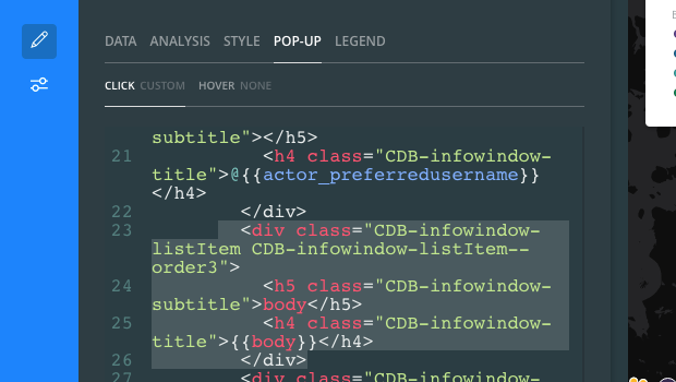
- From line 24, delete the subtitle text
bodyfrom the<h5>element.
<h5 class="CDB-infowindow-subtitle"></h5>- Click APPLY and notice how the body subtitle is removed from the pop-up information window. Only the Tweet description appears.
The following HTML code shows the
bodystyling for the CLICK pop-up in lines 23-25.<div class="CDB-infowindow-listItem CDB-infowindow-listItem--order3"> <h5 class="CDB-infowindow-subtitle"></h5> <h4 class="CDB-infowindow-title"></h4> </div> - Lines 23-25 of the HTML template contain the subtitle
Apply a Hyperlink within a Pop-Up
If you have a column that contains URL values, you can edit the HTML code to make these hyperlinks clickable from the pop-up information window. Let’s continue to modify the CLICK pop-up HTML code from the twitter_dogs map layer.
-
Apply an HTML
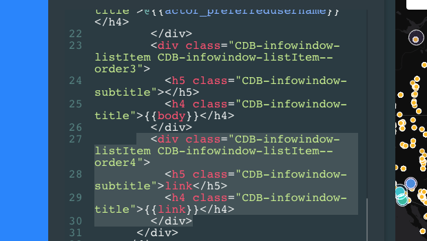
<a href>element for hyperlink values.- Lines 27-30 of the HTML template contain the subtitle
<h5>and title<h4>for the `` column.
- Lines 27-30 of the HTML template contain the subtitle
-
From line 28, delete the subtitle text
linkfrom the<h5>element.<h5 class="CDB-infowindow-subtitle"></h5> -
From line 29, modify the
<h4>title element to display hyperlinks for the `` column.<h4 class="CDB-infowindow-title"><a href="" target="_blank">View Tweet</a></h4> -
Click APPLY. The
linkcolumn from the CLICK pop-up opens the Tweet in a separate window.
The following code displays the customized HTML stylesheet for the CLICK pop-up information window.
<div class="CDB-infowindow CDB-infowindow--light js-infowindow" data-cover="true">
<div class="CDB-infowindow-close js-close"></div>
<div class="CDB-infowindow-container">
<div class="CDB-infowindow-header CDB-infowindow-headerMedia js-header js-cover">
<div class="CDB-infowindow-mediaTitle">
<h4 class="CDB-infowindow-title">
<span></span>
</h4>
</div>
</div>
<div class="CDB-infowindow-inner js-inner">
<div class="CDB-infowindow-list js-content">
<div class="CDB-infowindow-listItem CDB-infowindow-listItem--order1">
<h5 class="CDB-infowindow-subtitle">actor_displayname</h5>
<h4 class="CDB-infowindow-title"></h4>
</div>
<div class="CDB-infowindow-listItem CDB-infowindow-listItem--order2">
<h5 class="CDB-infowindow-subtitle"></h5>
<h4 class="CDB-infowindow-title">@</h4>
</div>
 	<div class="CDB-infowindow-listItem CDB-infowindow-listItem--order3">
       <h5 class="CDB-infowindow-subtitle"></h5>
       <h4 class="CDB-infowindow-title"></h4>
 </div>
<div class="CDB-infowindow-listItem CDB-infowindow-listItem--order4">
<h5 class="CDB-infowindow-subtitle"></h5>
<h4 class="CDB-infowindow-title"><a href="" target="_blank">View Tweet</a></h4>
</div>
</div>
</div>
<div class="CDB-hook">
<div class="CDB-hook-inner"></div>
</div>
</div>
</div>
Download the final .carto map from the “Download resources” of this guide to view all of the custom pop-up styling that was applied.
Modify the Window Size with HTML
For HOVER pop-ups, the information window automatically adjusts to display the value of the column(s) selected.
For CLICK pop-ups, the POP-UP tab includes an option to define the WINDOW SIZE for the information window. Optionally, you can modify the window size in HTML.
For example, the selected WINDOW SIZE value (from the POP-UP tab) appears hidden in the HTML template.
<div class="CDB-infowindow CDB-infowindow--light js-infowindow">
  <div class="CDB-infowindow-close js-close"></div>
  <div class="CDB-infowindow-container">
To apply custom dimensions for the window size, you can apply width, height, and margin values within the <div style> and container elements of the pop-up.
<div style="width:600px; background-color:white">
  <div class="CDB-infowindow-close js-close" ></div>
  <div class="CDB-infowindow-container" style="width:97%; height:97%; margin: 0 auto">
Pop-Up CSS Library
Reference the open source CSS library for the latest CARTO stylesheet code for pop-up information windows. Optionally, create a new pop-up style.
For example, suppose you want to combine elements of CLICK and HOVER pop-up styling into a new style.
Example of Custom HTML Pop-Up Styling
<div style="padding=0; background-color:white; border=0px; padding=0px">
  <div class="CDB-infowindow-container">
<div class="CDB-infowindow-header CDB-infowindow-headerBg CDB-infowindow-headerBg--light js-header" style="background: #CC66FF;margin-top:1em;margin-bottom:1em;text-align:center">
      <ul class="CDB-infowindow-list">
        <li class="CDB-infowindow-listItem">
          <h4 class="CDB-infowindow-title ">
            TITLE: I created a custom pop-up style with HTML
          </h4>
        </li>
      </ul>
    </div>
    <div class="CDB-infowindow-inner js-inner">
      <ul class="CDB-infowindow-list js-content">
        <li class="CDB-infowindow-listItem">
          <h5 class="CDB-infowindow-subtitle">ssid</h5>
          <h4 class="CDB-infowindow-title"></h4>
        </li>
        <li class="CDB-infowindow-listItem">
          <h5 class="CDB-infowindow-subtitle">village</h5>
<h4 class="CDB-infowindow-title"></h4>
        </li>
      </ul>
    </div>
  </div>
</div>
Custom Pop-Up Styling Applied
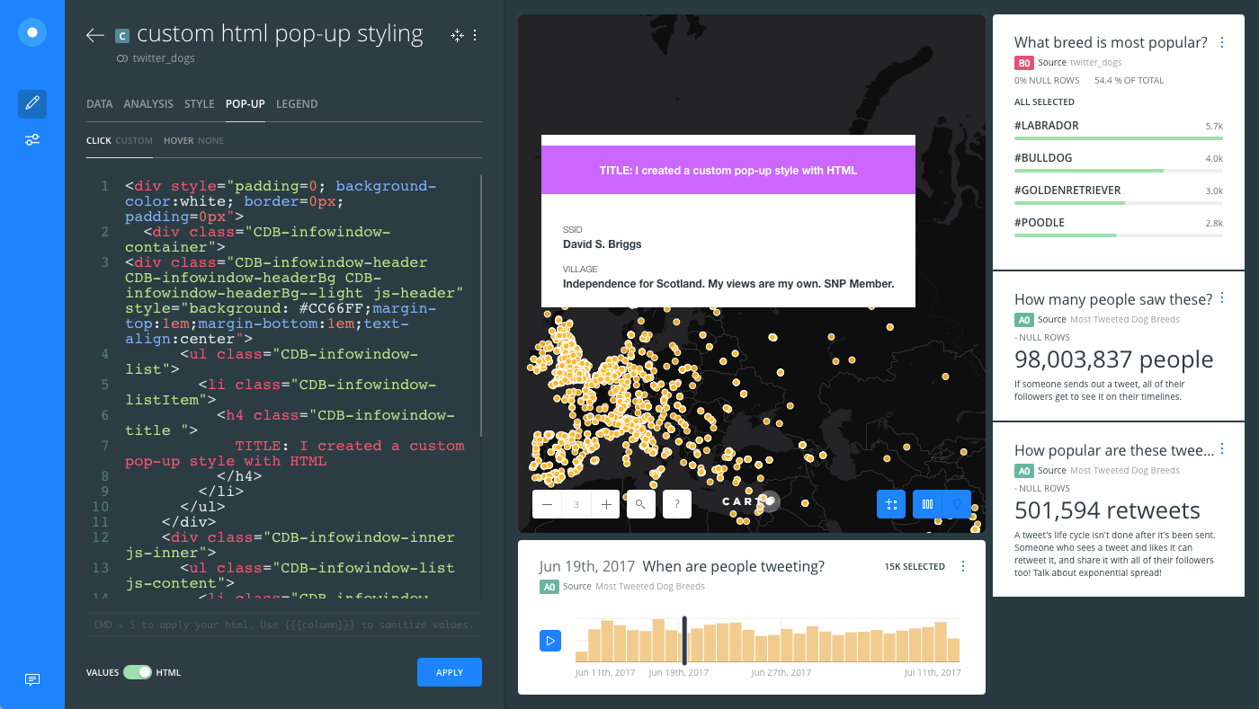
Use the full power of the CSS library to create your own custom pop-up styling with HTML!