Example - Analyze Barcelona Biking Data
Learn how to analyze and visualize Barcelona's public bike distribution and availability with CARTO Builder.
You will need to import the following dataset/s into your account:
- New York subway stations:
biking_sheet. You can download it from here.
In order to download them to your local machines, you are using CARTO SQL API behind the scenes.
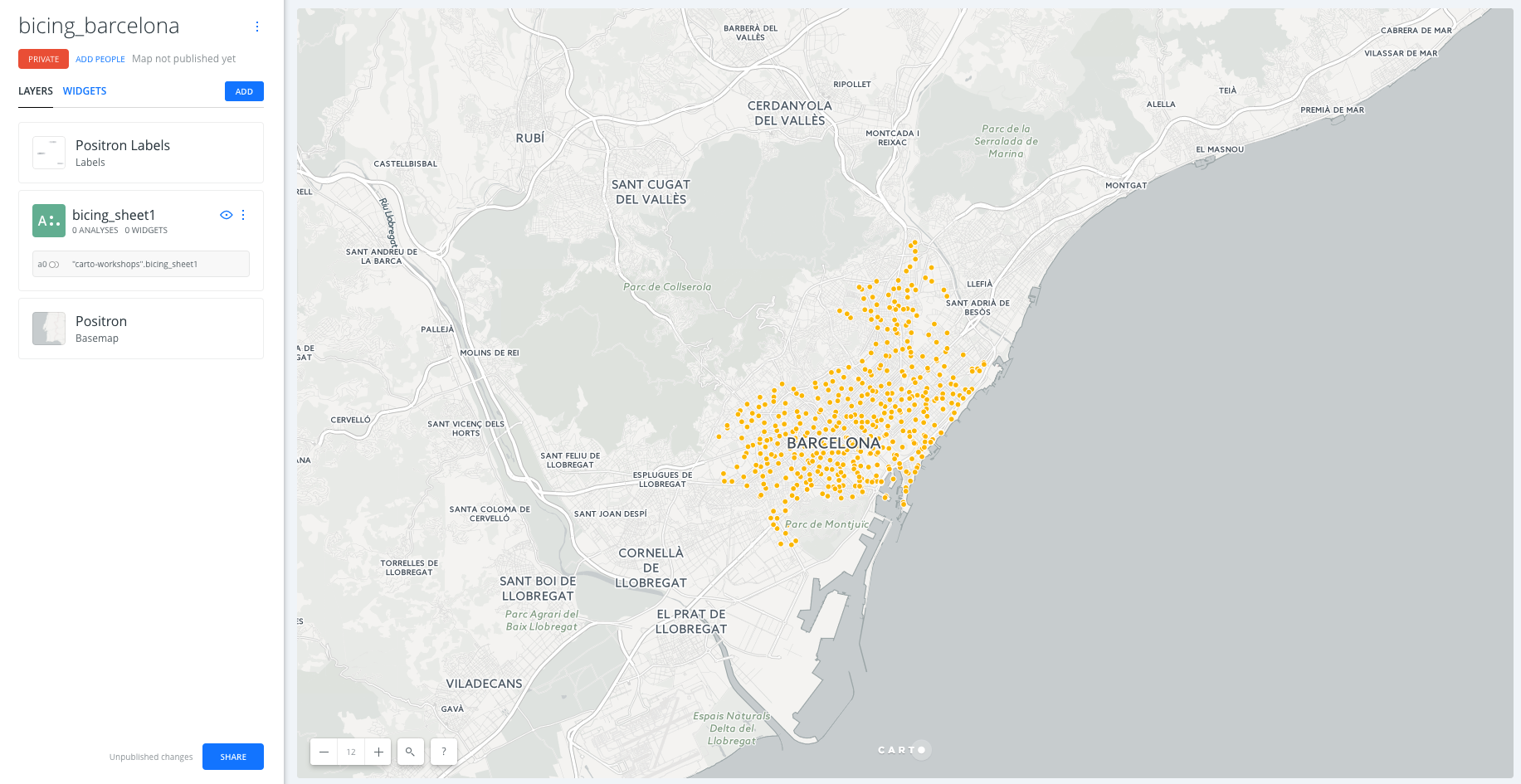
Create a map
- Click on
NEW MAP. - Click on
CONNECT DATASET. - Drag and drop
biking_sheet1. - Click on
CONNECT DATASET. - Click on
Don't show me this againto avoid modals. - You can rename the map title as “biking Barcelona” by double-clicking on it.
Layers
- Add new layer:
- We are going to click on the button
ADDin order to add a new layer on the map. In the add layer menu, we will click on theDATA LIBRARYand will look forbarcelona. We will seelct theBarrios de Barcelonadataset. Finally we will drag and drop layer B below layer A in order to have the biking stations as the top layer and the neighbourhoods of Barcelona as a low layer.
- We are going to click on the button
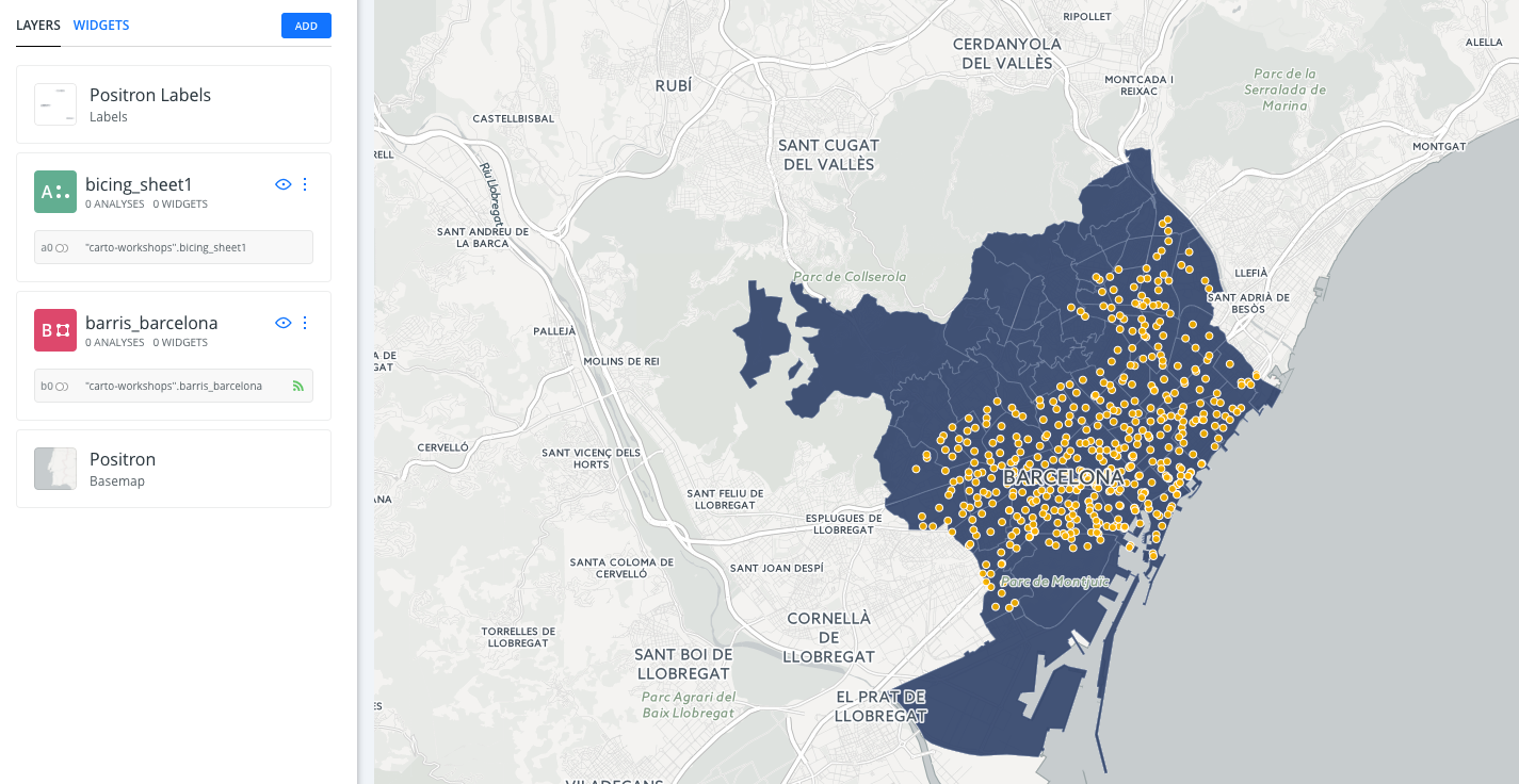
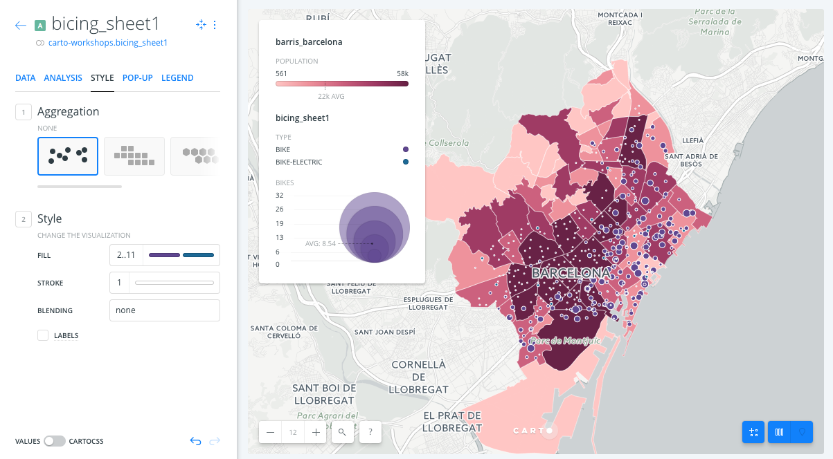
- Click on one of the layers to show its components:
DATAtab: an overview of your table schema; from here you can also add widgets. If you want to have a look at your dataset, click the Data View icon, located on the bottom right of Builder when a map layer is selected.ANALYSIS: Add analysis.STYLE: Change styles.POP-UP: Add pop-up.LEGEND: Add legend
Have a look at the letter and number the layers card has (
AorB). This would be very useful for adding widgets and analysis. Depending on the order in which you added your data, your layer letters could be different than the screenshots. In this example, biking stations are layer A, and neighbourhoods of Barcelona are layer B.
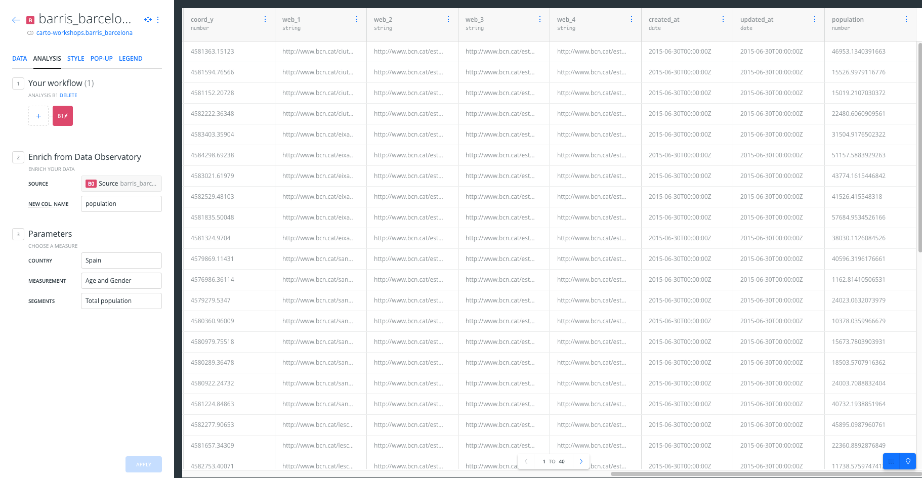
Analysis
Data observatory
- Go to the edit pane.
- Click layer
barris_barcelonaand then select theAnalysistab. Finally, click on theADD ANALYSISbutton in order to add the analysis. - Select
Enrich from Data Observatoryanalysis. - Click on
ADD ANALYSIS. - Set the parameters as follows:
New COL. NAME:population.COUNTRY:SPAIN.MEASUREMENT:Age and Gender.SEGMENTS:Total Population.
- Now click on
APPLYto see the result of the analysis. If we open the table view of the layerbarris_barcelonawe will see the newpopulationcolumn added to the layer.
Styling
- Go to the edit pane, click on the
barris_barcelonalayer B and select theSTYLEtab. Set theFillcolorBY VALUEand select thepopulationcolumn to style the polygons using the population.
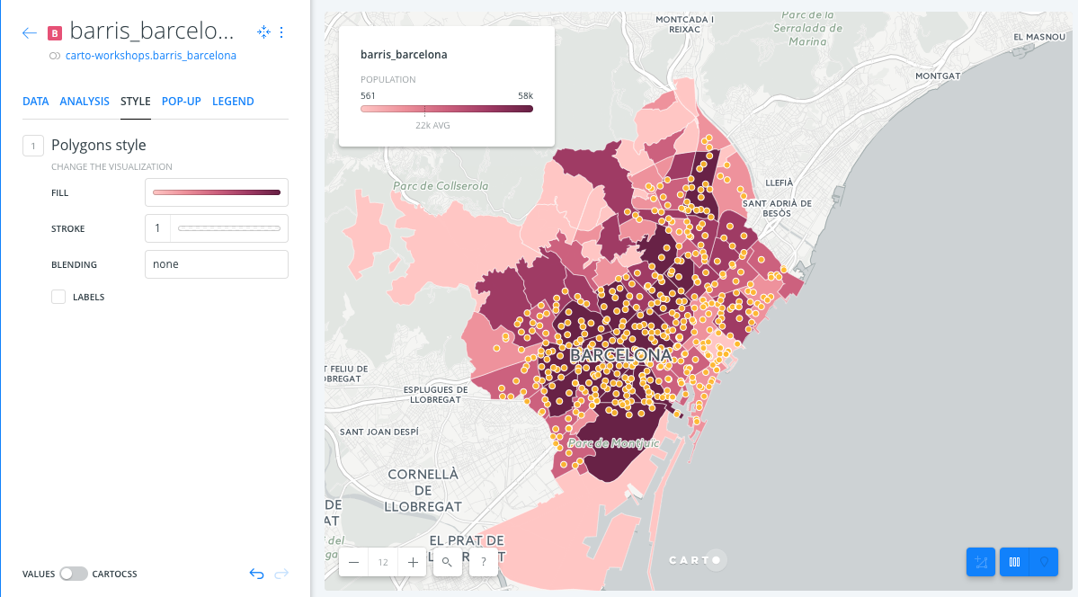
- Then, go to the edit pane, click on the
biking_sheet1layer A and select theSTYLEtab. Set theFillcolor toBY VALUEand select thetypecolumn. Finally, set theFillsize toBY VALUEand select thebikescolumn to see the number of bikes for each station visually.
Widgets
- Go to the edit pane and click on the
widgetstab. - Click on
ADD WIDGETbutton.- Under the
CATEGORYtab, click on the check box of variablesstreet_nameandstatus - Under the ‘HISTOGRAM’ tab, click on the check box of variables
population - Under the ‘FORMULA’ tab, click on the check box of variable
point_count.
- Under the
- Click on
CONTINUE
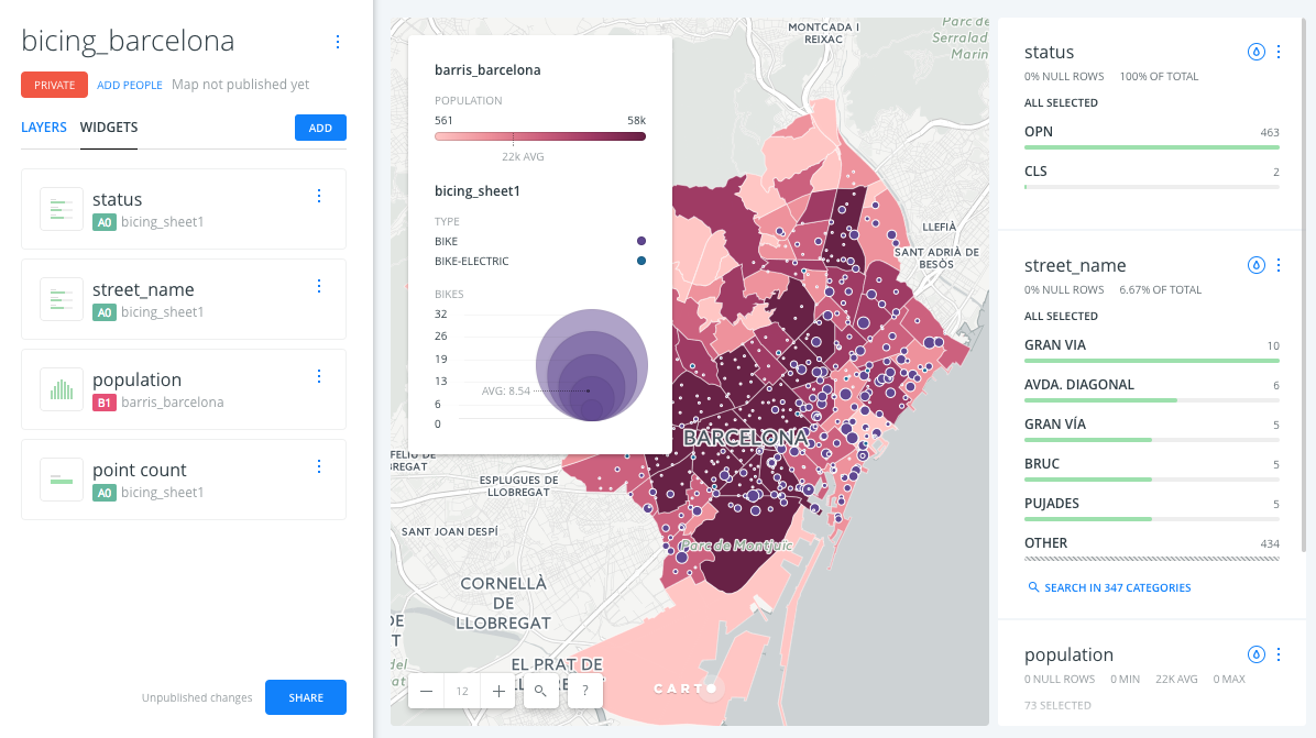
Customize widgets
- Reorder widgets: From
WIDGETtab, drag and drop them into your preferred order. - Rename widgets: From
WIDGETtab, rename each widget by clicking on its three blue dots and selecting the option toRename.
Publish
- Click on
SHARE. - Set the map’s privacy to
LINKorPUBLIC. - Click on
PUBLISH. - Now you can share the map:
- Link: https://public.carto.com/builder/11a01495-5512-4296-bffe-263159bff955/embed
- iframe:
Remember to update your map every time you make a change. To see those changes refresh your embed, or the web page where your map is hosted.