Example - Analyze 'Spies in the Skies' Data
Learn how to analyze flight data and explore the stories behind with CARTO Builder.
This use case is based on data journalism research published in buzzfeed in April. The authors used data from FlightRadar24, where thousands of collaborators upload flight information using automatic dependent surveillance-broadcast (ADS-B) technology. You can have a look at how they built the dataset in this GitHub repository. The research reveals that each weekday, dozens of U.S. government aircraft (from FBI and DHS agencies) take to the skies and slowly circle over American cities. Back in the day, the authors used CARTO Editor SQL and CartoCSS. Now because of Builder, you can do the same but in just a few minutes!
- Datasets needed:
Import and create map
Import flights_sampled geopackage
- Don’t download the dataset, instead you can put the url above directly into the URL box and CARTO will download and import it in one single step.
View Dataset from the Data page
Take a look at the dataset schema, the relevant fields are: flight_id, timestamp, altitude and speed.
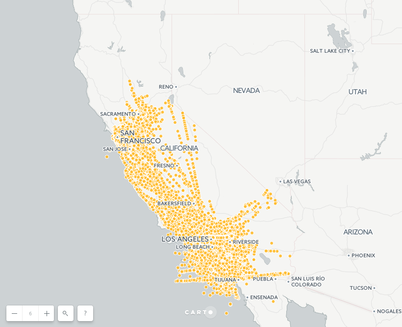
Click on CREATE MAP from flights_sampled
Explore the visualization. Could you observe any clear pattern? The expected patterns are straight lines, but what about the circles?
Hint: try to use the multiply composite operation to see dataset patterns more clearly.
Layers and styles
Show the new ordering of the layers in the Builder
-
Every layer has a source. For instance, the source of the
flights_sampledlayer is theflights_sampledtable, identified here asA0. This will be very important when adding analysis and widgets. -
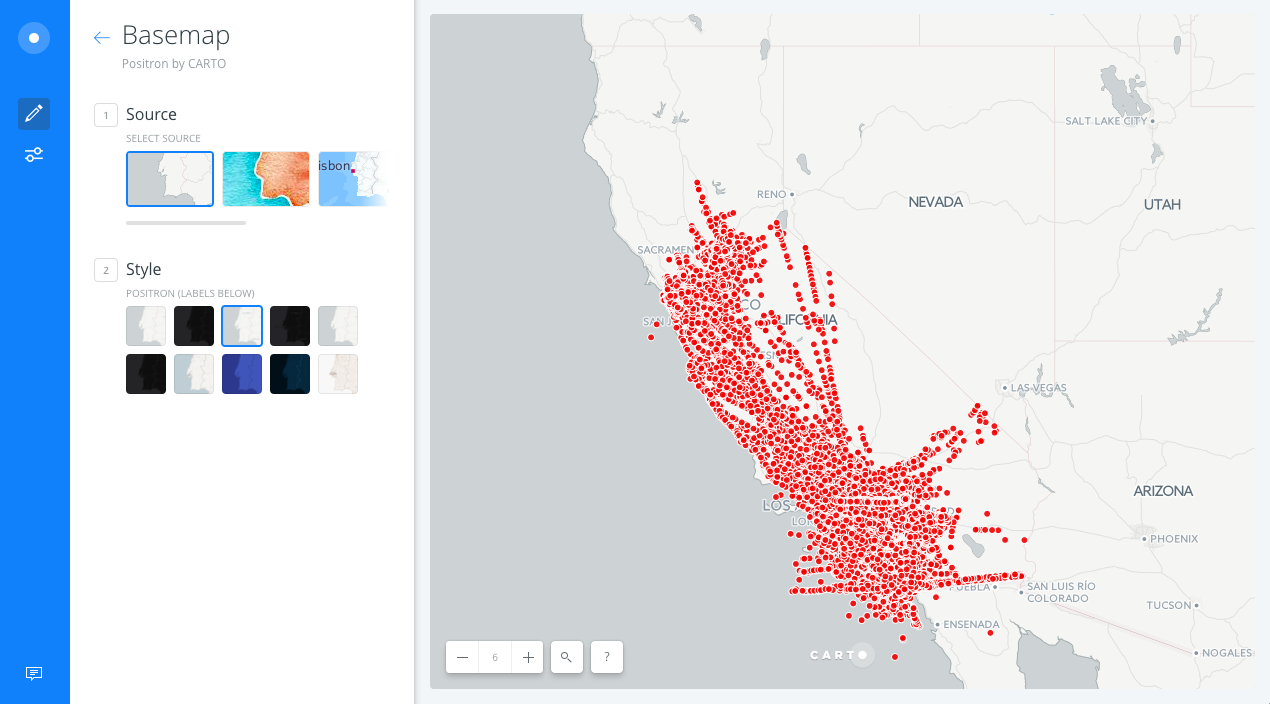
Change basemap from Positron to Positron (labels below).
Show the different options layers have
Each layer has 5 options: DATA, ANALYSES, STYLE, POP-UPS and LEGENDS.
- DATA:
- This interface gives a general view of the layer’s fields, its name and data type. Also you can add layer fields as widgets from here.
- Click the slider button from VALUES to SQL. The SQL view allows more advanced users to manage data in a more precise way.
- Finally, it’s easy to change from Map view to Data view.
- STYLE:
- Change the FILL color to
#f20000and set the size of the markers to7. - Click the slider button from VALUES to CARTOCSS. CartoCSS view allows more advanced users to style a layer in a more precise way.
- Change the FILL color to
Analysis
Filter by column Analysis
-
Back in the main menu of layers, select the
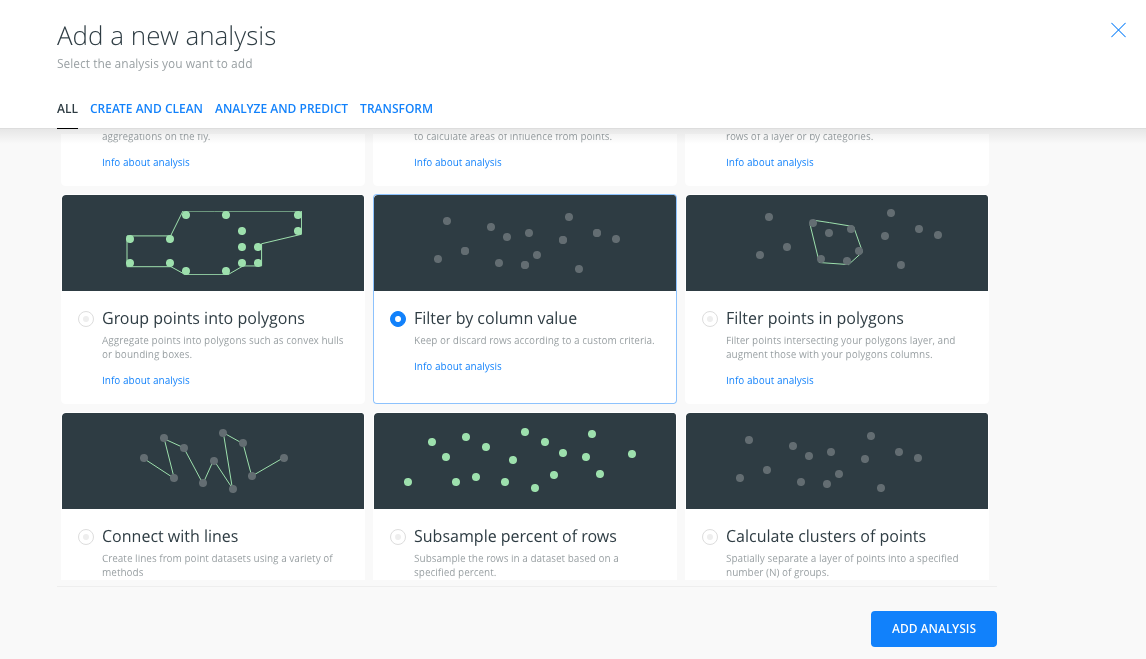
flights_sampledlayer and click on theADD ANALYSISoption. -
From the analysis menu, select the Filter by column analysis and click on ADD ANALYSIS.
- In the ANALYSES tab of the layer, we have several sections:
- Workflow: Is an overview of the analysis we apply to the layer. You can have more than one. The analysis should have the name A1 to indicate that it’s the first analysis applied to the layer.
- Filter by column value: asks for the source layer containing the column you want to use to filter (input parameter), and the column name. We select the column
flight_id. A new section Parameters appears in the analysis menu. - Parameters: We select the column value that we want to filter our data by.
We select/write the value
8366cde.
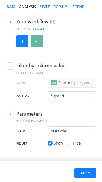
- After clicking APPLY, CARTO will return the result of the Filter by column analysis. After finishing the analysis, CARTO will return all of the points that have the flight_id value equal to
8366cde.
Connect with lines Analysis
- We will apply the analysis to the result of the
Filter by column valueanalysis, so we will go back to the main menu and we will click on theADD ANALYSISoption of theflights_sampledlayer. - We will select the Connect with lines analysis.
- There are two sections in the
ANALYSESlayer tab:- Workflow: Now, because we are applying a second analysis to the
flights_sampledlayer, the workflow has changed.A1represents the filter analysis, but now we have a new analysis namedA2, indicating the second analysis applied to the layer. - Connect with lines:
- Source: we indicate that we’re using the Filter by column analysis results as the source. The source is not the original layer points; it’s the points that we got after the Filter by column value analysis (A1).
- Type: we indicate how we want to connect our points. We select the
sequentialoption. - Order by: we indicate the column we’ll use to define the order in which the points will be connected. We will use the
timestampcolumn, to order our data by date.
- Workflow: Now, because we are applying a second analysis to the
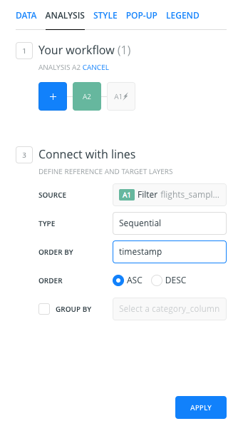
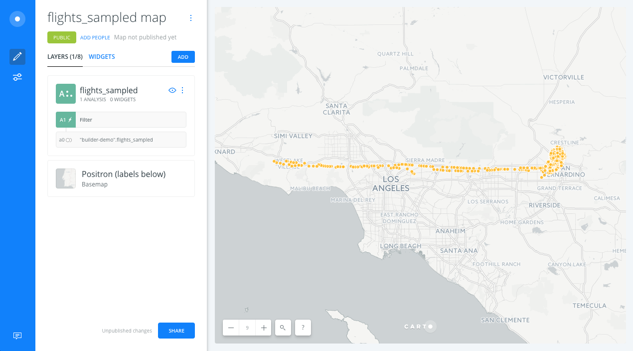
- After clicking APPLY, we should see the lines of the filtered points from the Filter by column value analysis.
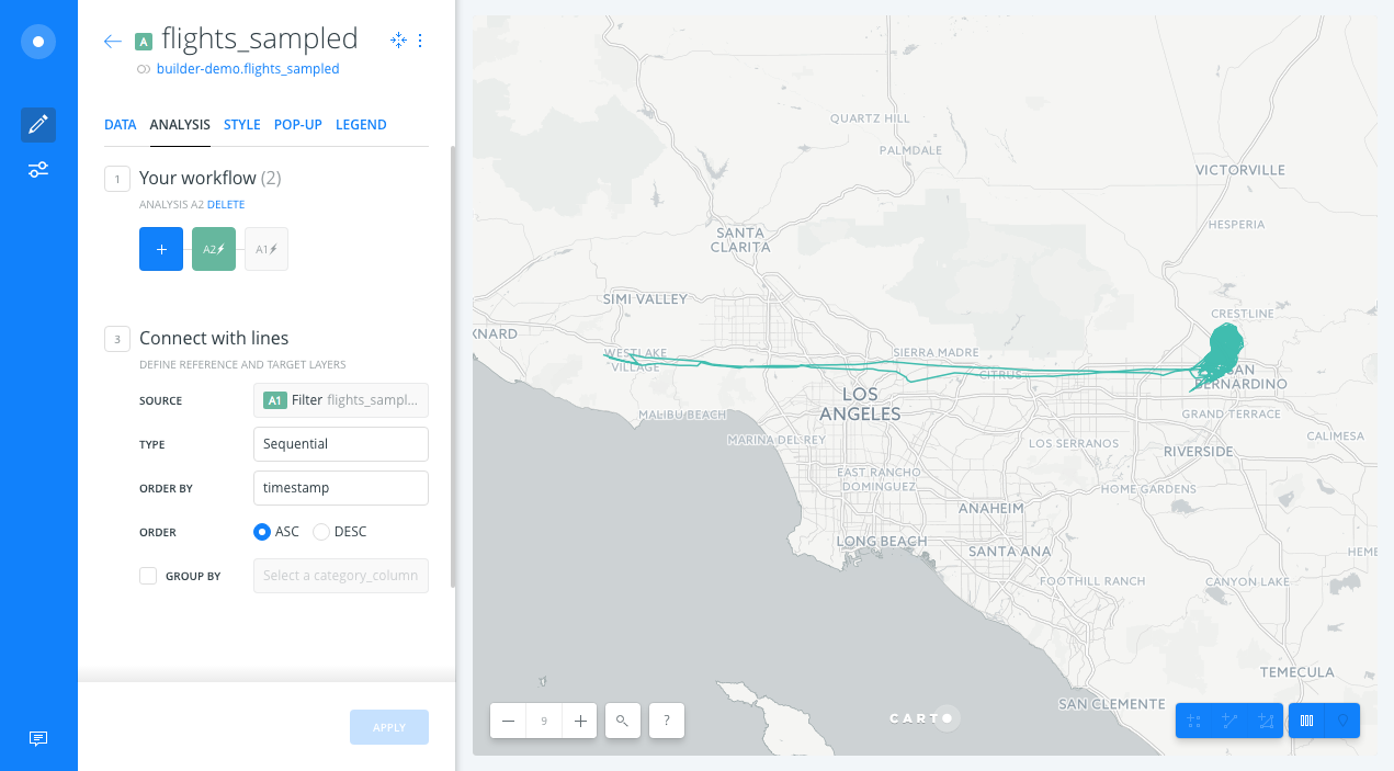
Improve visualization
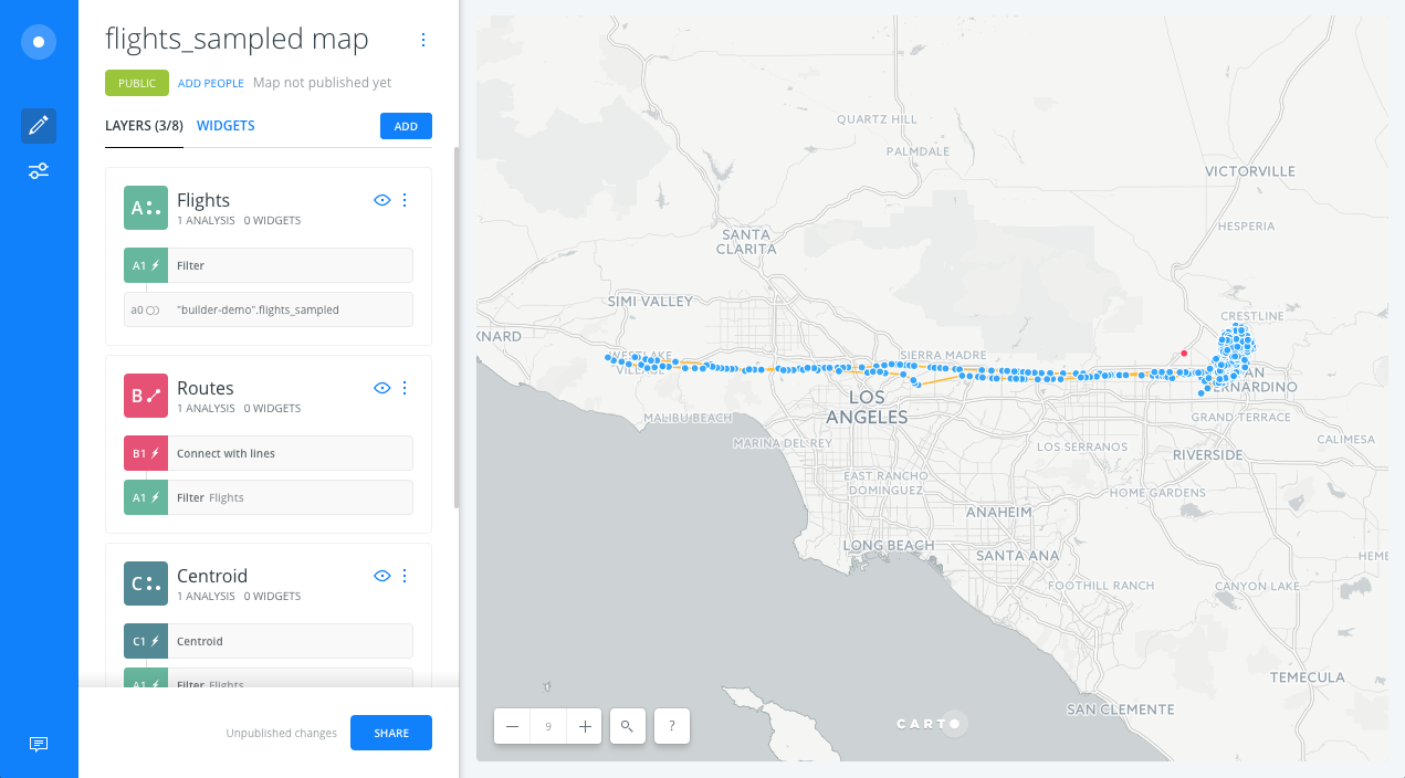
- Back to the main menu, in the Layers tab, drag and drop the Connect with lines node analysis outside of the layer (node A2) to create a new data layer with lines (layer B). By doing this, we will have a map layer with the filtered points and a layer with lines representing those connected points.
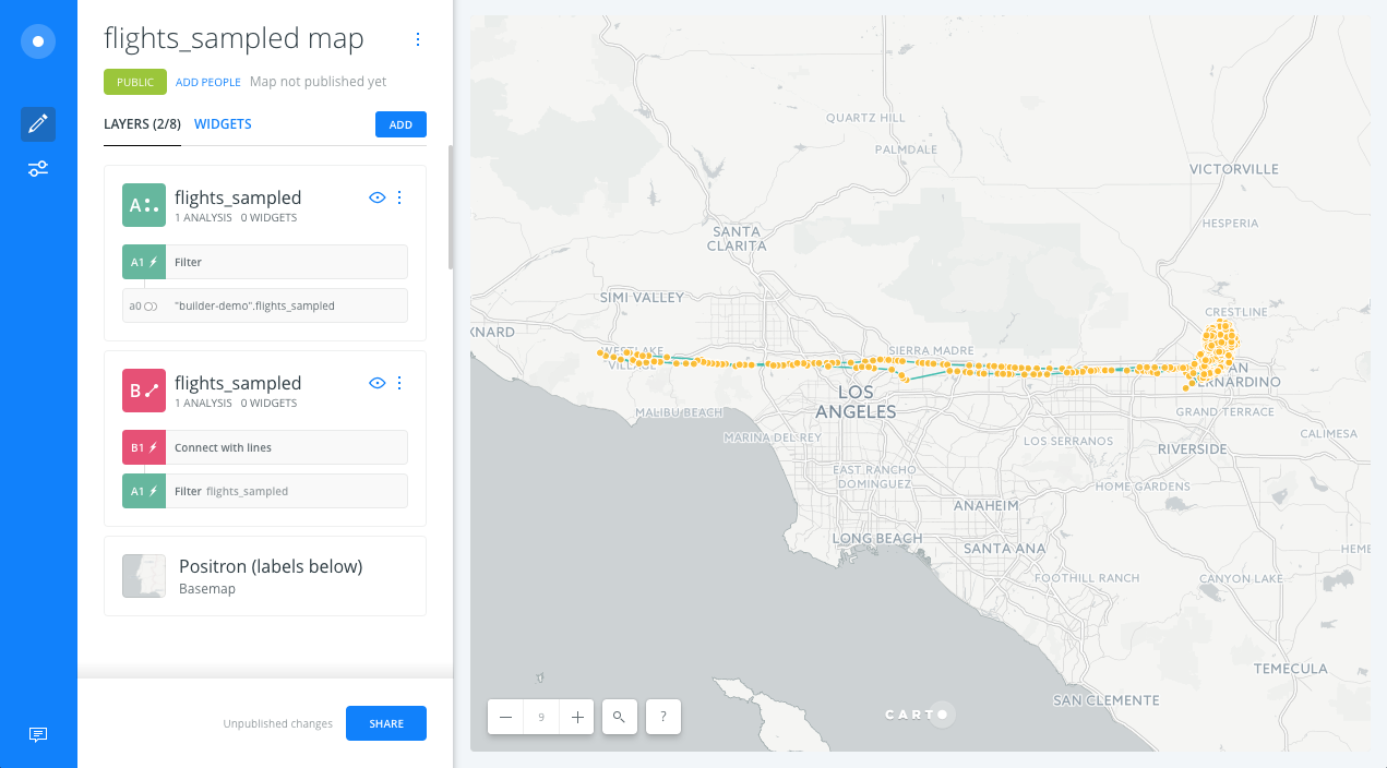
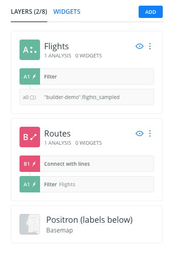
- Now, we change the name of the layers. The name of Layer A will be
Flightsand the name of layer B will beRoutes.
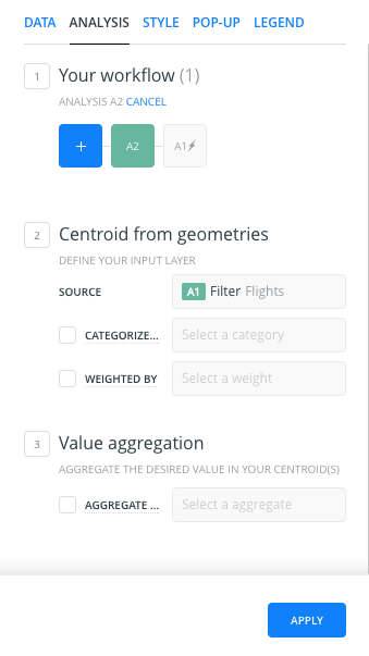
Find centroid of geometries analysis
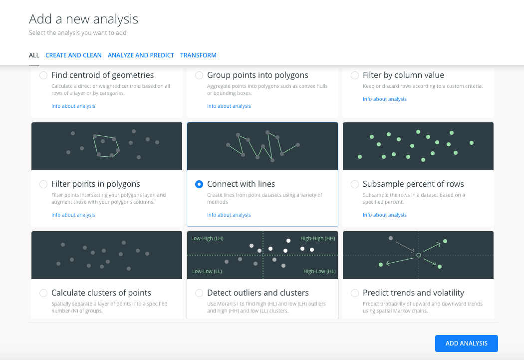
- We will apply the analysis to the result of the Filter by column values analysis. We will go back to the main menu and click on the
ADD ANALYSISoption of theFlightslayer (A). - We will select the Find centroid of geometries analysis.
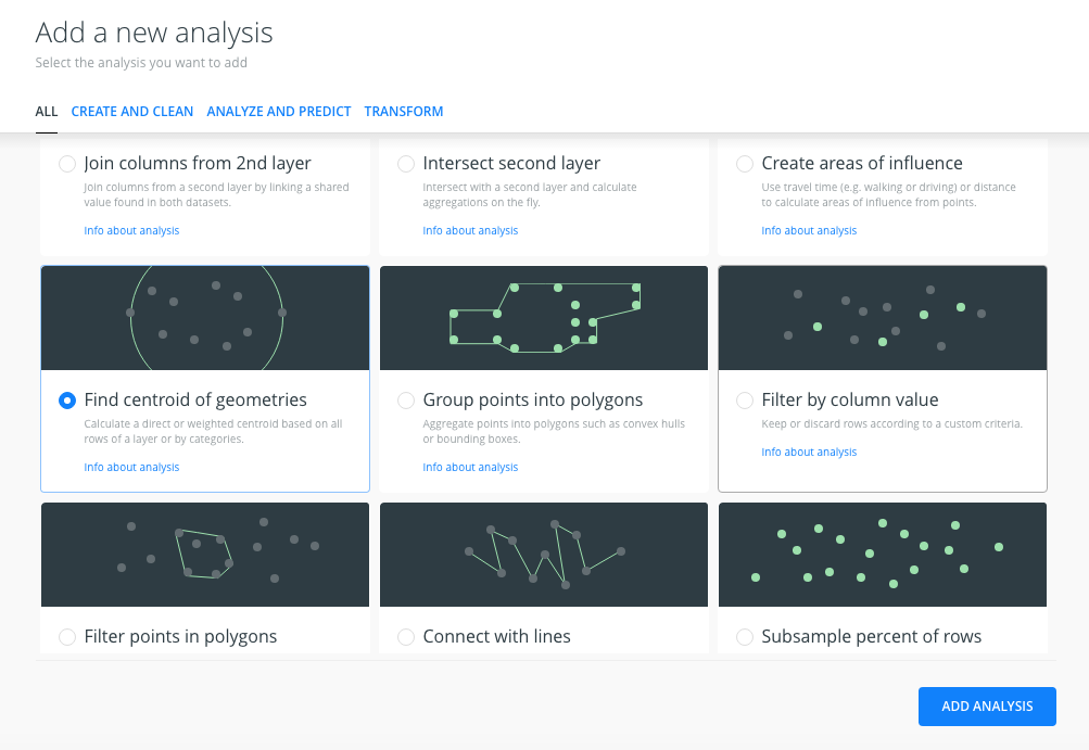
- In the
ANALYSEStab of the layer, we have three sections:- Workflow: Now, because we are applying a second analysis to the
filterlayer, the workflow has changed.A1represents the Filter by column analysis,A2represents the new analysis we’re adding. - Centroid from geometries:
- Source: we indicate that we’re using the Filter by column values analysis results as the input. The input is not the original layer points; it is the points that we got after the Filter by column values analysis.
- Categorize: we leave this checkbox uncheched.
- Weighted by: we don’t want weighted centroids, so we leave this checkbox uncheched.
- Value aggregation: we don’t aggregate the values, we don’t check the AGGREGATE checkbox.
- Workflow: Now, because we are applying a second analysis to the
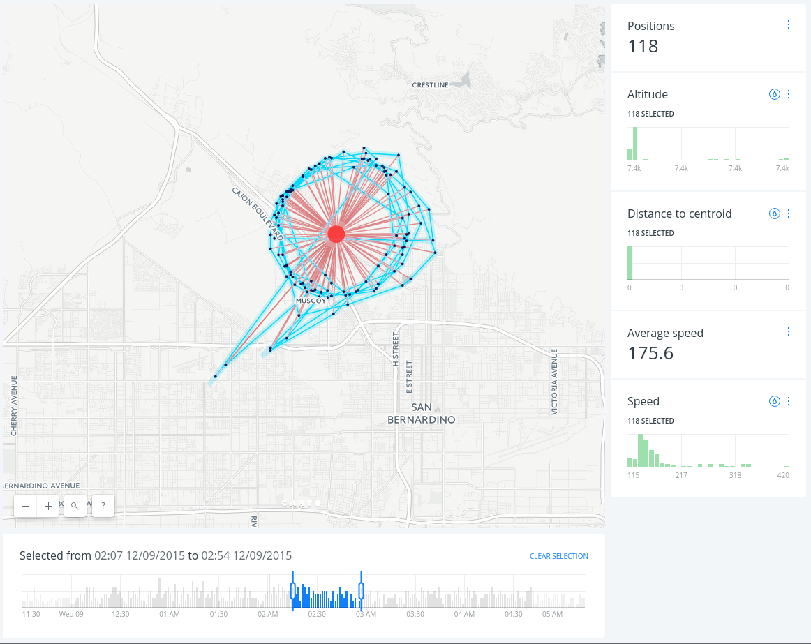
- After clicking APPLY, we should see the centroid of our filtered data:
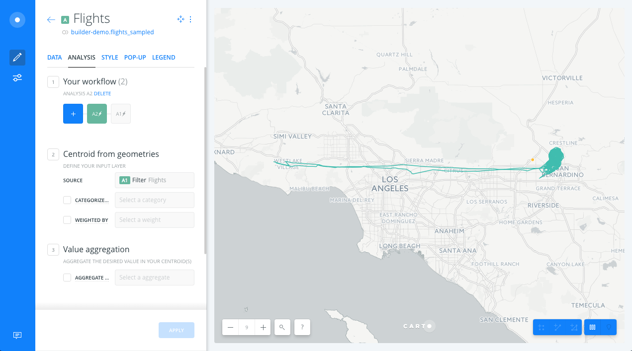
Improve visualization
-
Back to the main menu, in the LAYERS pane, we drag and drop the Centroid node analysis outside of layer (A) to create a new Data layer containing the areas of influence (C). The new layer (C) will have the same name as layer A, so we will change the name of layer C to Centroid.
-
We also change the styles of the Centroid, Flights and Routes layers to highlight the lines, points and their centroid.
Widgets
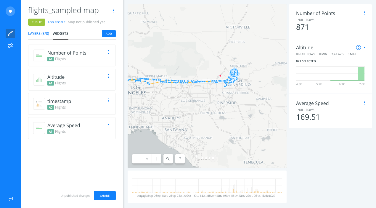
Timeseries widget
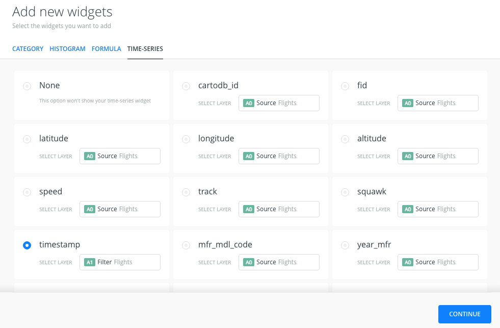
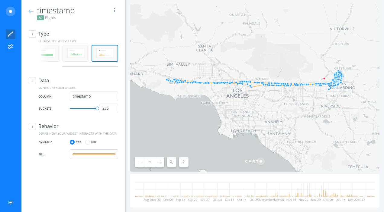
- Open WIDGETS pane and select the ADD WIDGET option.
- In the options of the TIMESERIES tab, select the
timestampcolumn of the A1 layer and we click on CONTINUE.
- We will see the timeseries widget on the map, we can filter by time using the widget.
Histogram widget
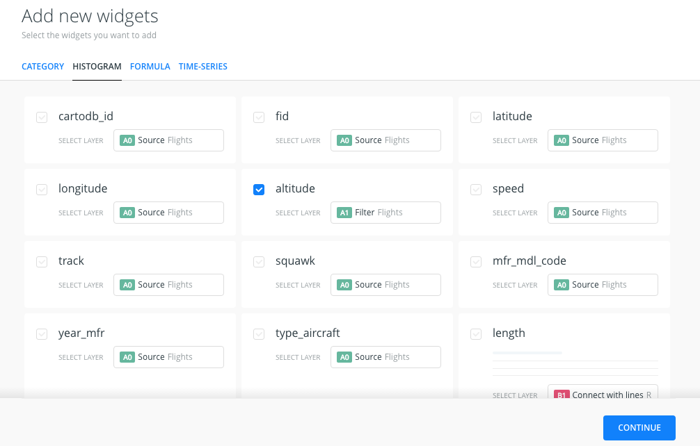
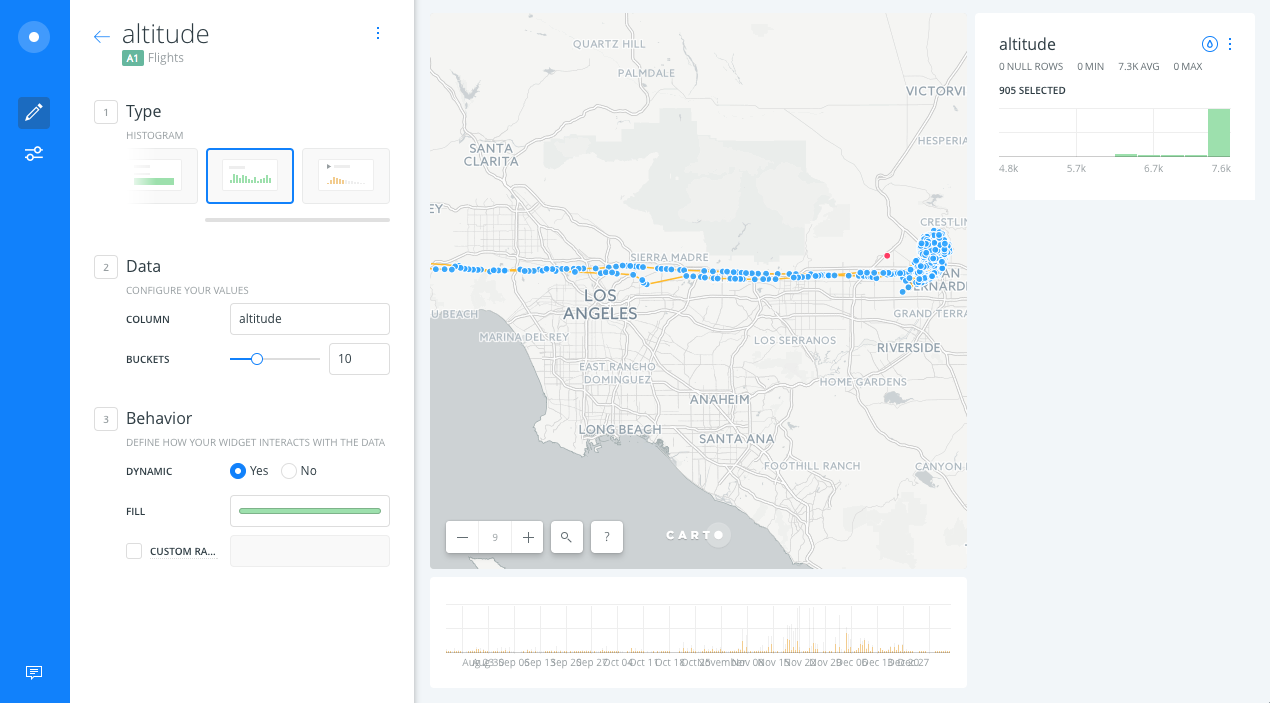
- Open WIDGETS pane and select the ADD WIDGET option.
- Within HISTOGRAM tab options, select altitude from A1 layer and click on CONTINUE.
- We should get a histogram with the distribution of the altitude values. Click on the histogram to filter your data:
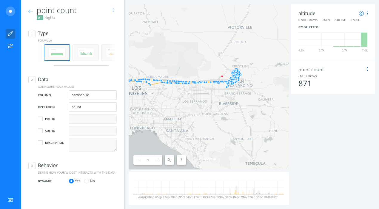
Formula widget
- Open WIDGETS pane and select the ADD WIDGET option.
- Within FORMULA tab options, select point_count of the A1 layer and we click on CONTINUE.
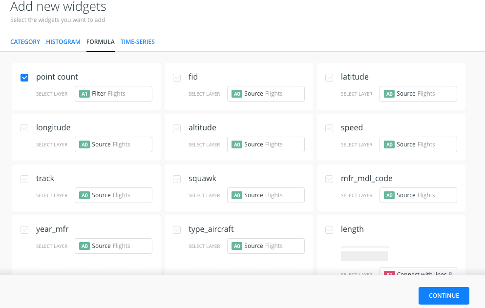
- We will get a widget that counts the number of points displayed on the map.
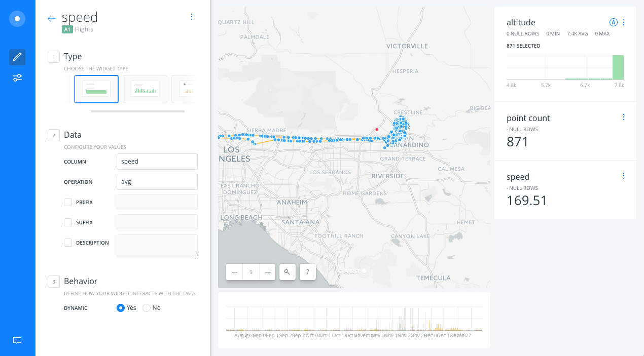
- Open WIDGETS pane and select the ADD WIDGET option.
- Within FORMULA tab options, select speed from A1 layer and we click on CONTINUE.
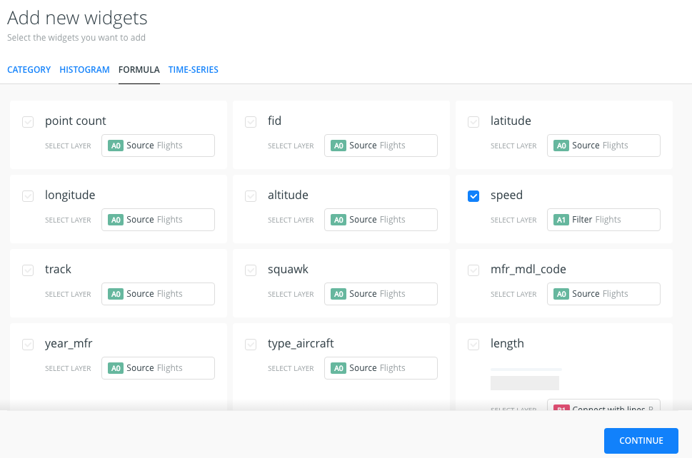
- We will get a widget that calculates the average speed of the points displayed within the map view.
Modify widgets
- We will rename the widgets. To do this go back to the main menu and select one of the widgets in the list.
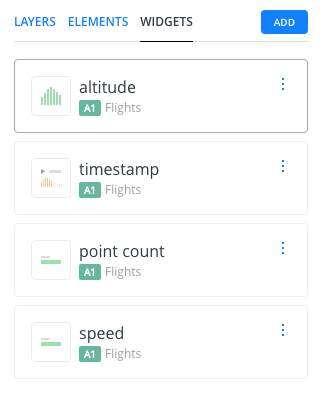
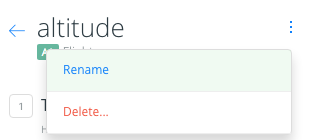
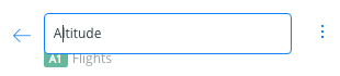
- Click on the icon with three dots and a new dropdown menu will appear will appear. Select Rename widget and change the widget name.
- By doing a drag and drop operation we can change the widget display order.
Publish
-
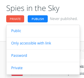
At the bottom of the main menu, click the SHARE button.
-
Change the privacy of the map to Only accessible with link.
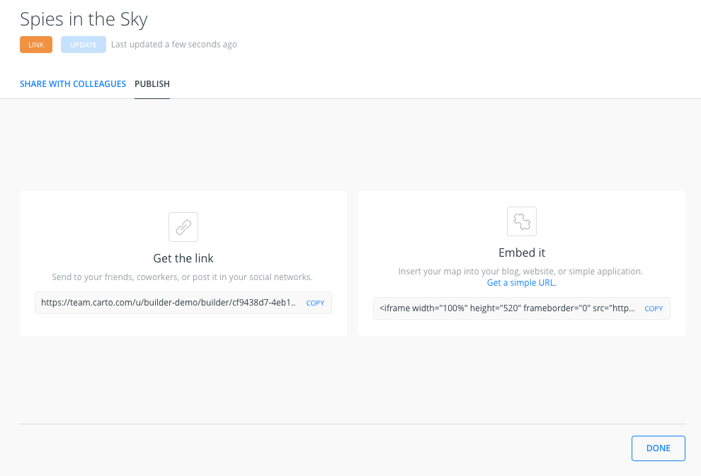
- Navigate to PUBLISH tab and click on PUBLISH below the Map title to share our map.
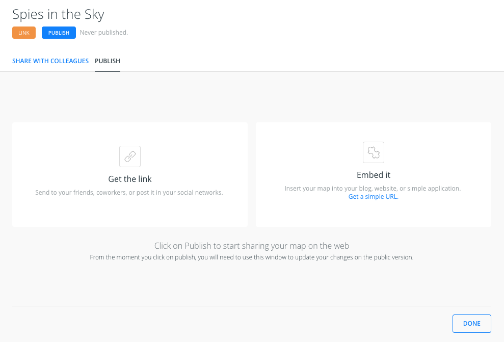
- After clicking PUBLISH, we can select the option to share our map.
Extension
An extension of this exercise would be to add another analysis to the filtered points: connect them with the centroid. This is another version of the Connect with lines analysis, using the Source option to connect all the points to a different source, in this case the Centroid layer. This analysis also gives to the resulting dataset a new field named length that can be added as a histogram, to be able to find that as our planes are doing circles we have a significant number of lines with the same length.