Example - Breaking Down an Area into Sales Territories
Learn how to find the best place to create a store near the customers in Portland city.
You will need to import the following dataset/s into your account:
- Customer locations dataset customer_home_locations from Sales Territories (Portland) Demo or use this url directly.
Import and create map
Import customer_home_locations csv.
- Use the New Dataset wizard on your Data page to import the table.
- Select customer_home_locations and click on CREATE MAP.
- Rename the layer from customer_home_locations to Customer Home Locations and update the map name to Sales Territories (Portland) Demo.
Warning: after renaming a layer a error could pop up saying the map cannot be rendered, don’t worry about this. Refresh the page and it will dissapear.
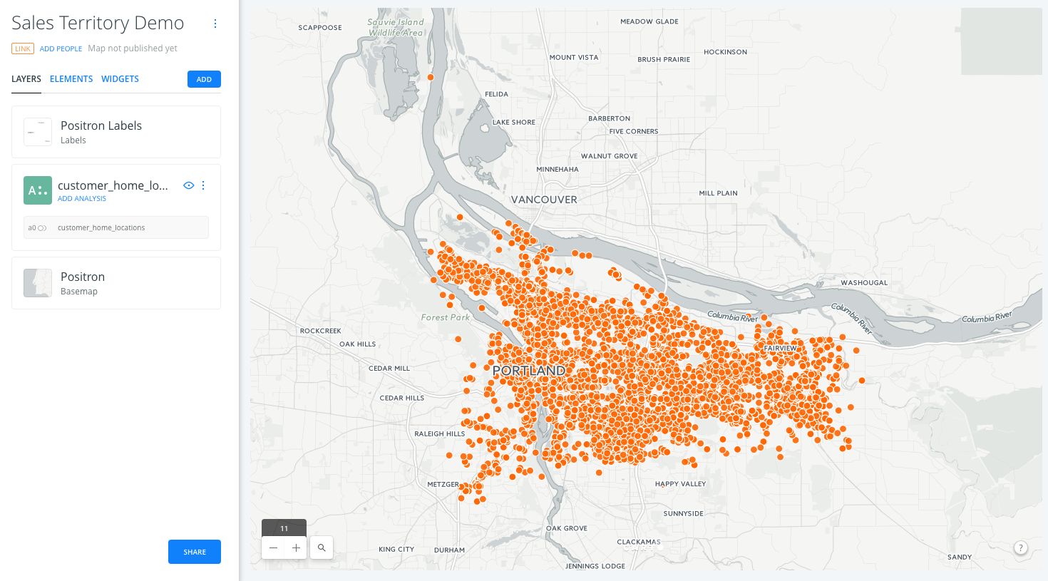
You should have a dashboard like this:
Layer styling: first view
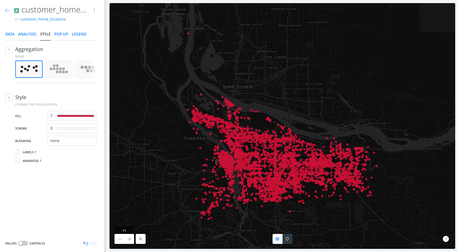
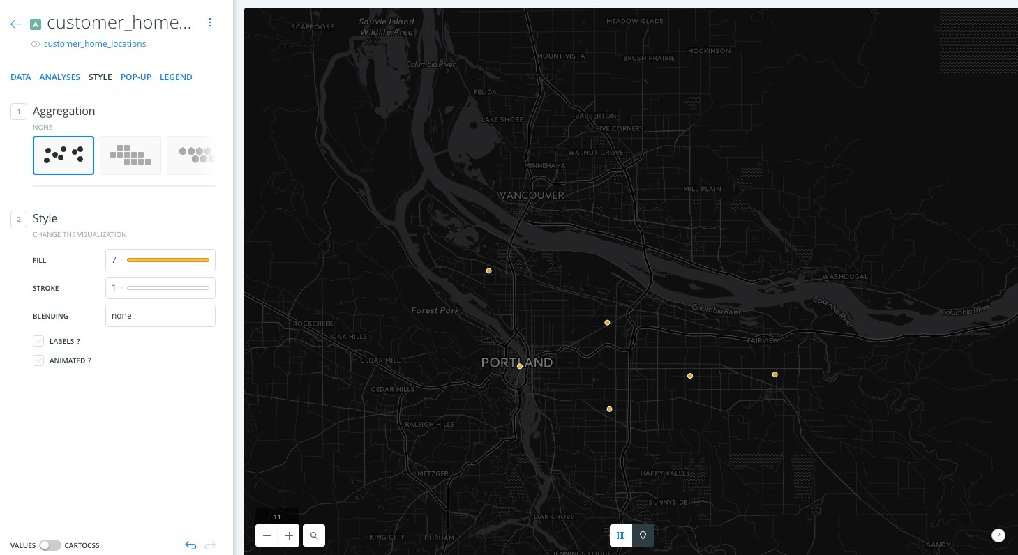
On this example we will start with a single color styling and fixed marker size.
- Change the FILL color to
#cc1035and set the size of the markers to7. - Set the STROKE of the points to
0. - Click the slider button from VALUES to CARTOCSS. Take a look on the CartoCSS view and try to change any of them like increasing the width of the marker.
Analysis
Cluster Analysis
-
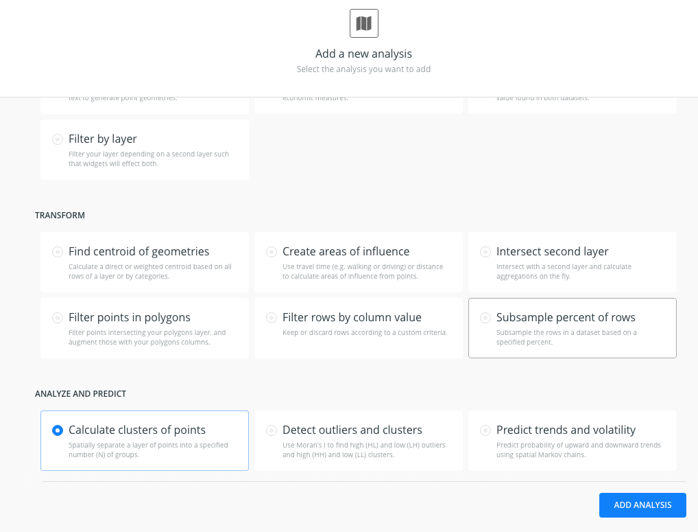
Back to LAYERS pane on Builder user interface, select Customer Home Locations and click on ADD ANALYSIS.
-
From the analyses options, select Calculate clusters of points analysis and click on ADD ANALYSIS.
- From ANALYSES tab, we have three sections:
- Your workflow: Is an overview of the analysis that we apply to the layer, so you can have more than one. The analysis should have the name A1 to indicate that is the first analysis applied to the layer.
- Source: asks for the geometry column from which we will calculate the clusters.
- Parameters: Define the number of possible stores that you want. We set the number of clusters to
6.
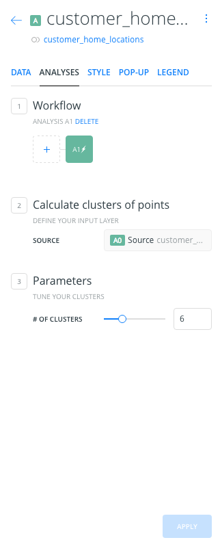
- After clicking APPLY, CARTO will return the result of the analysis. The result should have the same number of points on the map, but with an extra column called
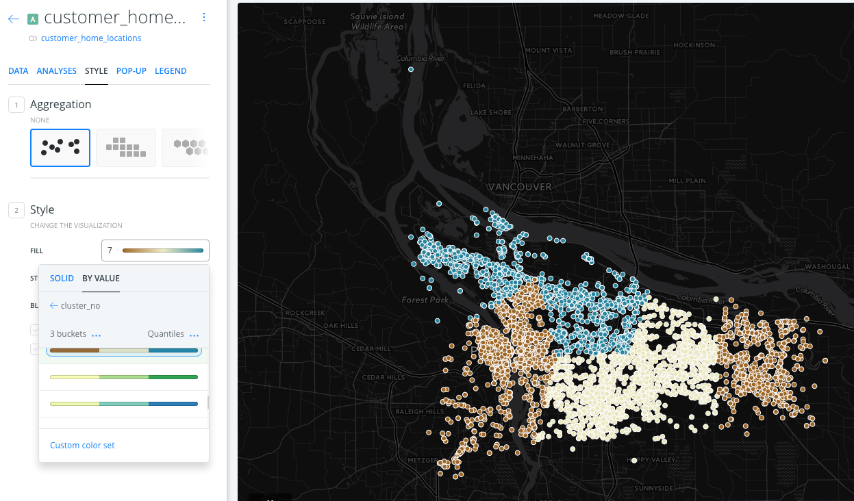
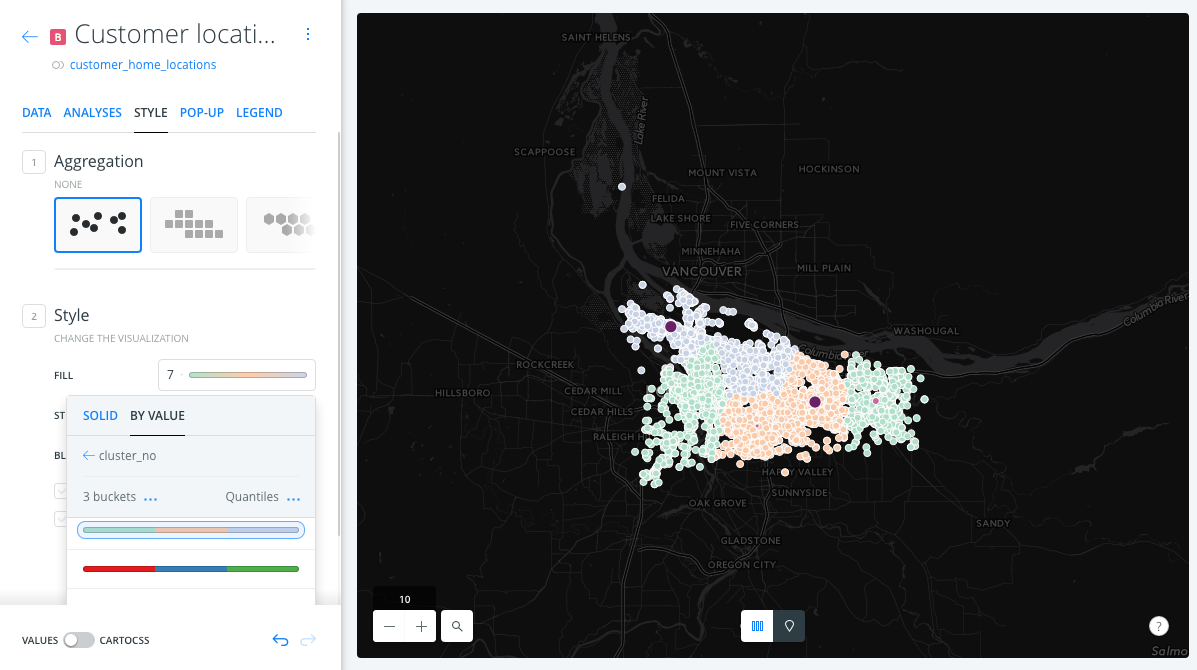
cluster_no. - In order to have a better understanding of the result of the analysis and see how the points are grouped, we should change the FILL option of the points (in STYLE tab) according to the value of
cluster_nocolumn using BY VALUE options:
Weighted Centroid Analysis
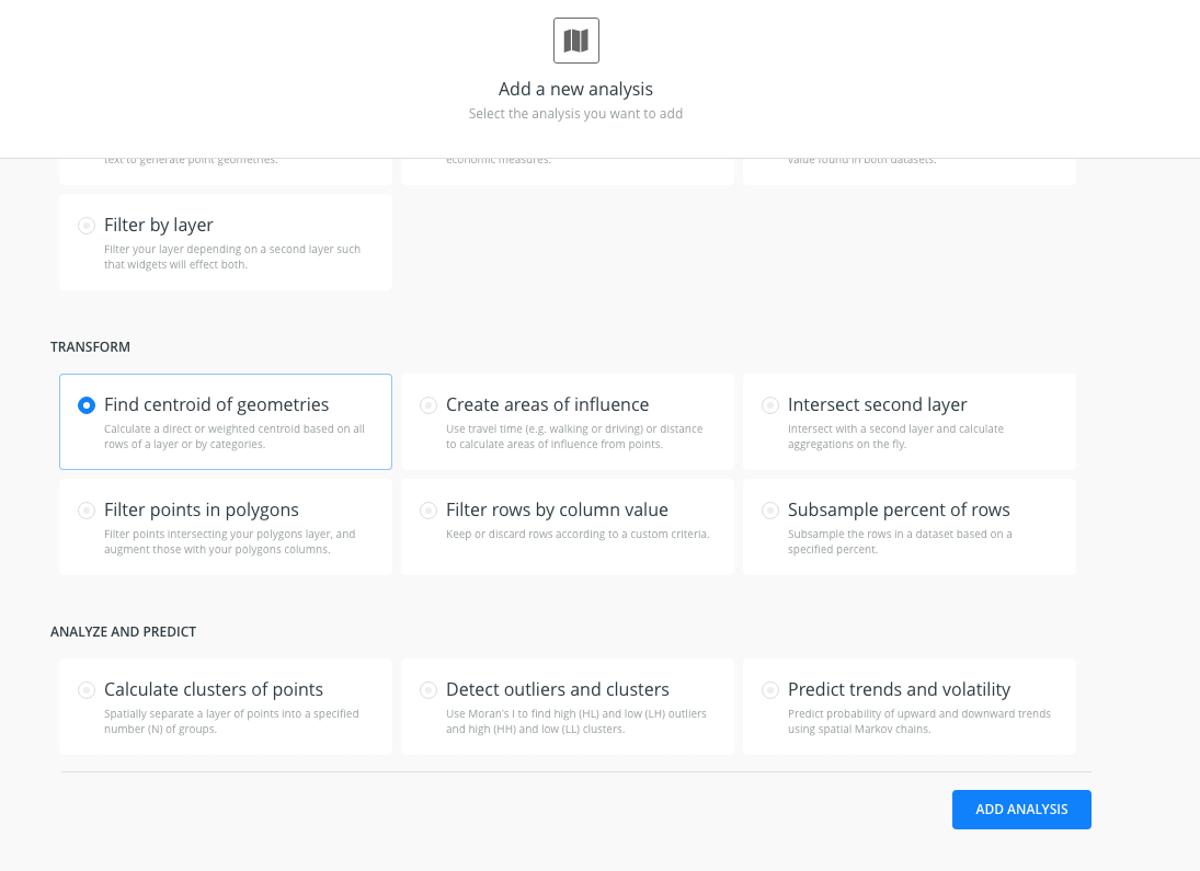
- Click on Customer Home Locations, go to ANALYSIS tab and click on ADD ANALYSIS.
- Select the Find centroid of geometries analysis.
- In the ANALYSES tab of the layer, we have two sections:
- Your workflow: Now, because we are applying a second analysis to the Customer Home Locations layer, the workflow has changed. A1 node represents the cluster analysis, but now we have a new analysis named A2 to indicate that is the second analysis applied to the layer.
- Centroid:
- Source: we indicate that we are using as the source, the results from the Calculate clusters of points analysis. The source is the result from Calculate cluster points analysis.
- Parameters: to set how we want to calculate the centroids of the cluster data. We will select the Categorized by option using the
cluster_nocolumn, we will also select the Aggregated by parameter to aggregate the result bycustomer_valueaverage value. Finally, we will select the Weigthted by parameter using thecustomer_valuecolumn to indicate the column that we want to use to calculate the centroids of the clustered regions.
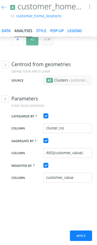
- After clicking APPLY we should see the result, which should be the centroids of the clustered areas.
Improve visualization
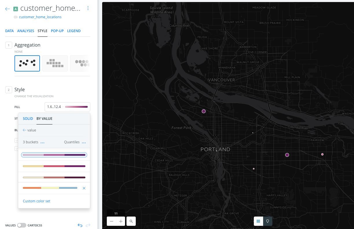
- We could style our resulting points by changing the size and the color according to the resulting aggregated values.
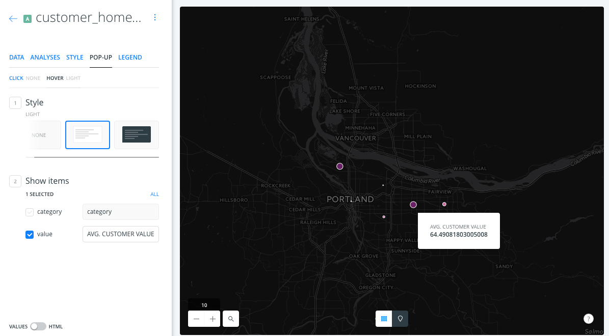
- We also could add a popup to the layer, so for each point we can display its value. In order to do this we need open the POP-UP tab and select the HOVER option to display the pop-up when we mouse over the centroids. We select the column value to display its values in the pop-up. We will also change the name that will be displayed on the pop-up to AVG. CUSTOMER VALUE.
- Back to the main menu, in the Layers tab, we drag and drop the clusters’ node analysis outside of layer A1 to create a new data layer with the customer locations (B).
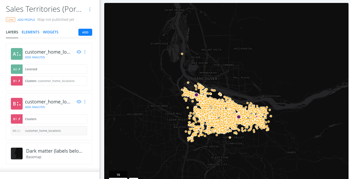
- Now, we change the name of the layers. The name of Layer A will be Centroids and the name of layer B will be Customer Locations. Then, we change the style of the Customer Locations layer using the values from the column
cluster_noin order to style the points depending on the cluster they belong to.
Area of influence analysis
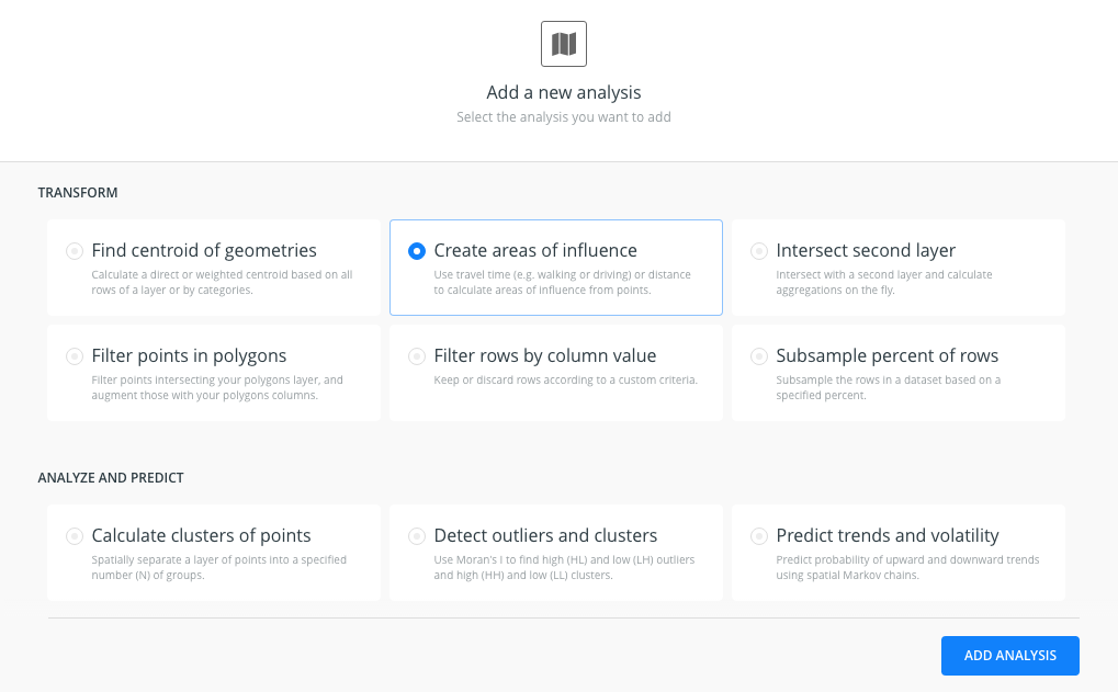
- We will apply the analysis to the result of the centroid analysis. We will go back to LAYERS pane on Builder interface and click ADD ANALYSIS on Centroids layer (A).
- We will select the Create areas of influence analysis.
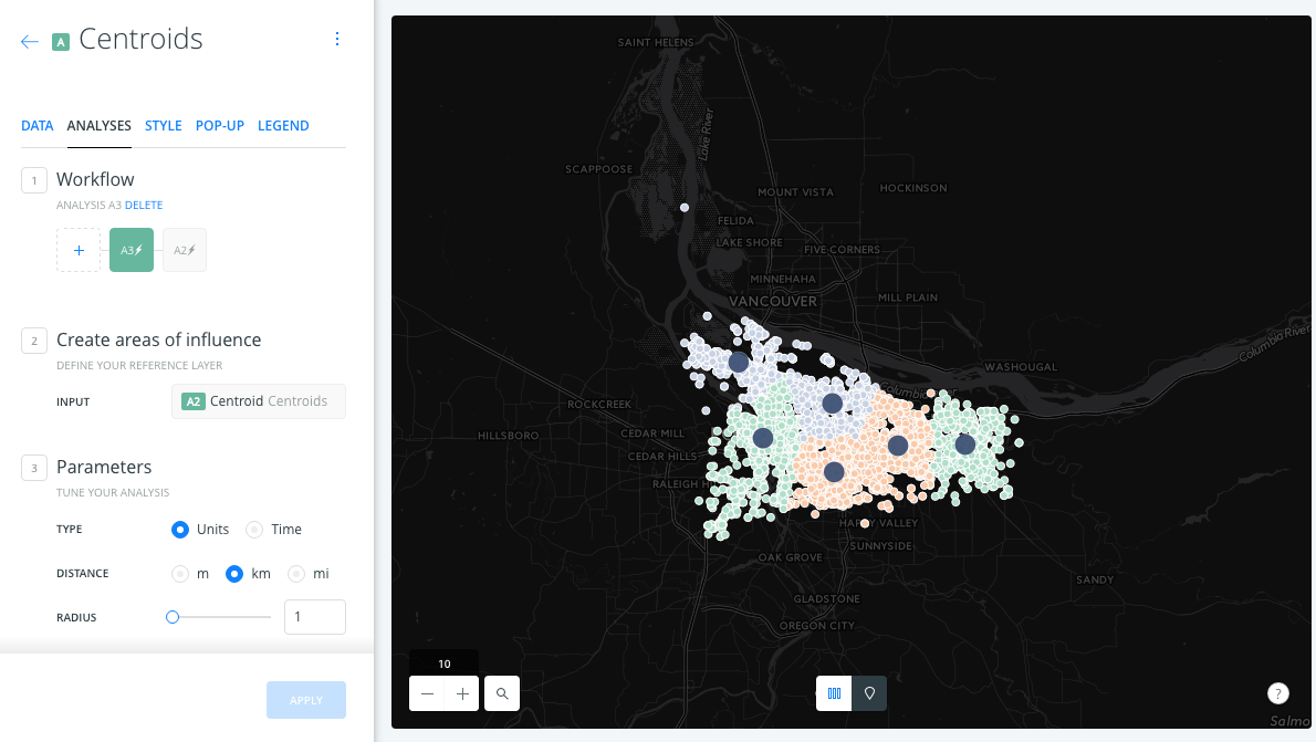
- In the ANALYSES tab of the layer, we have three sections:
- Your workflow: Now, as we are applying a third analysis to Centroids layer, the workflow has changed. A1 represents the cluster analysis, A2 represents the centroid analysis and A3 indicates the third analysis applied to the layer.
- Create areas of influence:
- Input: Should be the result of centroid analysis, node A2.
- Parameters: define the distance of the area of influence, the type of units, the radius and the boundaries. The boundaries might be Intact or Dissolved. If we choose the Intact option, that means that if our areas of influence polygons overlap, then they will keep their original polygon borders. On the other hand, if we choose the Dissolved option, if the areas of influence polygons overlap, they will be merged so the result will be one big polygon with the outer shape of all AOIs polygons. We set the units to km, set the radius to 1 and choose the Intact option for the BOUNDARIES parameter.
- After clicking APPLY, we should see the result: areas of influence of 100 meters around the subway stations.
Improve visualization
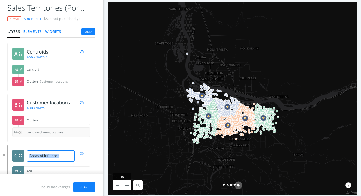
- Back to LAYERS pane, we drag and drop the Area of influence node analysis outside of layer A3 to create a new layer C with the areas of influence. Change the name of layer C to Areas of Influence.
Filter Points in polygons analysis
- We will apply the analysis to the Areas of Influence layer, so we click ADD ANALYSIS option of that layer and select the Filter points in polygons option.
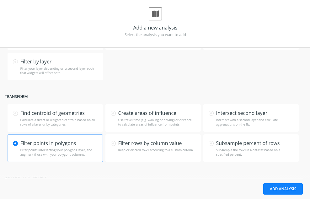
- In the ANALYSES tab of the layer, we have two sections:
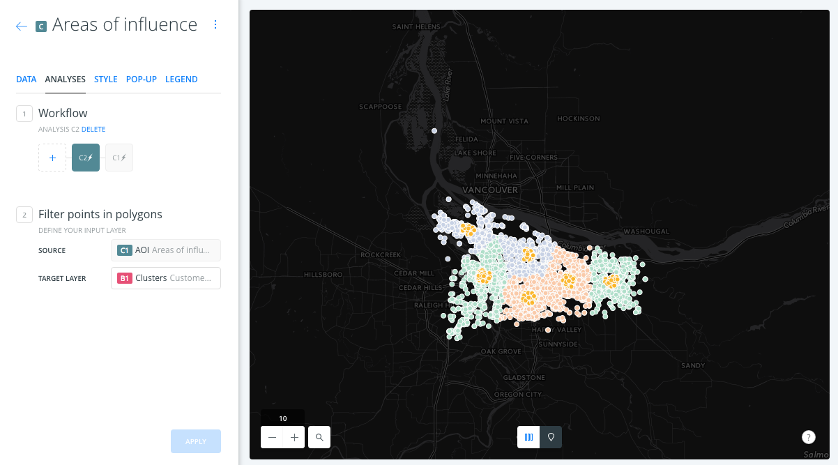
- Workflow: Now, because we are applying a second analysis to Areas of Influence, the workflow has changed. C1 represents the area of influence analysis, but now we have a new analysis named C2 to indicate that is the second analysis applied to the layer.
- Filter points in polygons:
- Source: we indicate that we are using as the source, the results from the AOIs analysis. The source should be B1.
- Target Layer: is the Clusters layer (B1).
- After clicking APPLY, we should see a result where instead of the circles we had before on our Areas of Influence Layer, we should have now points referring to customers within those areas. The result is indicating which customers are closer to each store.
Widgets
Formula widget
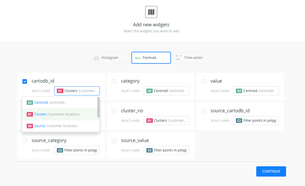
- Go to WIDGETS pane on the Builder interface and click on ADD WIDGET.
- In the options of the FORMULA tab, select the
cartodb_idcolumn of the B1 layer and we click on CONTINUE.
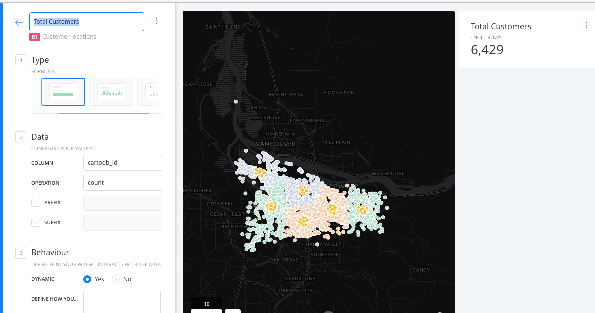
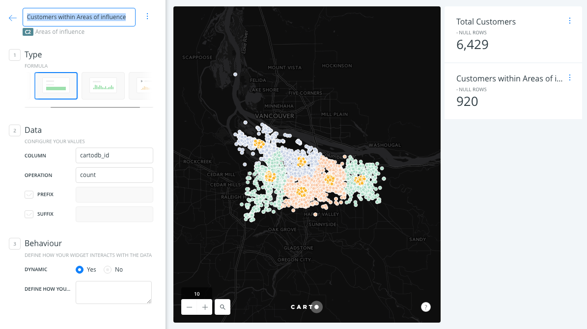
- In the widget menu, we set the OPERATION parameter to COUNT and we change the name of the widget to Total Customers.
- Go to WIDGETS pane on the Builder interface and click on ADD WIDGET.
- In the options of the FORMULA tab, select the
cartodb_idcolumn of the C2 layer and we click on CONTINUE.
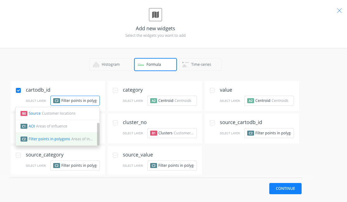
- In the widget menu, we set the OPERATION parameter to COUNT and we change the name of the widget to Customers within Areas of influence.
Histogram widget
- Go to WIDGETS pane on the Builder interface and click on ADD WIDGET.
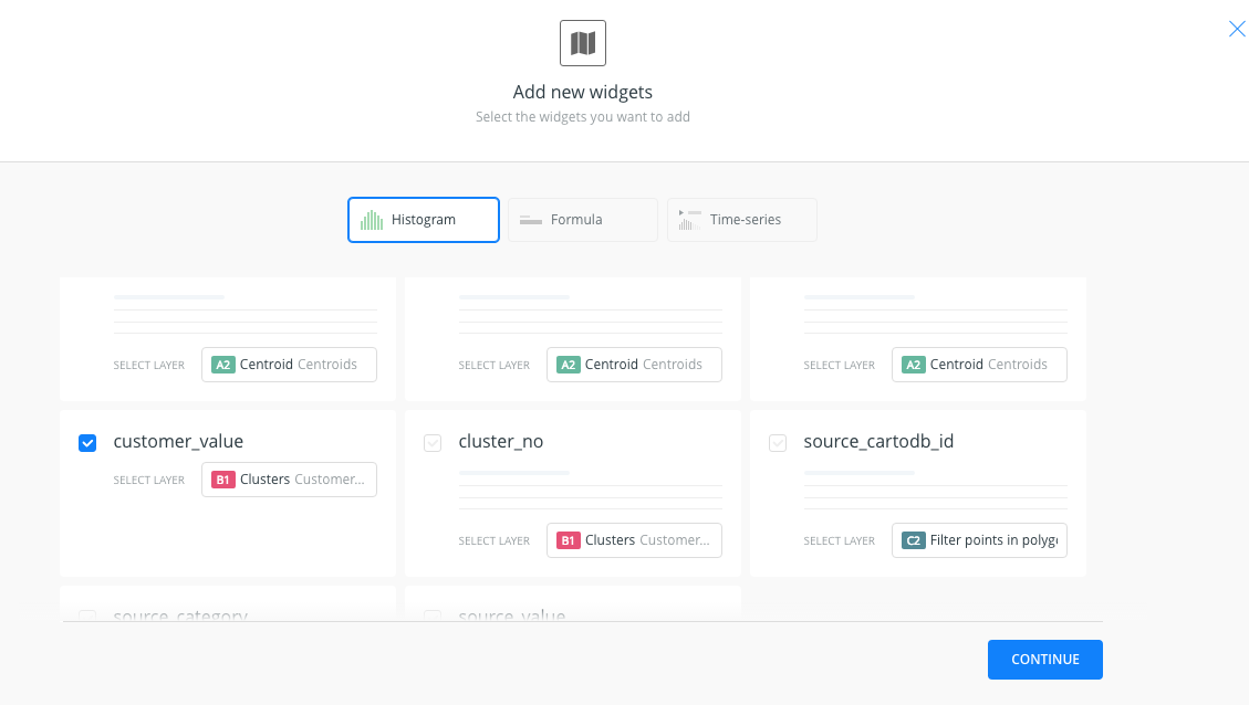
- In the options of the HISTOGRAM tab, select
customer_valuecolumn from B1 layer and click on CONTINUE.
- We should get a “U shape” histogram:
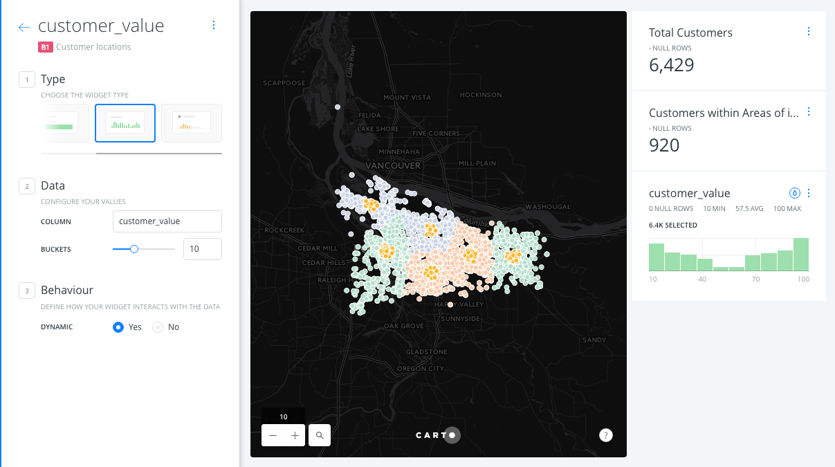
- Go back to the main menu, and filter your map with the histogram. Watch how the map changes!
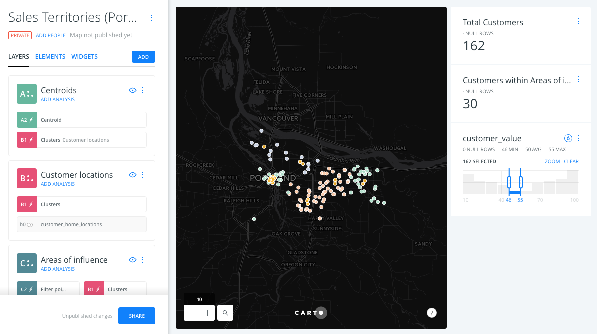
Extension
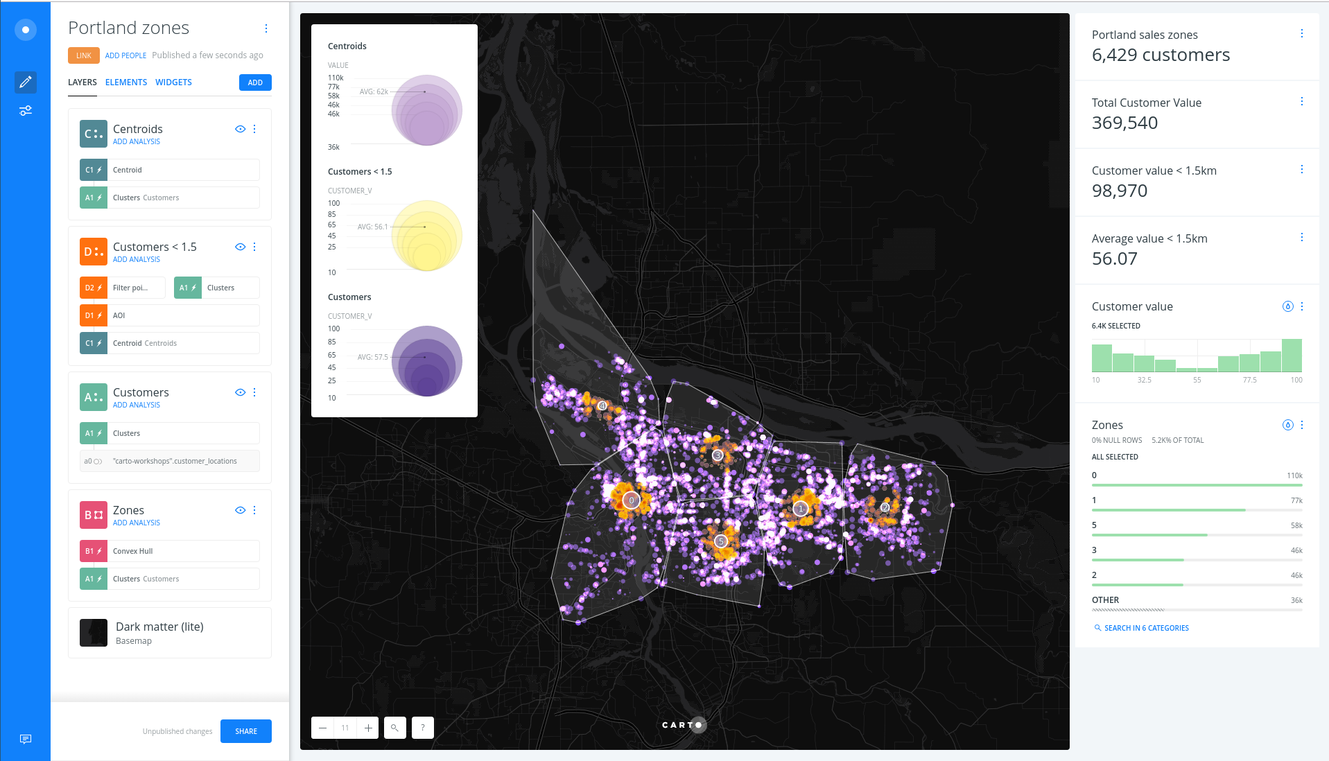
Check this screenshot carefully and see the different analysis and widgets applied. Can you get something like this?
