Example - Simplifying Moran's I Analysis
Learn what US counties have higher risk for insuring railroad companies.
You will need to import the following dataset/s into your account:
- Railroad accidents (railroad_data): download it from the
builder-demoCARTO account and import it into CARTO from your local machine. Or use this url directly. - US counties (cb_2013_us_county_500k): search and connect via Data Library.
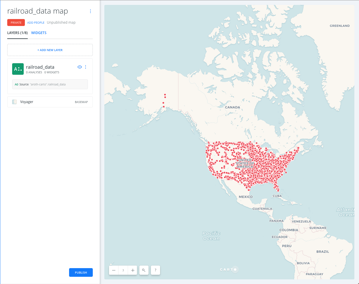
Import and create a map
- Import the dot_rail_safety_data csv file into Your datasets dashboard.
- Create a new map with it
- You should have a dashboard like this:
Styling
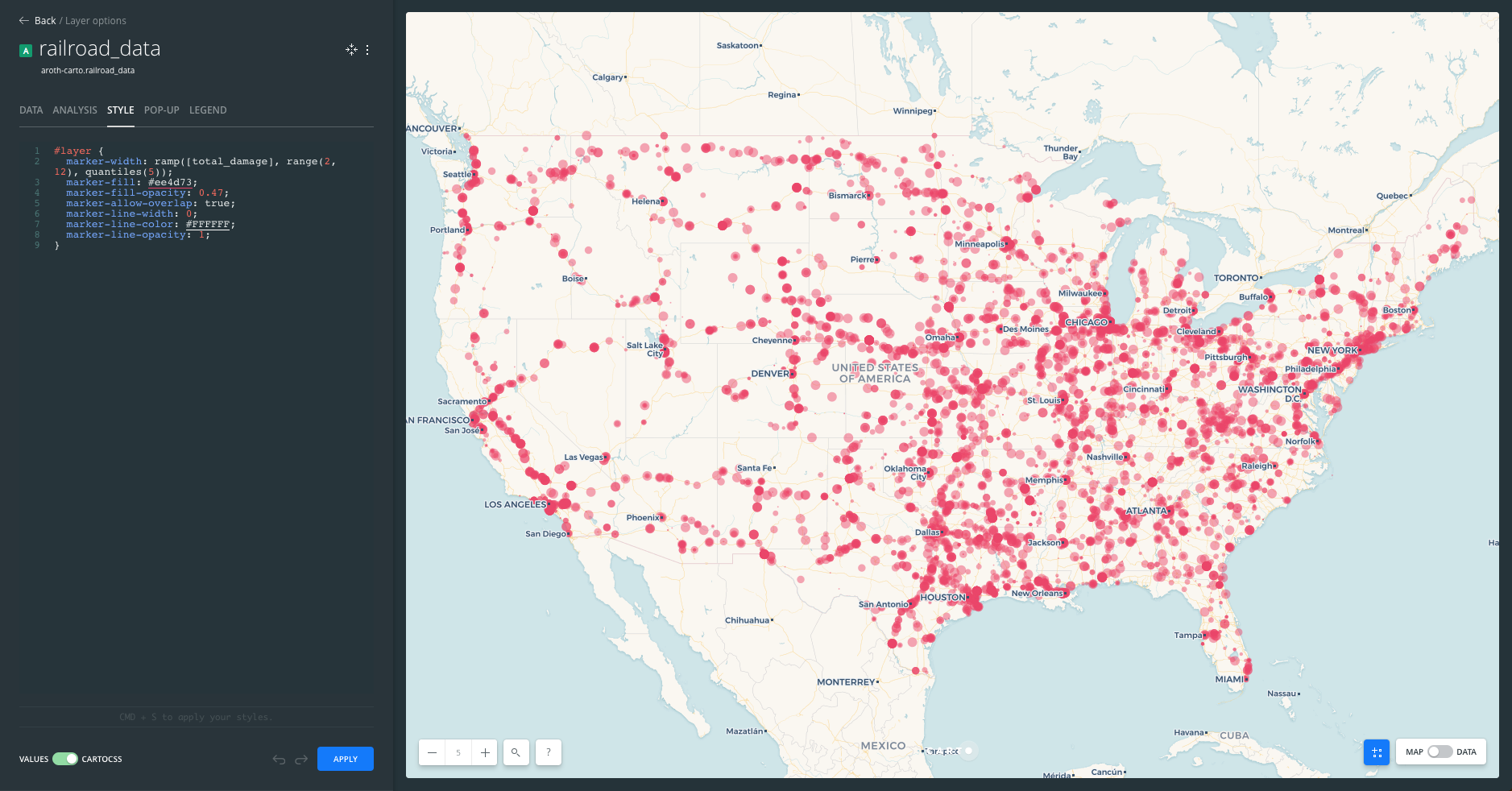
Click on layer A (our only layer) and navigate to the STYLE pane.
SIZE/COLOR:
- Click on the marker size (number). At the top of the pop-up, select BY VALUE, select
total_damageas the variable. Set MIN to2and set MAX to12. - Click on the color selector (bar). Select any color. Set the opacity slider (or use the A text field) to be between
.5and.4
STROKE:
- Click on the stroke width (number). Set to
0.
Exploring the cartoCSS
More advanced users can access the cartoCSS of their map by clicking on the slider at the bottom of the style pane to toggle from VALUES to CARTOCSS.
Switch to the cartoCSS view and check how the quantitative map has been defined. You’ll see a ramp() function. This is TurboCARTO, our cartoCSS pre-processor that helps creating parametric symbolization based on column values. Learn more about TurboCARTO in this awesome blog post by our senior cartographer Mamata Akella.
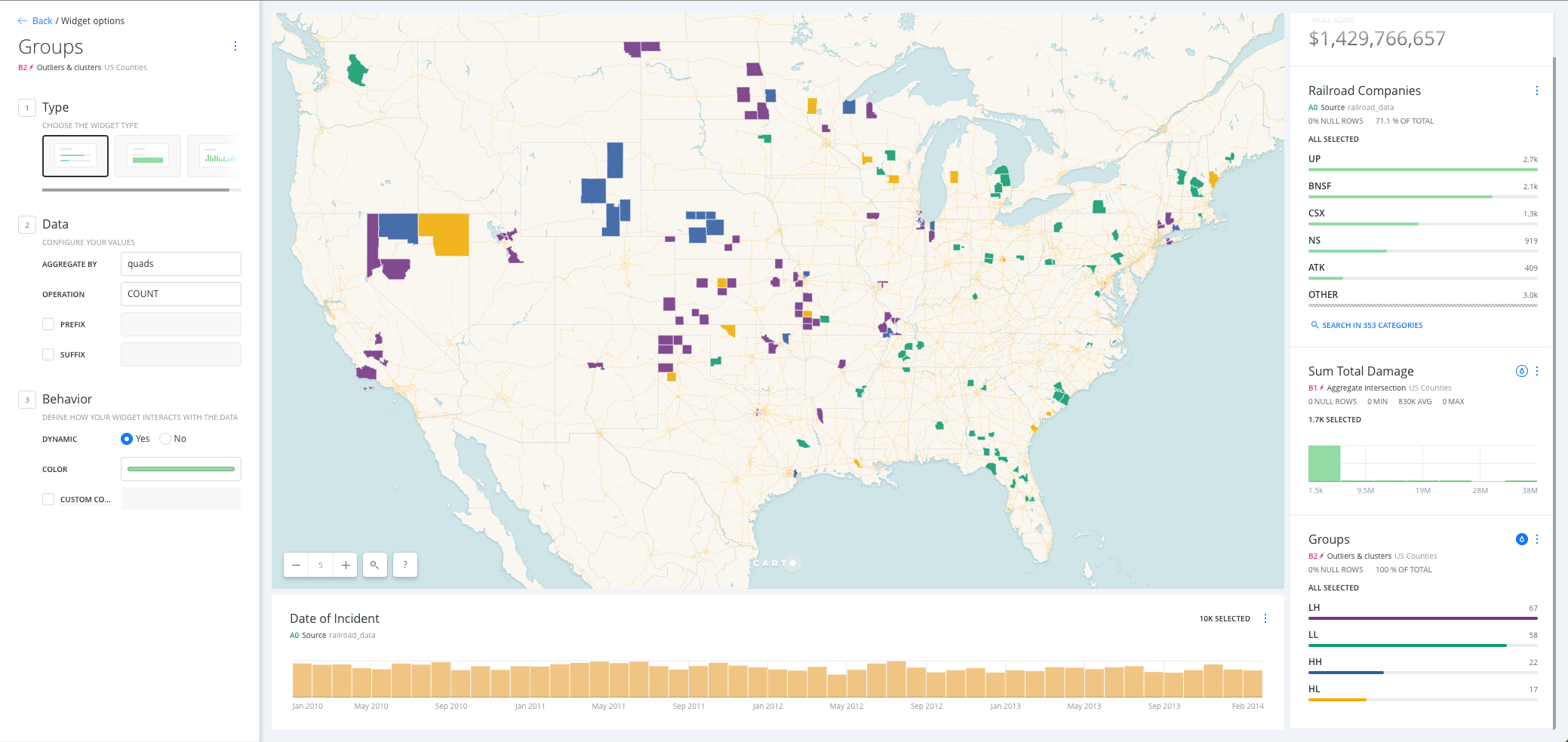
Widgets
Click the Back button to navigate to the layers pane, and switch to the widgets pane
Adding Widgets
Click on ADD NEW WIDGET and add the following:
- CATEGORY:
railroad - FORMULA:
total_damage - TIME SERIES:
date
Click on CONTINUE
Customizing Widgets
Click the Back button to navigate to the widgets pane. From here, you can drag the widgets into the order you would like them to appear on your map. To rename a widget, either double click on it’s name, alter the text and hit enter, or click the three buttons on the right of the widget tiles and select Rename. Give the widgets meaningful names:
railroad->Railroad Companiestotal_damge->Total Damage Costsdate->Date of Incident
Customize the widgets in the following ways:
Railroad Companies Category Widget:
- Notice how CARTO Builder relates map visualizations to widgets. This connection is bidirectional, the map changes widgets values and clicking on categories changes the map.
- Click on the Auto style droplet button to see how each dot is colored according to its category.
- Disable the Auto style to come back to the default visualization.
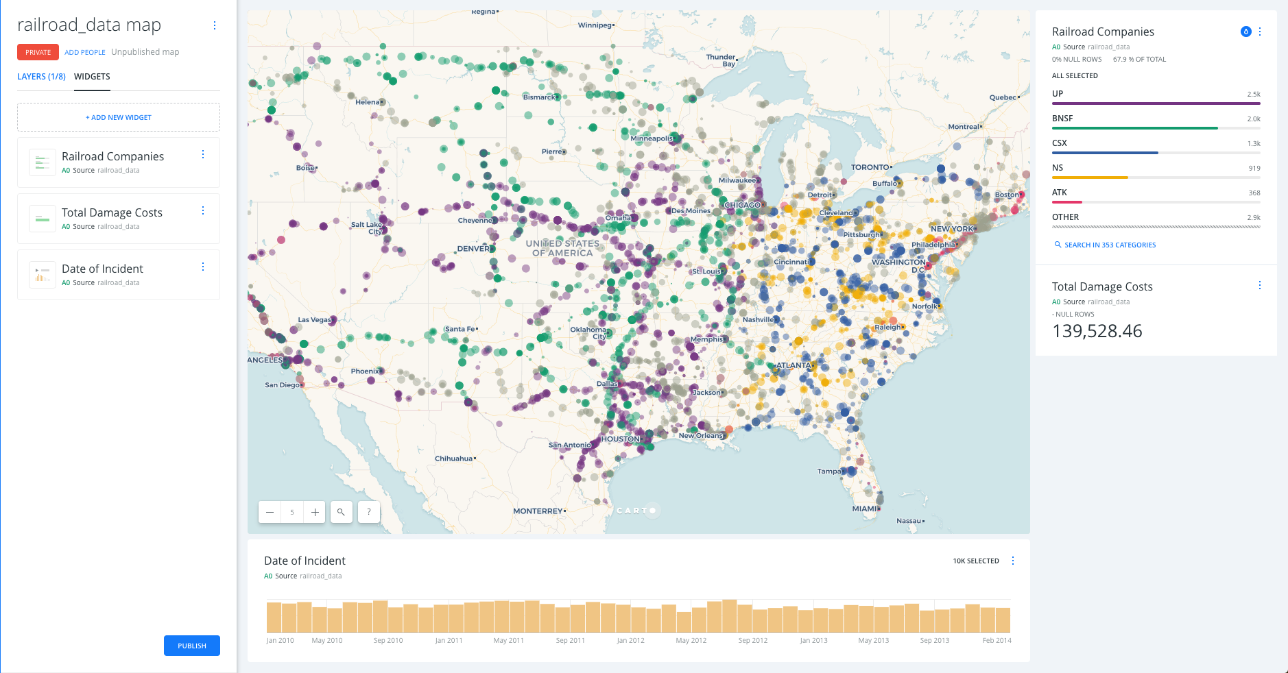
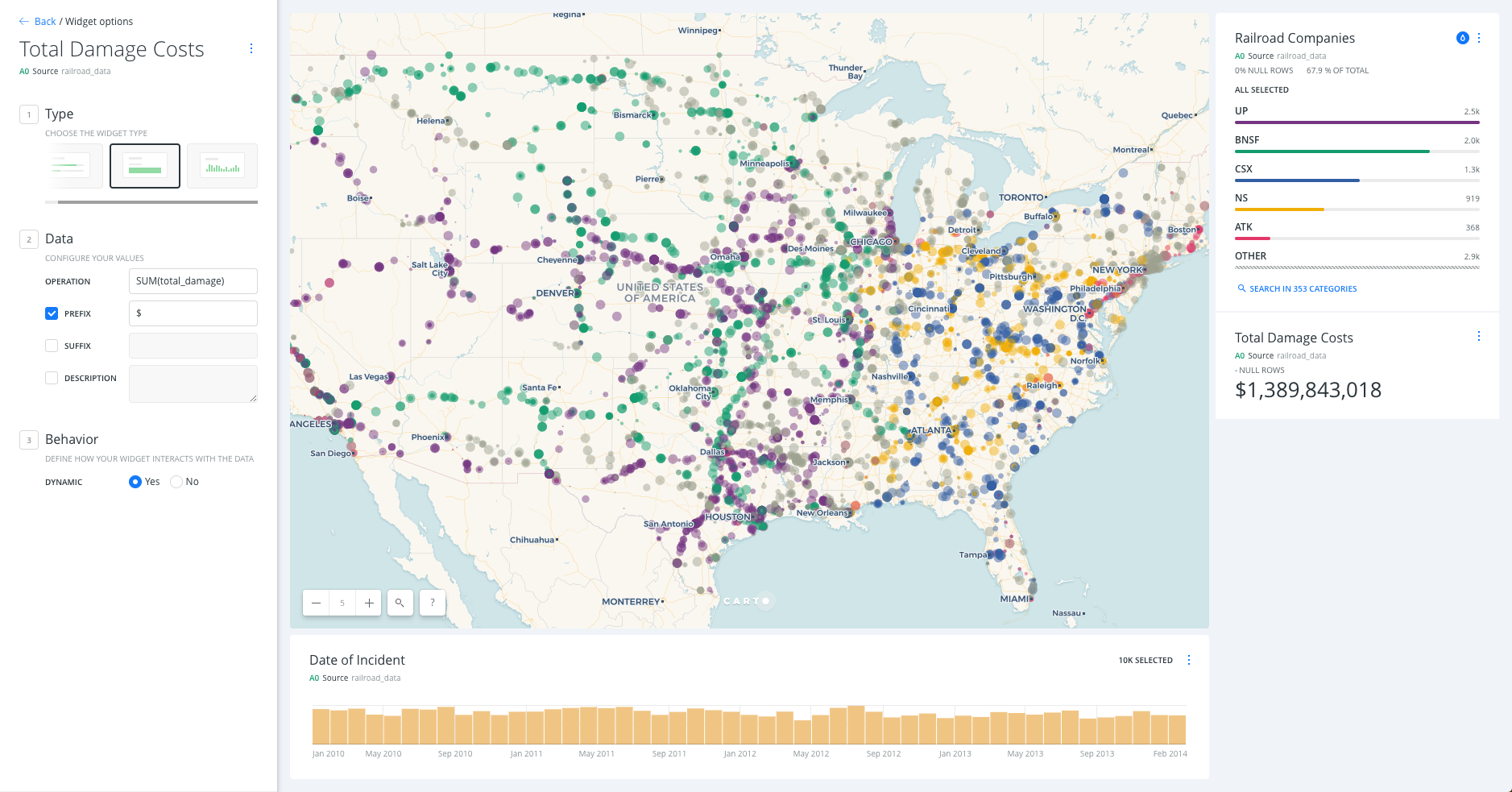
Total Damage Costs Formula Widget:
- Set OPERATION to SUM and add
$as PREFIX. - Again, take note of the relationship between map visualization and widgets.
- Try to filter by company by clicking on a category from the
Railroad Companieswidget and see how theTotal Damage Costswidget is updated automatically.
Date Time Series Widget:
- Set COLUMN to
date - Set BUCKETS to
month
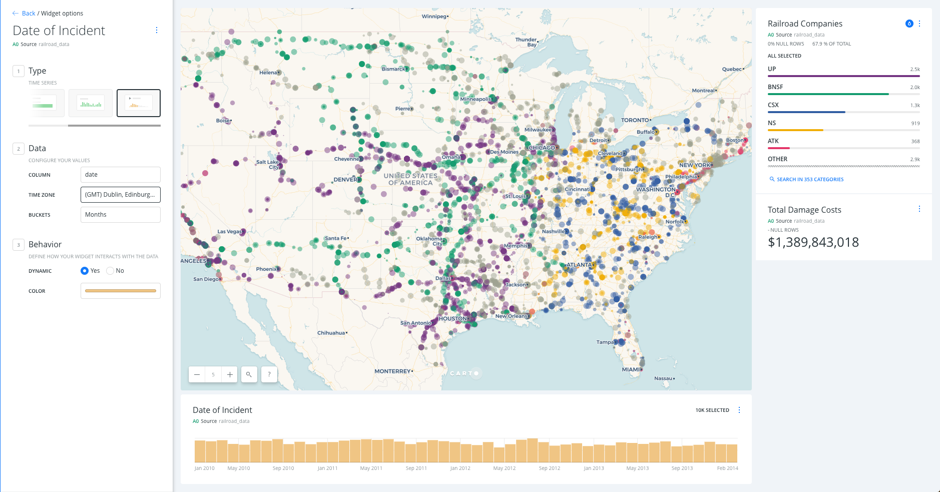
You can now explore how filtering widgets can quickly provide powerful insights.
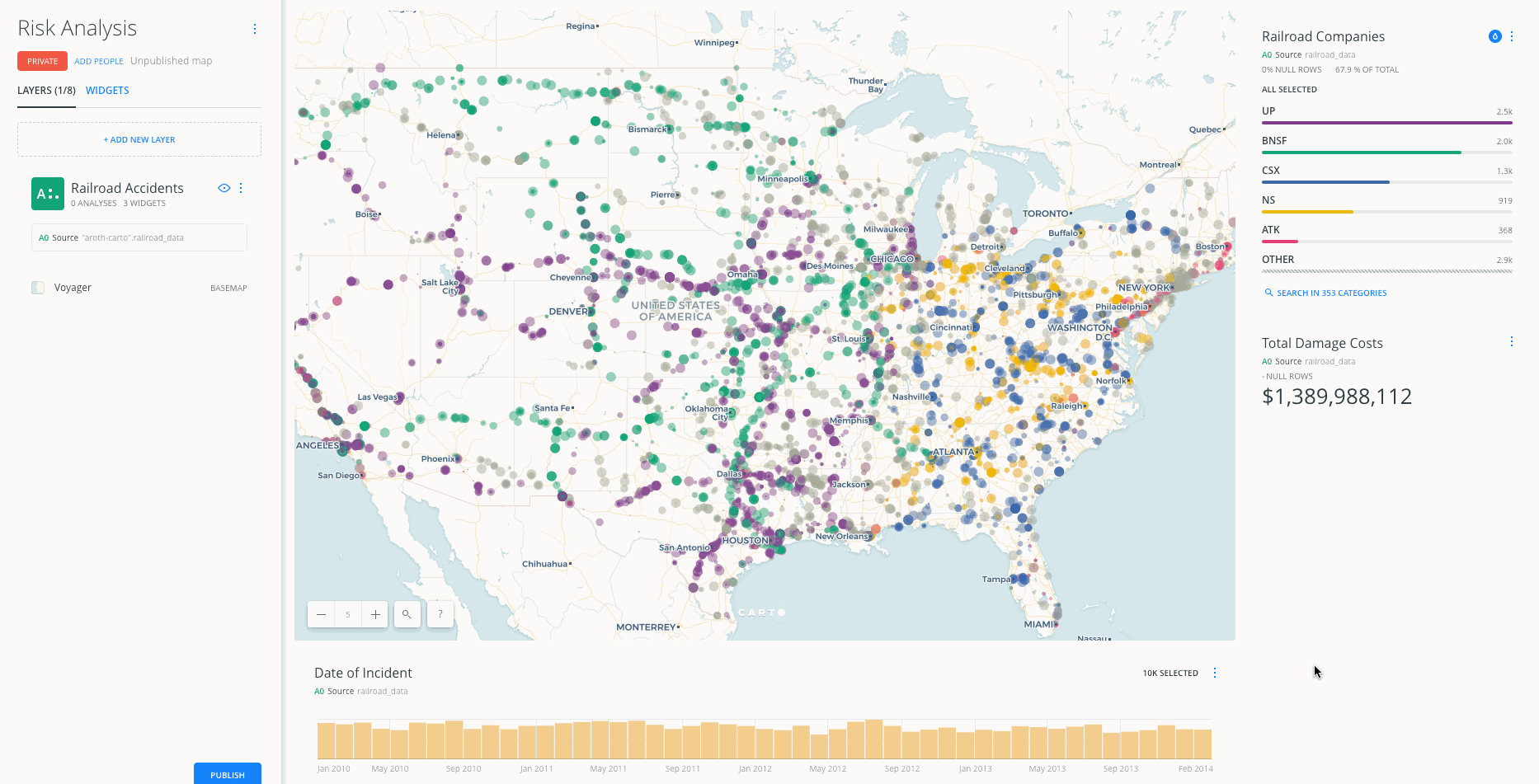
Analysis Add US counties layer, start the analysis
Click the Back button to navigate to the layers pane, then click ADD
Adding Layers
- In order to add a common dataset, such as USA Counties, use the data library.
- From the dataset selection window, click on DATA LIBRARY
- Click on the magnifying glass while in the data library tab in order to expand the search bar and search within the library.
- Type
countiesin the SEARCH bar - Select the cb_2013_us_county_500k (it may be called USA Counties) dataset. Click ADD LAYER.
- Rename the new layer to
US Counties. - Drag
US CountiesbelowRailroad Accidents.
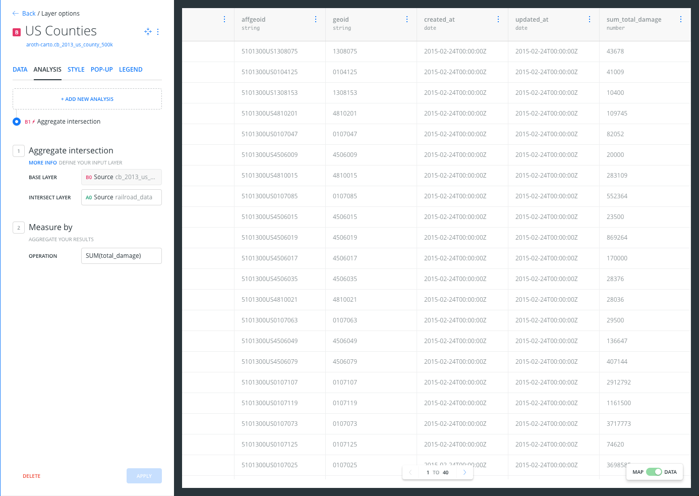
Perform Analysis
- Click on US Counties layer
- Navigate to the ANALYSIS tab
- Click ADD NEW ANALYSIS
Intersect second layer Analysis:
- Select
Intersect second layer: this analysis performs a spatial intersection and aggregates the geometry values from the target layer that intersect with the geometry of the source layer. - Click ADD ANALYSIS
- Set TARGET LAYER to
A0 Source railroad_data - Set OPERATION to
SUM(total_damage) - Click APPLY.
- Set TARGET LAYER to
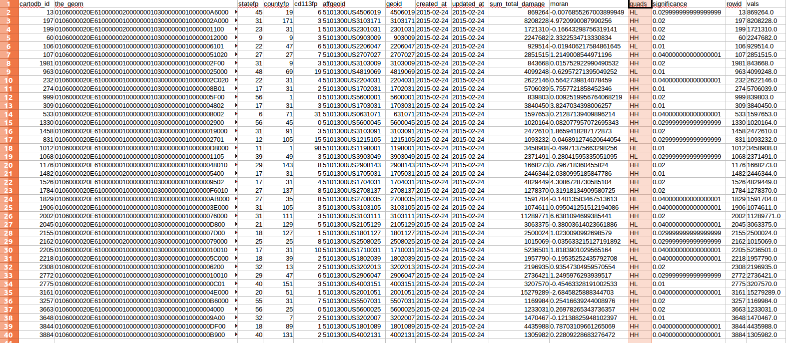
- Notice that only the counties overlapping with data points are showed. Switch to the Data View to see the new column created with the analysis,
sum_total_damage.
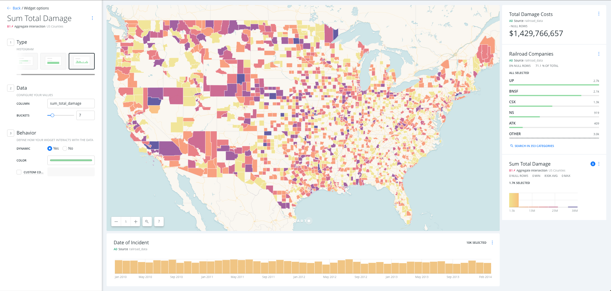
Sum Total Damage Histogram Widget:
- Navigate to the DATA pane
- Click the Add as a widget checkbox of the sum_total_damage field, click the EDIT button that appears.
- Set the BUCKETS to
7 - Rename widget to
Sum Total Damage.
- Set the BUCKETS to
- Click the eye icon to hide
Railroad Accidents - Click on the Auto style droplet button to see how each polygon is colored according to its value.
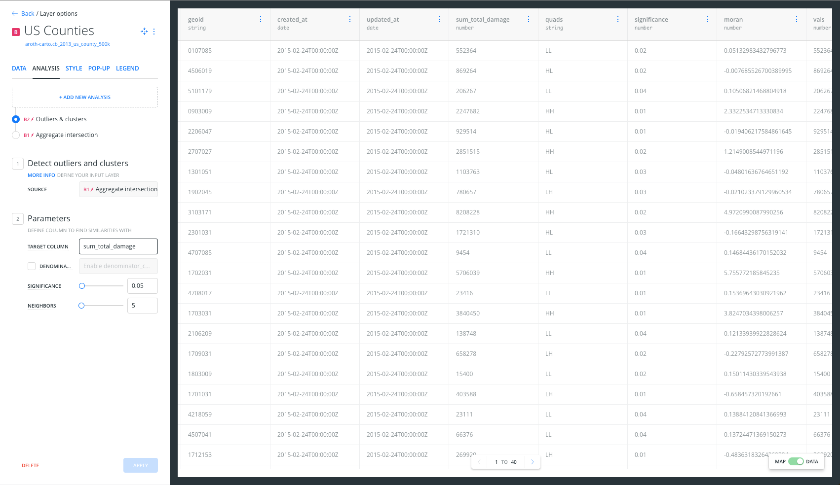
Detect outliers and clusters Analysis:
- Click the Back button to navigate to the layers pane
- Click on US Counties layer
- Navigate to the ANALYSIS pane
- Click ADD NEW ANALYSIS, near the top of the pane
- Select Detect outliers and clusters: this analysis finds areas in your data where clusters of high values or low values exist, as well as areas which are dissimilar from their neighbors.
- Set TARGET COLUMN to
sum_total_damage - Click APPLY.
- Set TARGET COLUMN to
-
First, using the map show the viewer the results of the analysis: only the counties considered by the analysis as outliers or clusters are showed. Secondly, switch to the Data View to see the new columns created with the previous analysis,
quadis the more interesting column because it contains the groups resulting from the analysis: HHandLL: clusters of high or low values surrounded by similar valuesHLandLH: outliers of high or low values surrounded by opposite values
Sum Total Damage Histogram Widget:
- Navigate to the DATA pane
- Click the Add as a widget checkbox of the quads field, click the EDIT button that appears.
-
Rename widget to
Groups. - Filter by
HHandHLcounties. Those are counties with high value of total damage surrounded by counties with also high values, and counties with high value of total damage surrounded by counties with low values. - Click on the Auto style droplet button to see how each polygon is colored according to its category.
Publishing
Exporting Data
- Click the Back button to navigate to the layers pane
- On the US Counties layer tile, click the three vertical dots
More optionsbutton - Select Export data, choose CSV.
- Open (with Excel or another similar software) the csv file you just download US_Counties.csv. Collapse
the_geomcolumn. You should have 39 counties/rows, containing onlyHHandHLvalues.
Publish Map
- On the left blue bar, click on the switches button.
- Click the LAYER SELECTOR checkbox. A floating layer selector box will appear in the top left of your map.
- On the left blue bar, click on the pencil button.
- Below the map title should show PRIVATE, ADD PEOPLE and Unpublished map. Let’s change that.
- First, click on PRIVATE, and again. Select
Link. - Secondly, click on SHARE (at the bottom of the LAYERS pane). Click on PUBLISH, and then DONE.
- Get the link and past it into your browser.
- First, click on PRIVATE, and again. Select
Notice that the state your map is published in will be the default view that the link for the map opens as. If you alter your map (try changing the zoom level, pan the map around, turn off a layer) and do not republish your map, your link will remain the same as when you initially published. However, next to the PUBLISH button, you will see text that says Unpublished changes to let you know you have altered your map. When you republish your map, the link will automatically update to match your latest changes.