Filter by Column Value
Filter your map layer by a selected column from your dataset, with CARTO Builder.
The Filter by column value analysis enables you to filter a map layer by a selected column from your dataset. If you are familiar with using SQL, this is similar to a typical WHERE operation on a database. You can select the column to be filtered and define limits, or a range of values (depending on your data).
The Filter by column value analysis does not filter your map layer by a specified column. It filters and displays identified values within a single column. The analysis result displays rows that meet the criteria. This method of row filtering is a quick way to narrow down the total data being displayed.
For this guide, we will use maps created from other guides so that you can practice filtering layers by column values. Depending on the data of the column selected (string or numerical), different filter options can be applied.
It is important to understand the data type of your dataset columns. When you upload your data to CARTO, it automatically assigns a data type to your columns; such as string, number, date, or boolean. Certain styling is rendered based on the column data type. This is especially useful since you can filter and style map layers by column values in CARTO Builder.
Filter Data by a String Column
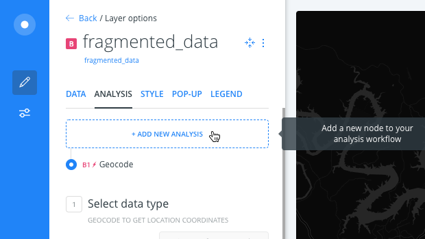
Apply the Filter by column value analysis as the next chain in the workflow for the Austin Fire Stations map. The map layer contains several types of identified data; such as fire stations, police stations, and hospitals. Our goal is to show only the fire stations for your layer.
-
Create the map from this guide, about georeferencing street addresses. The map contains Austin Fire Stations as the first map layer and fragmented data as the second map layer.
-
From the fragmented data layer, click the ANALYSIS tab.
-
Click on ADD NEW ANALYSIS to add a second analysis to the chain.
-
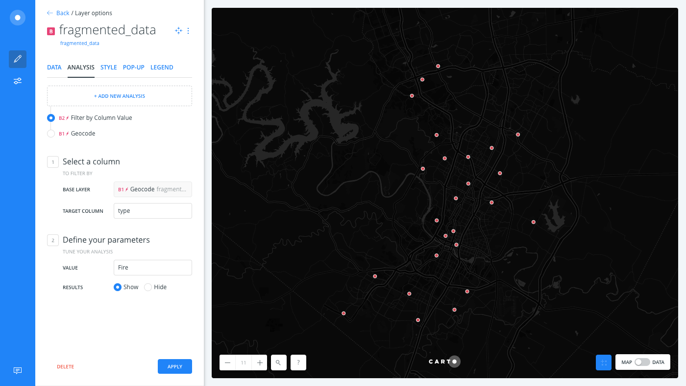
Select Filter by column value and apply the following options:
-
For TARGET COLUMN, select type. Once you select a column, additional parameters appear.
-
For VALUE, select Fire as the column value.
-
For RESULT, keep Show selected.
-
Click APPLY.
-
Show and Hide options only appear when you are filtering by a string column.
- SHOW - any rows matching the defined value appears on your visualization.
- HIDE - any rows matching the defined value are hidden from your visualization.
The map layer refreshes to only show the fire stations.
If you switch to the Data View of your map layer, only the rows that contain type=fire appear.
The Data View and Map View appear as buttons on your map visualization when a map layer is selected. Click to switch between viewing your connected dataset as a table, or show the map view of your data.
Filter Data by a Numeric Column
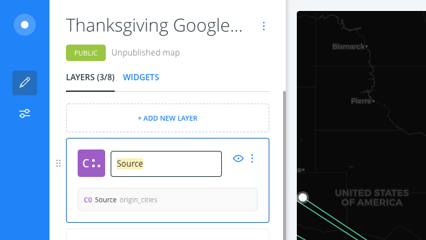
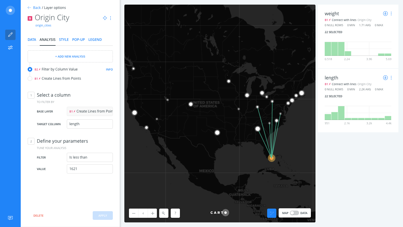
In this section, let’s apply the Filter by column value analysis as the next chain in the workflow for the Thanksgiving Google Flight Searches map. The map layer contains the length output column, that was created as a result of the Create Lines from Points analysis. This column displays the distance between the airports from the origin cities to the destination. Our goal is to show only the flights less than specified distance away from the origin.
-
Create the map from this guide, about origin flights from Miami during Thanksgiving. The map contains Flight Destinations as the first map layer, Origin City as the second map layer (with the Create Lines from Points analysis applied), and a copy of the original source of Origin City as the third map layer.
-
In order to avoid any confusion between layers, rename the third map layer (layer C) to “Source”.
-
Click on the Origin City map layer.
-
Click the ANALYSIS tab.
-
Click on ADD NEW ANALYSIS to add a second analysis to the chain.
-
Select Filter by column value, and apply the following options:
- For TARGET COLUMN, select length. Once you select a column, additional parameters appear. Since this column contains numerical data, you can select the filter operation and define the values.
-
For FILTER, select is less than as the operation.
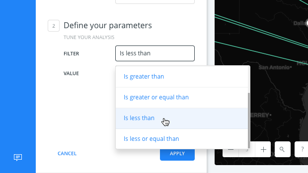
- For VALUE, type in the
1621as the maximum value. This indicates the distance in kilometers. - Click APPLY.
The map layer refreshes and displays only the flights that are less than 1621 kilometers from Miami.
If you switch to the Data View of your map layer, only the rows that contain the matching values appear.