Introduction to Map Design - Part 1
Here we will start talking about designing your data for maps. This won’t be a one-stop guide to all things map design, but will cover a few basic concepts to get you started.
We will be talking about designing for the web, and about designing the data that will go on your maps. Remember that this is just the tip of the map design iceberg!
Thinking about Map design
Designing maps, and designing the data on them, is not a new endeavor. Just take a look at the old maps recently released by the New York Public Library. In these thousands of beautiful maps, you can find many examples of great map design where geography and a particular set of data are displayed harmoniously and clearly using colors, labels, and scale.
That said, though designing maps and data is not new, it also is not simple! There are many concepts to master, competing priorities to consider, and techniques with which to familiarize yourself.
Designing for Digital
To narrow our focus a bit, we’re going to be talking about designing digital, online maps. This is still a vast and changing set of practices, concepts, and design principles. To get an idea of what is out there in terms of design, let’s take a look at a few tools and examples that you can play around with before we dive in to the other lessons in this course.
One of the first things people probably think of when considering web maps is Google Maps. Google has developed a wealth of resources that make their online maps easy to use, and customize. One interesting tool is the Styled Maps Wizard, which allows you to change the way different features of the map are visualized. You can edit color, stroke, fill of things like administrative divisions, roads, or water. Essentially, you can edit the features of what is called the basemap. The basemap is the map upon which you would overlay your data, and is an important part of making a good-looking map. Go ahead and see what you can create.
Another example of how you can edit a map’s features is Mapbox Studio. Using this great tool, you can build basemaps quickly and easily. See what you can make there, too!
While designing your own basemaps can be fun and rewarding, there are also some great existing basemaps out there. Stamen produces great digital cartography and basemaps that you can use in your maps! In future Courses, we’ll take a look at how to add these, but if you want to, you can take a sneak peak at a quick how-to, read more about CARTO basemaps or head over to see what basemaps CARTO makes available for use in all your web mapping projects.
D3 is another tool that’s a relative newcomer. It can be used to structure the way your data is visualized, and it offers some really diverse opportunities. With D3, you can also start to explore how projections shape the way your data and geography are visualized.
Finally, animated maps are entering the conversation and are adding a lot to the discussion around designing maps and data for the web. Check out this example of an animated map.
Colors, Data, and Labels
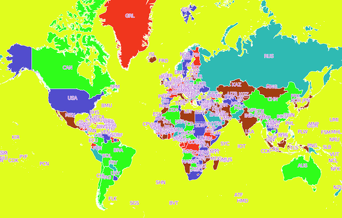
Take a look at this map here. It’s a pretty ugly map, and also highlights the first three topics we will tackle: colors, data, and labels. In this example of a bad map, it’s clear that much could be made better by just changing the colors, filtering the data, and changing the labels. By taking a look at each of these - discussing which colors, which subset of data, and what kinds of labels - we will start to get an understanding of good map design and be well on our way to designing beautiful maps!