Introduction to Map Design - Part 4
While they’re not always necessary, labels can be an important part of many maps. Ensuring that they are legible, helpful, and well-designed can be a complex process. Spending some time learning about typography in general will help you. We’ll start by talking about placement of labels. There are many other topics to consider, like font face, and color, that we won’t get in to now. If you want to know more, you can start by exploring tools like TypeBrewer, or joining some of the conversations the cartographic community is having about map typography.
If we take another look at Stamen’s maps, we can see again the positive effects of careful design. They have small and large labels, a carefully made font choice, and considerate placement of labels off to the side, or even hidden.
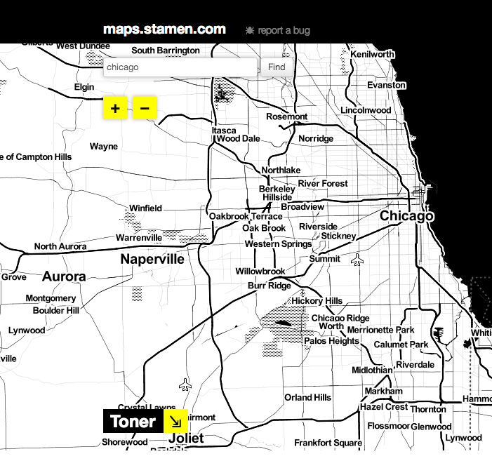
If we look back at our ugly map, we can see that one of its biggest problems is where the labels are placed. There is no logic behind where they’re placed, nor is there any filtering. They are just randomly placed, and add nothing to the viewer’s understanding of the map.
Clearly, adding text to a map in the form of labels is a large consideration, so let’s get started.
Adding our Labels
Before we add our labels, let’s copy the styling that we have done with our markers at the end of the last lesson. Just navigate to the CartoCSS panel, select all of the CartoCSS and use Ctrl+C/CMD+C to copy the text.
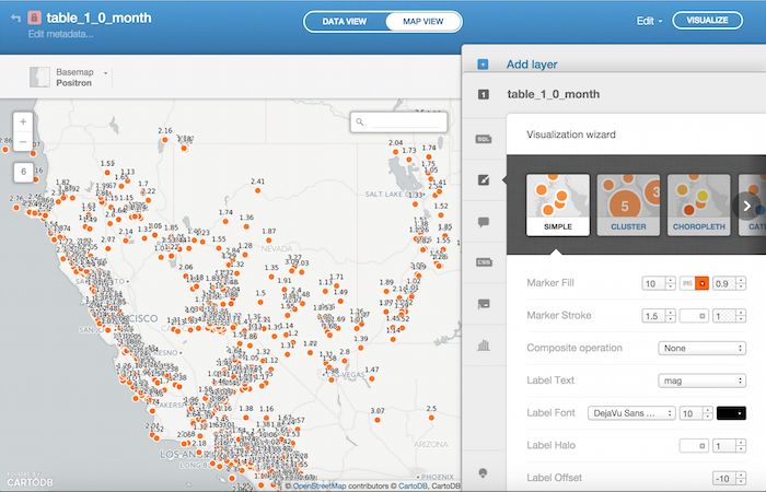
Next, go ahead and use the map layer wizard. Near the bottom, you can see the option to add label text based on a column. In our case, we’re interested in mag. Once you select the mag column, you can see that the labels are pretty pointless, like the labels in our ugly map. There are too many of them, and they don’t communicate anything to the viewer.
Let’s fix this by fine-tuning our CartoCSS. You’ll notice that there’s a section formatting the markers, and one formatting the labels. Let’s go ahead and replace the section formatting the markers with our copied CartoCSS by deleting it and pasting in the CartoCSS from where we left off in Lesson 3. If you apply the style, you’ll see that not much seems to change. The labels are just too obtrusive to allow us to see any of the underlying markers.
To fix this, let’s go ahead and add rules to when labels appear on the map. Let’s say we only want to see the mag label for large earthquakes. To do so, we would want to use some of the skills we learned in Lesson 3. We would go ahead and add conditions to the CartoCSS formatting that tell CARTO to only sometimes display the labels. See if you can decipher the block of code below:
#table_1_0_month::labels
[mag>=5][zoom>6]
{
  text-name: [mag];
  text-face-name: 'DejaVu Sans Book';
  text-size: 21;
  text-label-position-tolerance: 10;
  text-fill: #000;
  text-halo-fill: rgba(255,255,255,0.8);
  text-halo-radius: 2	;
  text-dy: 0;
  text-allow-overlap: true;
  text-placement: point;
  text-placement-type: simple;
}
Here, we’re telling CARTO to only display the labels when the mag is greater than or equal to 5, and zoom is larger than 6. That way, we only see the mag measurement for the largest earthquakes, and only when we’re zoomed in enough for the label to make sense. Notice that we can chain together conditions (like zoom level, or mag value) by just including them side-by-side, without characters in between them.
We can also describe multiple condition pairs in which we would want the labels to be displayed. For example, we want to see labels when the mag is at or above 6 and the zoom is above 6, OR when the mag is above 5 and the zoom is above 7. To do that, we just separate condition chains with commas. Our code, then, would look like this:
#table_1_0_month::labels
[mag>=6][zoom>6],
[mag>=5][zoom>7],
[mag>=4][zoom>8],
[mag>=3][zoom>9]
{
  text-name: [mag];
  text-face-name: 'DejaVu Sans Book';
  text-size: 21;
  text-label-position-tolerance: 10;
  text-fill: #000;
  text-halo-fill: rgba(255,255,255,0.8);
  text-halo-radius: 2	;
  text-dy: 0;
  text-allow-overlap: true;
  text-placement: point;
  text-placement-type: simple;
}
You can see that we have four pairs of conditions, which, if met, would mean that a label is displayed. In this case, more and more labels are displayed the more zoomed-in we get. This allows us to preserve readability when we’re zoomed out, but include a great deal of data for when we’re zoomed in. You can edit other attributes of labels using CartoCSS like this, so feel three to play around! Remember that you can’t “break” your map by tinkering with the CSS, and can revert to the standard wizard whenever needed. You can also copy and paste old CartoCSS like we did earlier in this lesson, in order to preserve your work.
Armed with these tools, go forth and build beautifully designed maps!