Viewing Analysis Results with Widgets
Describes how to interactive widgets run analyses in CARTO Builder.
When analyses are applied to map layers (A, B, C, D), the results are included as a node (A1, A2, B1, B2) within your data. Analysis nodes act like sublayers in association with each map layer that they are applied to. Sublayers can then be selected as the source for creating widgets, initiating dynamic filtering. Any time the widget is filtered, the analysis is run and recalculated based on the selected filters.
This guide describes how analysis results run, and rerun, when filtering and exploring data with widgets.
Analysis Data and Layers
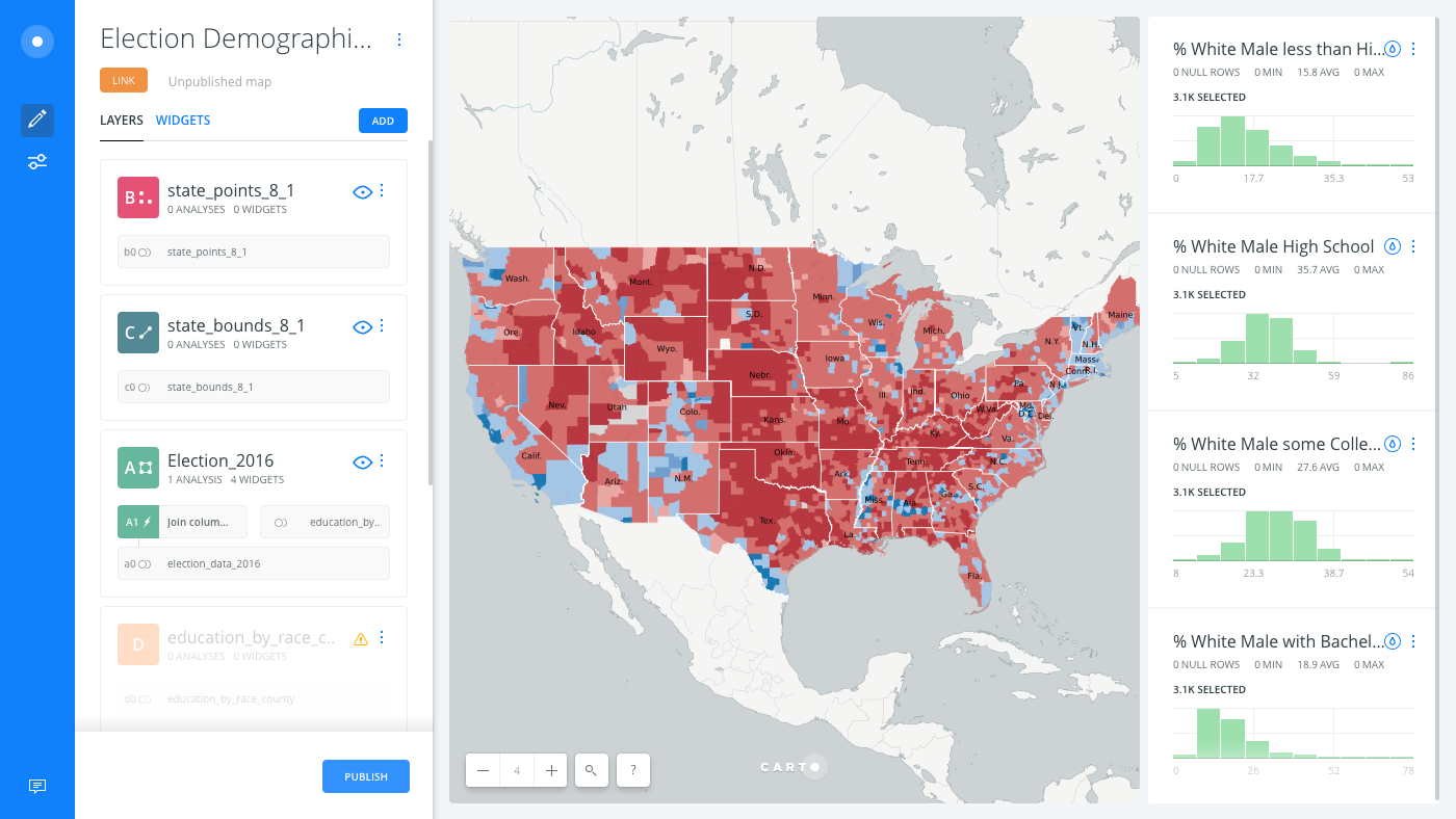
From the LAYERS list in Builder, a map layer indicates when analyses are applied as part of the workflow for rendering data.
For example, the following image displays the Join Columns from 2nd Layer analysis A1, applied to the Election 2016 layer A.
You can chain several different analysis nodes to a single map layer, or automatically create a new layer from analysis results.
CHEATSHEET: Create layer from analysis
Once an analysis is created, you can drag and drop the analysis results from a select layer into the LAYERS list of Builder (above or below the selected layer) to create a new layer for your map. The reference to the previous data layer is kept intact.
Selecting Analysis Nodes in Widgets
When creating widgets, you can select the analysis node as the layer of data to be used for the widget.
-
From an open map in the Builder, select WIDGETS.
The WIDGETS list appears, where you can add and manage widgets. The following example indicates that all of the existing widgets are filtering by the analyzed results
A1.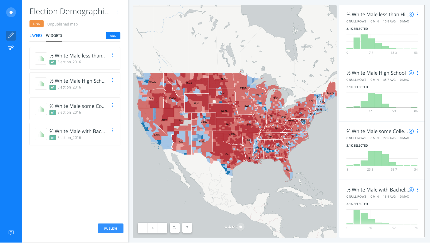
-
Click ADD to add a widget.
-
Select the type of widget to be added (CATEGORY, HISTOGRAM, FORMULA, TIME-SERIES).
-
Select the checkbox next to the column(s) to be included for the widget.
-
Select the layer to be used for the widget.
If you have multiple map layers, the SELECT LAYER drop-down list enables you to select any map layer (or analysis node) that contains common data. Click on the default layer name to choose the analysis node as the layer instead.
The following example displays the
A1analysis node being selected as the source of data for a category widget.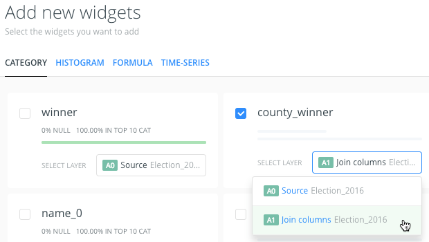
-
Click CONTINUE.
The selected widget(s) appear on your map visualization, and the WIDGETS list displays the Type, Data, and Behavior options for the widget.
From the WIDGETS list, you can reorder how the widgets appear by clicking and dragging (similar to reordering layers). You can also rename the title of the widgets by editing the widget details from the WIDGETS list.
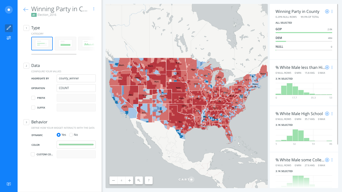
The widget enables you to filter and explore the selected analyzed data.