Create Polygons from Points
Group points, lines or polygons into polygons based on the extent of similar points.
This guide describes how to apply the Create Polygons from Points analysis to group point, line or polygon data into polygons, based on the extents of similar points or lines.
For example, from a sample of soil classification point data of a region, polygon extents of similar soil type can be mapped. Another relevant example is mapping different species habitats that can be analyzed by movement, or location trends, over time.
Grouping Points
This analysis method can be used in a variety of contexts, such as analyzing sales territories for optimization, understanding catchment areas, and defining location patterns with mobile tracking data.
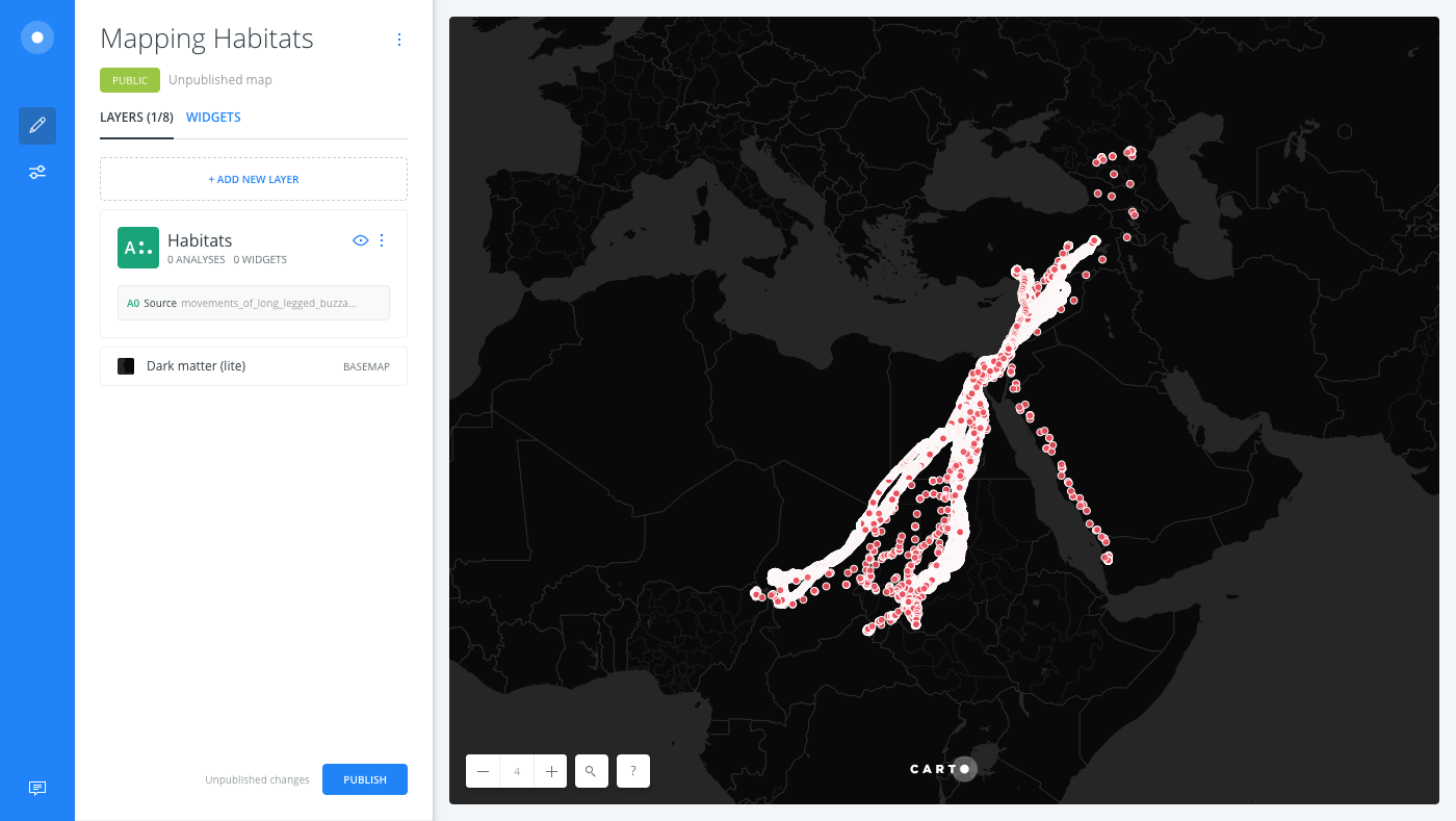
For this guide, let’s explore species movement data from Movebank to understand how habitat-ranges of different birds compare. This example groups GPS tracking data for two species of birds into polygons.
Movebank is a rich online database of animal tracking data hosted by the Max Planck Institute for Ornithology.
-
Import the template .carto file packaged from “Download resources” of this guide and create the map. Builder opens with point data as the first and only map layer, named Habitats.
Click on “Download resources” from this guide to download the zip file to your local machine. Extract the zip file to view the .carto file(s) used for this guide.
-
From the LAYERS list in Builder, click the Habitats map layer.
-
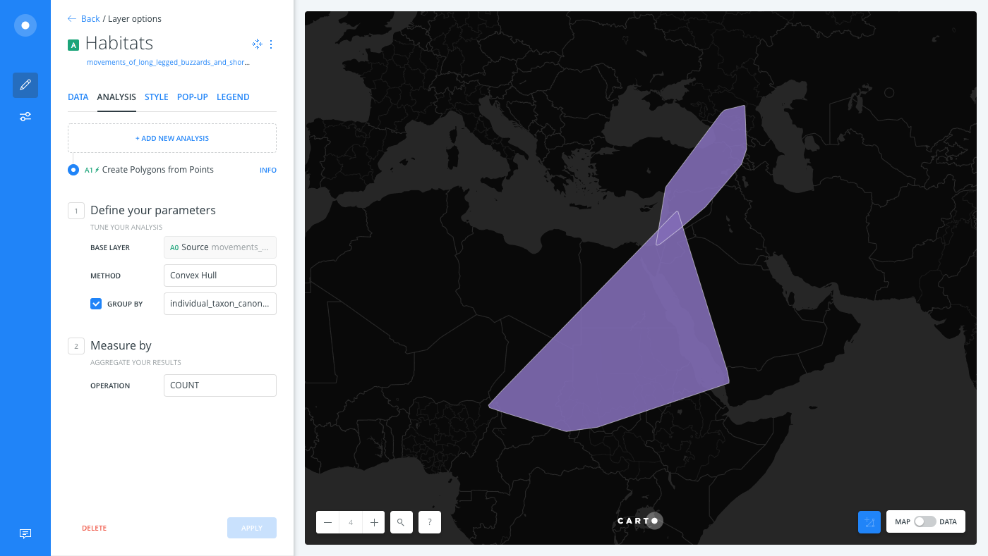
Click the ANALYSIS tab to add an analysis to the layer.
-
Apply the Create Polygons from Points analysis.
- The BASE LAYER is the layer on which to perform the analysis.
- Select Convex Hull as the METHOD.
CHEATSHEET: Polygon Methods for Grouping
The following methods can be used to group point, or line, geometry aggregations into polygons:
- Convex Hull: A convex hull is a set number of points within a space, that has the smallest plane for all points. It is commonly visualized as the shape of a rubber-band stretching around, and containing all the points in the space.
- Concave Hull: A concave hull is a convex, or non-convex polygon, or a group of such, that represents the area occupied by a given set of points. In doing so, it may represent a smaller area than the convex hull, but the boundary length of the resulting polygon is much larger. It is commonly visualized as a shrink-wrap, wrapped around the points in space.
- Bounding Circle: This represents the smallest circle polygon around the points in space, and contains all the points.
- Bounding Box: This represents the smallest rectangle polygon around the points in space. The X and Y coordinates for the polygon are determined by the farthest points in space, from each direction.
- Select the GROUP BY checkbox to enable the category column drop-down list, and select
individual-taxon-canonical-nameas the column. This is the column from the dataset that specifics the species name associated with location points. - For the Measure by option, keep the default COUNT operation selected.
- Click APPLY.
The location points of each species are grouped into their potential habitat polygons.
Grouped Results
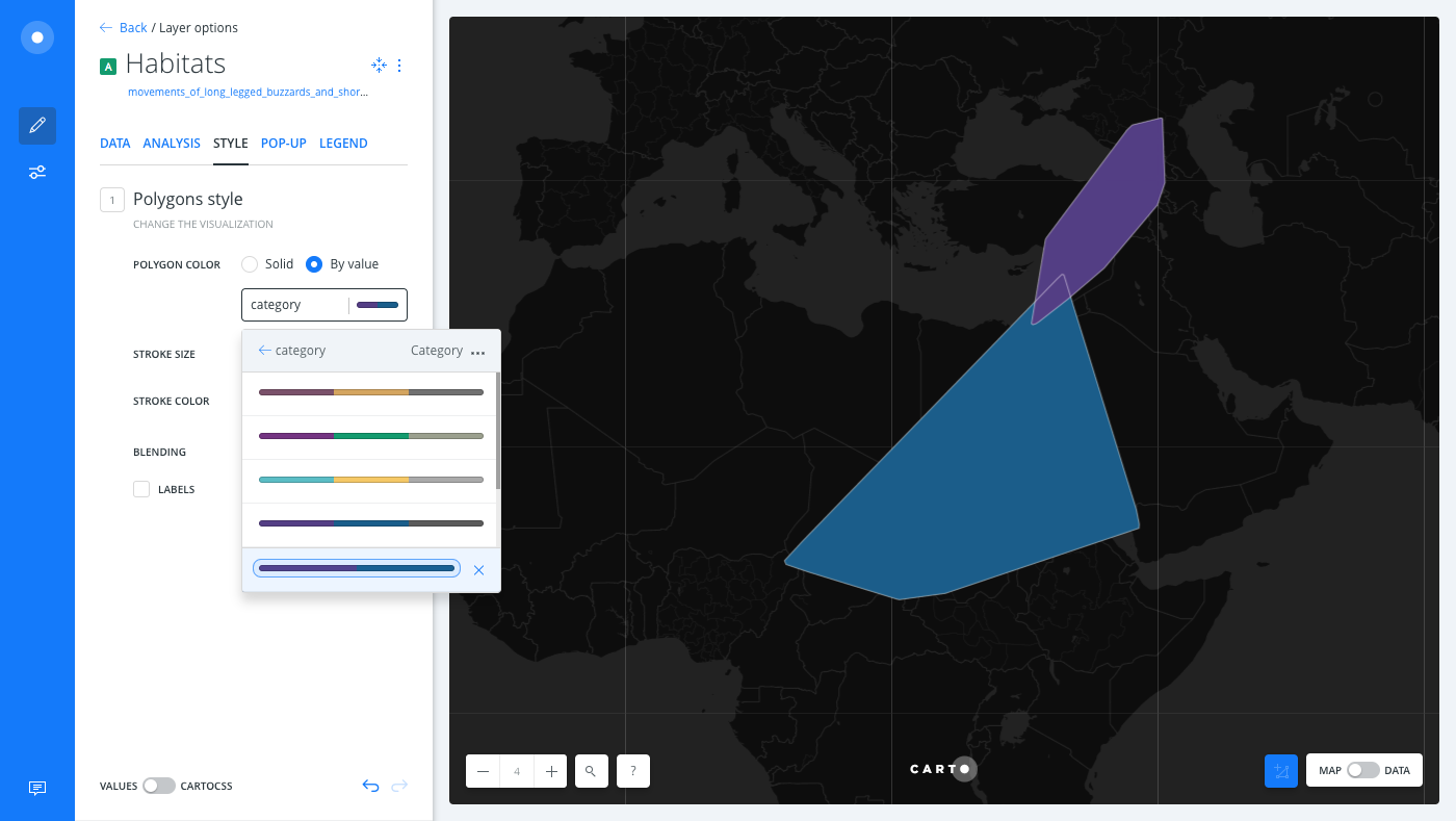
As as result of the analysis, two polygons appear on your Map View, each representing the group of species category. To enhance the visualization, style the polygons with the category column, by styling by value.
-
From the LAYERS list in Builder, click the Habitats map layer.
-
Click the STYLE tab to apply custom styling to the layer.
-
Click the By Value option for POLYGON COLOR.
-
Select
Category. Builder assigns a default qualitative CARTOColor scheme, which helps you visualize the difference between the two groups of data.
CHEATSHEET: Color Schemes
Choosing the right colors for your data aids storytelling, engages the map reader, and visually guides the viewer to uncover interesting patterns that may otherwise be missed. When styling by value, different types of color schemes appear, based on the selected data column from your map layer. Builder provides you with CARTOColor and ColorBrewer schemes, and enables you to customize your own color schemes.
- Sequential Scheme: Color schemes that use variations in lightness make these ideal for displaying orderable, or numeric data. The variations progress from low to high, using colors that range from light to dark (or vice versa).
- Qualitative Scheme: Color schemes that demonstrate categorical differences in qualitative data, which use different hues, with consistent steps in lightness and saturation.
- Diverging Scheme: Color schemes that highlight values above and below an interesting mid-point in quantitative data. The middle color is assigned to the critical value, with two sequential type palettes at either end, assigned to values above or below.
Enhanced Cartography
The Movebank dataset also has a column which records the time at each location point for the species. To trace the spots where the birds flew between 2011 to 2014, create a new layer from the original data and drag it above the Habitats layer.
You can drag and drop analysis results to create a new layer. You can also drag and drop the original source (point data from the Habitats layer) as a new layer from the LAYERS list.
-
Click on the original Habitat source of data
A0 Sourcefrom Layer A. This is separate from the analysis resultsA1, Create Polygons from Points.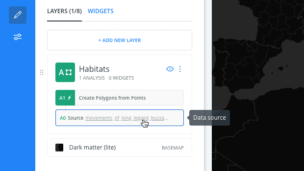
-
Click and drag the data above the Habitats layer. You will notice that a new layer is created based on the original source of data.
CHEATSHEET: Create Layer from original source data
Each map layer identifies the connected dataset as the original source of data. From the LAYERS list of Builder, drag and drop the original source above or below the selected layer to create a new layer. Note that the original source data is separate from analysis nodes of data (A1, A2, B1, B2), which are temporary cached results for the map layer.
-
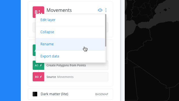
Rename the new layer to Movements.
-
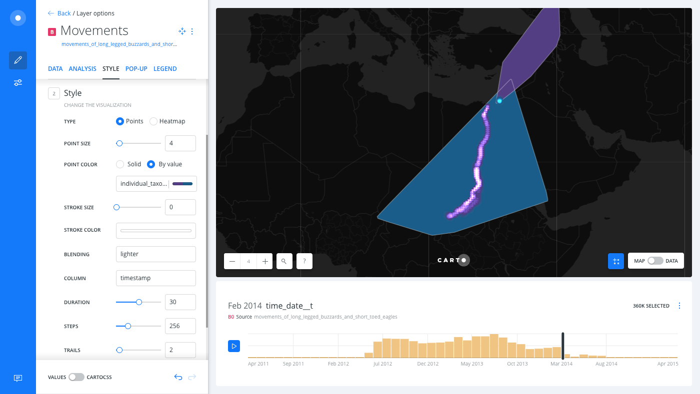
Select the Movements layer and apply styling by using the STYLE tab of the map layer:
- Select ANIMATED as the Aggregation option and keep Points as the TYPE.
- Click the By Value option for POINT COLOR, and select
individual-taxon-canonical-nameas the column. - Select timestamp as the COLUMN option.
- Further style the map by modifying the color and opacity of the layer. Change the SIZE value to 4, and change the STROKE size to O.
This analysis is a first step of identifying behaviors for these bird species. For example, data patterns may reveal if they like suitable climatic conditions, if they can co-exist with other animals, what food they gravitate towards, if they are an endangered threat, and many more potential investigations.
Download the final .carto file from the “Download resources” of this guide, and explore the additional cartography, and CartoCSS, that was applied to the map.
External Resources
If you are interested in using the underlying functions in the SQL view of Builder, view the PostGIS documentation.