Customizing Widget Color
Customize the widget colors on your map with CARTO Builder.
By default, widget filters are a predefined color on your map. Optionally, you can customize the color properties for how widget filters appear. This widget behavior is managed through the WIDGETS list of Builder, and enables you to control the aesthetic details of your widget filters.
This guides describes how you can define the color for widget filters. Specifically, we will customize the filter colors to match the default styling of the map.
Default Widget Map Colors
If you have a CATEGORY, HISTOGRAM, OR TIME-SERIES widget, you can define the solid COLOR for widget filters in CARTO Builder. The defined color is not related to how the selected values appear on your map, it is only applicable to the color properties of the widget filters before values are selected.
For widgets that include the Auto style option, auto style overrides any custom fill colors applied to widget filters. This is intentional by design, since auto style applies temporary styling to your data. For details, see the Auto Style to View Dynamic Data Guide.
- For CATEGORY and HISTOGRAM widgets, the default filter color is
#9DE0AD. - For TIME-SERIES widgets, the default filter color is
#FBD59E.
Custom Widget Map Colors
For this example, let’s customize the filter color of all of the widgets to match the default color of the Brooklyn Poverty layer.
-
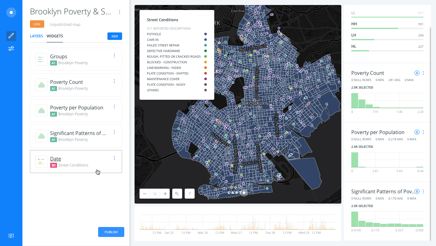
Unzip the template .carto file packaged from “Download resources” of this guide, and import it to your account to create the map. Builder opens with Brooklyn Poverty as the first map layer and Street Conditions as the second map layer.
The initial Brooklyn Poverty map was created in the Detect Outliers and Clusters guide. This map includes an additional layer, 311 reported street conditions, which allowed us to Intersect a second layer, and add a Time-Series widget that displays timestamp data.
Note the default filters colors on your map.
-
From the WIDGETS list in Builder, select Date to edit the details of the Time-Series widget.
-
From the Behavior options, click the COLOR to open the color picker for the widget filters and enter
#374c70as the Hex input color.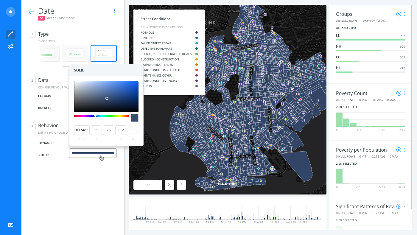
The custom color appears as the filter color for the Time-Series widget.
-
Click once on the Time-Series widget to display the range selector, and click and drag to select the start and end date.
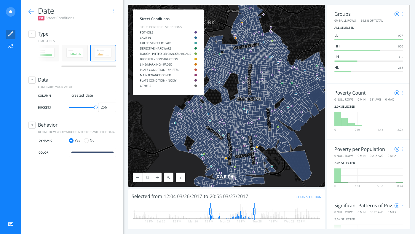
Note how the custom filter color no longer appears, as values have been selected from the widget. Click CLEAR SELECTION to view the default filter colors again.
Any time that you filter a widget connected to a layer that contains analyses, the analysis is rerun and recalculated! It may take some time for the results to appear. This is expected behavior.
-
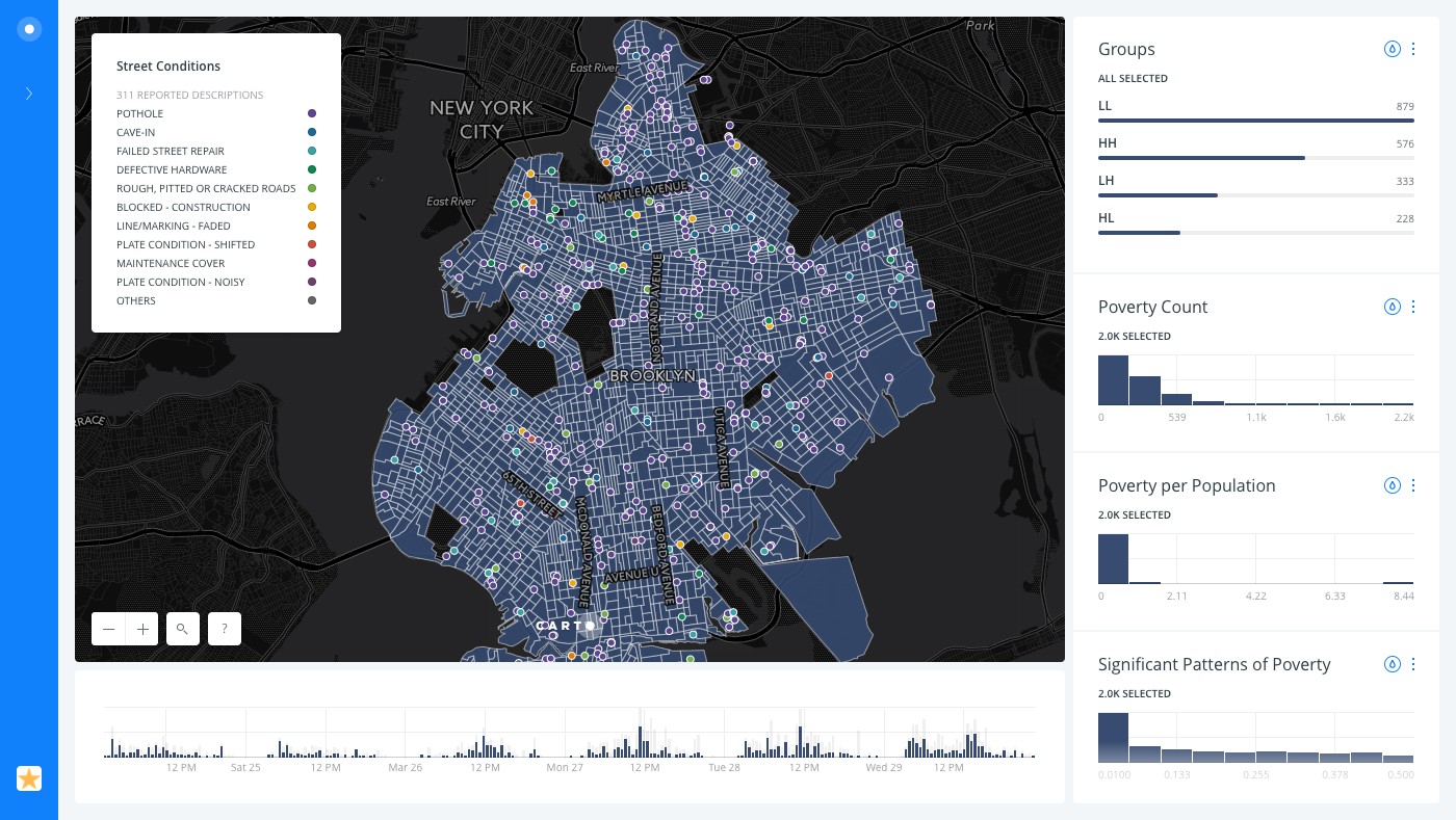
To apply the same filter color
#374c70to the rest of the widgets on your map, repeat these steps by editing each of the widgets from the WIDGETS list in Builder.
In this case, the filter colors are visually consistent with the default map styling. This is especially noticeable on the published version of the map.
Go ahead and apply widget Auto style to visualize how the poverty data exposes the neighborhoods that are most likely to gentrify next.