Displaying Temporal Data with Heatmaps
Describes how to change the style aggregation options to display a static or animated heatmap in CARTO Builder.
This guide describes how to visualize point data by a slowly changing dimension of time, as represented by a Heatmap. Temporal data can be visualized as a static or an animated heatmap through the STYLE tab in Builder.
Static Heatmaps
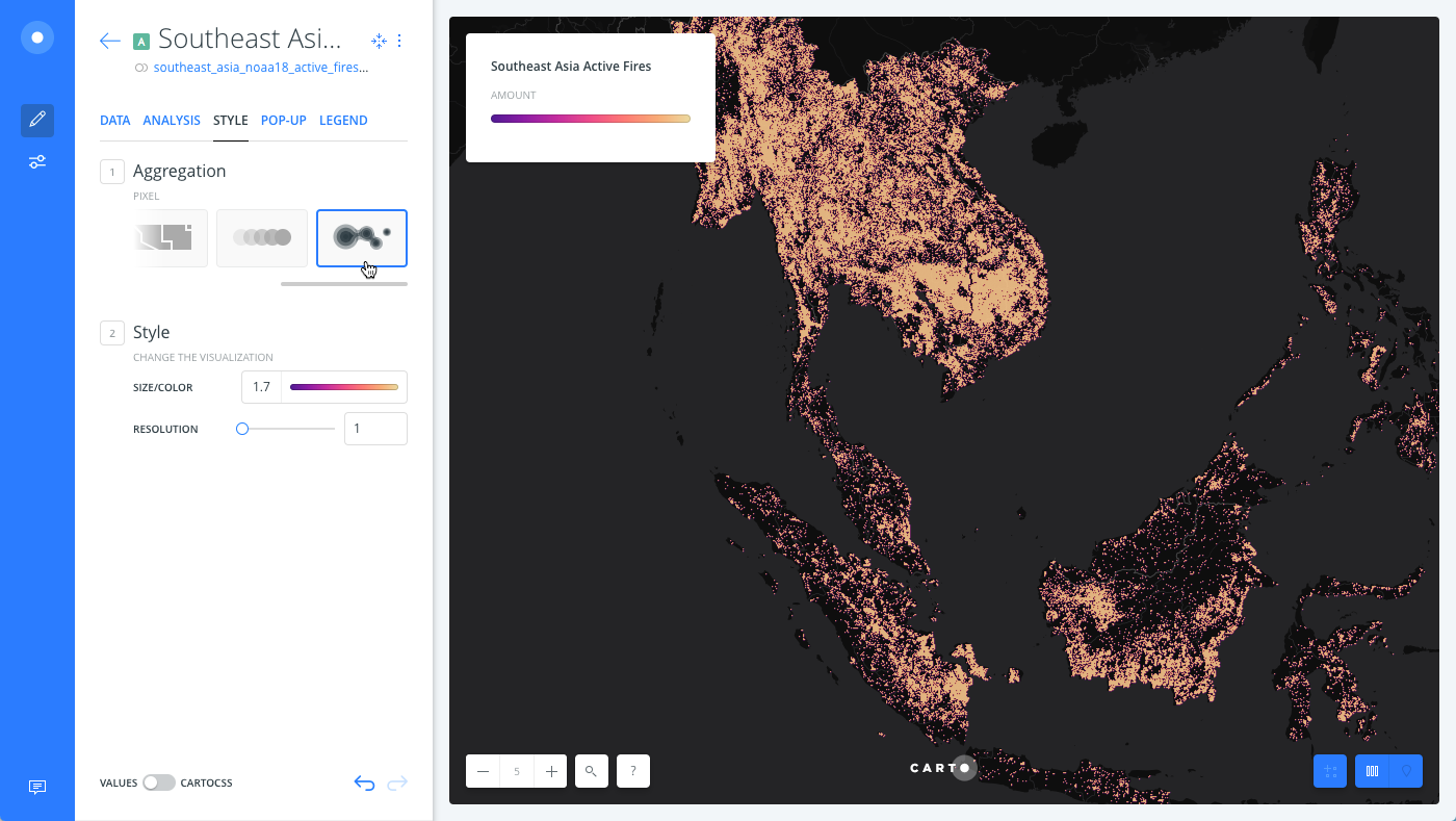
Static heatmaps display the intensity of occurrence of incident data, by applying a suitable color scheme. To create a heatmap, your map layer must contain point geometries. For this example, we are using data for active forest fires in Southeast Asia from the Global Forest Watch.
-
Import the .carto file packaged from the “Download resources” of this guide and create the map.
Click on “Download resources” from this guide to download the zip file to your local machine. Extract the zip file to view the .carto file(s) used for this guide.
-
Click on the Southeast Asia map layer.
-
From the STYLE tab, select PIXEL as the Aggregation style.
Since a heatmap represents intensity of occurrences, it is styled by the number of occurrences at a location.
To achieve a similar effect with polygon or line map layers, you can style by value and apply the BLENDING options, to show different intensities of static map data.
-
Edit the marker size to better visualize heatmap points.
- Change the POINT SIZE to
1.7. - For the RESOLUTION, enter
1.
- Change the POINT SIZE to
Animated Heatmaps
You can animate the temporal data on your map by changing the aggregation option from the STYLE Tab.
-
From the STYLE tab, change the Aggregation to ANIMATED.
-
Select Heatmap as the TYPE of animation.
-
Customize your animation options, as displayed in the following image or download the final .carto file from the “Download resources” of this guide.
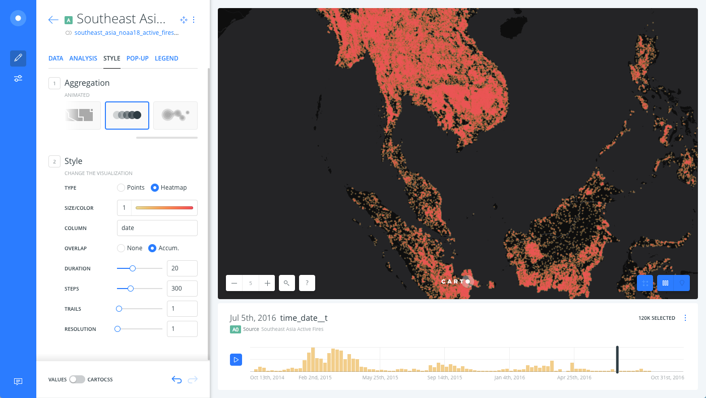
By default, CARTO Builder includes a time-series widget with the animated map styling option. You can define what column attribute of the dataset is used for animation.
It is recommended to select a date attribute to best represent changes.
Only numeric or date type columns can be added for the time-series widget.
To explore more animation styling with point data, see the Animating Maps with Point Data Guide.
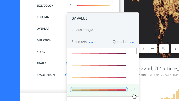
Invert the Color Scheme
In some cases (like this guide), you can invert the color scheme for how the temporal heatmap appears. This is particularly helpful if you need to highlight the intensity of the data, or to display standard colors on a dark basemap.
-
By default, color schemes are shown from darker shades (representing high values) to lighter ones (representing low values).
-
From a selected color scheme, click the arrows to invert the color scheme. Note that these arrows only appear when you hover your mouse over a color scheme, or when the color scheme is selected.
Toggling the color scheme is also useful if you have a dark background. Inverting the color scheme can help better visualize the results. For details, see 5 Cartographic Tips for your Data Observatory Maps.