5 cartographic tips for your Data Observatory maps


Over the past couple of weeks, you've probably been keeping up with all of the exciting news about CartoDB's Data Observatory and losing sleep thinking about all of the cool maps that you can make!
With all of the information available in the Data Observatory, the thematic mapping possibilities are endless. In this post, we give you a few cartographic tips (there are definitely more!) to consider when building your Data Observatory maps.
Tip 1: Choose an appropriate map type
There are some basic principles to follow when choosing an appropriate thematic map type. First, establish if your variable of interest represents categories or numbers.
Categories?
Make a category map. Category maps are meant for data that are non-numeric and have distinct categories.
Limit the number of categories to around 10 maximum 12. Why? The human eye can only distinguish between so many different elements on a map. The consequence of using too many of anything is that your map reader will have a difficult time identifying patterns and some pretty interesting information can easily get lost. If you have more than 12 categories, think about ways to aggregate your categories to higher level groupings.
Numbers?
There are several thematic map types for numeric data. Examples include choropleth maps, proportional symbol maps, dot density maps, isarithmic maps, and many more. In this post, we'll focus on choropleth maps and briefly touch on proportional symbol maps. For a detailed how-to on dot density maps in CartoDB check out this post by my colleague Stuart Lynn.
Choropleth Maps
On a choropleth map, each polygon (or enumeration unit) is colored according to its value in the data. Choropleth maps should not be used to map raw counts. Instead they should be used to map data that are rates, proportions, percentages, etc. By normalizing your data, you avoid the pitfall of making a map that is biased towards larger areas. An un-normalized choropleth gives unfair advantage to larger areas on your map -- mapping raw counts often times shows that if an area is large, it must have 'more' of the variable of interest.
The example below illustrates this area effect with the total female population for each county on the left, and the percent of the total population for a given county that is female on the right. You can see the map with raw totals does not give an accurate picture of female populations around the country. By normalizing the total female population by total population, we can more easily compare different parts of the country and find places that are more or less similar from one another.
A super useful piece of the [Data Observatory Catalogue] is the guidance it provides on which normalizing variable is best suited to use with which counts.
Proportional Symbol Maps
If you are mapping raw counts, proportional symbols are a good choice. For a more detailed discussion on proportional symbol maps, check out this blog post.
Tip 2: Choose an appropriate classification method
Numbers
Choropleth and proportional symbol maps can be classed or unclassed. For a classed map, choose a classification method that best suits your data's distribution histogram. For example, if the distribution is uniform, you may want to use Equal Interval. On the other hand, if the distribution is clustered, you may want to use Jenks. Or, if you know your data well, you may decide to manually define your class breaks to best highlight the story you want to tell.
Regardless of your classification method, for classed maps (choropleth or proportional symbol), aim to have between 3-7 classes. Any more than 7 classes will make it difficult for your map reader to pick out important patterns and detail. That might sound counterintuitive (you are showing more details in the data with a higher number of classes) but the more colors and/or symbol sizes used, the harder time your map reader will have distinguishing between them. The goal at all times is to reveal interesting patterns and outliers in your data.
Tip 3: Choose the right color palette
Categories
The most common type of symbology for category maps is to use discrete colors for each unique type in your variable of interest. An alternative to color is to explore the use of pattern fills (for polygons) or different shaped icons (for points). If using color, be sure to pick a palette that keeps a somewhat uniform level of saturation and lightness for each category. In doing so, one category is not perceived as more important than another.
Below is a map of the most common mode of transportation to work other than by car, for each county. There are three categories: public transportation, walk to work or tie. Each category is given a unique color. Since walk to work is the most common category, I chose a color that would act as a highlighter for the other, less common categories. By doing this, we're able to easily see the patterns and outliers in the other two categories.
Numbers
Choropleth maps typically use sequential or diverging color palettes. The colors in a sequential palette should be ordered in such a way where your map reader can easily distinguish between high and low values. An effective sequential palette varies in lightness and saturation at each color stop. Sequential palettes can use a single hue or multiple hues.
Diverging palettes can be thought of as two sequential palettes on either side of a central, neutral color. Use a diverging palette when you want to show values above or below an interesting midpoint in your data. Lots of times you will see variables with near-normal distributions symbolized using a diverging color palette with a standard deviation classification method.
Typically, darker colors represent higher values and lighter colors lower values. If using a dark background, think about flipping this order, just make sure to update your legend!
To illustrate this idea, let's take a look at a light and dark version a map showing the percent of household income spent on rent by county. On the left, the sequential palette is 'traditionally' ordered with lighter colors representing lower values, and darker colors, higher values. We could use the same ordering for the dark version on the right, but the contrast of light against dark is stronger so I flipped the ramp so that higher values (now using the lighter end) come to the foreground of the map.
Tip 4: Basemaps
For a lot of the thematic maps I design, I typically create a really simple basemap in the CartoDB Editor. There are times where having more detailed context is important especially at larger scales but if the basemap is hurting more than its helping you can create one of your own. For more information on simple basemap design in CartoDB see our blog on how to Create a Thematic Map of Current Drought Conditions.
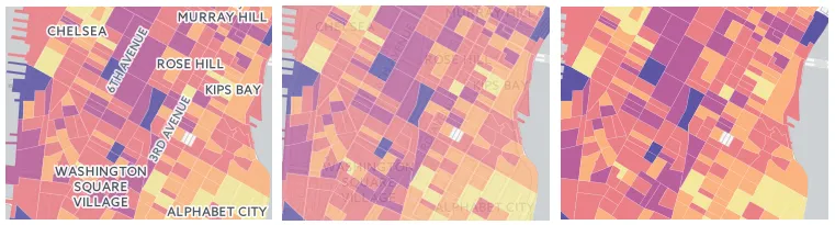
If you use one of CartoDB's basemaps you have a few different options for both Positron (our light map) and Dark Matter (our dark map). The default version of both maps sandwich thematic layers between a base layer and a label reference layer (left). This is a great option for the majority of your maps especially when you have continuous polygons. Other options include labels underneath (middle) and a 'lite' version of both basemaps with no labels (right).
Tip 5: Projections
The category, choropleth, and proportional symbol maps described above are summarizing information about areas (counties). With these maps it is a best practice to use a projection that preserves area! In the example maps above, I am using Albers Equal Area centered on the US.
At larger scales around the block group level (from the US Census), sticking with the default web mercator projection is an OK choice. For more details about projections in CartoDB, see our post Free Your Maps from Web Mercator.
To create similar or even better visualizations, you can watch our Data Observatory webinar as many times as you need to!
We hope these tips help get you started building your thematic maps. Keep an eye out for more blogs about the Data Observatory and cartography best practices!
Happy Map Designing!