Example - Using Buffers to Filter Data
Learn how to find the closest Airbnb rooms to subway metro stations and lines in Madrid city with CARTO Builder.
You will need to import the following dataset/s into your account:
- Madrid Airbnb data:
listings_madrid. You can download it from here. - Madrid metro lines:
lineas_madrid. You can download it from here.
Both datasets were originally downloaded from the Inside Airbnb and Nomecalles websites, respectively. In order to download them to your local machines, you are using CARTO SQL API behind the scenes.
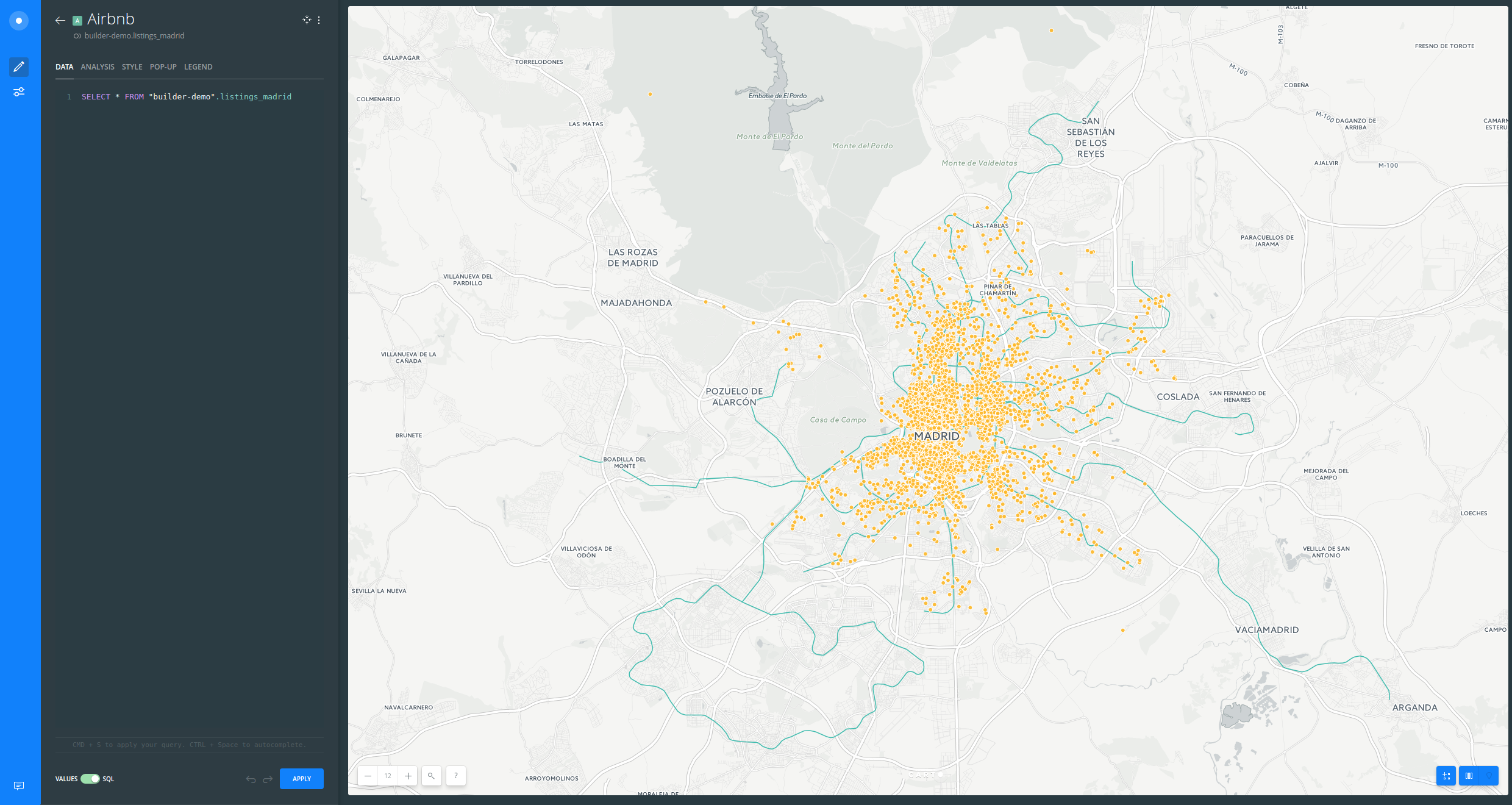
Create a map
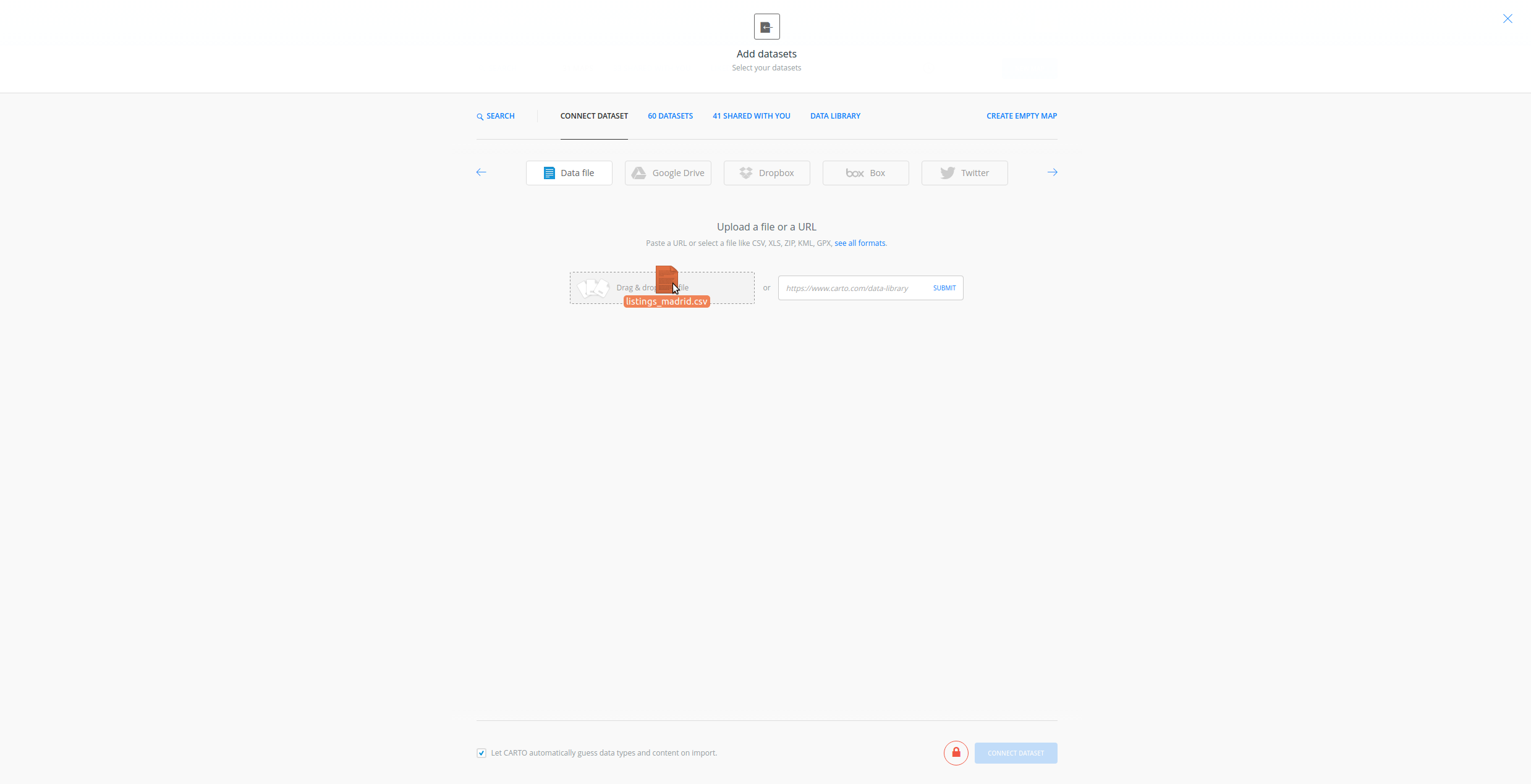
- Click on
NEW MAP. - Clik on
CONNECT DATASET. - Drag and drop
listings_madridfile. - Click on
CREATE MAP.
- Click on
Don't show me this againto avoid modals. - You can rename the map and layer title as “Madrid Airbnb Demo” and “Airbnb” respectively, doing double click over them.
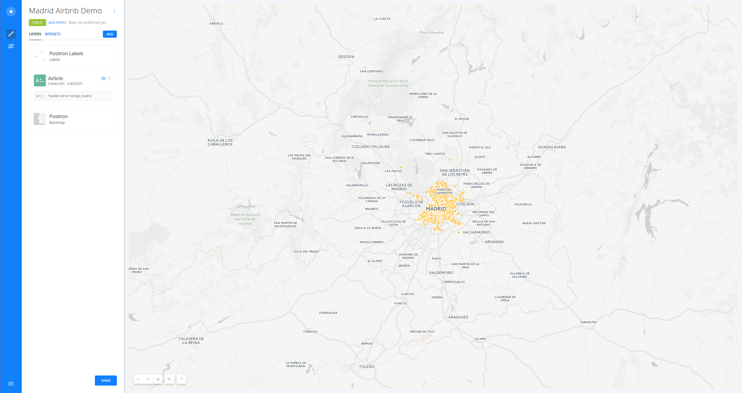
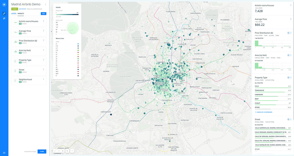
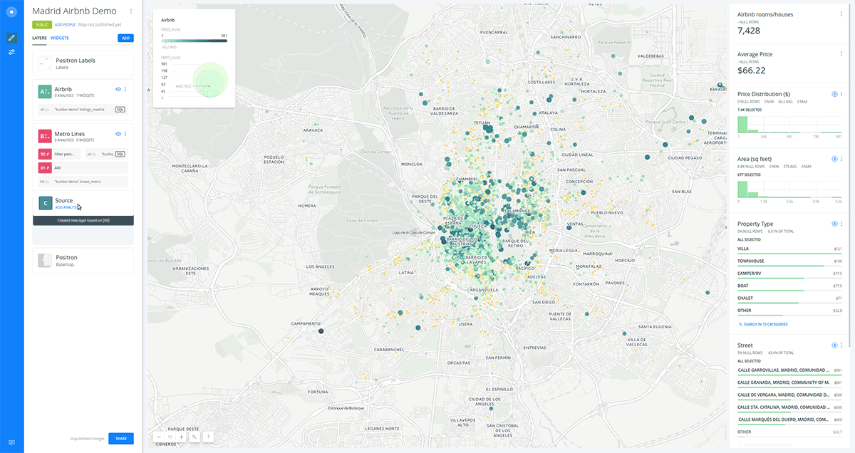
Layers
- Add a new layer:
- Click on
ADD. - Clik on
CONNECT DATASET. - Drag and drop
lineas_madridfile. - Click on
ADD LAYER.
- Click on
- You can rename the title of this new layer as “Metro Lines”.
You can order your layers. For instance, try to drag the “Airbnb” layer on top of the “Metro Lines” layer.
- Click on any of the layers to show its components:
DATAANALYSISSTYLEPOP-UPLEGEND
Have a look at the letter and number the layer card has (
A). This would be very useful for adding widgets and analysis.
Data
- The layer
DATAtab shows you an overview of your table schema, from here you can also add widgets. If you want to have a look at your Data View, click the Data View icon, located on the right bottom corner of Builder when a map layer is selected.
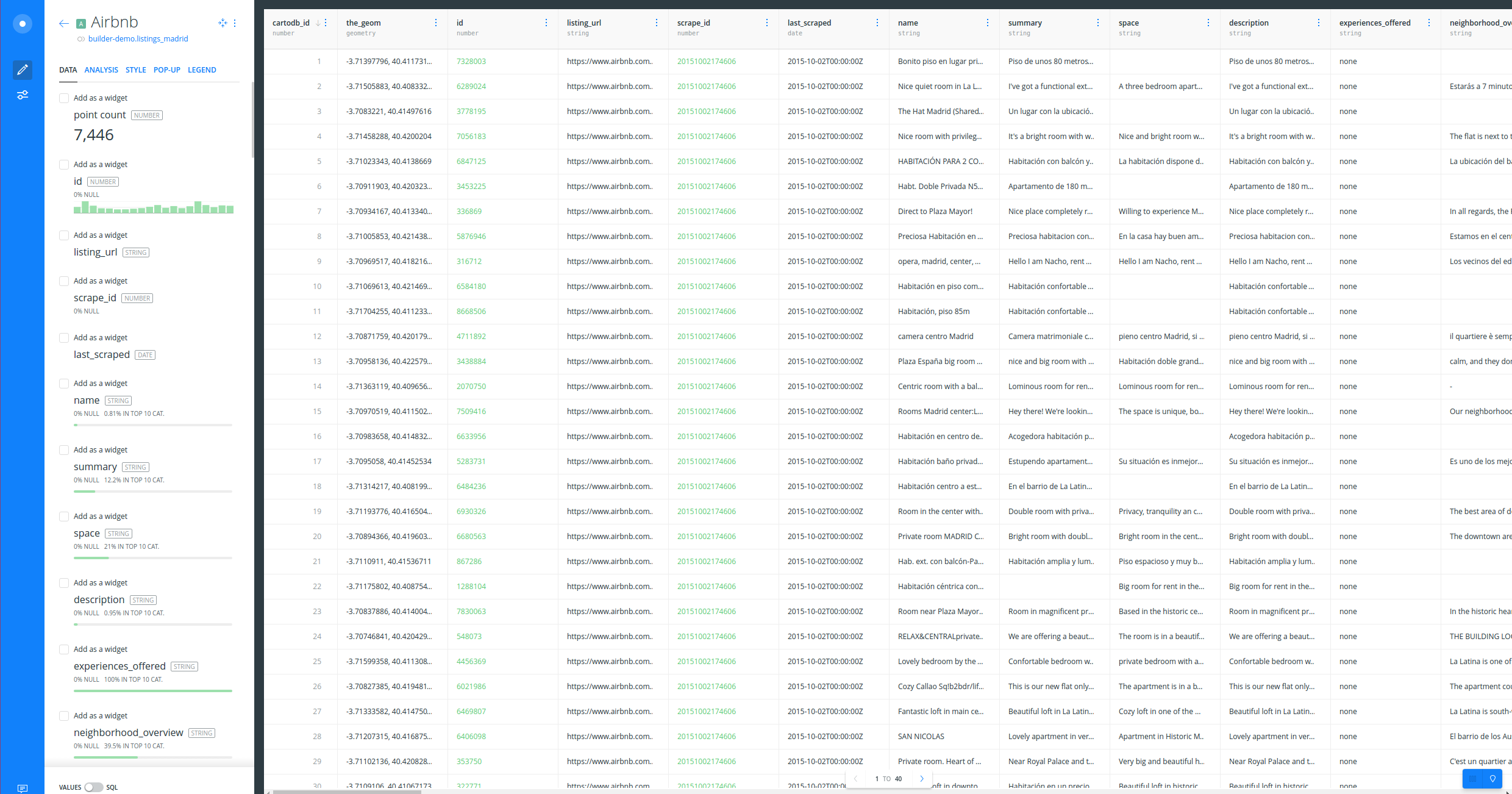
- We can check that the
pricecolumn contains values like$60. In order to remove the dollar sign and convert the field into a numeric one, we need to use theDATAtab. - Switch the slider button, located at the bottom of the DATA tab, from VALUES to SQL and apply the following SQL query:
- Type the following query on your console in order to create a new numeric field called
price_num:
SELECT
  *,
  substring(price FROM '[0-9]+')::numeric as price_num
FROM
  listings_madrid
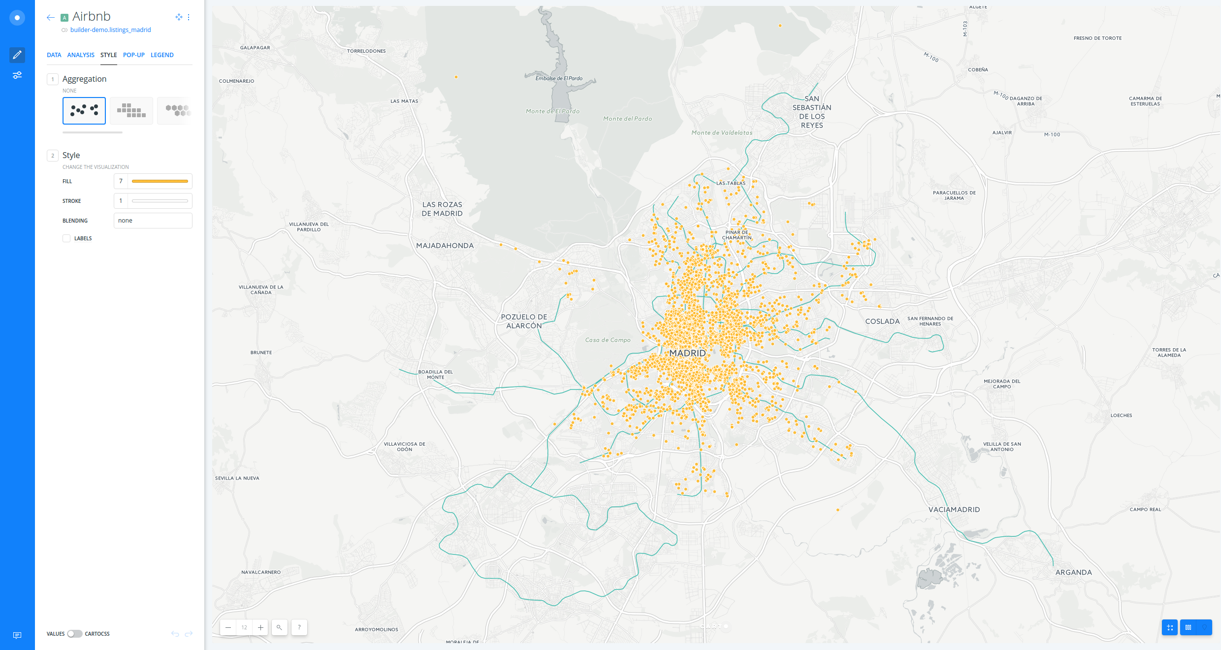
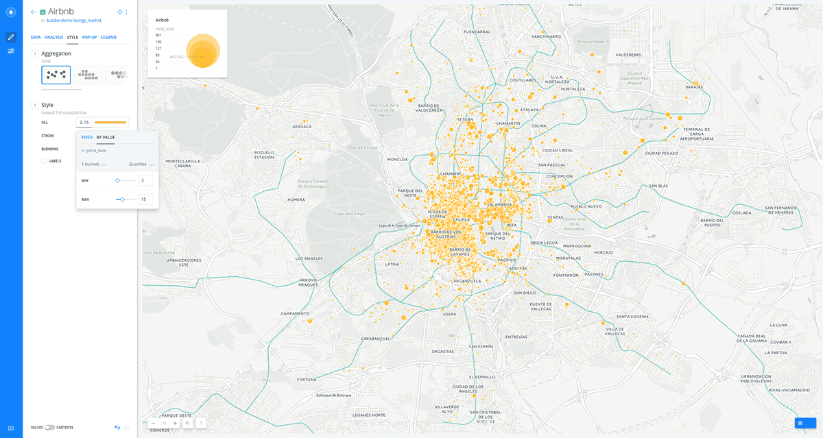
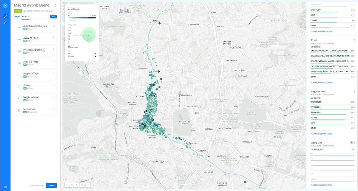
Styling
- In order to style our layer with this new field, click on the
STYLEtab. - Create a bubble (proportional symbols) map:
- Click on “AirBnB” layer.
- Use the SIZE control to change the size of the points.
- Select
BY VALUE. - Select
price_numcolumn. - Set buckets to
7and the classification method toJenks. - Change the
minto3andmaxto15
Check how the legend is dynamically generated.
- Create a chroropleth map:
- Use the COLOR control to change the color ramp settings
- Select
BY VALUE. - Select
price_numcolumn. - Set buckets to
7and the classification method toJenks. - Finally, remove the
STROKE.
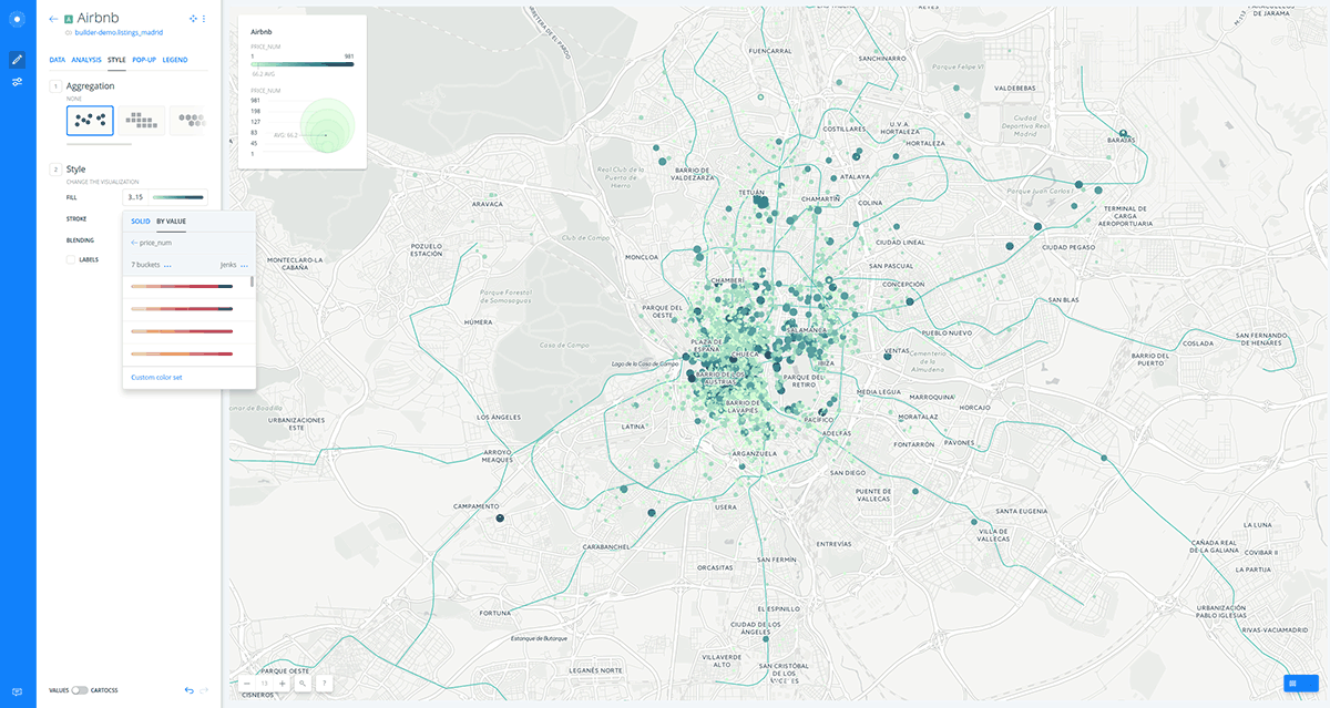
You can customize your map further changing (and inverting) a different CARTOColors, the number of buckets and quantification method.
- Time to style “Metro Lines” layer.
- Go back to the main menu.
- Click on “Metro Lines” layer.
- Create a category map:
- Click on the FILL color (light blue is the default fixed color for lines).
- Select
BY VALUE. - Select
namecolumn.
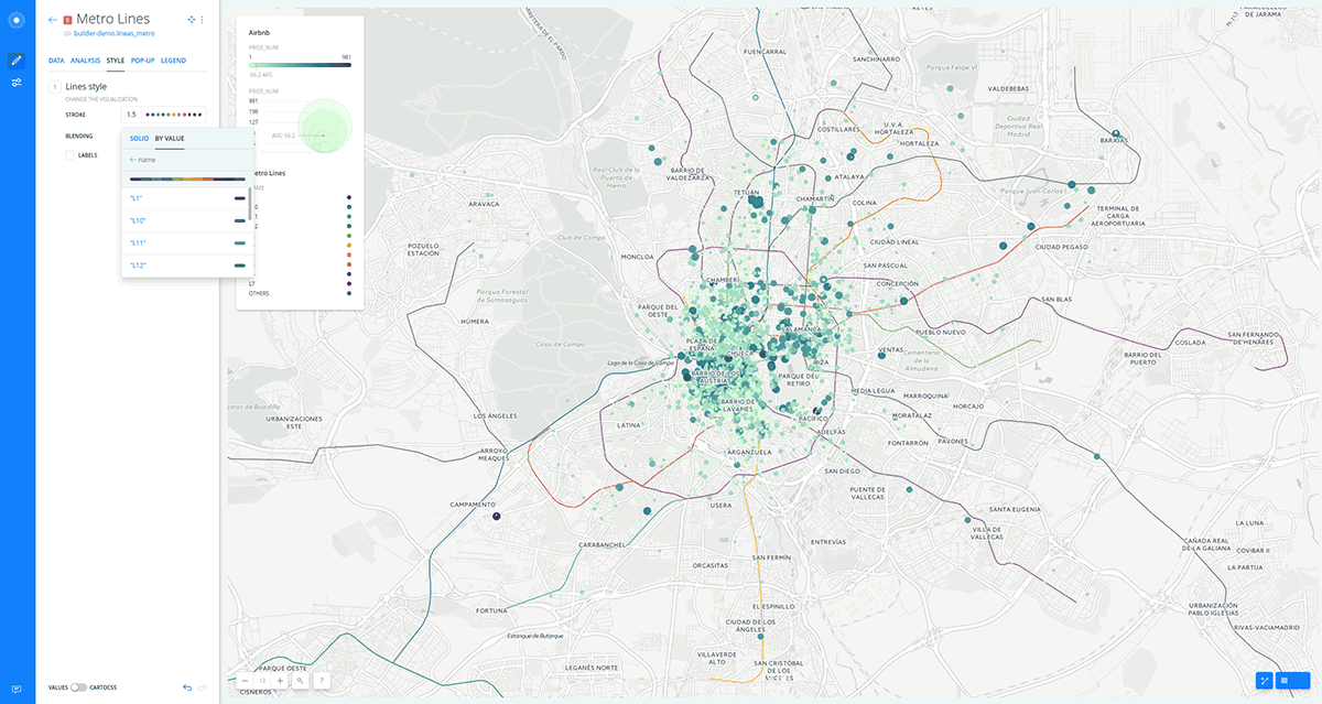
- As you can see the lines are color based on the
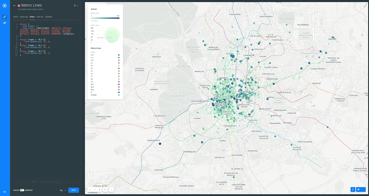
namecolumn. But we want to be colored according to the real Madrid Metro Lines colors. In order to achieve this we are going to use theSTYLEtab. - Switch the slider button, located at the bottom of the STYLE tab, from VALUES to CARTOCSS:
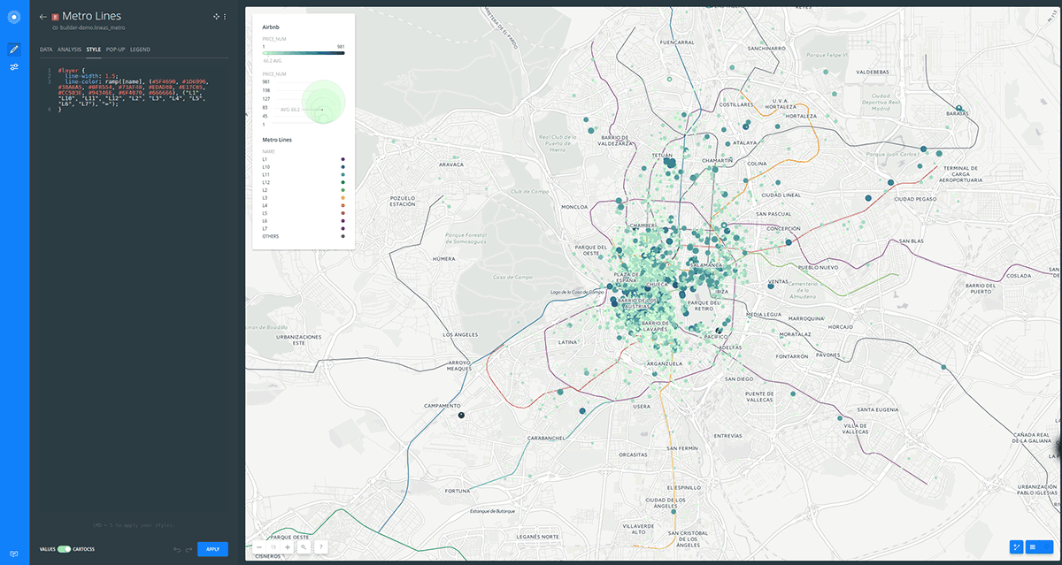
- Type the following CartoCSS style to change the default colors to the ones you need:
#layer {
  line-width: 1;
  line-color: ramp([name], (#01bff5, #014ea5, #01836b, #849a01, #fe1225, #fed201, #a75608, #34c83a, #949492, #fe862d, #fe82b0, #b91a8d, #014ea5, #b91a8d, #fe1225, #000000), category);
}

#layer [name = 'ML1']{
	line-dasharray: 10, 4;
}
#layer [name = 'ML2']{
	line-dasharray: 10, 4;
}
#layer [name = 'ML3']{
	line-dasharray: 10, 4;
}
Widgets
- In order to add widgets to “Airbnb” layer, go back to the main menu:
- Click on
DATA. - Activate the checkbox at the upper left side from the following fields:
point_count,price_num,square_feet,street,neighbourhoodandproperty_type.
- Click on
- Go to the main menu.
- Click on
WIDGETS.
In this menu you can see the list of all widgets you have just added.
- Click on
ADD. - Click on
FORMULA. - Check
price_num.
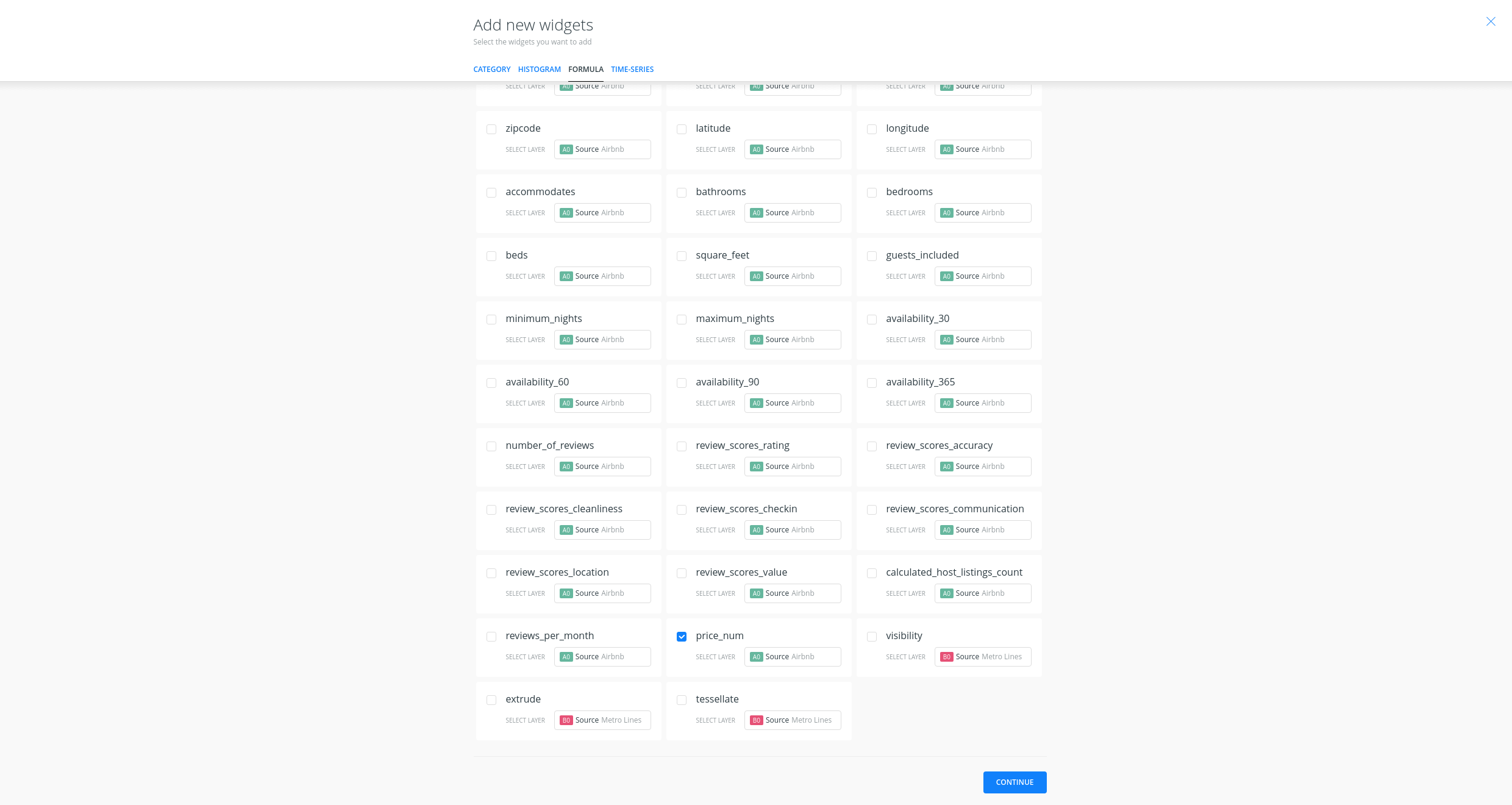
- Click on
CONTINUE. - Edit widgets names and prefixes (adding a dollar sign).
- You can order the values from the category widgets with
AVG(price_num)instead ofCOUNT.
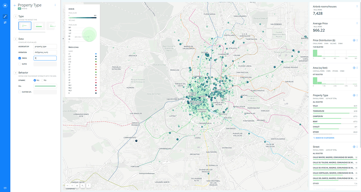
- Now you can filter and display aggregate information with widgets.
- Add a last widget for
namefield from “Metro Lines” layer.
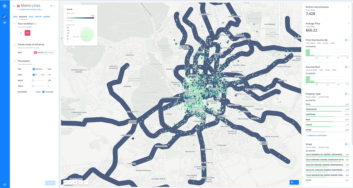
Analysis
- In order to select the rooms or houses within 250 m from a metro line, first we need to create an area of 250 meters surrounding each line.
- Go back to the main menu.
- Click on “Metro Lines” layer.
- Go to the
ANALYSIStab. - Click on
ADD ANALYSIS. - Select
Create Travel/Distance Buffersanalysis. - Click on
ADD ANALYSIS.
- Change
RADIUSto250meters andBOUNDARIEStoDissolve. - Click on
APPLY
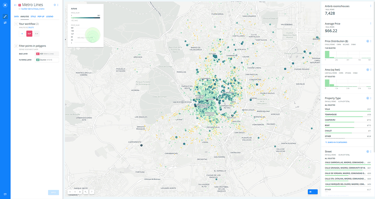
- Secondly, we have to filter the points within those new areas.
- Click on
+to concatenate a new analysis. - Select
Select points in polygonsanalysis. - Click on
ADD ANALYSIS. - Set “Airbnb” layer as
FILTERING LAYER. - Click on
APPLY.
- In order to recover the “Metro lines” original layer, drag the source node out.
- Rename the layer with the analysis attached as “Airbnb houses”.
- We can quickly restyle again copying, pasting and applying the CartoCSS code we have used before.
In order to display the legends, first change the styles from the UI and secondly apply the custom CartoCSS from the CartoCSS view. Also, you can go to
LEGENDtab and customize the legends information.
- Now if you fiter by one line, you only get the Airbnb houses closer to that line.
Publish
- Click on
SHAREblue bottom at the bottom left corner of Builder. - Set to
LINKorPUBLIC. - Click on
PUBLISH.
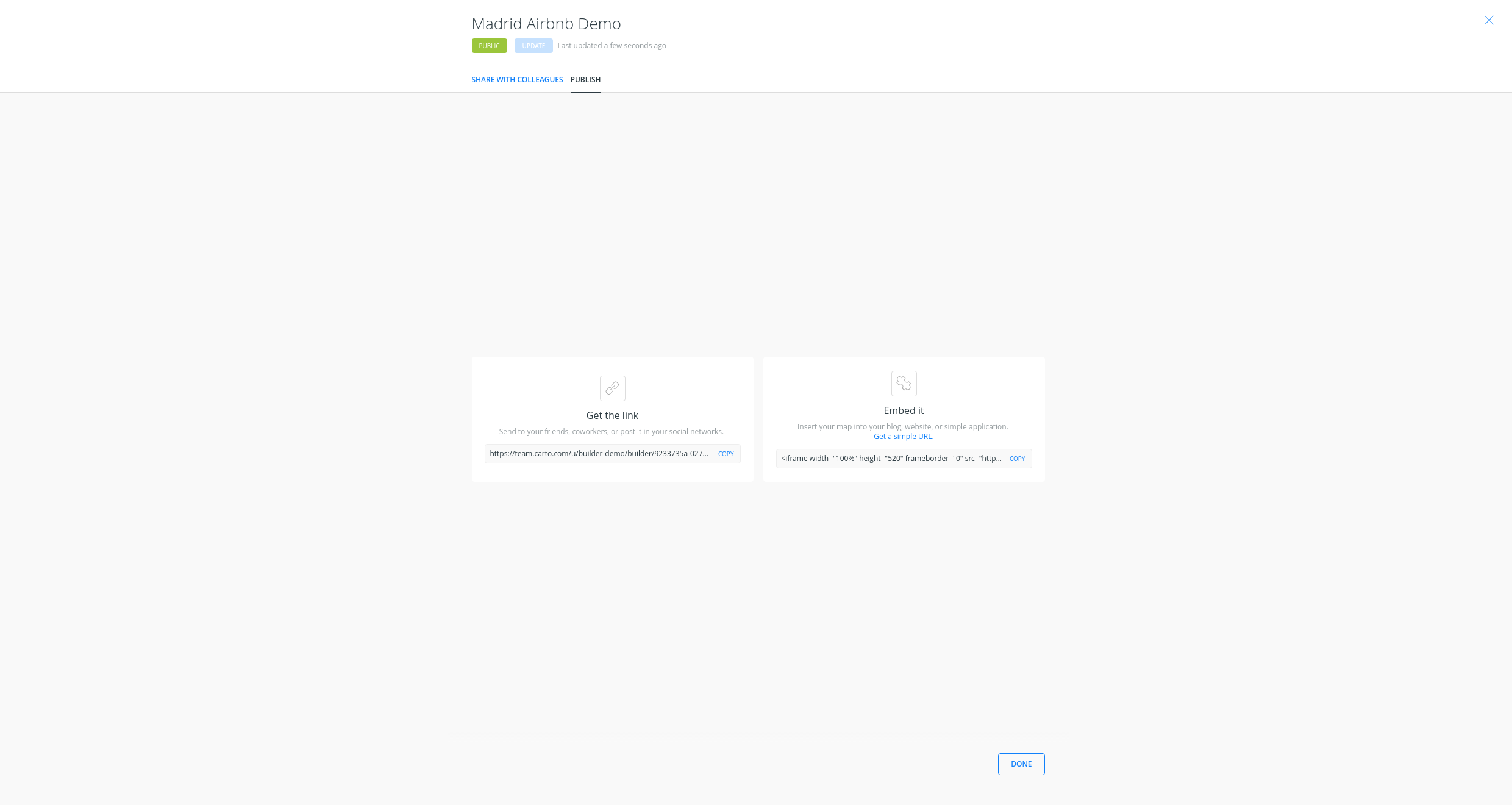
- Now you can share the map:
- Link: https://public.carto.com/builder/b0384547-04e6-4058-9ce4-fc6521fa2c8c/embed
- iframe:
<iframe width="100%" height="520" frameborder="0" src="https://public.carto.com/builder/b0384547-04e6-4058-9ce4-fc6521fa2c8c/embed" allowfullscreen webkitallowfullscreen mozallowfullscreen oallowfullscreen msallowfullscreen></iframe>
Remember to update your map everythime you make a change. Then refresh your embed or website where the map is hosted to see those changes.