Predict Trends and Volatility
Describes how to predict probability of upward and downward trends using spatial Markov chains, with CARTO Builder.
This guide describes how to use the Predict trends and volatility analysis (also known as Spatial Markov). This analysis looks at a sequence of values (e.g., housing prices) equally spaced in time, and predicts whether a future value at the same location will increase, decrease, or remain the same.
Unlike typical Markov Chains, this analysis uses the history of a geography’s neighbors to help predict the future of any geography as well as a geography’s value history. For example, if a geography has a history of lagging in prices as compared to its neighbors, this information is captured and constrains the predictions to give a more accurate picture than without the spatial information.
At least two input columns are needed to make predictions. Generally, the larger the number of columns selected, the more accurate the analysis.
Example
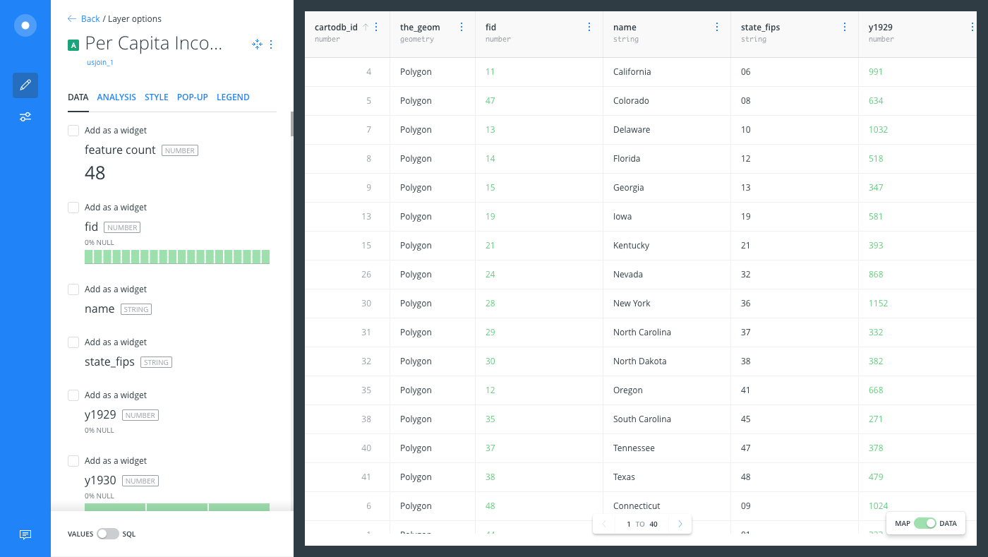
Using a historical dataset on per capita income in the United States, we can make predictions about the probability that any state will have higher, lower, or static per capita income.
- Import the template .carto file packaged from the “Download resources” of this guide and create the map. Builder opens with Per Capita Income Trends as the first and only map layer. The connected dataset contains values from 1929 to 2010 for the lower 48 US states.
Click on “Download resources” from this guide to download the zip file to your local machine. Extract the zip file to view the .carto file(s) used for this guide.
- Click on the Per Capita Income Trends map layer and change the visualization to the Data View, so that you can inspect the values in the columns before applying the analysis.
The Data View and Map View appear as buttons on your map visualization when a map layer is selected. Click to switch between viewing your connected dataset as a table, or show the map view of your data.
-
Switch back to the Map View and click the ANALYSIS tab.
-
Add the Predict trends and volatility analysis and apply the following options:
- For the INPUT COLUMNS, select the checkbox for columns
y1929throughy2009. You can select ALL to select all the columns, and de-select the columns that you do not need.
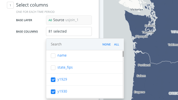
- Click APPLY. The analysis adds four new columns to your dataset.
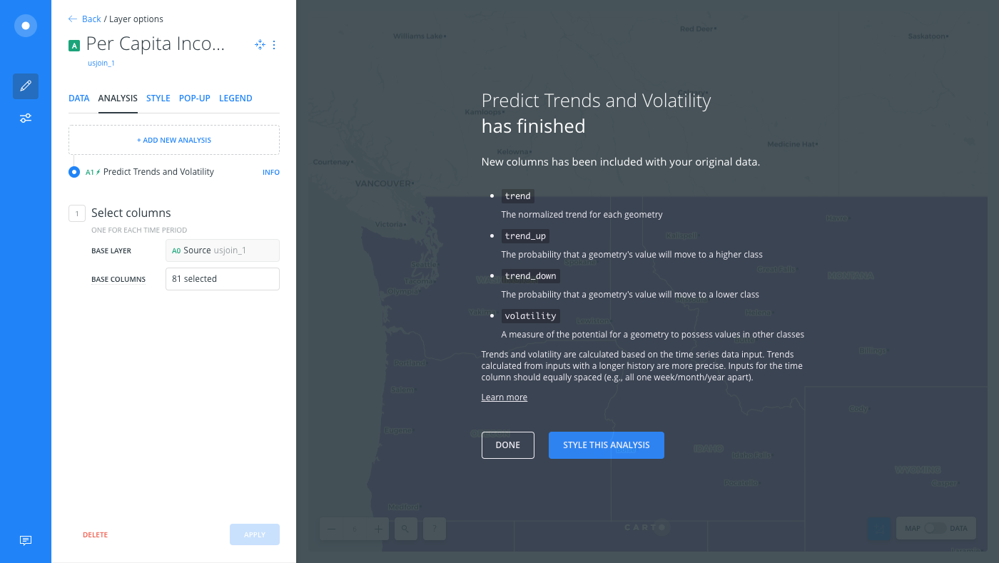
- Click STYLE THIS ANALYSIS to style your data to get a better sense of the predictions.
-
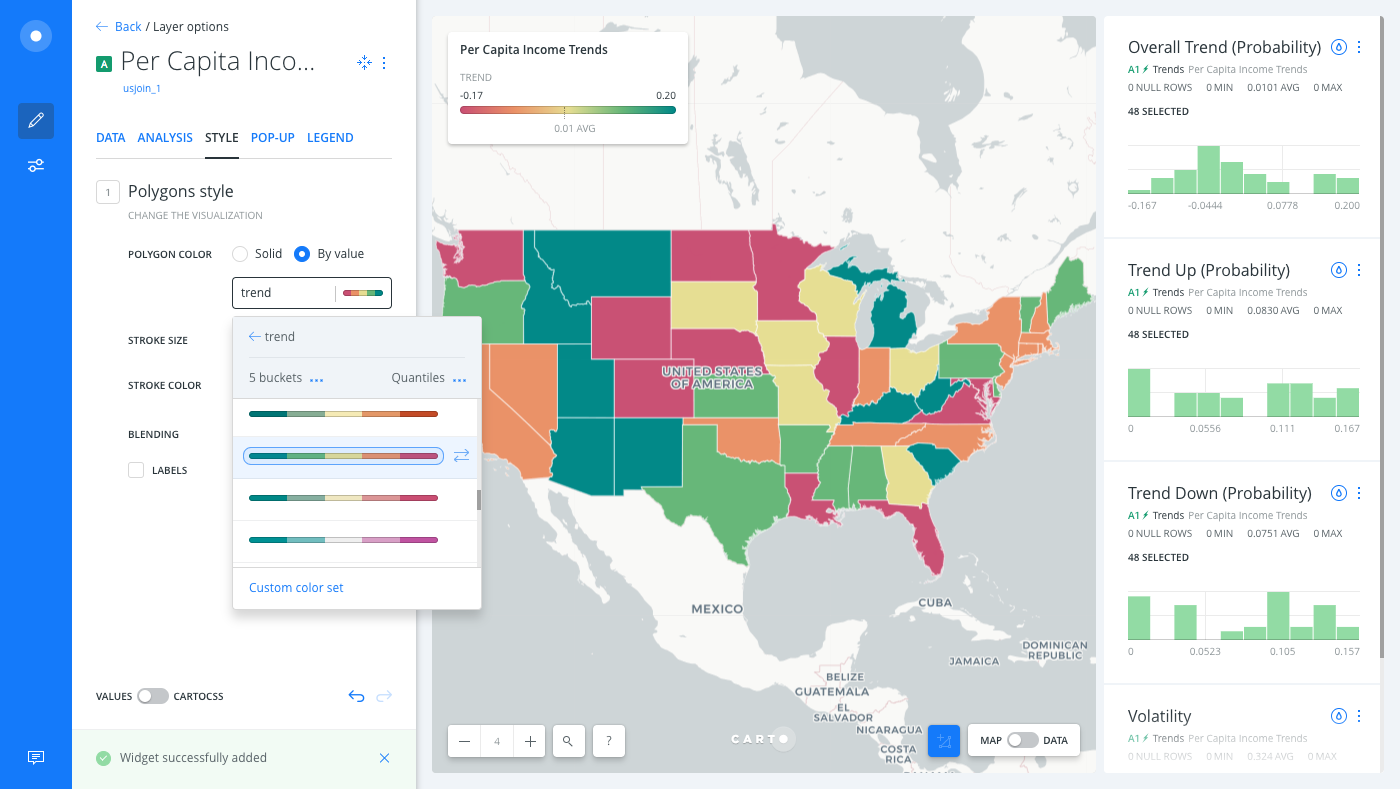
From the STYLE tab of the Per Capita Income Trends layer, click the By value option for POLYGON COLOR.
-
Select
trend.
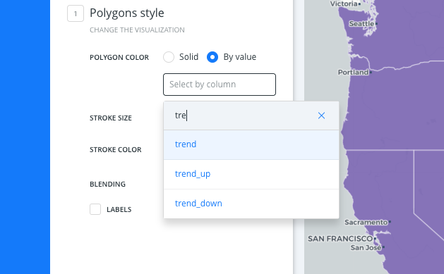
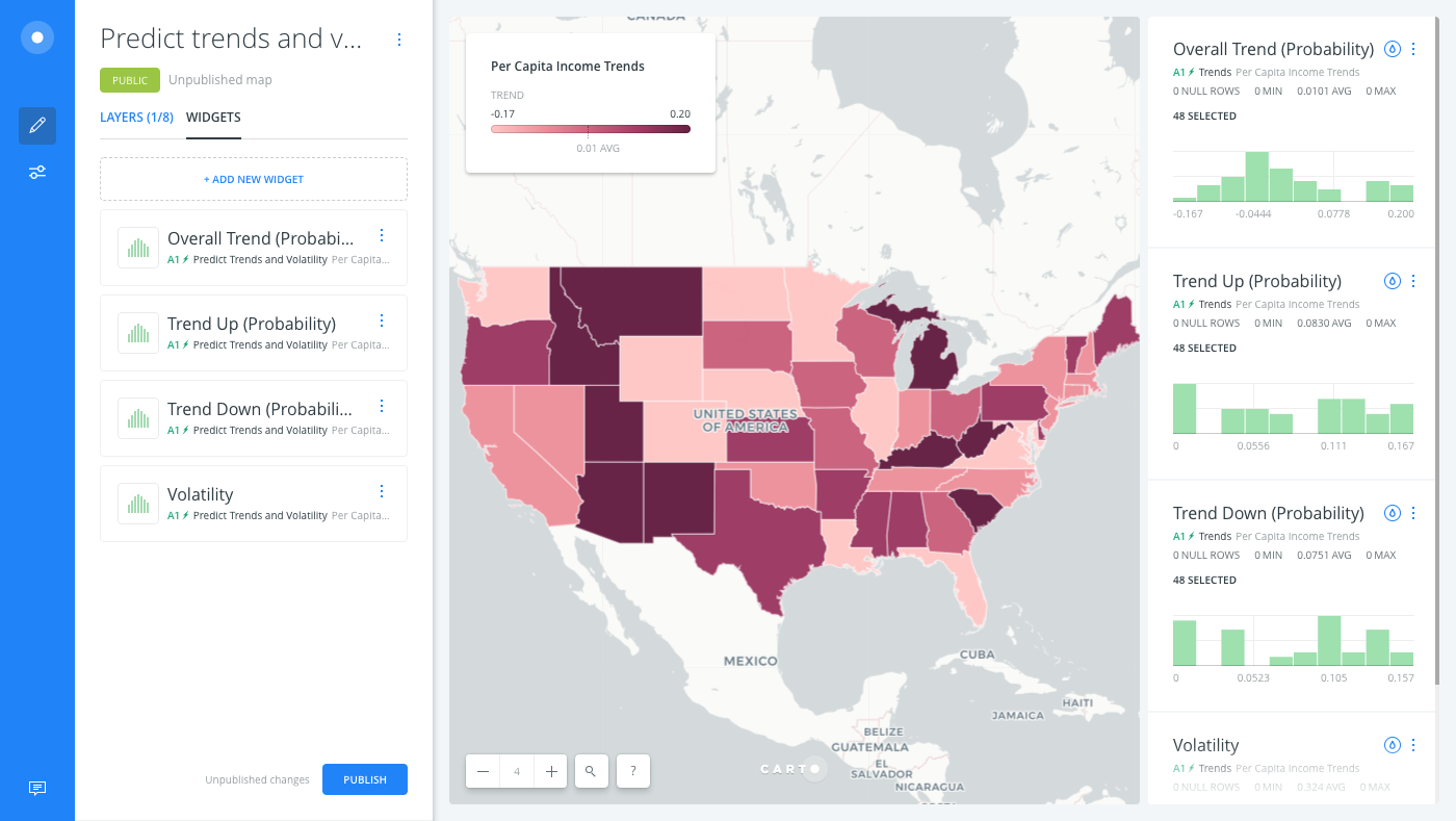
A default color scheme is applied. From the output of this analysis, it is clear that the states on the pinker end of the color scheme are among the more likely to increase in per capita income. On closer inspection, this is likely due to many of these states being in the lowest quartile in per capita income, so are most likely to have upward movement.
Add Widgets and Pop-up Information Windows
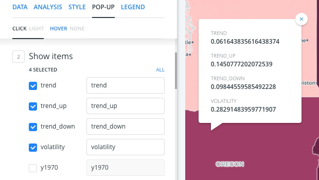
The result of this analysis are the columns which give probabilities of trends (trend, trend_up, trend_down), and volatility, which is the variance of all possible internal trending probability options for a geography.
Let’s add these column values as widgets, and pop-up information windows on our map, to explore our data.
| Column Value | Description |
|---|---|
trends |
Define the statistics of probability distribution. Since the system changes randomly, it is generally impossible to predict with certainty the state of a Markov chain at a given point in the future. However, the statistical properties of the system’s future can be predicted. In many applications, it is these statistical properties that are important. The changes of state of the event-series are called transitions, and the probabilities associated with various state-changes are called transition probabilities. The set of all states and transition probabilities completely characterizes a Markov chain. By convention, we assume all possible states and transitions have been included in the definition of the processes, so there is always a next state. This transition of the sum of probabilities trending up (relative to the unit index of that probability) is given in the trend up, the trend downwards in trend_down and the overall trend (with the direction signified by preceding signs) by trend. |
volatility |
The degree of variation of the event series data over time, measured by the standard deviation of probabilities within the trends. |
-
From the Per Capita Income Trends map layer, click the DATA tab to access the widget shortcut options.
-
Click the checkbox next to Add as a widget for the
trend,trend_up,trend_down, andvolatilitycolumns.
From the POP-UP tab, select these same columns to enable pop-up information windows when viewing data on your map.
- Edit the widget details to rename how they appear on your map, as shown in the following image.
Change the Color Scheme
There are multiple cartographic enhancements that can be applied, depending on how you want to display your data. For the trend output, these values are generally centered about zero, and are positive or negative from there. In this case, a diverging color scheme is the best choice.
CHEATSHEET: Color Schemes
Choosing the right colors for your data aids storytelling, engages the map reader, and visually guides the viewer to uncover interesting patterns that may otherwise be missed. When styling by value, different types of color schemes appear, based on the selected data column from your map layer. Builder provides you with CARTOColor and ColorBrewer schemes, and enables you to customize your own color schemes.
- Sequential Scheme: Color schemes that use variations in lightness make these ideal for displaying orderable, or numeric data. The variations progress from low to high, using colors that range from light to dark (or vice versa).
- Qualitative Scheme: Color schemes that demonstrate categorical differences in qualitative data, which use different hues, with consistent steps in lightness and saturation.
- Diverging Scheme: Color schemes that highlight values above and below an interesting mid-point in quantitative data. The middle color is assigned to the critical value, with two sequential type palettes at either end, assigned to values above or below.
In other cases, a sequential color scheme might be a better choice, where the boldest color represents the higher values; which is also helpful if you are using a lighter basemap. If using a darker basemap, invert the color scheme.
Limits
This analysis has a limit on the time that it takes to execute the analysis. If the analysis takes more than 5 minutes, CARTO will return a timeout error.