Working with TurboCARTO Ramps
Styling point, line, and polygon map layers using TurboCARTO.
As introduced in the Style Thematic Maps with TurboCARTO Guide, TurboCARTO enables you to apply complex, thematic styling using a ramp in CartoCSS. TurboCARTO ramps define how features are drawn on a map.
While you can easily style map layers by column values from the STYLE tab in CARTO Builder, this guide focuses on using the CartoCSS view to apply TurboCARTO ramps to a point, line, and polygon map layer.
See the TurboCARTO Ramps documentation to review how TurboCARTO syntax and parameters are built. Values can be applied by size and color.
Import an Example .carto File
Let’s create a map with a point layer, line layer, and polygon layer; from which we will apply a TurboCARTO ramp to each type of geometry.
- Import the template .carto file packaged from the “Download resources” of this guide and create the map.
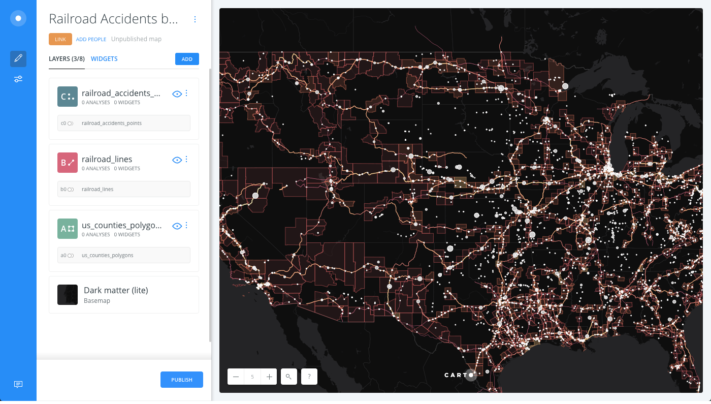
Builder opens with railroad accidents by US Counties, where US Counties (polygons) is the first layer, Railroad Lines (Lines) is the second layer, and Railroad Accidents (points) is the third, top layer. The data was created from another map with several analyses applied. Each of those layers were exported to create new datasets and create this map.
Since the map contains a dark basemap (Dark matter (lite)), we can style each geometry with different, bright colors that will stand out. Railroad Accidents (points) will be displayed as white bubbles, and Railroad Lines and US Counties with a higher accidenty density will be styled using a warm (yellow-red) gradient color-scheme.
TurboCARTO Ramp for Point
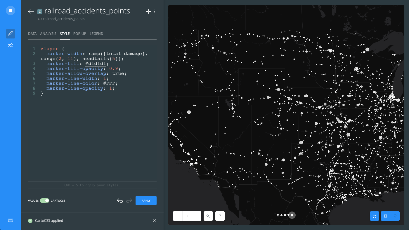
For the railroad accidents (points) layer, create a bubble map by applying a TurboCARTO ramp within the marker-width CartoCSS property. We will apply a custom marker size and change the classification method.
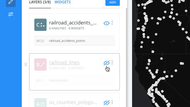
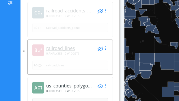
- To focus on visualizing the style of one layer at a time, hide the railroad lines (lines) and US Counties (polygons) layer.
-
Click on the railroad_accidents_points layer.
-
Click the STYLE tab.
-
Click the slider button from VALUES to CARTOCSS.
-
Modify the
marker-widthproperty by applying a TurboCARTO ramp:
  #layer {
    marker-width: ramp([total_damage], range(2, 11), headtails(5));
  }
- The
total_damagecolumn from the railroad accidents dataset is being used as the column value. - The minimum marker size is
2and maximum marker size is11. - Data is grouped by the
headtailsclassification method, sincetotal-damagehas a heavy-tailed distribution.
CHEATSHEET: Classification Methods
Classification methods group data into ranges. CARTO supports classifying numeric fields for graduated symbology through the following methods:
- Quantiles: A quantile classification is well suited to linearly distributed data. Each quantile class contains an equal number of features. There are no empty classes or classes with too few or too many values. This can be misleading sometimes, since similar features can be placed in adjacent classes or widely different values can be in the same class, due to equal number grouping.
- Jenks: Breaks the data into classes based on natural groupings inherent in the data. The groups are formed by decreasing the variance within classes and increasing the variance between different classes -- a 1D k-means. Since Jenks are data-specific classifications, they are not useful for comparing multiple maps built from different underlying data.
- Equal Interval: Divides the range of attribute values into equal-sized subranges. The class breaks specified by the number of buckets selected. Usually used for percentage values, it is best applied to familiar data columns such as temperature, ratios, and other relative attribute values.
- Heads/Tails: Best for data with heavy-tailed distributions, such as exponential decay or lognormal curves. This classification is done through dividing values into large (head) and small (tail) around the arithmetic mean. The division procedure repeats continuously until the specified number of bins is met, or there is only one remaining value left. This method, more than others, helps to reveal the underlying scaling pattern of far more small values than large ones.
- Category: Classifies a limited (or fixed) number of possible values, based on an attribute of a particular group, or nominal category.
The following image displays how the marker-width TurboCARTO ramp appears in the CartoCSS view, and how styling is applied in the Map View.
TurobCARTO Ramp for Line
For the railroad lines (lines) layer, we will apply two TurboCARTO ramps to style the line-width and the line-color properties.
-
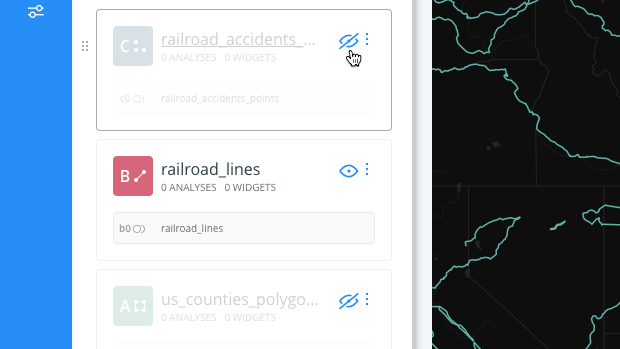
To focus on visualizing the style of one layer at a time, hide the railroad accidents (points) and US Counties (polygons) layer.
-
Click on the railroad_lines layer.
-
Click the STYLE tab.
-
Click the slider button from VALUES to CARTOCSS.
-
Modify the
line-widthproperty by applying a TurboCARTO ramp:#layer { line-width: ramp([sum_total_damage], range(0.5, 1.5), quantiles(5)); }- The
sum_total_damagecolumn from the railroad lines dataset is being used as the column value. The data is aggregated values that came from intersecting the accidents with the railroads. - The minimum line width is
0.5and maximum line width is1.5. -
Data is grouped by the
quantilesclassification method. This example using different classification methods in order to achieve a compromise between these two line properties.CHEATSHEET: Classification Methods
Classification methods group data into ranges. CARTO supports classifying numeric fields for graduated symbology through the following methods:
- Quantiles: A quantile classification is well suited to linearly distributed data. Each quantile class contains an equal number of features. There are no empty classes or classes with too few or too many values. This can be misleading sometimes, since similar features can be placed in adjacent classes or widely different values can be in the same class, due to equal number grouping.
- Jenks: Breaks the data into classes based on natural groupings inherent in the data. The groups are formed by decreasing the variance within classes and increasing the variance between different classes -- a 1D k-means. Since Jenks are data-specific classifications, they are not useful for comparing multiple maps built from different underlying data.
- Equal Interval: Divides the range of attribute values into equal-sized subranges. The class breaks specified by the number of buckets selected. Usually used for percentage values, it is best applied to familiar data columns such as temperature, ratios, and other relative attribute values.
- Heads/Tails: Best for data with heavy-tailed distributions, such as exponential decay or lognormal curves. This classification is done through dividing values into large (head) and small (tail) around the arithmetic mean. The division procedure repeats continuously until the specified number of bins is met, or there is only one remaining value left. This method, more than others, helps to reveal the underlying scaling pattern of far more small values than large ones.
- Category: Classifies a limited (or fixed) number of possible values, based on an attribute of a particular group, or nominal category.
The following image displays how the
line-widthTurboCARTO ramp appears in the the CartoCSS view, and how styling is applied in the Map View.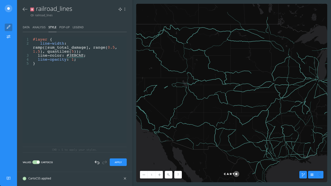
- The
-
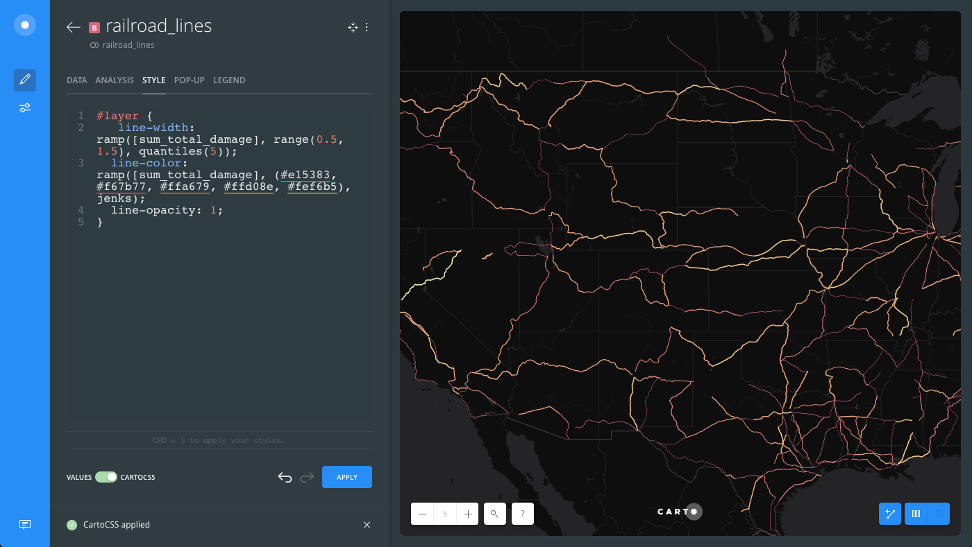
Apply a second TurboCARTO ramp by modifying the
line-colorproperty:#layer { line-color: ramp([sum_total_damage], (#e15383, #f67b77, #ffa679, #ffd08e, #fef6b5), jenks); }- The
sum_total_damagecolumn from the railroad lines dataset is being used as the column value. - The color scheme values are
#e15383, #f67b77, #ffa679, #ffd08e, #fef6b5.
CHEATSHEET: Color Schemes
Choosing the right colors for your data aids storytelling, engages the map reader, and visually guides the viewer to uncover interesting patterns that may otherwise be missed. When styling by value, different types of color schemes appear, based on the selected data column from your map layer. Builder provides you with CARTOColor and ColorBrewer schemes, and enables you to customize your own color schemes.
- Sequential Scheme: Color schemes that use variations in lightness make these ideal for displaying orderable, or numeric data. The variations progress from low to high, using colors that range from light to dark (or vice versa).
- Qualitative Scheme: Color schemes that demonstrate categorical differences in qualitative data, which use different hues, with consistent steps in lightness and saturation.
- Diverging Scheme: Color schemes that highlight values above and below an interesting mid-point in quantitative data. The middle color is assigned to the critical value, with two sequential type palettes at either end, assigned to values above or below.
- Data is grouped by the
jenksclassification method.
CHEATSHEET: Classification Methods
Classification methods group data into ranges. CARTO supports classifying numeric fields for graduated symbology through the following methods:
- Quantiles: A quantile classification is well suited to linearly distributed data. Each quantile class contains an equal number of features. There are no empty classes or classes with too few or too many values. This can be misleading sometimes, since similar features can be placed in adjacent classes or widely different values can be in the same class, due to equal number grouping.
- Jenks: Breaks the data into classes based on natural groupings inherent in the data. The groups are formed by decreasing the variance within classes and increasing the variance between different classes -- a 1D k-means. Since Jenks are data-specific classifications, they are not useful for comparing multiple maps built from different underlying data.
- Equal Interval: Divides the range of attribute values into equal-sized subranges. The class breaks specified by the number of buckets selected. Usually used for percentage values, it is best applied to familiar data columns such as temperature, ratios, and other relative attribute values.
- Heads/Tails: Best for data with heavy-tailed distributions, such as exponential decay or lognormal curves. This classification is done through dividing values into large (head) and small (tail) around the arithmetic mean. The division procedure repeats continuously until the specified number of bins is met, or there is only one remaining value left. This method, more than others, helps to reveal the underlying scaling pattern of far more small values than large ones.
- Category: Classifies a limited (or fixed) number of possible values, based on an attribute of a particular group, or nominal category.
- The
The following image displays how both the line-width and line-color TurboCARTO ramps appear in the the CartoCSS view, and how styling is applied in the Map View.
TurboCARTO Ramp for Polygon
For the US Counties (polygon) layer, we will apply three TurboCARTO ramps to style the polygon-fill, polygon-opacity, and the line-color properties.
-
To focus on visualizing the style of one layer at a time, hide the railroad accidents (points) and railroad lines layer.
-
Click on the us_counties_polygons layer.
-
Click the STYLE tab.
-
Click the slider button from VALUES to CARTOCSS.
-
Modify the color of the polygons by applying a TurboCARTO ramp to the
polygon-fillproperty:#layer { polygon-fill: ramp([accidents_density], (#ee4d5a, #f86f56, #f7945d, #f1b973, #ecda9a), jenks); }- The
accidents_densitycolumn from the US Counties dataset is being used as the column value. The data is the result of intersect analysis that returned density values for the number of railroad accidents. We can use these values to create a Choropleth style map. -
The color scheme values are
#ee4d5a, #f86f56, #f7945d, #f1b973, #ecda9a.CHEATSHEET: Color Schemes
Choosing the right colors for your data aids storytelling, engages the map reader, and visually guides the viewer to uncover interesting patterns that may otherwise be missed. When styling by value, different types of color schemes appear, based on the selected data column from your map layer. Builder provides you with CARTOColor and ColorBrewer schemes, and enables you to customize your own color schemes.
- Sequential Scheme: Color schemes that use variations in lightness make these ideal for displaying orderable, or numeric data. The variations progress from low to high, using colors that range from light to dark (or vice versa).
- Qualitative Scheme: Color schemes that demonstrate categorical differences in qualitative data, which use different hues, with consistent steps in lightness and saturation.
- Diverging Scheme: Color schemes that highlight values above and below an interesting mid-point in quantitative data. The middle color is assigned to the critical value, with two sequential type palettes at either end, assigned to values above or below.
- Data is grouped by the
jenksclassification method.
The following image displays how the
polygon-fillTurboCARTO ramp appears in the the CartoCSS view, and how styling is applied in the Map View.
- The
-
Apply a second TurboCARTO ramp by modifying the
polygon-opacityproperty:#layer { polygon-opacity: ramp([accidents_density], range(0.1,0.4), jenks); }- The
accidents_densitycolumn from the US Counties dataset is being used as the column value. - The minimum opacity is
0.1and maximum opacity is0.4. - Data is grouped by the
jenksclassification method.
The following image displays how the
polygon-fillandpolygon-opacityTurboCARTO ramps appear in the the CartoCSS view, and how styling is applied in the Map View.
- The
-
Apply a third TurboCARTO ramp by modifying the
line-colorproperty for the polygons:#layer { line-color: ramp([accidents_density], (#ee4d5a, #f86f56, #f7945d, #f1b973, #ecda9a), jenks); }- The
accidents_densitycolumn from the US Counties dataset is being used as the column value. - The color scheme values are
#ee4d5a, #f86f56, #f7945d, #f1b973, #ecda9a, which are the same colors applied for thepolygon-fillparameters. - Data is grouped by the
jenksclassification method.
The following image displays how the
polygon-fill,polygon-opacity, andline-colorTurboCARTO ramps appear in the the CartoCSS view, and how styling is applied in the Map View.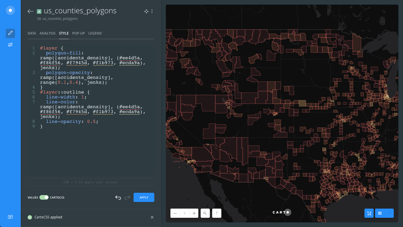
- The
-
Show all three layers from the LAYERS list and see how TurboCARTO styling was applied to your map!