Editor - General Overview
Map Privacy
When you create a map with CARTO, you can protect your map and identify the privacy options as Public, With link, Password protected, or Private. These map privacy settings are managed through the map metadata and enable you to determine how your maps are accessed.
Note: Map metadata is stored separately from your dataset metadata. This enables you to share maps while protecting each layer of data.
The following image, and table, display the available map privacy options.
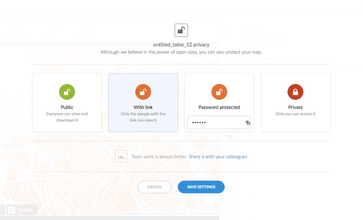
| Map Privacy Option | Description |
|---|---|
| Public | Available to anyone on the internet and viewable from your public profile page on CARTO |
| With link | Only accessible to anyone that has the shared link to the map. This type of map is not viewable from your public profile |
| Password protected | Indicates that map is password protected. When selecting this option, type a password and click SAVE SETTINGS. This type of map is not viewable without the password and does not appear from your public profile |
| Private | A private map that is only visible to you |
You can access the map privacy options through your maps dashboard or through the Data View and Map View for a selected map.
Note: Different privacy options may appear, depending on your account settings.
Map Metadata
You can edit the attributes for each map to add metadata for your map. This is useful for keeping your maps organized and discoverable in a search, as your repository of maps increases. This is especially useful if your map is public.
Note: Map metadata is stored separately from Dataset metadata. Each dataset contains its own metadata, however, once you connect a dataset to a map, you can edit the dataset metadata as a layer within the map.
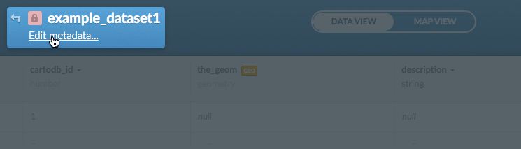
Editing Metadata for a Map
The following procedure describes how to edit metadata for a map.
- Visit the Maps page
-
Select the name of the map to view, or click the Edit icon on a map
The page refreshes, displaying the Map View for the selected map.
-
Click Edit metadata from the selected map
Note: You can edit metadata from the Data View or Map View of a selected map. The Data View contains the connected dataset as a layer within the map.
The Map metadata options appear.
-
Edit the map name, description, and tags for the selected map. You can also change your map privacy settings
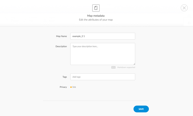
The following map metadata options are available.
Map Attribute Description Map name The name of the map. Note to be as specific as possible if this is a public map Description Describe the content and purpose of your map. You can also add license information in this field if you are sharing your map Tags Tags enable you to group your maps by project or theme Privacy Options may vary depending on your account settings. Click the current status to change the (privacy settings) for the selected map -
Click SAVE to close and save the map metadata attributes
-
Click Search to search your repository of maps by name or tag
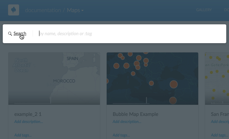
Note how applying metadata enables you to identify and search for map attributes.
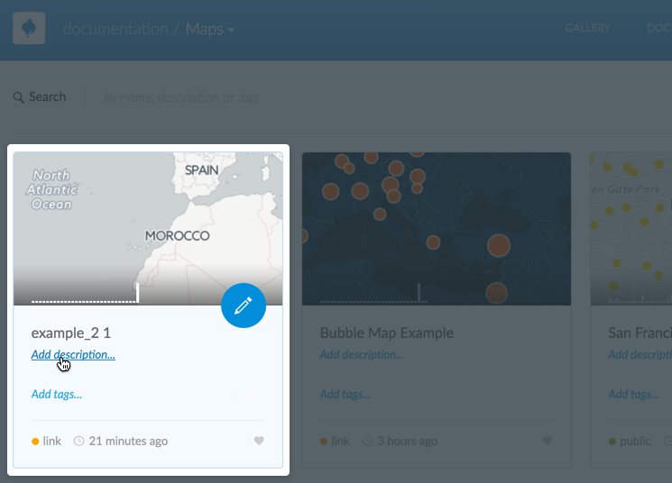
Tip: You can add a description, add tags, or edit the map privacy setting directly from your maps page. Once an initial map description and map tag is entered using this shortcut, you must click Edit metadata from the selected map if you need to update these attributes again.
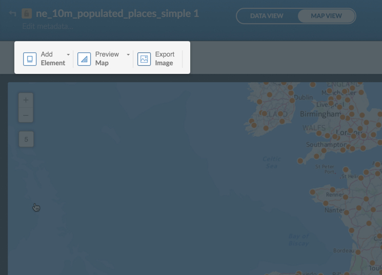
Map Toolbar
The map toolbar includes options to add map elements (such as title, text, annotation, and image items), preview the map to configure it for desktop or mobile applications, and export a static image of your map. This toolbar appears above your map, from the Map View of a selected map.
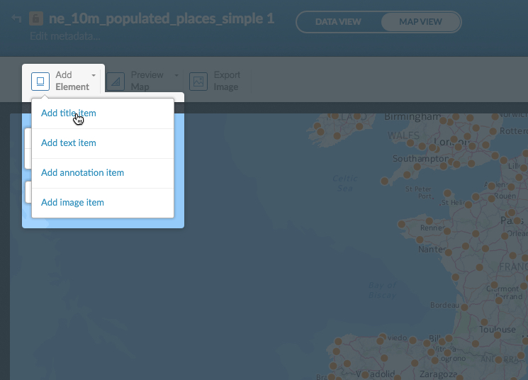
Add Element
In Add Element, it is easy to add overlays on top of your map that help to better showcase your map and clarify the design. With this function you can quickly add fully customizable titles, texts, annotations, and images.
-
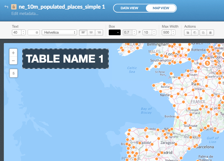
Add Title Item
When you add this item, a text box with a title format will appear on your map. You can place the title box wherever you want and edit the style.
-
Add Text Item
Similar to titles, text boxes will give you control over the position of a block of text on your map. You can place text boxes anywhere in your visualization and edit them.
For annotation, title, and text box overlays, double clicking an element allows you to change the content. Clicking on the element opens the overlay customization toolbar. From here, the text size, colors, fonts, alignment, and box properties can be tailored to fit your map. The toolbar also allows for additional actions with your overlays such as bringing a layer forward or backward, duplicating a layer, or deleting an element entirely.
-
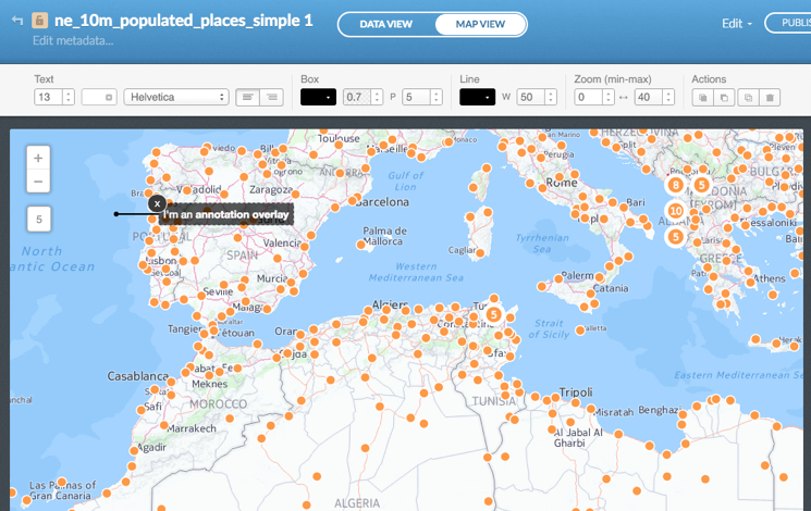
Add Annotation Item
Annotations are text overlays linked to a coordinate and a zoom range. They allow users to explain and point to specific map elements. These overlays will remain fixed on a position on the map, and are excellent for annotating information, telling stories, or highlighting interesting information.
Similar to the title and text overlays, clicking an annotation element brings up the customization toolbar. You will notice that a Zoom (min-max) option has been added. This allows for dynamic annotations and zoom-dependent labeling of map items.
-
Add Image Item
An image can give extra value to your visualization. You will only need to add the image link to the box and it will pop up on your map. You can edit the box style color, the position, and also change the width with the customization toolbar.
Preview Map
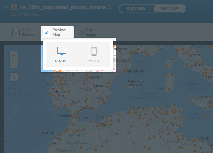
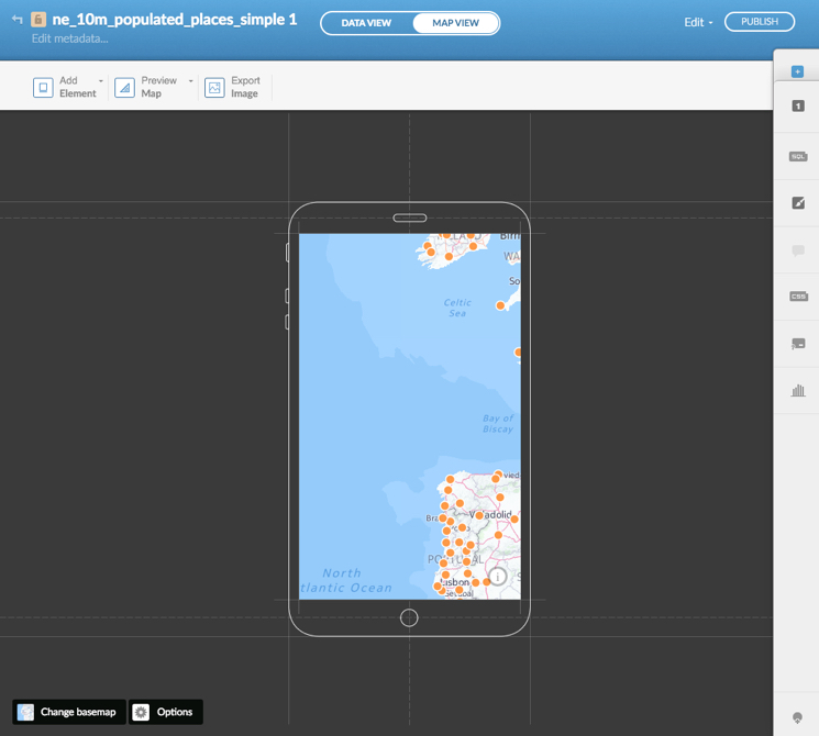
We use our portable devices frequently to consume content, so there is a chance that many people will visit your maps using a mobile device. And that means a small screen in which not many elements will fit right. That’s why we let you create responsive maps: you can design your map for desktop and mobile devices. We offer two canvases so you can design your map for each type of screen.
By default you are in Desktop view. If you switch to the Mobile view, you’ll see that we crop the viewable area. If you include elements for the Desktop view, you’ll see that they are not present when you switch to Mobile. You can create specific elements for this new view, and vice versa.
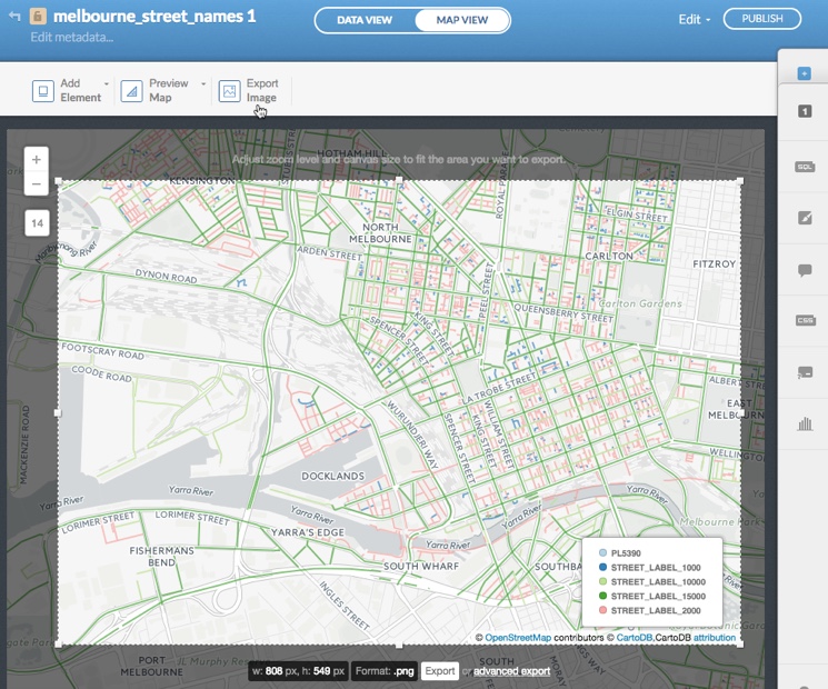
Export Image
The Export Image option enables you to export a static image of a map in .PNG format. You can adjust the zoom level and the size of the map before exporting it as an image. Advanced export image options are also available, which enable you to customize the size and format of the exported static image. Once your map image is exported, you can print it and share it.
-
From the Maps View of a selected map. click Export Image
Your map is selected and the export image options appear.
-
Adjust the zoom level of the image by using the increase size (+) or decrease (-) buttons, located to the top-left of the image
-
Adjust the size of the image by clicking and dragging the edges of the selection.
The width and height changes in displays in pixels. The maximum export pixels values that can be entered for the Export Image options are:
- Maximum width in pixels (838 px)
- Maximum hight in pixels (619 px)
-
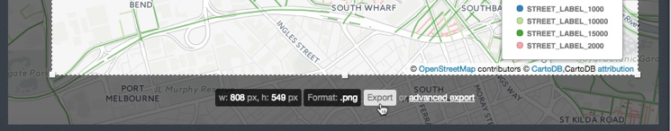
Click Export, located underneath the selected image
Tip: See advanced export for a description of the advanced export image options.
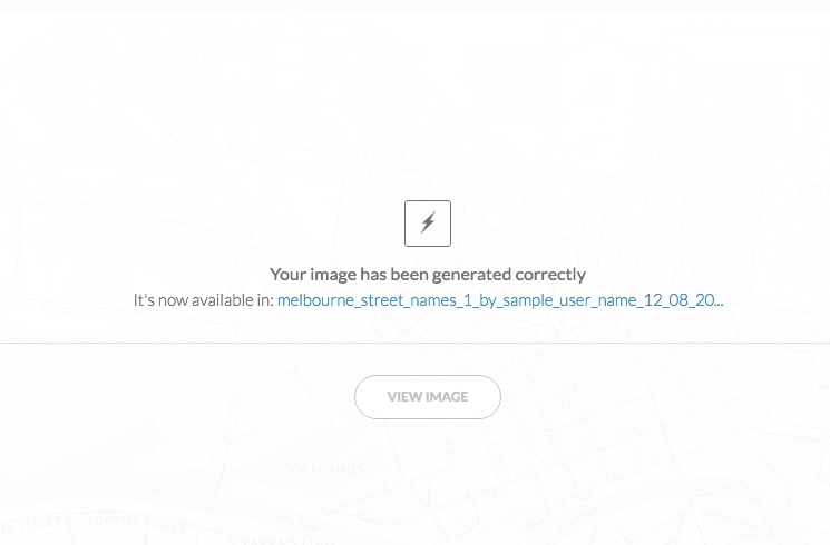
A confirmation dialog appears, indicating that your image has been generated correctly.
-
Click VIEW IMAGE to view the exported .PNG image in a new tab
Tip: Ensure that your browser pop-up blocker is disabled.
You can also share this map image by sharing the URL to the exported image.
Once your map image is exported, you can print it. The maximum print PPI (pixels per inch) resolution for exported images is 72ppi. For details, see Setting the Print Resolution for Exported Images.
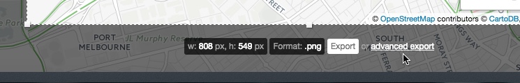
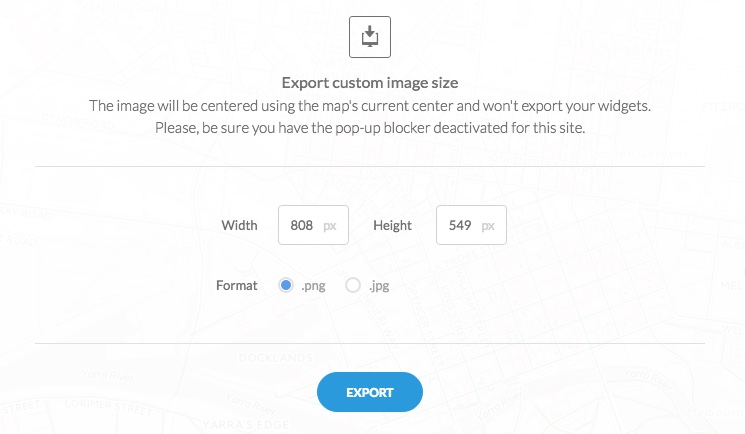
Advanced Export Image Options
The advanced export image options enable you to enter a custom image size and save the image in .PNG or .JPG format.
-
Once you select Export Image and adjust the zoom level as describe above, click advanced export, located underneath the selected image
The Export custom image size dialog box appears.
-
Enter in a custom width an height, in pixels
-
Select the image format as either .png or .jpg
-
Click EXPORT
-
Click VIEW IMAGE to view the exported .PNG image in a new tab
Tip: Ensure that your browser pop-up blocker is disabled.
You can also share this map image by sharing the URL to the exported image, or print the exported image.
Setting the Print Resolution for Exported Images
The maximum print PPI (pixels per inch) resolution for exported images is 72ppi. If the quality of you exported image is not sufficient, you can export the image at a larger dimension and use an external image editor (such as Photoshop) to size down the image to your desired print dimensions.
For example, if you are creating an 11x17 inch image for printing at 300ppi resolution, the pixel dimensions are 3300 pixels wide by 5100 pixels tall. If you are creatinge an 11x17 inch image for 72ppi resolution, the pixel dimensions are 792 pixels wide by 1224 pixels tall (Tip: For landscape format, you should apply 1224 px x 792 px dimensions). If you are using the 72ppi image in a program that prints out at 300ppi resolution, it will not fill the area of the printed page.
If you are using CARTO Editor, the maximum pixels values that can be entered with the export image options are:
- Maximum width in pixels (838 px)
- Maximum hight in pixels (619 px)
Note: If you are using the advanced export image options (or using the MAPS API to export static map images), the following Static Maps API Limits are enforced.
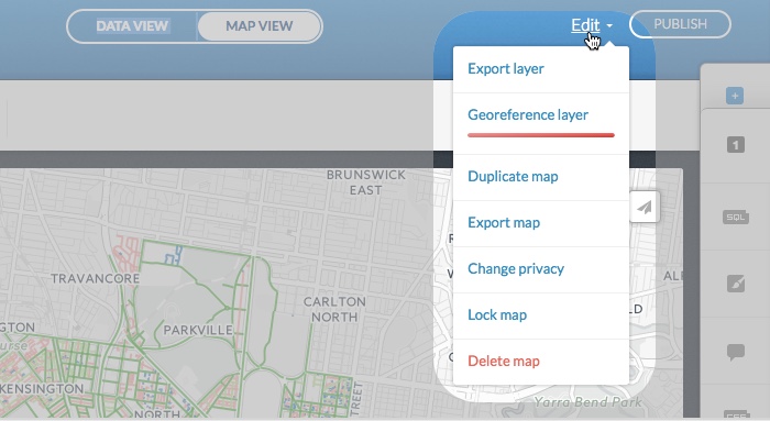
Edit Map Options
The following options are available from the Edit menu of the Data View or Map View of a selected map.
Tip: These edit options are separate from the (map display options), accessible from the bottom of a selected map.
| Map Edit Menu Options | Description |
|---|---|
| Export layer | A dataset appears as a layer on your map. You can export the dataset layer for use offline. This process is identical to exporting a dataset once you select Export layer from the Edit menu. For details, see how to Export Data |
| Georeference layer | Edit your map and apply geocoding coordinates to transform your data. This process is identical to the georeferencing dataset options once you select Georeference layer from the Edit menu. For details, see Geocoding Data |
| Duplicate map | Creates a duplicate of your map so that you have a backup copy of it. Note that changes applied to a duplicate map are not applied to the original |
| Export map | Exports a map, and connected data, as a .carto file. This is useful for downloading complete CARTO visualizations that you can share or import. For details, see Export Map |
| Change privacy | You can protect your map and identify the privacy setting. For details, see Map Privacy Settings |
| Lock map | To prevent your map from undesired changes, you can lock a map and hide it from your dashboard. For details, see the Frequently Asked Questions about how to lock a dataset or map |
| Delete map | Deletes the selected map |
Export Map
The Export map option enables you to download a map, and the connected dataset, as a .carto file. This .carto file includes the dataset and visualization definition, which contains any SQL queries, CartoCSS, basemaps, attributions, metadata, and styling that was applied to a map.
-
Open a selected map from your Maps page
The page refreshes, displaying the Map View for the selected map.
-
Select the Export map option from the Edit drop-down menu
The Export map confirmation appears.
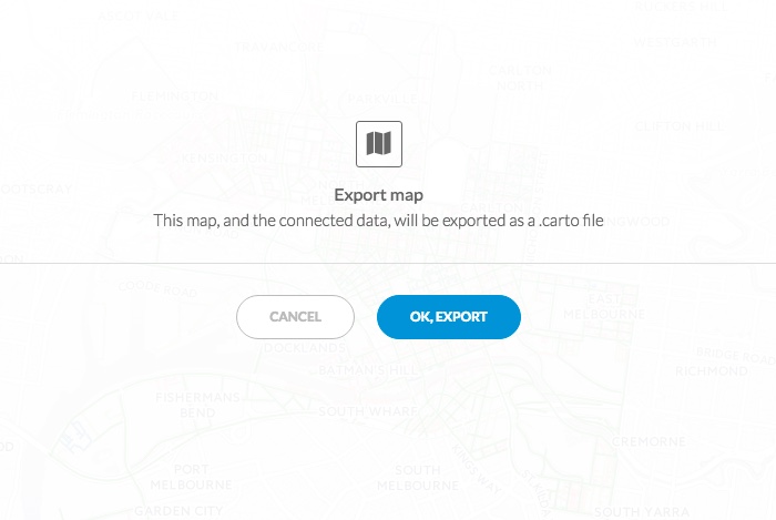
Tip: You can also access this option by clicking the export icon from any CARTO Public Profile map.

-
Click OK, EXPORT
The map, and connected data, is exported to your Downloads folder as a .carto file. See the rules about what is exported.
Note: The Ready to Download dialog will appear if you do not have pop-ups enabled for Carto. Allow pop-ups from CARTO in your web browser to begin the download and export process.
-
Additionally, you can import a .carto file with the CARTO Editor. This is useful if you are sharing maps with team members, exported a public map from someone’s CARTO’s Public Profile page, or if you are migrating maps to another account
- From the Maps page, click NEW MAP
-
Click Connect Dataset
From the Connect Dataset options, select Data file to browse to, or drag your downloaded .carto file
- Click CONNECT DATASET
Your map and dataset are imported. See the Exporting/Importing .carto files section for details about what is imported.
Note: You can also import .carto files with the Import API. For details see CARTO Map Visualizations.
Exporting/Importing .carto files
This section describes the behavior that is enforced when exporting and importing .carto files. It also describes how .carto files are handled with privacy settings.
Exporting Rules:
- When exporting, the privacy settings of your map and dataset are inherited in the .carto file. You will only be able to export what you have access to, anything else is excluded
- For Private and Password protected maps, only the owner can export
- For With Link and Public maps, everyone can export
- For Enterprise users, you can export private maps that have been shared with you
- If you have a map with multiple layers, all accessible layers of your map will be exported
Importing Rules:
- Where you import the .carto file matters!
- If importing the .carto file as a NEW DATASET from the Data page, only the data is imported
- If importing the .carto file as a NEW MAP from the Maps page, the map and dataset(s) are imported
- You will only be able to import public data that is shared with you. If there is any private data, or private layers included in a map, those layers will be excluded from the .carto file
- Importing .carto files containing map and datasets with the same name as existing maps and datasets:
- If the .carto file contains a map with the same name as an existing map, a duplicate map is created
- If the .carto file contains a dataset with the same name as an existing dataset, it will generate a new dataset with a number suffix to avoid overwriting data. For example, if
my_tableis an existing dataset in your account, importing a .carto file with a dataset named “my_table”, is imported asmy_table_1. However, the map included as part of the .carto file will use the original datasetmy_table, notmy_table_1. As an alternative, you can rename the dataset to a unique name before exporting
- When importing a .carto file, you will only be allowed to import the number of layers allowed for your account plan. For example, if someone is sharing a .carto file and has more layers enabled for their account, you will only be able to import the first four layers to your account
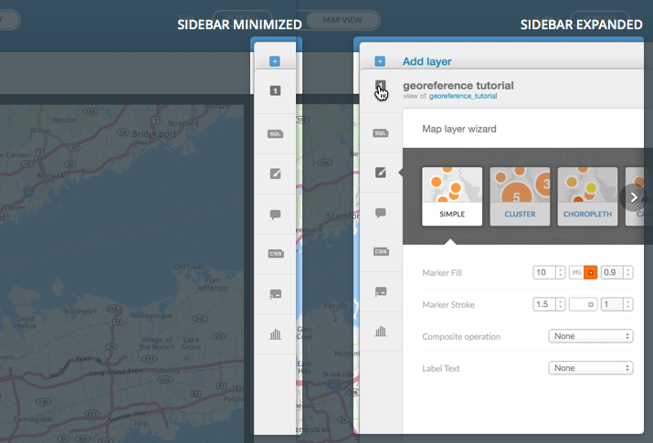
CARTO Sidebar
The CARTO sidebar enables you to access additional tools to help you customize your map data. The sidebar appears minimized by default from the Maps View. Clicking a sidebar option expands the options over your map. This section describes the options available from the CARTO sidebar.
The CARTO sidebar appears minimized by default. When an option is selected, the sidebar expands displaying the related options. You can switch between minimizing and maximizing the sidebar options. The following example displays a side-by-side view of the sidebar option minimized and maximized.
Add Layer
If you need to show multiple layers to differentiate hierarchies in your map, you can add layers from the CARTO sidebar from the MAP VIEW, or the DATA VIEW. The maximum number of layers per map depends on your CARTO account. All plans contain at least four layers and increase up to six layers, depending on your account type. Please contact us if you need a custom number of map layers for your account.
When you click the Add layer plus sign from the CARTO sidebar, the Add a new layer dialog box appears.
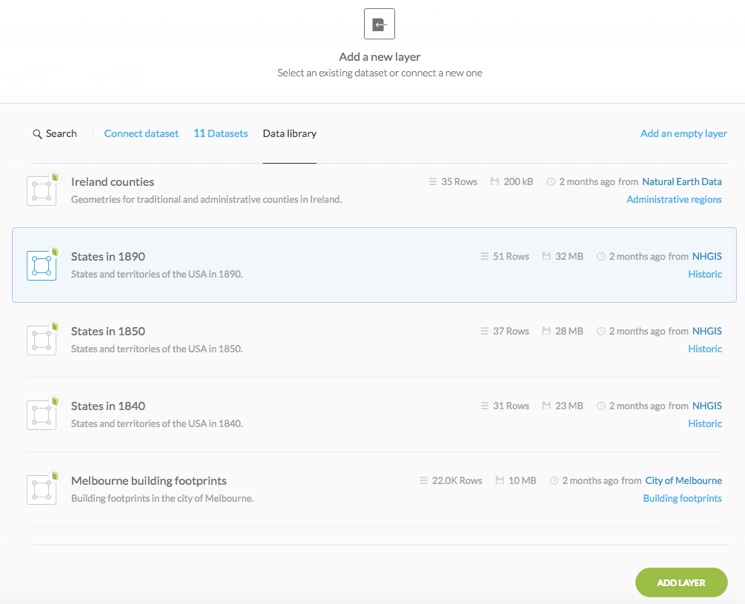
You can:
- Click Connect dataset to open view the connect dataset options, select from your existing datasets from your datasets dashboard, select from the Data library, or add an empty layer
- Click ADD LAYER to add the layer
-
Style each layer independently
Note: When styling a map with multiple layers, the order of the layers reflects the order in which they are visualized. You may need to adjust the styling for each layer to accommodate conflicting features. For example, suppose you have one fully opaque layer over another one, you may be unable to view the data under the opaque layer. Additionally, if you have infowindows enabled for both layers, only the top layer infowindow is displayed in areas where the bottom layer covered (by the top layer).
SQL
SQL (Structured Query Language) is how applications request data from a database. The CARTO geospatial database is built on the PostgreSQL platform and supports advanced PostGIS capabilities. PostGIS allows you to perform geospatial queries, such as finding data points within a given radius, the area of polygons in your dataset, and so on.
SQL queries enable you to:
- Request simple queries (i.e. “request all records from this dataset”)
- Request queries that match certain conditions (i.e. “request all records in which this field equals a certain value”)
- Request more complex queries that combine data from two or more datasets
- Change your map projection by inserting definitions
The SQL option is available from the CARTO sidebar and displays when an SQL query is applied.
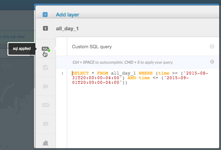
When you connect a dataset and create a map, all of the data in the dataset is displayed by default. You can apply an custom SQL query, or use the filters option, to view specific data.
Tip: If you apply a filter, the related SQL code automatically appears in the custom SQL query. This enables you to view and modify what SQL queries are applied to your data.
Wizards
The CARTO map wizard is an interface that enables you to quickly style your data layers. The wizards option is accessible from the CARTO sidebar of the Map View. This section describes how to access the map wizard and includes details of the available styling options, based on your data.
Note: The wizards options vary, depending on the type of dataset that is connected to your map.
-
Visit the Maps page
-
Select the name of the map to view, or click the Edit icon on a map
The page refreshes, displaying the Map View for the selected map.
-
Click wizards from the CARTO sidebar
The sidebar expands, displaying a list of style options based on your data.
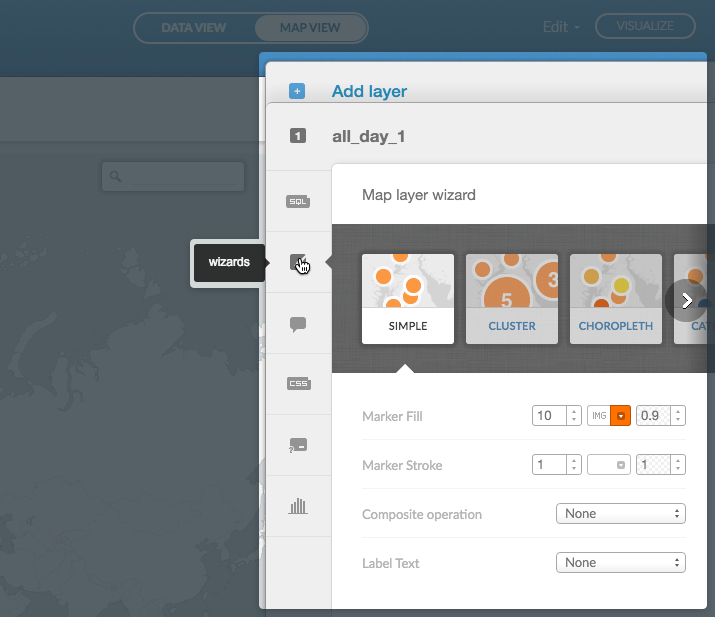
-
Click a map type from the ribbon options to view the applicable styling options
Note: The wizards options vary, depending on the type of dataset that is connected to your map. Selecting a map type displays the applicable styling options in the wizard.
The following map types are available, depending on your data.
Map Type Wizard Options Simple Displays data as simple marker or polygon points. You can set the point size, point opacity, select a marker image or polygon pattern, select the marker/polygon color, add label text, and select the composite operation effect. This map type is recommended for beginners.
For details about all Simple styling options available from the wizard, see Simple.Cluster Displays point files in a group of numbered circles, rendering a cluster of points in close proximity of a given area.
For details about all Cluster styling options available from the wizard, see Cluster.Choropleth A thematic map, with regions of different colors, applied in proportion to the data. This is based on a secondary numeric value from a column in your dataset.
Tip: Choropleth is often used with polygon data to compare characteristics of regions and areas, such as income levels by neighborhood.
For details about all Choropleth styling options available from the wizard, see Choropleth.Category Displays points and polygons, in different colors, based on a qualitative characteristics (categories) in your dataset.
Tip: If your data contains multiple characteristics (i.e. land-use zones), you can use the Category wizard options to change the color of each characteristic (i.e. blue for residential, red for commercial, and purple for mixed-use districts).
For details about all Category styling options available from the wizard, see Category.Bubble Scales the radius of markers, based on a numeric value (as a defined column from your dataset). Bubble maps are not supported with polygons.
Tip: Bubble maps are useful for comparing numeric values associated with a certain point, such as the population sizes of cities.
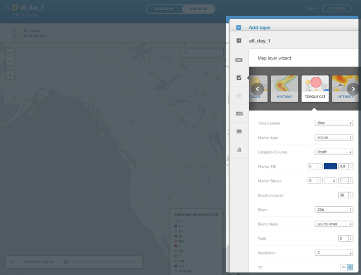
For details about all Bubble styling options available from the wizard, see Bubble.Torque Data animation of a progression of points that is based on time-series data. For example, you can display temporal data and animate a progression of points, based on a data column containing the time stamp.
Note: The standard format of the time stamp date column isYYYY-DD-MMThh:mm:ss. However, Torque maps can also visualize data that contains the year, year/month, or year/month/day format (but only if the complete timestamp is included, i.e,2014-01-01T00:00:00Z).
You can only add one Torque layer in the CARTO Editor. Optionally, you can use Torque.js to add multiple layers, but this is not recommended as it effects performance.
Note: When visualizing Torque style maps, it is required that you normalize your data to show a total count, or a range, of0-255. For more details, see this description about statistical normalization.
For details about all Torque styling options available from the wizard, see Torque.Heatmap A variation of a Torque map, that creates interactive heatmaps (or animated heatmaps) for temporal data. Areas of greater color intensity indicate a larger density of data.
You can only add one Torque layer in the CARTO Editor. Optionally, you can use Torque.js to add multiple layers, but this is not recommended as it effects performance.
Note: When visualizing Torque style maps, it is required that you normalize your data to show a total count, or a range, of0-255. For more details, see this description about statistical normalization.
For details about all Heatmap styling options available from the wizard, see Heatmap.Torque Cat A variation of a Torque map, that displays data points in different colors based on qualitative characteristics (categories) in your dataset. Similar to the Category map, you can style different characteristics for the Torque Cat map.
You can only add one Torque layer in the CARTO Editor. Optionally, you can use Torque.js to add multiple layers, but this is not recommended as it effects performance.
Note: When visualizing Torque style maps, it is required that you normalize your data to show a total count, or a range, of0-255. For more details, see this description about statistical normalization.
For details about all Torque Category styling options available from the wizard, see Torque Category.Intensity Displays the density of points (similar to a heatmap), by darkening areas (of many points) in contrast to those with fewer points.
Tip: Intensity maps are useful when you have a dataset with a large number of points and want to stratify their occurrence. You can also apply infowindows functionality to create a more dynamic style heatmap.
For details about all Intensity styling options available from the wizard, see Intensity.Density Aggregates your data in hexagons and colors them based on the amount of data contained within each unit. Areas with more data points are darker than those with fewer points.
For details about all Density styling options available from the wizard, see Density. -
When you choose options from the wizard, the selected styling is automatically applied to your map
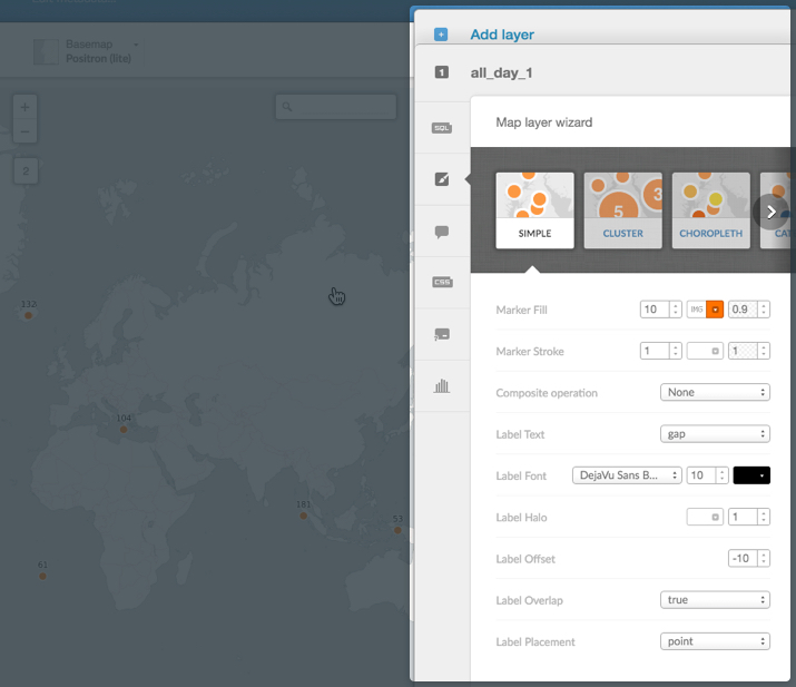
Simple
Displays data as simple marker or polygon points. You can set the point size, point opacity, select a marker image or polygon pattern, select the marker/polygon color, add label text, and select the composite operation effect. This map type is recommended for beginners.
The following style options are available for Simple maps.
Note: Depending on your data, options appear as marker or polygon.
| Simple Wizard Options | Description |
|---|---|
| Marker Fill | Contains all fill options for the point (point size, point image/pattern, point color, and point opacity). |
| size - The size of the marker in a numeric value between 0-40. (Note: The size option is not applicable for polygons). | |
image / pattern - Select IMG to select a marker image or polygon pattern. You can also upload your own icons and patterns from these image options.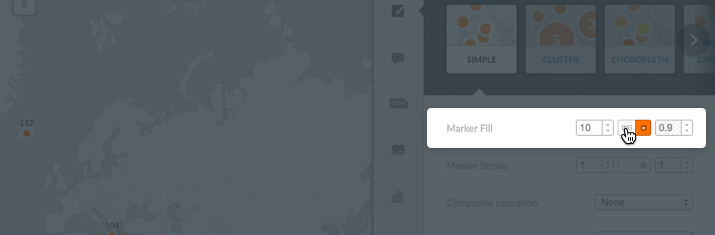 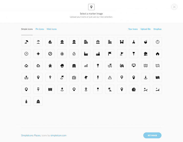 |
|
color - Select a color for the point. Click the default color to open the color palette. You can select a new color, or type a color in the hex code input field (i.e. #FF5C00).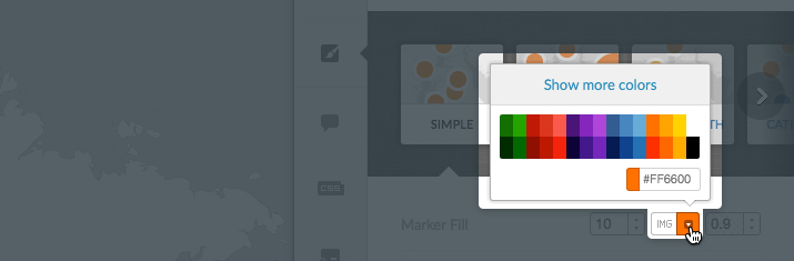 |
|
| opacity - A value between 0-1. | |
| Marker Stroke | Note: This option appears as Polygon Stroke when polygon data is detected by the map wizard. Edit the width of your points’ border or outline (a value between 0-40), the color (using hex codes or by selecting a color from the color palette), and the opacity (a value between 0-1). 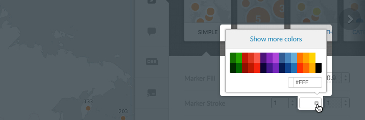 |
| Composite operation | Change how the colors of overlapping geometries interact with one another. You can select multiply, screen, overlay, darken, lighten, color-dodge and color-burn. See CartoCSS Composite Operations for a description of composite operation effects. |
| Label Text | Select the column to act as a map label (if any). Note: When a value is selected for Label Text, additional styling options appear in the wizard. |
Label Font - Select the label font, size, and color. See a list of the supported fonts available through the CARTO Editor. Additionally, see the text-face-name: 'string' property for a description of fonts that can be applied with CartoCSS syntax. |
| Label Halo - Change the color and width of the outline around your text. This is helpful for increasing readability. |
Label Offset - Change how far the label text sits from the marker. Positive values display the label below the marker, negative values display the label above the marker. If set to 0, the marker appears directly under the corresponding label. |
Label Overlap - Shows or hides overlapping labels. false, does not allow labels to overlap. Overlapping labels are hidden. |
| Label Placement - point (places labels on top of points), line (along multiple lines or border, repeatedly), vertex (on the vertexes of points, repeatedly), interior (the interior inside a point. The label remains in place, even if the center is outside of the geometry). |
Note: Conditional formatting is not supported for Simple maps.
Cluster
Displays point files in a group of numbered circles, rendering a cluster of points in close proximity of a given area.
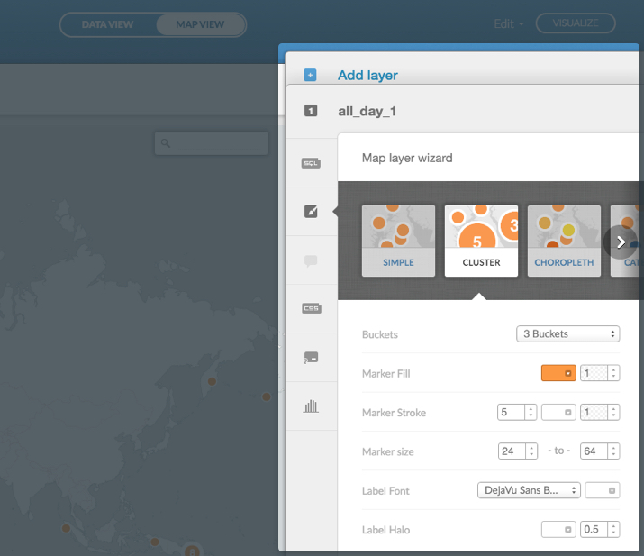
| Cluster Wizard Options | Description |
|---|---|
| Buckets | Define the number of buckets to display groups of data. The more buckets, the more granular the data. Fewer buckets indicates that data displays at a less granular level. |
| Marker Fill | Contains the fill options for the point (point color and point opacity). |
color - Select a color for the point. Click the default color to open the color palette. You can select a new color, or type a color in the hex code input field (i.e. #FD8D3C).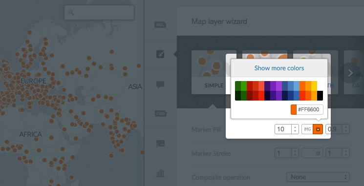 |
|
| opacity - A value between 0-1. | |
| Marker Stroke | Edit the width of your points’ border or outline (a value between 0-40), the color (using hex codes or by selecting a color from the color palette), and the opacity (a value between 0-1). |
| Marker size | The size of your markers, in pixels. |
| Label Font | Select the label font and color. |
| Label Halo | Label Halo - Change the color and width of the outline around your text. This is helpful for increasing readability. |
Choropleth
A thematic map, with regions of different colors, applied in proportion to the data. This is based on a secondary numeric value from a column in your dataset.
Tip: Choropleth is often used with polygon data to compare characteristics of regions and areas, such as income levels by neighborhood.
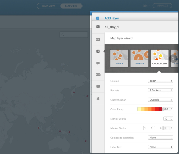
Note: Depending on your data, options appear as marker or polygon.
| Choropleth Wizard Options | Description |
|---|---|
| Column | Select the numeric value column that you want to display. |
| Buckets | Define the number of buckets to display groups of data. The more buckets, the more granular the data. Fewer buckets indicates that data displays at a less granular level. |
| Quantification | Choose the way that data is divided into buckets. Options are: Jenks, Equal Interval, Heads/Tails, and Quantile. See GIS Data Classifications in Cartographica for more information and data quantification. |
| Jenks - Increases the standard deviation between each group of data while decreasing the standard deviation within each group. In other words, it increases the similarity within a given group in conjunction with the differences from each of the other groups. The Jenks method shuffles data across each group until it detects an optimization. | |
| Equal interval - Calculates the range of your data, and divides the total, into equally-sized subranges for your desired number of groups. | |
| Heads/Tails - Creates a break-point at the mean of your data, removes all data below the break-point, and creates the next break-point from the data above the first break-point. It repeats the break process until either a single value is left above the break-point, or if it reaches the desired number of breaks. | |
| Quantile - Creates each group with an equal number of discrete units. The discrete units are gathered from the distinct possible values of your data. | |
| Color Ramp | Select the color theme of your dataset. Click the color ramp to select from a set of color themes. You can also select the opacity for the color ramp (a value between 0-1).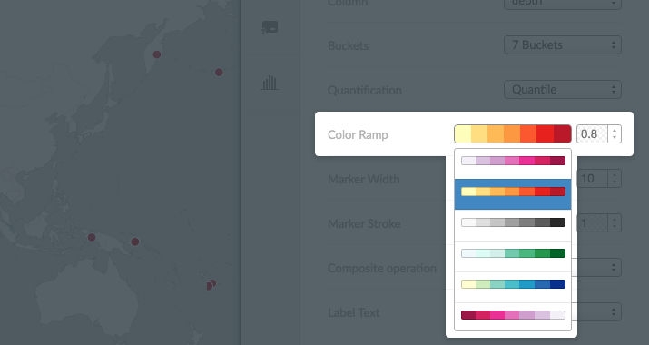 |
| Marker Width | The width of the marker. |
| Marker Stroke | Note: This option appears as Polygon Stroke when polygon data is detected by the map wizard. Edit the width of your points’ border or outline (a value between 0-40), the color (using hex codes or by selecting a color from the color palette), and the opacity (a value between 0-1). |
| Composite operation | Change how the colors of overlapping geometries interact with one another. You can select multiply, screen, overlay, darken, lighten, color-dodge and color-burn. See CartoCSS Composite Operations for a description of composite operation effects. |
| Label Text | Select the column to act as a map label (if any). Note: When a value is selected for Label Text, additional styling options appear in the wizard. |
Label Font - Select the label font, size, and color. See a list of the supported fonts available through the CARTO Editor. Additionally, see the text-face-name: 'string' property for a description of fonts that can be applied with CartoCSS syntax. |
| Label Halo - Change the color and width of the outline around your text. This is helpful for increasing readability. Label Offset - Change how far the label text sits from the marker. Positive values display the label below the marker, negative values display the label above the marker. If set to 0, the marker appears directly under the corresponding label.Label Overlap - Shows or hides overlapping labels. false, does not allow labels to overlap. Overlapping labels are hidden.Label Placement - point (places labels on top of points), line (along multiple lines or border, repeatedly), vertex (on the vertexes of points, repeatedly), interior (the interior inside a point. The label remains in place, even if the center is outside of the geometry). |
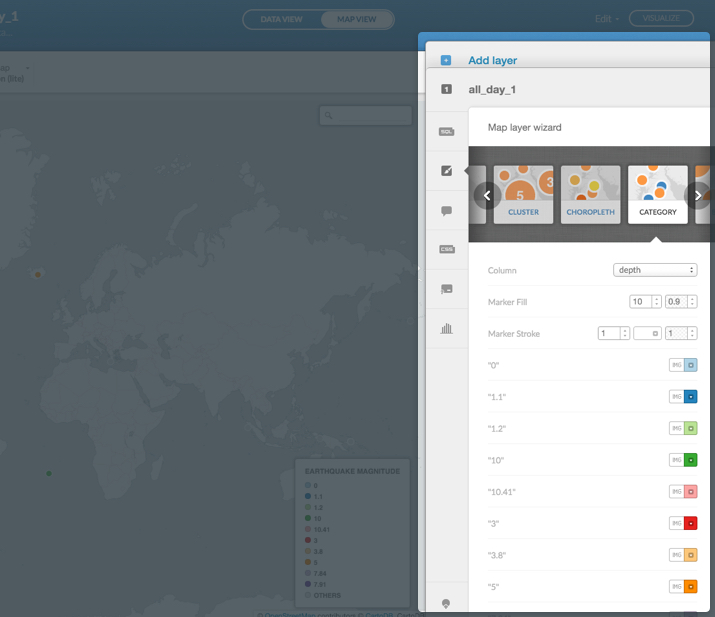
Category
Displays points and polygons, in different colors, based on a qualitative characteristics (categories) in your dataset.
Tip: If your data contains multiple characteristics (i.e. land-use zones), you can use the Category wizard options to change the color of each characteristic (i.e. blue for residential, red for commercial, and purple for mixed-use districts).
Note: Depending on your data, options appear as marker or polygon.
| Category Wizard Options | Description |
|---|---|
| Column | Select the numeric value column that you want to display. |
| Marker Fill | Note: This option appears as Polygon Fill when polygon data is detected by the map wizard. Contains the fill options for the point size (a value between 0-40) and the point opacity (a value between 0-1). |
| Marker Stroke | Note: This option appears as Polygon Stroke when polygon data is detected by the map wizard. Edit the width of your points’ border or outline (a value between 0-40), the color (using hex codes or by selecting a color from the color palette), and the opacity (a value between 0-1). |
| List of detected map/legend items | A list of the different categories that appear on your map (and your legend items). You can add an image marker and edit the color for each category. |
Bubble
Scales the radius of markers, based on a numeric value (as a defined column from your dataset). Bubble maps are not supported with polygons.
Tip: Bubble maps are useful for comparing numeric values associated with a certain point, such as the population sizes of cities.
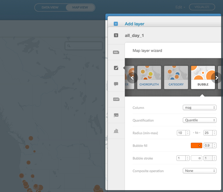
| Bubble Wizard Options | Description |
|---|---|
| Column | Select the numeric value column that you want to display. |
| Quantification | Choose the way that data is divided into buckets. Options are: Jenks, Equal Interval, Heads/Tails, and Quantile. See GIS Data Classifications in Cartographica for more information and data quantification. |
| Jenks - Increases the standard deviation between each group of data while decreasing the standard deviation within each group. In other words, it increases the similarity within a given group in conjunction with the differences from each of the other groups. The Jenks method shuffles data across each group until it detects an optimization. | |
| Equal interval - Calculates the range of your data, and divides the total, into equally-sized subranges for your desired number of groups. | |
| Heads/Tails - Creates a break-point at the mean of your data, removes all data below the break-point, and creates the next break-point from the data above the first break-point. It repeats the break process until either a single value is left above the break-point, or if it reaches the desired number of breaks. | |
| Quantile - Creates each group with an equal number of discrete units. The discrete units are gathered from the distinct possible values of your data. | |
| Radius (min-max) | Set the sizes of the smallest and largest markers, or bubbles, on your map. |
| Bubble fill | Set the color and opacity of bubble markers. |
| Bubble stroke | Edit the width of your points’ border or outline (a value between 0-40), the color (using hex codes or by selecting a color from the color palette), and the opacity (a value between 0-1). |
| Composite operation | Change how the colors of overlapping geometries interact with one another. You can select multiply, screen, overlay, darken, lighten, color-dodge and color-burn. See CartoCSS Composite Operations for a description of composite operation effects. |
Torque
Data animation of a progression of points that is based on time-series data. For example, you can display temporal data and animate a progression of points, based on a data column containing the time stamp.
Note: The standard format of the time stamp date column is YYYY-DD-MMThh:mm:ss. However, Torque maps can also visualize data that contains the year, year/month, or year/month/day format (but only if the complete timestamp is included, i.e, 2014-01-01T00:00:00Z).
You can only add one Torque layer in the CARTO Editor. Optionally, you can use Torque.js to add multiple layers, but this is not recommended as it effects performance.
Note: When visualizing Torque style maps, it is required that you normalize your data to show a total count, or a range, of 0-255. For more details, see this description about statistical normalization.
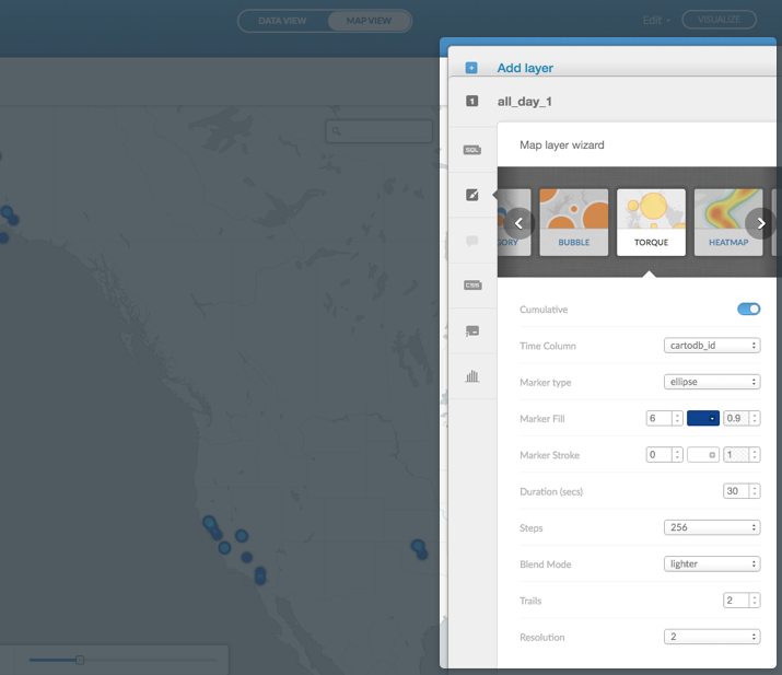
| Torque Wizard Options | Description |
|---|---|
| Cumulative | Determines whether points remain on your map throughout the animation, or fade away. |
| Time Column | Select the date column to display on your map. This column must contain either date-type or numerical data (so long as it reflects the passage of time) to be used in the Torque map. Tip: See Supported Data Types for details about how to change the data type for columns. See the PostgreSQL documentation for general information about date and time data types. |
| Marker type | Sets the marker type to display as an ellipse or rectangle. |
| Marker Fill | Contains the fill options for the point size (a numeric value between 0-40), point color, and point opacity (a value between 0-1). |
| Marker Stroke | Edit the width of your points’ border or outline (a value between 0-40), the color (using hex codes or by selecting a color from the color palette), and the opacity (a value between 0-1). |
| Duration (sec) | Set the total number of seconds for your map visualization. |
| Steps | Edit the number of animation groupings. Fewer steps creates a more step-by-step or choppy data animation with more data in each “step.” A greater number of steps appears smoother. This correlates to whether your data is being displayed by day, week, month, etc. |
| Blend Mode | Change how layered data is blended during animation by applying composite operation effects. You can select from lighter, multiply, source-over, and xor. See CartoCSS Composite Operations for a description of composite operation effects. |
| Trails | Display a trail effect as your data points fade away from your map. Select a value between 0-5. 5 displays a longer trail whereas 0 does not display any trail. This appears as ‘frame-offset’ in the CartoCSS Torque syntax. |
| Resolution | Creates a grid of your data and aggregates data to each cell of that grid. The resolution parameter determines the width and height of each cell. Larger numbers display larger grids of data. |
Note: You can also style Torque maps with CartoCSS properties. For details about Torque specific parameters, see CartoCSS - Torque Maps.
Heatmap
A variation of a Torque map, that creates interactive heatmaps (or animated heatmaps) for temporal data. Areas of greater color intensity indicate a larger density of data.
You can only add one Torque layer in the CARTO Editor. Optionally, you can use Torque.js to add multiple layers, but this is not recommended as it effects performance.
Note: When visualizing Torque style maps, it is required that you normalize your data to show a total count, or a range, of 0-255. For more details, see this description about statistical normalization.
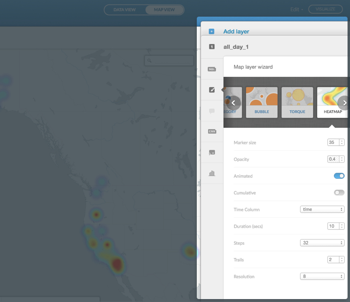
| Heatmap Wizard Options | Description |
|---|---|
| Marker size | Choose the size of your markers. |
| Opacity | Sets the opacity for the heatmap, a value between 0-1. |
| Animated | Displays temporal data into a linear Torque animation. |
| Resolution | Creates a grid of your data and aggregates data to each cell of that grid. The resolution parameter determines the width and height of each cell. Larger numbers display larger grids of data. |
Torque Category
A variation of a Torque map, that displays data points in different colors based on qualitative characteristics (categories) in your dataset. Similar to the Category map, you can style different characteristics for the Torque Cat map.
You can only add one Torque layer in the CARTO Editor. Optionally, you can use Torque.js to add multiple layers, but this is not recommended as it effects performance.
Note: When visualizing Torque style maps, it is required that you normalize your data to show a total count, or a range, of 0-255. For more details, see this description about statistical normalization.
| Torque Cat Wizard Options | Description |
|---|---|
| Time Column | Select the date column to display on your map. This column must contain either date-type or numerical data (so long as it reflects the passage of time) to be used in the Torque map. Tip: See Supported Data Types for details about how to change the data type for columns. See the PostgreSQL documentation for general information about date and time data types. Note: If you select Torque Category as the map type, ensure your SQL query is not using torque_category as a column name, to prevent unexpected behaviors. |
| Marker type | Sets the marker type to display as an ellipse or rectangle. |
| Category Column | Select the numeric value column that you want to display. |
| Marker Fill | Contains the fill options for the point size (a numeric value between 0-40), point color, and point opacity (a value between 0-1). |
| Marker Stroke | Edit the width of your points’ border or outline (a value between 0-40), the color (using hex codes or by selecting a color from the color palette), and the opacity (a value between 0-1). |
| Duration (sec) | Set the total number of seconds for your map visualization. |
| Steps | Edit the number of animation groupings. Fewer steps creates a more step-by-step or choppy data animation with more data in each “step.” A greater number of steps appears smoother. This correlates to whether your data is being displayed by day, week, month, etc. |
| Blend Mode | Change how layered data is blended during animation by applying composite operation effects. You can select from lighter, multiply, source-over, and xor. See CartoCSS Composite Operations for a description of composite operation effects. |
| Trails | Display a trail effect as your data points fade away from your map. Select a value between 0-5. 5 displays a longer trail whereas 0 does not display any trail. This appears as ‘frame-offset’ in the CartoCSS Torque syntax. |
| Resolution | Creates a grid of your data and aggregates data to each cell of that grid. The resolution parameter determines the width and height of each cell. Larger numbers display larger grids of data. |
| List of detected map/legend items | A list of the different categories that appear on your map (and your legend items). You can add an image marker and edit the color for each category. |
Intensity
Displays the density of points (similar to a heatmap), by darkening areas (of many points) in contrast to those with fewer points.
Tip: Intensity maps are useful when you have a dataset with a large number of points and want to stratify their occurrence. You can also apply infowindows functionality to create a more dynamic style heatmap.
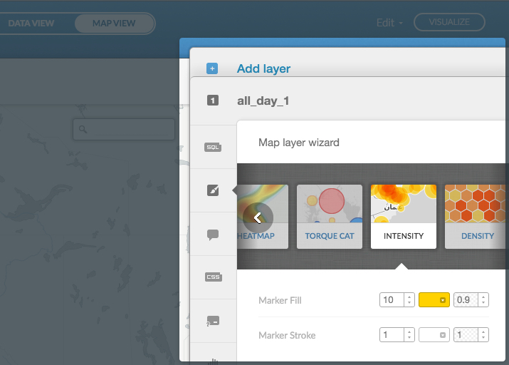
| Intensity Wizard Options | Description |
|---|---|
| Marker Fill | Contains the fill options for the point size (a numeric value between 0-40), point color, and point opacity (a value between 0-1). |
| Marker Stroke | Edit the width of your points’ border or outline (a value between 0-40), the color (using hex codes or by selecting a color from the color palette), and the opacity (a value between 0-1). |
Density
Aggregates your data in hexagons and colors them based on the amount of data contained within each unit. Areas with more data points are darker than those with fewer points.
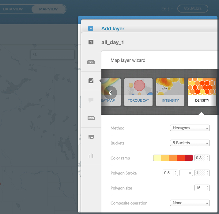
Tip: When Density is selected as the map type, infowindow options are disabled. If you need to apply infowindows functionality, select Intensity as the map type instead.
| Density Wizard Options | Description |
|---|---|
| Method | Displays density with either the hexagon or rectangle shape. |
| Buckets | Define the number of buckets to display groups of data. The more buckets, the more granular the data. Fewer buckets indicates that data displays at a less granular level. |
| Color ramp | Select the color theme of your dataset. Click the color ramp to select from a set of color themes. You can also select the opacity for the color ramp (a value between 0-1). |
| Polygon Stroke | Edit the width of your points’ border or outline (a value between 0-40), the color (using hex codes or by selecting a color from the color palette), and the opacity (a value between 0-1).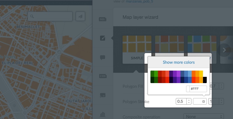 |
| Polygon size | Adjust the size of the polygons on your map. |
| Composite operation | Change how the colors of overlapping geometries interact with one another. You can select multiply, screen, overlay, darken, lighten, color-dodge and color-burn. See CartoCSS Composite Operations for a description of composite operation effects. |
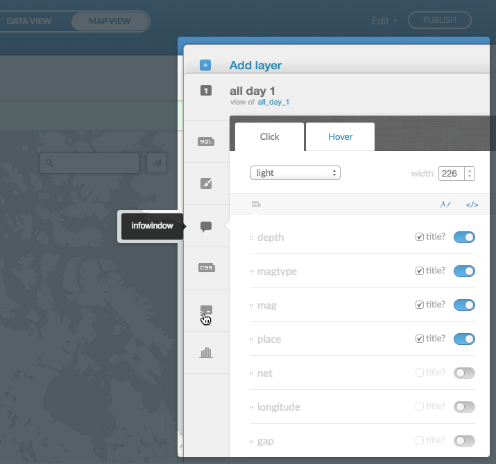
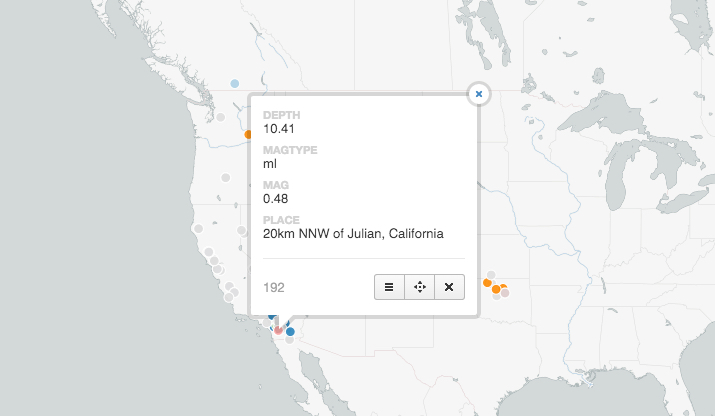
Infowindows
Infowindows provide additional interactivity for your published map. A pop-up information window appears when a viewer clicks, or hovers their mouse over, select data on your map. You can define whether the infowindow appears with the click or hover action, choose what data appears in the infowindow, style the infowindow color and width, display the default title of the infowindow, or add custom title labels for the infowindow data.
You can create custom infowindows with HTML code directly from the CARTO Editor. Infowindows is available from the CARTO sidebar of the Map View. (For details about how to create infowindows with Carto.js, see How can I use Carto.js to create and style infowindows?).
-
From the Map View of a selected map, click infowindows from the CARTO sidebar
Note: infowindows are not supported for every map type. Depending on the map type selected from the wizard, the infowindow option may be disabled.
The sidebar expands, displaying the infowindows options.
-
You can add infowindows for Click actions or for Hover actions
Tip: Click between the subtabs to style either the click infowindow or the hover infowinodow.
Infowindow Options Description style The drop-down list displays infowindow style options. 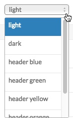
Tip: You can apply a custom image header to an infowindow. For details, see How to add my own images to infowindows?
Additionally, you can embed a video in your infowindow.width The width field enables you to change the size of the infowindow, in pixels. Enable data points Each of the data points on the map is listed, you can enable the data point to appear with the slider button Change the order of labels You can change the order of the labels that appear. Left-click and drag a data label up or down in the infowindow options 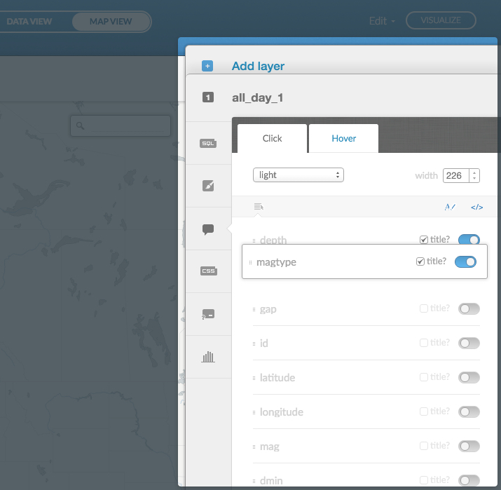
Hide the label title When a data point is enabled, and the title checkbox is selected, the default title of the data point appears in the infowindow. You can deselect the title checkbox to hide the title from the infowindow. The data point value still appears when clicked (or hovered). Change title label To create custom labels for infowindow data points, click Change title labels from the infowindow toolbar and type in your own label name. Click Toggle fields and titles to return to the original view. 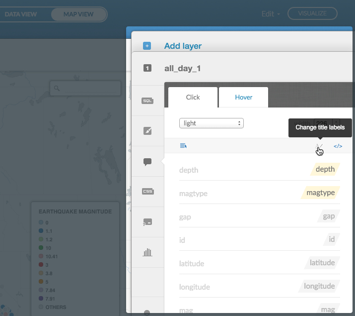
Change HTML If you want to create your own custom infowindow, click Change HTML from the infowindow toolbar. Apply custom HTML code to create and style your own infowindow. 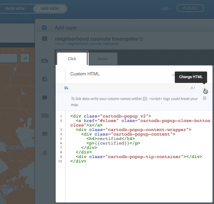
There is a tip icon next the width field when Change HTML is selected from infowindows.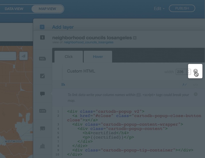
Click to view additional guidelines and examples for creating HTML infowindows.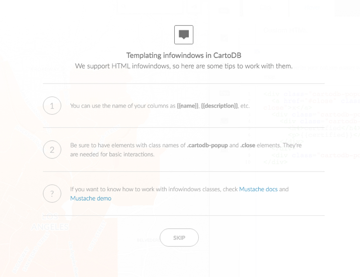
-
Click Publish to view your map and click (or hover) over points to view the infowindow
Tip: If you receive an error message while trying to view an infowindow, ensure that you have the correct connection setup. For details, see Why is my infowindow showing an error?
See all the Frequently Asked Questions related to infowindows.
CartoCSS
CartoCSS is the syntax language that enables you to customize the style of your map data. You can apply CartoCSS styles directly from the the Map View of the CARTO Editor. For more details about CartoCSS, see CartoCSS.
Apply CartoCSS with the CartoCSS Editor
The CartoCSS option is available from the CARTO sidebar, and opens the CartoCSS Editor. The CartoCSS Editor enables you to apply CartoCSS styling directly from the selected map view.
-
Click Your maps from your dashboard drop-down menu
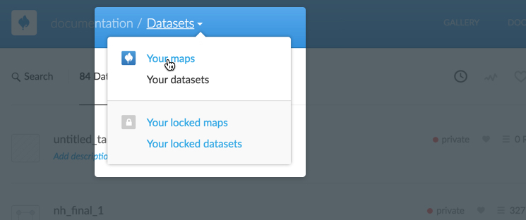
The page refreshes, displaying a list of your maps.
-
Select the name of the map to view, or click the Edit icon on a map
The page refreshes, displaying the Map View for the selected map.
-
Select CartoCSS from the CARTO Sidebar
Note: This CartoCSS option may be disabled, based on your data.
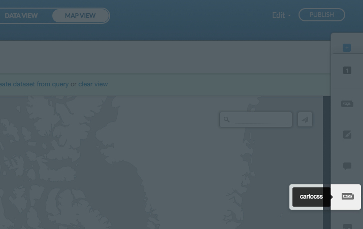
The sidebar expands, displaying the CartoCSS Editor.
-
Enter CartoCSS properties for styling your map
Note: See CartoCSS Properties for a description of the available CartoCSS properties and values.
-
Click Apply style
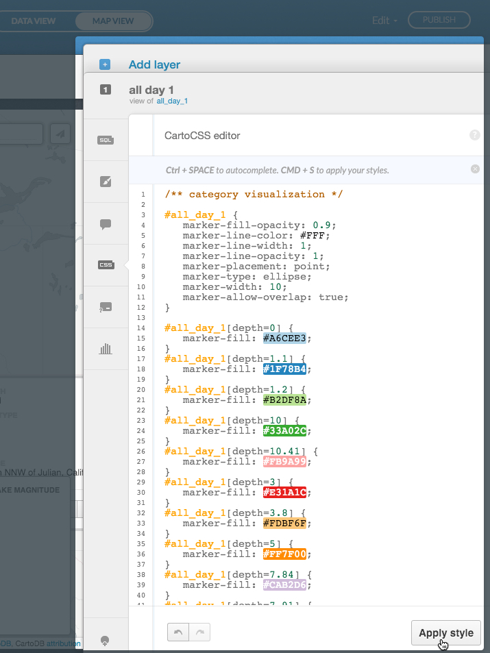
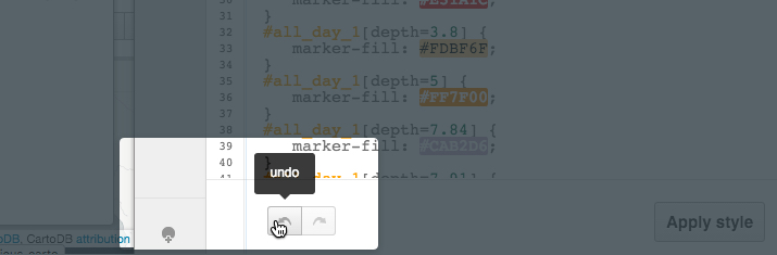
You are notified if there are any errors in the CartoCSS code. You can also click the undo and redo arrow buttons after entering code changes in the CartoCSS Editor.
The map refreshes, displaying the CartoCSS styling changes that you applied.
Note: While you can apply CartoCSS styles to different layers on a map, it is highly recommended that you view the suggested best practices for applying CartoCSS syntax more effectively.
Legends
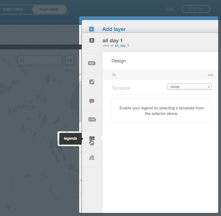
You can add and style a map legend for a published map. Map legends can be symbols and text that describe your map data. You can add a legend title, apply label text for the legend and define how the label text appears. You can also customize the color of your legend elements. Each map type has a default legend template that you can apply and personalize. Additionally, you can create custom legends with HTML code directly from the CARTO Editor. Legends is available from the CARTO sidebar of the Map View.
-
From the Map View of a selected map, click legends from the CARTO sidebar
The sidebar expands, displaying the legend template options.
-
Select a template from the drop-down list to enable your legend options
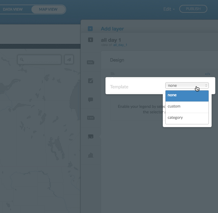
- Click none to disable the legend for the map layer
- Click custom to apply your own custom legend
- Click the legend template name based on your map type
Note: The available legend templates are dependent on the map type. When you select a map type from the wizard, the corresponding template name is automatically applied in the legend section.
-
Select and style your legend options
Legend options vary, depending on your map type. The following side-by-side example shows the intensity legend template options, and the custom legend template options.
The following legend options may appear.
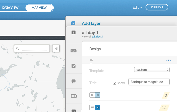
Legend Options Description Template Displays the template for the legend. The available legend template is based on your map type. Select custom to create your own legend.
Tip: To disable a legend for a map layer, select none as the legend template.Title Add a custom title for your legend, and show or hide the title._ Left Label Show the label text to the left of your legend. You can also edit the left label name. Right Label Show the label text to the right of your legend. You can also edit the right label name.
Tip: Other legend labels may appear depending on your map type. You can customize the legend labels for each element.
Colors Set the colors of the individual items in your legend. You can also synchronize with your map marker colors, when applicable. (Depending on your template, color options may vary). 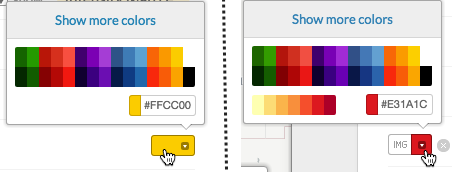
Tip: For some legend elements, you can also apply an image. Select IMG to select a symbol. You can also upload your own icons from this image option.Change HTML If you want to create your own custom legend, click Change HTML from the legends toolbar. Apply custom HTML code to create and style your own legend.
Note: Select custom from the Template drop-down list to apply HTML code to a custom template. While you can change the HTML code for an existing template, we recommend that you create a custom template if you are going to change the HTML code.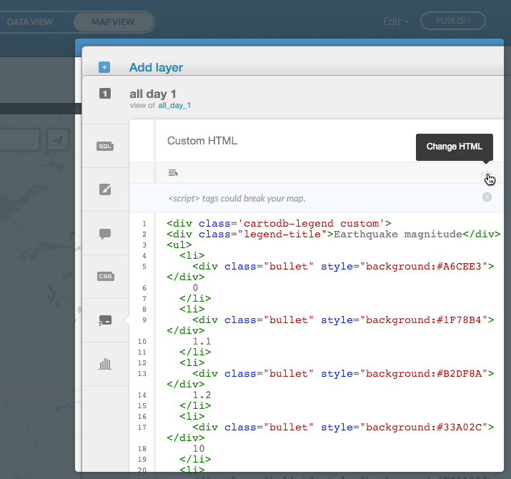
Click Toggle fields and titles to return to the original legends view.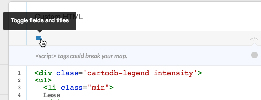
-
Click Publish to view your legend on your map
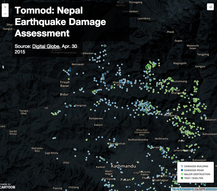
Tip: To view other example maps, see the CARTO Gallery page.
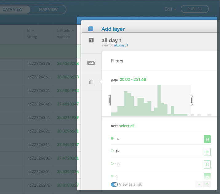
Filters
When you connect a dataset and create a map, all of the data in the dataset is displayed by default. You can use the filters option to view specific data, or specify a range of data to include or exclude. The filters option is available from the CARTO sidebar from the Data View and Map View, for both maps and datasets.
-
From the Data View (or Map View), in CARTO, click filters from the CARTO sidebar
The sidebar expands, enabling you to start filtering your data.
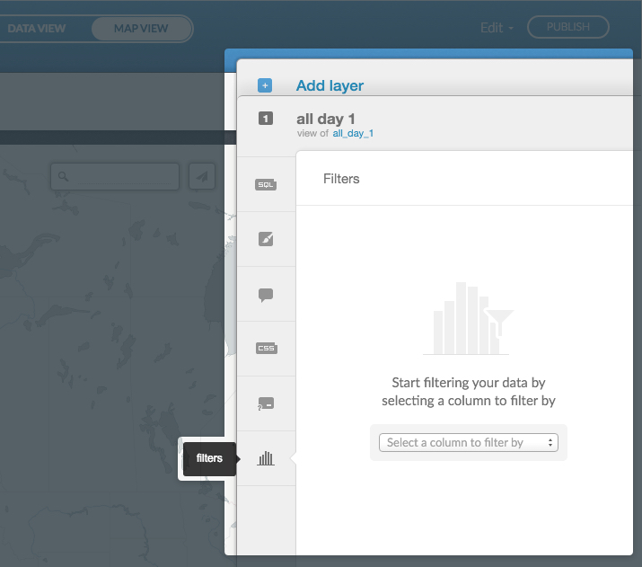
-
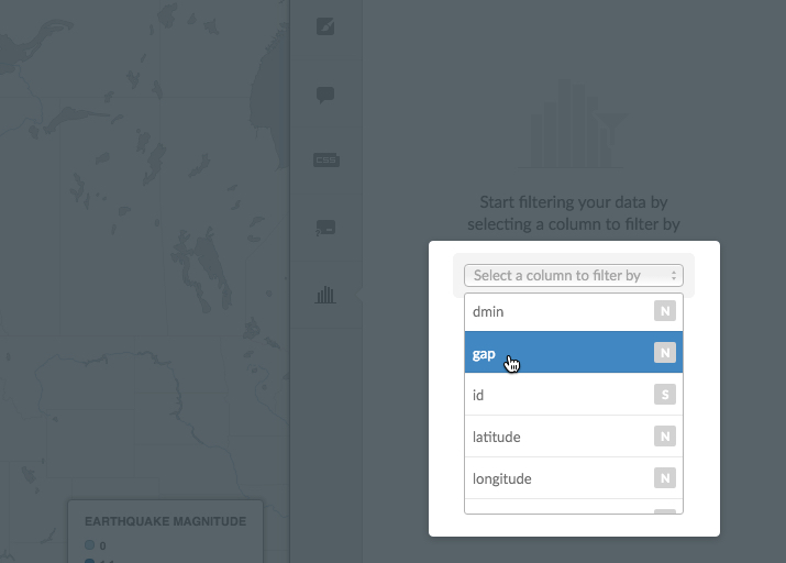
Select a column to filter to your data
A list of columns from your dataset appears in the drop-down list.
Tip: The lettered box next to the column name indicates the type of value for the data. For example, N are number values, S are string values, and D are date values. See Supported Data Types for more information.
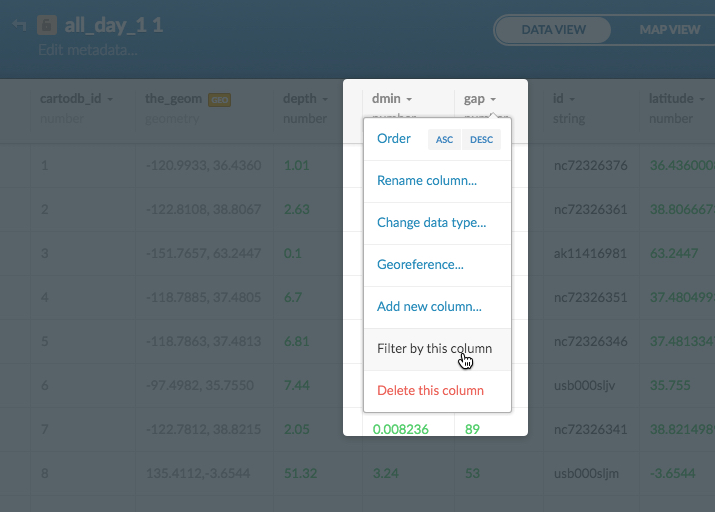
Optionally, if you are in the Data View, you can use the column context menu to filter by the selected column.
-
Include or exclude a specified range of results, as part of the filtered data
- For numerical data, select a range to include in your map. Left-click the slider button and drag the edges to change the range of data
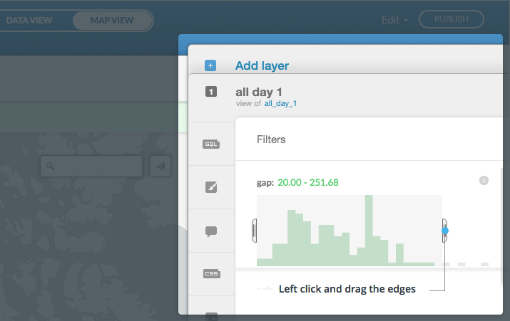
- For string (or text) data, enter a value to include or exclude, as part of the filtered data
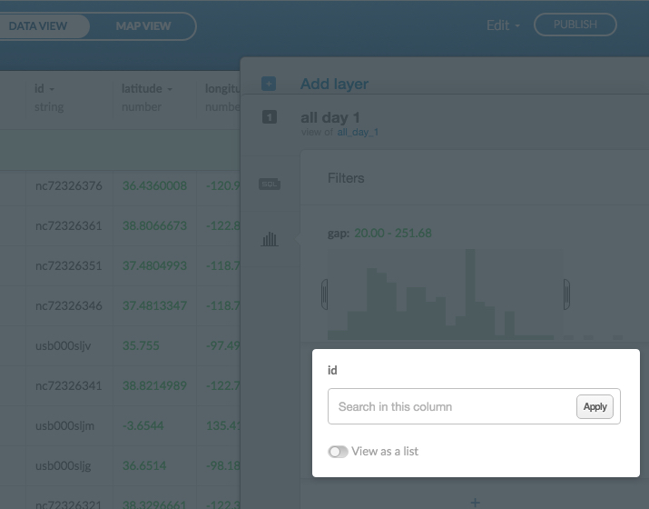
Your data refreshed as filters are applied.
You can apply multiple filters to your data and create a new dataset from your query, or clear your filtered data. When you apply filters to published map, the filters are included in the map output. The following example displays multiple filters applied to a dataset.
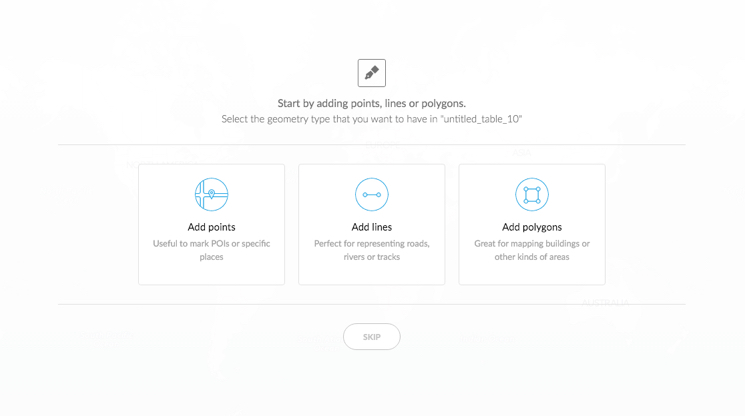
Add Feature
Typically, you add rows and columns to your dataset from the Data View. The Add feature option, available from the CARTO sidebar, enables you to add points. lines, or polygons directly on your map and add new coordinates to your dataset. As opposed to importing data, you can add points (lines, polygons) as you visualize features on the map.
-
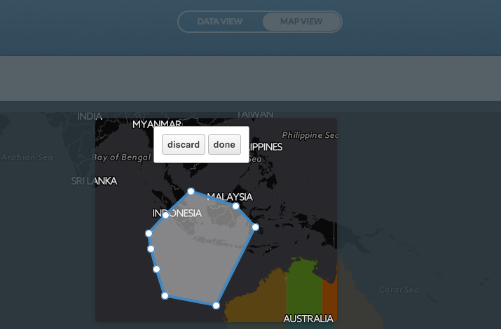
From the Map View of a selected map, click Add feature from the CARTO sidebar
Note: The sidebar does not expand. The add feature action appears on your map.
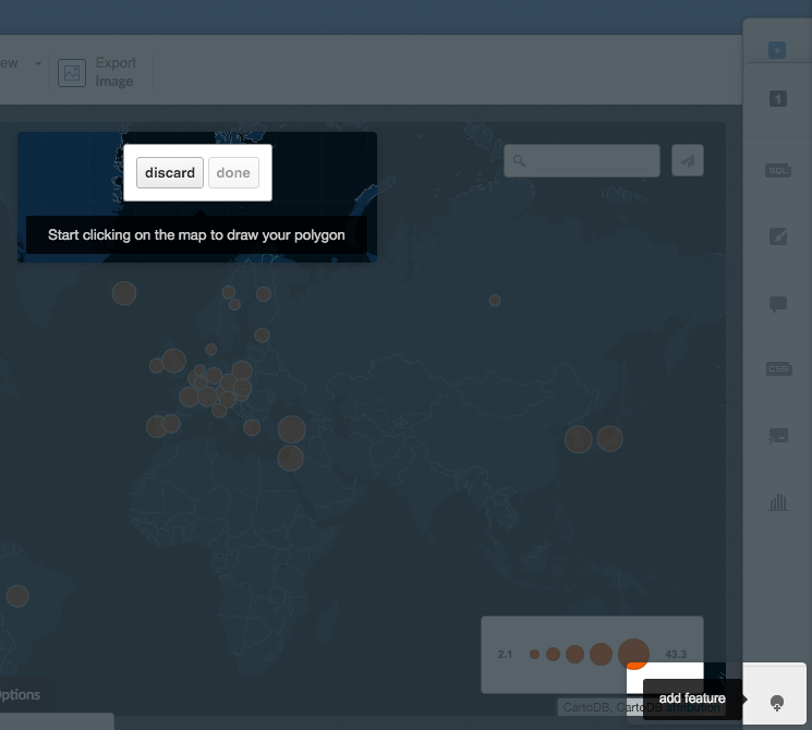
Tip: If you are starting from an empty dataset, a dialog appears, indicating that you can add points, lines, or polygons.
-
On your map, click where you would like to add the point, line, or polygon coordinates
-
Click done to add the coordinates
Your map updates, displaying the added coordinates.
-
Edit details of the coordinate. You can click Select fields to open the infowindow options. The other edit feature icons enable you to edit the metadata, edit the geometry, or delete the feature.
Tip: The number that appears for the added feature displays the corresponding row in the dataset. You can also edit the details for the added coordinates directly from the Data View.
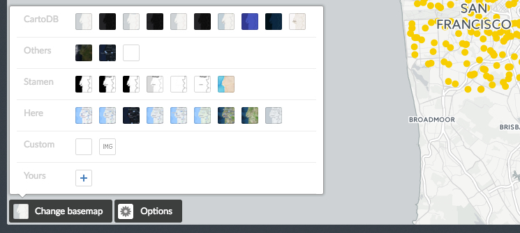
Basemaps
A basemap is a graphical representation of the world showing natural and cultural features such as water bodies, topography, park areas, points of interest, geopolitical borders, roads, streets, and sometimes buildings. CARTO provides you with a selection of basemap options and providers (such as Stamen or Here). You may import your own custom basemap (from Mapbox, an XYZ tileset (e.g. Stamen maps), or WMS.) or use a solid background color, repeating image, or pattern. With the easy-to-use basemap selector, you can focus on an aesthetically pleasing way of visualizing your data.
Changing your Basemap
The default basemap for the Here layer of a map is Nokia Day. The Change basemap options enable you to change your basemap and style.
- You can link to an external URL basemap with the Yours option. Click the + to open the Add a custom basemap options, enabling you to select from different resources
- You can also add a custom solid color with the Custom option. Click to change the map background color
- Optionally, you can select a repeating image pattern, instead of a basemap with the Custom IMG option. This opens the Select a pattern image dialog box. Additionaly, you can upload other files as your tile background with these options.
The Change basemap options are applied immediately and do not alter any other layers in your map.
Note: The provided basemaps are not editable, you cannot customize features from these preset basemap options. You can, however, create your own custom basemap by adding data to your map, or importing your own custom basemap.
Including an External Basemap
Apart from the default basemaps offered in Carto, you may integrate third-party basemaps to customize your maps even further. The following procedure describes how to add a custom basemap from an external resource.
-
Click Change basemap, located on the bottom left of a selected map
-
Expand Yours to add an external resource
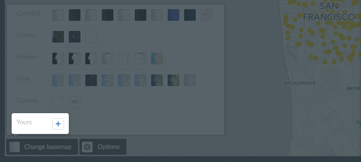
The following image, and table, display the available external resources to choose from.
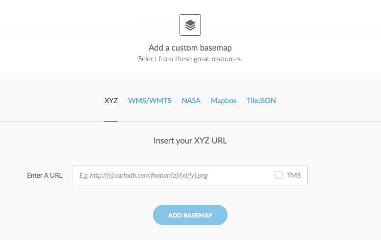
External Basemap Resource Description XYZ XYZ Templates enable you to access many other basemaps, including those from OpenStreetMap and Stamen. Insert the basemap URLs and click ADD BASEMAP. For example:
Stamen Toner:http://{s}.stamen.com/toner/{z}/{x}/{y}.jpg
Stamen Terrain:http://{s}.stamen.com/terrain/{z}/{x}/{y}.jpg
Stamen Watercolor:http://tile.stamen.com/watercolor/{z}/{x}/{y}.jpg
OSM:http://{s}.tile.openstreetmap.org/{z}/{x}/{y}.pngWMS/WMTS A WMS, or Web Map Service, enables you to connect to online generated map images by a map server using data from a GIS database. Insert your WMS/WMTS URL and click GET LAYERS. For example, WMS baselayer.
Note: Currently, CARTO only supports WMS files containing data that uses EPSG:900913 (Web Mercator) or EPSG:3857 coordinates.NASA Enables you to select a basemap provided by NASA Worldview. Select a date from which you want a global basemap and indicate Day (a day map changes based on the day selected) or Night Mapbox Mapbox is a service which lets you customize the design of a basemap with custom colors and elements. Insert your Mapbox URL and access token to add the basemap
Note: CARTO only supports Mapbox classic urls. If you enter a new Mapbox Studio url, an error appears.TileJSON Enables you to insert an open platform, web map by inserting the TileJSON URL. A TileJSON map contains tiles, minzoom and maxzoom as mandatory fields -
The map refreshes, displaying the external resource as a basemap layer.
About Map Projections
We all know by now that the earth is not flat. Maps, however, are. As 2D representations of the globe, maps are inevitably distorted. The methods used to digitally render the earth are called map projections. Different types of projections are used to represent the earth at various scales. From the continents to a single region or state / province, each projection type must preserve certain spherical properties at the expense of others (such as area, direction, shape, and distance).
The majority of online maps are a variant of the Mercator Projection, commonly referred to as the Web Mercator. By default, maps created in CARTO use the Web Mercator projection. You can learn more about map projections on Wikipedia.
Note: Alternatively, you can create non-Mercator maps by applying an SQL query to your maps. This enables you to change the default map projections in your dataset by inserting a projection definition. For examples of how to create non-Mercator maps, see the Free Your Maps from Web Mercator blogpost.
Displaying Map Options
In addition to changing your basemap, you can also control which options are visible on your map by using the Options selector. Click the slider button to display the selected option as visible or hidden on the map.
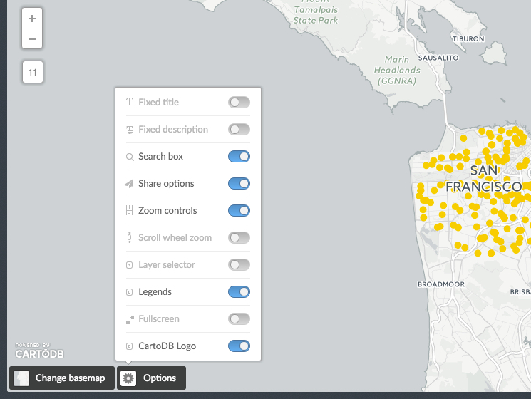
Tip: Some options are only active when viewing your map from your public profile page, not from the preview map of your dashboard.
| Map Option | Description |
|---|---|
| Fixed tile | Displays your map title on the map |
| Fixed description | Displays your map description on the map |
| Search box | Displays a search box on the map, enabling you to search for data points |
| Share options | Displays an icon for sharing your map. You can share your maps on social media, get a link to the map, or embed it using HTML code. For details, see (Sharing Maps) |
| Scroll wheel zoom | Displays the ability to zoom with the scroll wheel of your mouse |
| Layer selector | Enables you to display the visible layers on the map |
| Legends | Displays any map legends. For details about how to create legends, see (Legends) |
| Fullscreen | Enables you to view the map in fullscreen mode |
| CARTO Logo | Enables you to include or hide the CARTO logo on your map Note: Based on your (account settings), this option may not be enabled. |
Publish and Share your Map
This section contains information about publishing your map, sharing your map, and the attribution requirements that you must include.
Publishing Maps
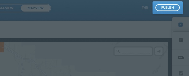
Once you visualize and publish a map, you can get a link to share the map, embed it to a website or blog, or add your map to another application. The Publish button is available from the Data View or Map View of your dashboard when a map is selected, and displays the following options.
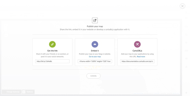
Note: You cannot publish a private map.
-
Get the link
Provides a URL to the map as it appears in your CARTO public profile.
- Select the URL from the Get the link field
- Copy and paste the link anywhere (email, social media, blog posts) to share the link
-
Embed it
Provides HTML code to embed the map.
- Select the embed code from the Embed it input field
- Click Go to your map to view how the embedded map appears and customize any of your iframe parameters as needed
Tip: This is very useful for publishing interactive maps of your data on your website or blog. For example, you can insert CARTO maps by including the iframe in the HTML code editor of WordPress, Joomla, and Drupal. Additionally, you can embed an iframe with the Embedly API.
-
CARTO.js
Provides a URL to your viz.json file, which is required if you are using the CARTO JavaScript library CARTO.js to publish maps in an external application.
- Select the URL from the “CARTO.js” input field
- Copy and paste the link to your external application
Tip: For details about CARTO.js, view the related documentation.
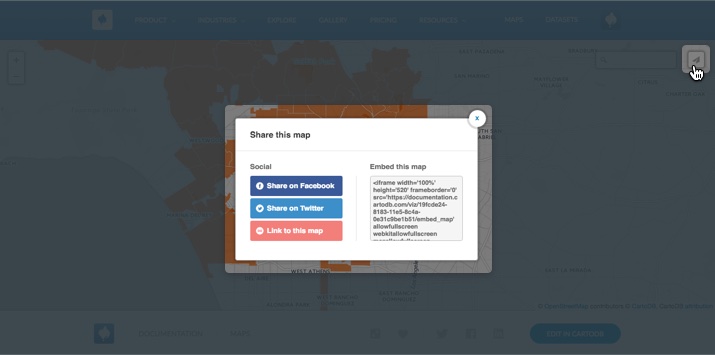
Sharing Maps
You can enable the Share options icon to display on a published map. When your map is viewed from your public profile page, clicking the share icon enables you to share you map on social, media, get a link to the map, or embed it using HTML code.
- Select Share options from the Options selector on a map. For more information about the Options selector, see Displaying Map Options
The following image displays an example of the share icon, and available options, from a public map.
Attribution Requirements for Publishing and Sharing Maps
Regardless of your CARTO account plan, you must include proper attributions whenever you publish or share your map. Attributions represent the data sources used in your map, which may have copyright protections.
There are several methods of defining map attributions.
| Attribution Method | Requirement |
|---|---|
| Automatic Attributions | When you choose a basemap with the CARTO Editor, map attributions are automatically included. When you export an image, or export a map, with the CARTO Editor, map attributions are automatically included. When you use CARTO.js to create a map, map attributions are automatically included. Note: Do not remove any automatic attributions. |
| Dataset Attributions | When you are using third-party data for your maps, you may need to provide attributions about the data sources. To add attributions to a dataset, Edit the Dataset Metadata. |
| Print Attributions | When you are printing CARTO maps, be sure map attributions are included. For details, see How to print maps in CARTO? |
Tip: For more information about how CARTO defines map attributions, see Attributions.
Supported Fonts
The following fonts can be selected from the map wizard, “Label Font” field, when label text is enabled for select map types: DejaVu Sans Book, unifont Medium, Open Sans Regular, Lato, Graduate, Gravitas One, Old Standard.
Additionally, you can apply the text-face-name: 'string' property with CartoCSS syntax. These are the font families and the supported weights for each font family.
-
Open Sans Light, Regular, Semibold, Bold, Extrabold, Light Italic, Italic, Semibold Italic, Bold Italic, Extrabold Italic
-
DejaVu Sans ExtraLight, Book, Oblique, Bold, Bold Oblique, Condensed, Condensed Oblique, Condensed Bold, Condensed Bold Oblique
-
DejaVu Serif Book, Italic, Bold, Bold Italic, Condensed, Condensed Italic, Condensed Bold, Condensed Bold Italic
-
Lato Hairline, Hairline Italic, Light, Light Italic, Regular, Italic, Bold, Bold Italic, Black, Black Italic
-
Graduate Regular
-
Gravitas One Regular
-
Old Standard TT Regular, Italic, Bold
-
unifont Medium