Introduction to Map Design - Part 2
Colors are important, and are challenging to master! Ugly maps, like the one we showed you at the end of the last lesson, are not hard to find. You can probably think of several maps you’ve seen that make you cringe. At the same time, you can likely think of many beautiful maps. One major component that makes a beautiful map beautiful is the color choices made for that map.
Learning how to pick good colors for your data and basemaps can be challenging, and applying color principles is sometimes hard to do. Selecting good colors for data visualization has it’s roots in math and color theory. It can get complex quickly - we won’t get in to it now - but it is also very interesting. If you are interested, you can check out Tilemill tips for using colors guide to get started, and feel free to explore more on your own!
For now, we are going to get our feet wet by looking at color in practice.
Why to think about colors?
To get started, go ahead and import the following data set on earthquakes into your account. The easiest way is to copy the URL and paste it into the Import box.
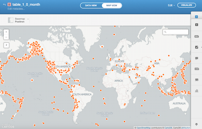
https://carto.com/academy/d/1.0_month.csvWhen we pull up the data, what we see is a distribution of dots (representing locations of earthquakes) that is hard to interpret. We know that there are many data points - many earthquakes - but it’s hard to identify patterns of distribution and intensity.
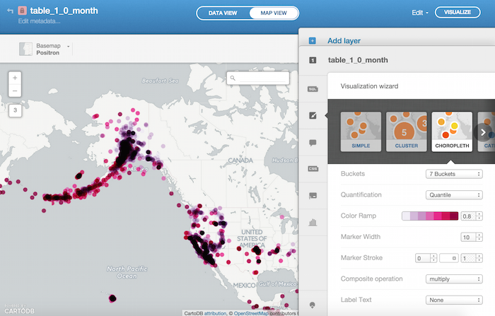
If you reduce the size of your markers, and tinker around with the marker stroke, you can make the distribution a little bit more clear. However, it’s still not a compelling view of the data, and doesn’t communicate as much information as the data contains.
This is where color could help us out. Changing marker colors based on an attribute in the data, like earthquake intensity, would give us a richer visualization. This kind of map, where the design is intended to communicate a story about a certain theme in the data, like earthquake intensity, is called a thematic map.
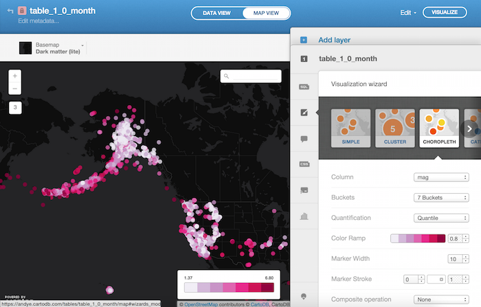
In the CARTO Visualization Wizard, we can use the Choropleth visualization in order to get started with our thematic map. In the Choropleth Visualization, let’s go ahead and select the mag column to visualize. But make sure the column type for mag is type “number” in data view. This column contains data that reflects the intensity of the earthquake. If we look at the different color ramps available, we can find one that we think best highlights the most intense earthquakes. Notice that when we select to use color in this way, the pattern of intense earthquakes becomes clearer to viewers of our map! Here is one example of how you could style your map:
Basic Ideas and Tools
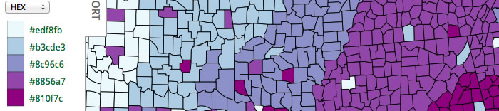
You may have started to wonder why the color ramps that CARTO Wizards come with were selected. In large part, it’s because other people have done the work and research necessary to identify the colors that work best displaying cartographic data. They’ve delved deep in to the mathematics of color theory we mentioned early, in order to develop tools and color sets that cartographers and data visualization specialists use. One great tool is Color Brewer. Using this color tool, you can experiment with different color ramps to see which could work best with your data type, underlying cartography, or even the vision type of your audience.
You are not bound to the color ramps that we pre-selected. You can choose a color ramp that suits your needs and customize your CARTO visualization with this new color ramp. In order to do so, you will need to copy the HEX values (six-character alphanumeric values beginning with “#” that tell the computer exactly which color you need) to use them in CARTO. Check out the screenshot below to see an example of HEX values generated by the Color Brewer tool.
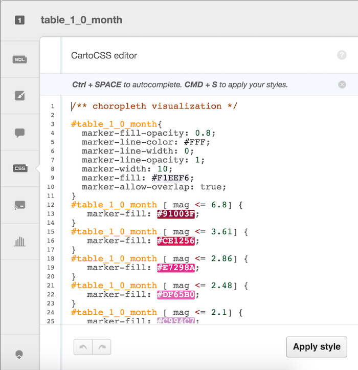
Once you have these values copied, you can use them to replace the existing color values using the CartoCSS Wizard in CARTO. We will explore CartoCSS in much more detail later on, but you can take a look now if you want to get a quick teaser for what is to come. In the pull-out tray on the right of your dashboard, pull out the CartoCSS window. As you can see below, you can overwrite existing HEX codes (which you can easily identify with the colored backgrounds) with the ones you have copied. Just delete what is in the CartoCSS and paste the values you’d like to use instead!
There are many other resources you can use to help in picking colors. Here’s one roundup of resources.
Composite Operations
In addition to editing the colors of your markers, you can also edit how the colors of overlapping or intersecting markers interact with one another. This function is called “Composite Operations” in your Visualization wizard.
While we won’t dive into this now, take a look at the different options available. Each one offers a unique way of visualizing overlapping points, that could further shape the way that you want to display your data. Below is our earlier map but with the “multiply” operation selected. You can read our Composite Operations lesson and the CartoCSS course to learn more about the options available to you.