Understanding the Histogram Widget
CARTO Builder histogram widgets filter numerical data within a given range.
Histogram widgets filter numerical data within a given range. The selected range is distributed across your map in buckets, to display groups of data. The higher the number of buckets, the more granular the data. The objective of grouping data into buckets is to put similar values together.
Filtering Values by Buckets
Histogram widgets display the number of selected records in each bucket, allowing you to visualize a range of data that you may want to explore.
-
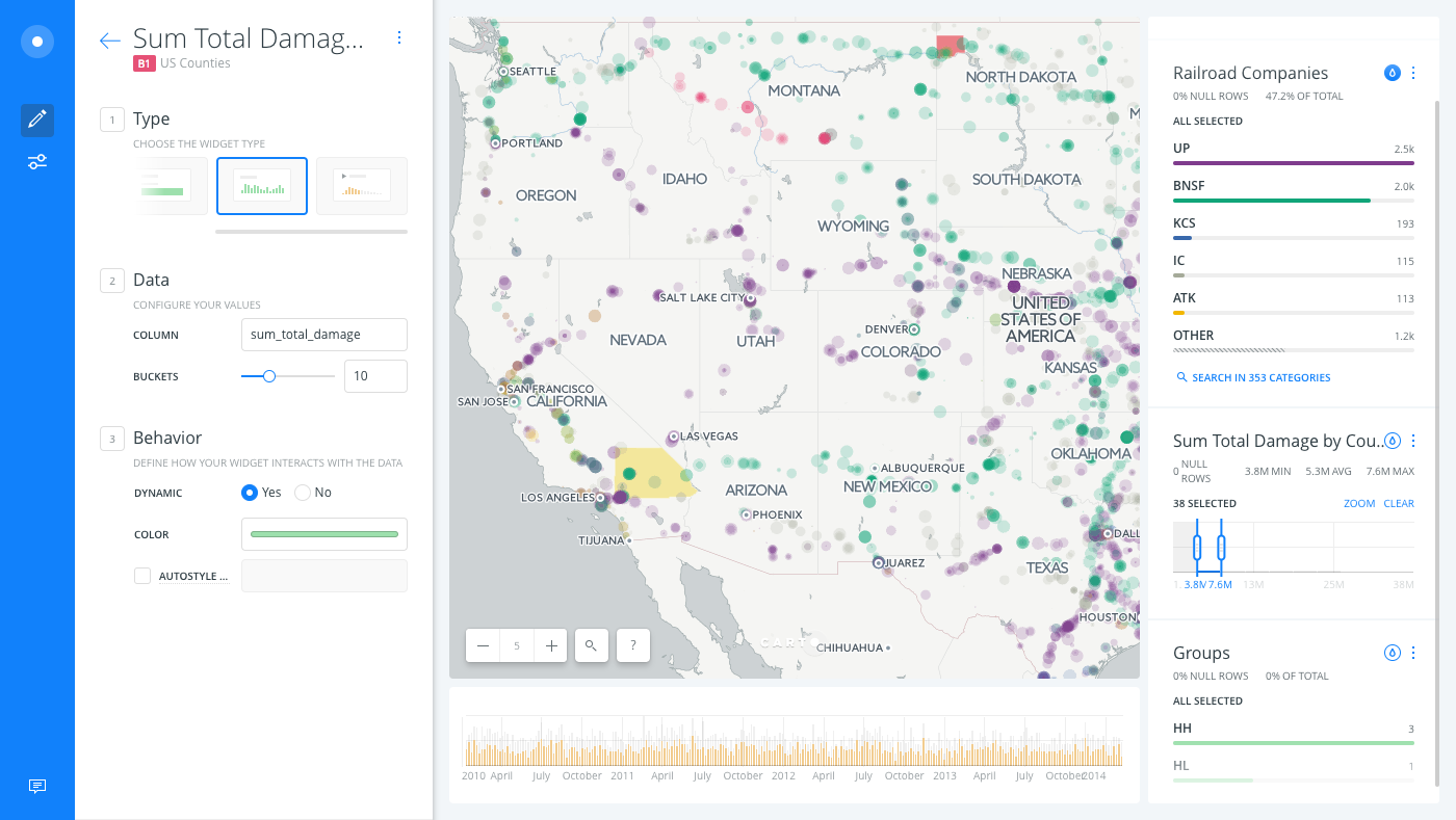
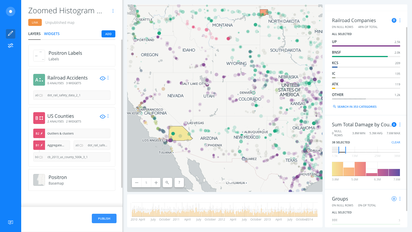
Unzip the .carto file packaged from “Download resources” of this guide, and import it to your account to create the map. Builder opens with US Counties as the first map layer and Railroad Accidents as the second map layer.
Click on "Download resources" from this guide to download the zip file to your local machine. Extract the zip file to view the .carto file(s) used for this guide. -
Ensure that your Map View is zoomed to level 5 and that Auto style is applied to the Railroad Companies widget. Pan your map over towards Nebraska and Wyoming, where there happen to be a higher number of railroad accidents.
-
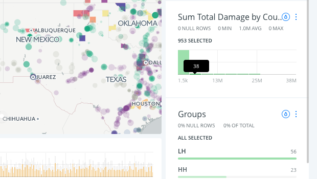
When hovering over a Histogram widget, the number of records in each bucket appears. This is a good indicator of where you might want to filter data.
-
Click once on the Histogram to display the range selector.
This enables you to click and drag the start and end range of selected data. Only the selected filters appear on your map, and any analyses are rerun and recalculated.
-
Select the start and end range by clicking and dragging the edge of the buckets to change the range of selected data.
When you create a histogram widget, you can define the number of buckets for the selected column from the WIDGETS list in Builder. For example, the following image displays the histogram widget options, where you can define the number of BUCKETS under the Data options.
Zoom into Histograms for more Granular Filtering
Once a selection is made from a histogram widget, you can CLEAR the selection or click ZOOM to filter deeper into a bucket.
-
Click ZOOM to view a more granular view of the selected range.
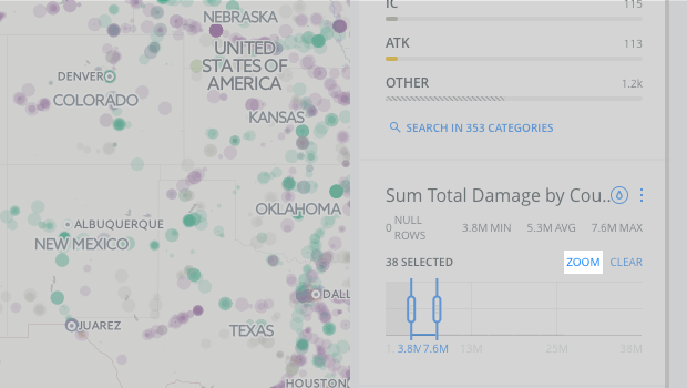
The original histogram range of buckets appears grayed out. The zoomed range of values appears underneath, enabling you to select more granular start and end values.
-
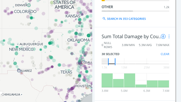
Click Auto style.
When auto style is applied to a histogram widget, each bucket is assigned a sequential or diverging color scheme. Optionally, you can customize the histogram widget colors on your map.
CHEATSHEET: Color Schemes
Choosing the right colors for your data aids storytelling, engages the map reader, and visually guides the viewer to uncover interesting patterns that may otherwise be missed. When styling by value, different types of color schemes appear, based on the selected data column from your map layer. Builder provides you with CARTOColor and ColorBrewer schemes, and enables you to customize your own color schemes.
- Sequential Scheme: Color schemes that use variations in lightness make these ideal for displaying orderable, or numeric data. The variations progress from low to high, using colors that range from light to dark (or vice versa).
- Qualitative Scheme: Color schemes that demonstrate categorical differences in qualitative data, which use different hues, with consistent steps in lightness and saturation.
- Diverging Scheme: Color schemes that highlight values above and below an interesting mid-point in quantitative data. The middle color is assigned to the critical value, with two sequential type palettes at either end, assigned to values above or below.
To see an example of a map that contains both sequential and diverging color schemes for auto styled Histogram widgets, view the map about Real Estate Trend Predictions.
-
Click Show totals from widget context menu.
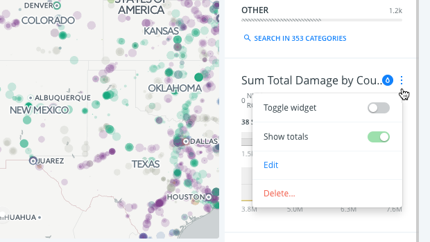
This option displays the total values in proportion to the selected range of data, which is useful for understanding how the histogram would appear if you were visualizing all of the data.