Aggregation Styles for Point Geometries
Describes how to apply an aggregation style for grouping point data.
A point is an exact location based on latitude/longitude coordinates and is represented by a single dot on a map. Points do not have a defined pattern, each point appears as a single geometry. In some cases, you may have multiple points at one coordinate that you want to aggregate and group as a single, counted point. This enables you to apply an Aggregation style (or spatial pattern) to your points.
- For point geometries, you can select the aggregation style of your data. These aggregation styles contain their own CartoCSS property, which you can further customize based on the overall spatial pattern of your map.
- Line and Polygon geometries are automatically styled based on resolutions and do not contain any additional aggregation options.
Selecting an aggregation style creates a pattern over your map tiles, based on the Web Mercator projection.
Aggregation Styles in Builder
For this guide, let’s explore a map that contains local Airbnb data from Amsterdam and world population data. We will apply some different aggregations to visualize how points are styled.
CHEATSHEET: Point Aggregation Styles
The following aggregation styles are available for map layers containing point geometries and apply CartoCSS related properties behind the scenes.
POINTS: Displays all geometries as a point. All columns are counted and appear as a single pattern.
SQUARES: Displays your data aggregated in squares, based on the defined operation. You can configure the grid size of the squares and apply the aggregation function for how the data is calculated (COUNT, SUM, AVG, MAX, MIN). Squares are useful if you have a high number of close points in your datasets.
TurboCARTO CartoCSS Property: The
agg_valueCartoCSS property is added and contains a unique color scheme to differentiate the styled pattern applied to your map.HEXBINS: Displays your data aggregated in hexbins, based on a defined operation. You can configure the size of the hexagonal grid and apply the operation for how the data is aggregated (COUNT, SUM, AVG, MAX, MIN). Hexbins are useful for symbolizing meaningful patterns of data for large datasets. The main difference between SQUARES and HEXBINS is how the shapes are calculated around the edges.TurboCARTO CartoCSS Property:
The
agg_valueCartoCSS property is added and contains a unique color scheme to differentiate the binned structure applied to your map.ADM. REGIONS: Aggregates points and displays the results as polygon boundaries defined by different administrative levels or regions. See Data Observatory for details about public boundary data.
TurboCARTO CartoCSS Property: The
agg_value_densityCartoCSS property is added and contains a unique color scheme based on the admin level selected.Note: ADM. REGIONS is useful if your layer contains world data, since the aggregation includes densities for normalized values. SQUARES and HEXBINS are better for local data (such as cities, stores, and so on).
- ANIMATED: Displays a selected column as an animated map, where you can style the different animation options for time-series data.CartoCSS Property: See CartoCSS Properties for Torque Style Maps for specific animated properties.
- PIXEL: Displays data aggregated by pixel(s). Areas of greater color intensity indicate a larger density of data.CartoCSS Property: See CartoCSS - Torque Heatmaps for specific Torque heatmap properties.
For a description of how aggregation functions are calculated, see MySQL documentation.
-
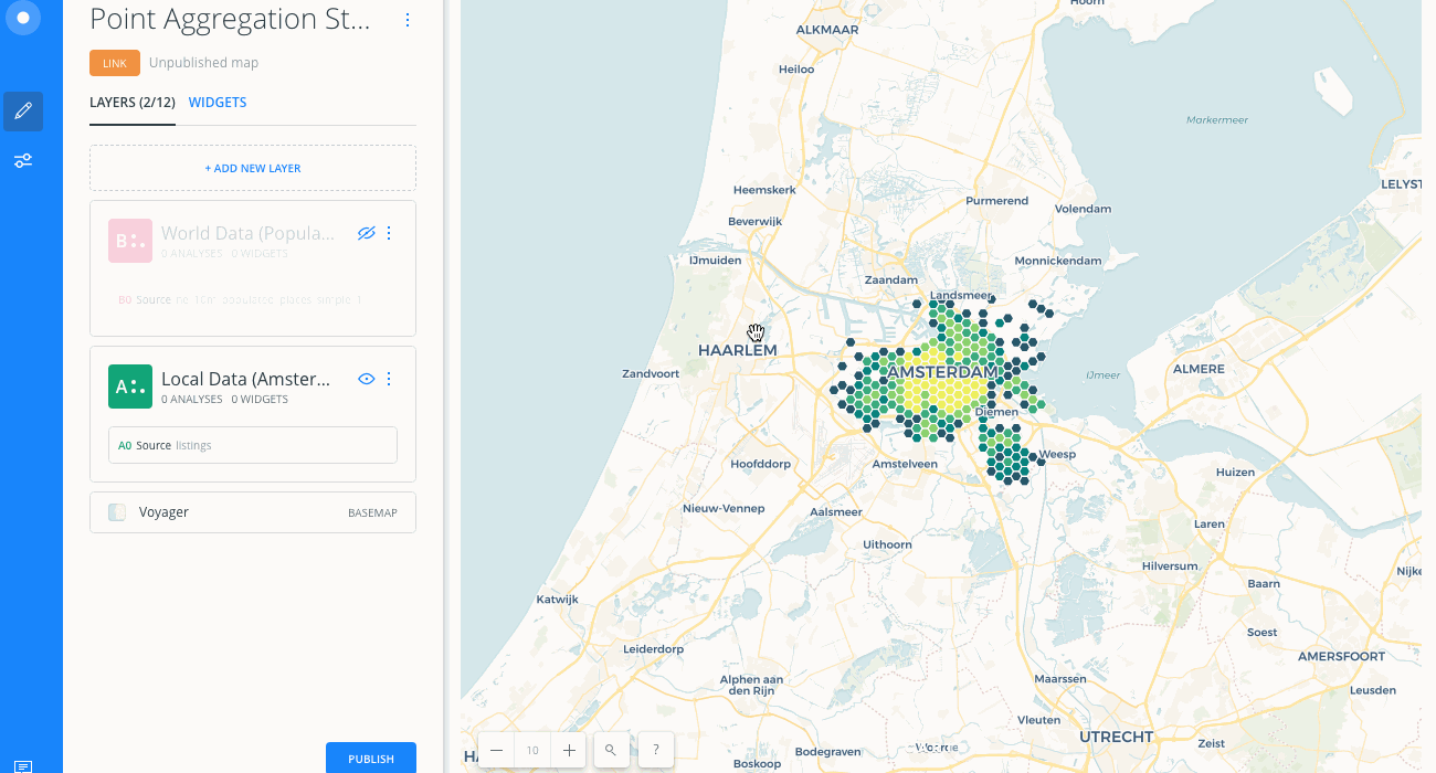
Import the template .carto file packaged from the Download resources and create the map. Builder opens with two layers displaying point geometries.
Click on "Download resources" from this guide to download the zip file to your local machine. Extract the zip file to view the .carto file(s) used for this guide.Local Data (Amsterdam Airbnb) appears as the first map layer and World Data (Population), the second map layer, is hidden from the Map View.
-
Click on Local Data (Amsterdam Airbnb).
The default aggregation style is POINTS, which indicates that all columns from your dataset are counted and appear as a point for each geometry.
-
Click between all the different aggregation styles to visualize how points are interpreted.
Let’s define the different aggregation options.
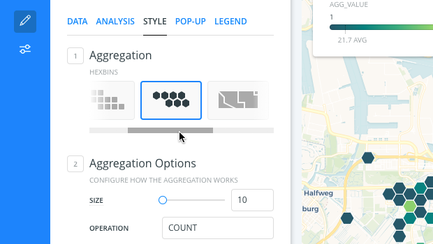
Squares Aggregation Style
You can configure the grid size of the squares and apply the aggregation function for how the data is calculated (COUNT, SUM, AVG, MAX, MIX). Squares are useful if you have a high number of close points in your datasets.
-
From the STYLE Aggregation, select SQUARES.
A square pattern is applied to your points and a default color scheme is applied.
-
Change the SIZE to 30.
The aggregation SIZE defines the pixel size of each square in the grid. The size is set for the current Map View zoom level. Zooming in or out on your Map View does not change how the points are grouped in the squares. Your data remains in the fixed square across different zoom levels.
-
For the OPERATION, select AVG by
review_scores_rating.
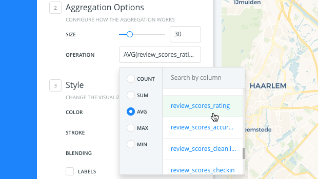
AVG returns the average values from the review_scores_rating column of your dataset and groups them by color. Darker colors represent higher averages.
Hexbins Aggregation Style
Similar to SQUARES, the HEXBINS aggregation style enables you to configure the size of the hexagonal grid and apply the operation for how the data is aggregated (COUNT, SUM, AVG, MAX, MIX). Hexbins are useful for symbolizing meaningful patterns of data for large datasets.
The main difference between SQUARES and HEXBINS is how the shapes are calculated around the edges.
- Change the Aggregation style to HEXBINS to visualize the different shape that is applied to your points.
Admin. Regions Aggregation Style
Admin Regions aggregates and groups points by polygon boundaries, based on world administrative levels (countries or provinces). Admin Level data is normalized by area.
Normalization provides a more accurate measurement of data, based on the aggregation function applied. Data that is not normalized displays raw total numbers of data, which may misrepresent higher density areas.
-
From the STYLE Aggregation, select ADM. REGIONS.
Note that our data is focused on local data, not world data. Let's hide local data (Amsterdam) and show world data (population), so that you can visualize how the Admin. Regions aggregation is better represented with the right kind of data. -
Change the focus of the map to World Data:
- From the LAYERS list in Builder, hide the Local Data (Amsterdam Airbnb) layer and show the World Data (Population) layer.
- Click on the World Data (Population) layer.
- Center map on layer refreshes your Map View by centering the map on the selected layer.
-
From the STYLE Aggregation, select ADM. REGIONS.
A default color scheme is applied. (Note how this aggregation pattern is better represented since the layer has a wider range of data). Higher density areas are displayed by darker colors.
-
Keep countries as the ADMIN. LEVEL.
- When ADMIN. LEVEL is _countries_, points are displayed based on the number of highly populated places within the defined boundaries.
- When ADMIN. LEVEL is _provinces_, points are grouped by provinces, states, or other administrative levels that are useful when not using data from the United States.
- See Data Observatory for details about administrative level boundary data.
-
Keep COUNT as the OPERATION.
COUNT returns all rows from the World Data layer.
-
Change the ADMIN. LEVEL to provinces.
Since provinces are typically administrative levels in Europe, zoom in to visualize how provinces and color schemes are more defined.
-
Define the OPERATION as MAX by the
pop_maxcolumn.
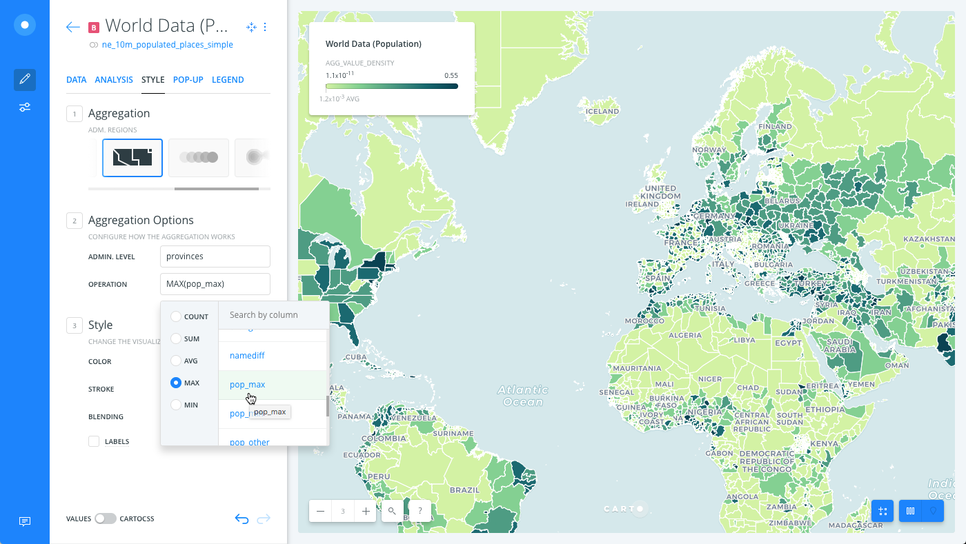
MAX returns the maximum values from the pop_max column.
Aggregation Color Schemes
When the SQUARES, HEXBINS, or ADM. REGIONS styles are applied, a default color scheme is automatically applied.
CHEATSHEET: Color Schemes
Choosing the right colors for your data aids storytelling, engages the map reader, and visually guides the viewer to uncover interesting patterns that may otherwise be missed. When styling by value, different types of color schemes appear, based on the selected data column from your map layer. Builder provides you with CARTOColor and ColorBrewer schemes, and enables you to customize your own color schemes.
- Sequential Scheme: Color schemes that use variations in lightness make these ideal for displaying orderable, or numeric data. The variations progress from low to high, using colors that range from light to dark (or vice versa).
- Qualitative Scheme: Color schemes that demonstrate categorical differences in qualitative data, which use different hues, with consistent steps in lightness and saturation.
- Diverging Scheme: Color schemes that highlight values above and below an interesting mid-point in quantitative data. The middle color is assigned to the critical value, with two sequential type palettes at either end, assigned to values above or below.
Aggregation styling is invoked on your map layer in the form of a CartoCSS property, implemented with the Style By Value feature.
| Aggregation Style | CartoCSS Property |
|---|---|
| SQUARES, HEXBINS | agg_value |
| ADMIN REGIONS | agg_value_density |
Typically, styling _By Value_ renders different styling based on a column's data type. This enables you to filter and style map layers based on column values.
The aggregation CartoCSS property is not actually a column from your dataset. It is a unqiue, temporary value that is created to style your data on the fly.
-
From the STYLE tab, the CartoCSS aggregation property is applied as the By Value option.
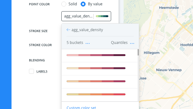
In this case, since we are aggregating by ADMIN. REGIONS, the
agg_value_densityproperty is applied. This CartoCSS property also appears as the value if legends are applied.Optionally, you can modify the number of buckets and classification method for the grouped points, and apply other style changes.
CHEATSHEET: Classification Methods
Classification methods group data into ranges. CARTO supports classifying numeric fields for graduated symbology through the following methods:
- Quantiles: A quantile classification is well suited to linearly distributed data. Each quantile class contains an equal number of features. There are no empty classes or classes with too few or too many values. This can be misleading sometimes, since similar features can be placed in adjacent classes or widely different values can be in the same class, due to equal number grouping.
- Jenks: Breaks the data into classes based on natural groupings inherent in the data. The groups are formed by decreasing the variance within classes and increasing the variance between different classes -- a 1D k-means. Since Jenks are data-specific classifications, they are not useful for comparing multiple maps built from different underlying data.
- Equal Interval: Divides the range of attribute values into equal-sized subranges. The class breaks specified by the number of buckets selected. Usually used for percentage values, it is best applied to familiar data columns such as temperature, ratios, and other relative attribute values.
- Heads/Tails: Best for data with heavy-tailed distributions, such as exponential decay or lognormal curves. This classification is done through dividing values into large (head) and small (tail) around the arithmetic mean. The division procedure repeats continuously until the specified number of bins is met, or there is only one remaining value left. This method, more than others, helps to reveal the underlying scaling pattern of far more small values than large ones.
- Category: Classifies a limited (or fixed) number of possible values, based on an attribute of a particular group, or nominal category.
-
Click the slider button from VALUES to CARTOCSS to view the CartoCSS syntax.
agg_value_denstityis style with a TurboCARTO ramp in CartoCSS.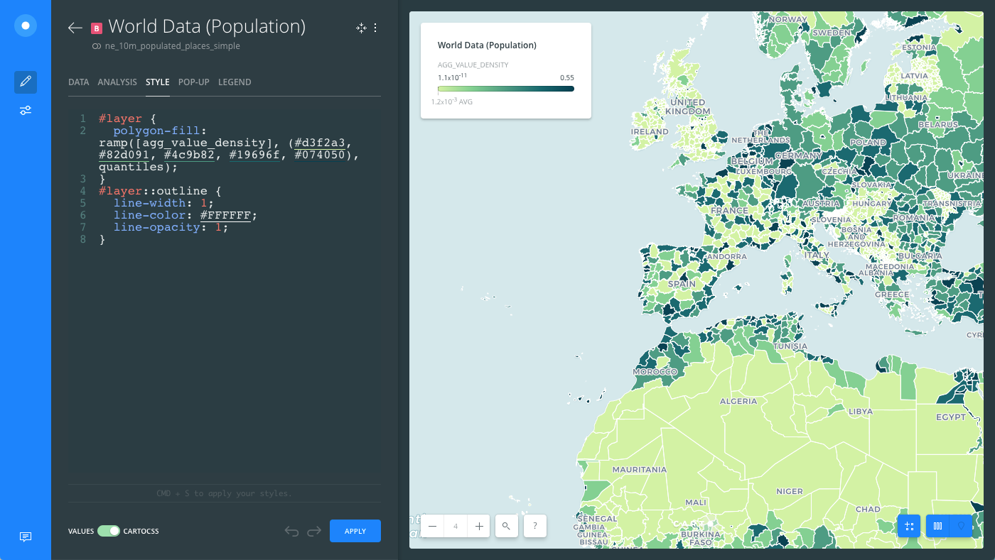
Aggregation Tips and Behavior
Note the following tips and behavior when using aggregation styles in Builder.
-
If an analysis is applied to a layer with aggregation styling, the style reverts to POINTS.
-
If widgets are applied to a map with aggregation styling, widget Auto style is not applicable.
-
Pop-ups are only available when the aggregation style is POINTS or PIXEL.
-
Geometry feature editing is disabled for layers with aggregation styles applied.
If you want to include any of the above features with your visualization, you can create a map with multiple layers!
- You can apply custom CartoCSS and TurboCARTO when aggregation styling is applied.
Download the final .carto map from the “Download resources” of this guide to view an example of Amsterdam Airbnb data aggregated by SQUARES. The counted aggregated values appear in the legend and a sequential color scheme (applied with TurboCARTO) differentiates between high and low availability of properties, based on the widget filters applied.