Animating Maps with Point Data
Describes how to change the style aggregation option to animate your map layer with CARTO Builder.
This guide describes how to visualize point data over time, by applying the ANIMATED aggregation style to animate your map. This feature requires a map layer containing point geometries with a timestamp, or numeric field.
Create Map from Spreadsheet Data
Use the provided .CSV spreadsheet as the data to create a bird tracking map.
-
Click on “Download resources” from this guide to download the zip file to your local machine. Extract the zip file to view the dataset to be used for this guide.
-
Import the
bird_tracking.csvdata file to your account and create the map from the dataset.Builder opens with bird tracking data as the first and only map layer.
-
Double-click on the map name and rename it to Bird Tracks.
Animate your Data
Once the data has been successfully imported, apply the aggregation style to animate your data.
-
From the LAYERS list, select the
bird_trackinglayer.The STYLE tab opens, enabling you to apply styling options for the map layer.
-
Choose ANIMATED as the aggregation option.
-
Select
date_timeas the COLUMN from your dataset that drives the animation of the map.
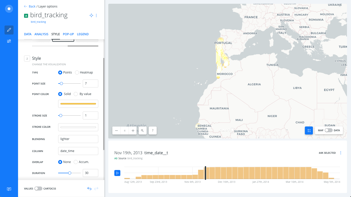
By default, a time-series widget is added when you create an animated map. To remove it, deselect the animated column in the DATA tab, or remove the widget.
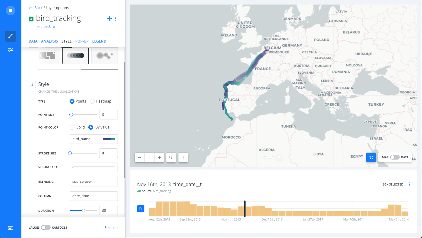
Style by Column Value
To gain a better understanding of the bird tracking data, color the paths of each of the three birds separately. We can do this by using the bird_name column to style the points by value.
-
From the STYLE tab, click the By value option for POINT COLOR.
-
Select
bird_nameto style your markers by the birds’ names. Builder assigns a default qualitative CARTOColor scheme.CHEATSHEET: Color Schemes
Choosing the right colors for your data aids storytelling, engages the map reader, and visually guides the viewer to uncover interesting patterns that may otherwise be missed. When styling by value, different types of color schemes appear, based on the selected data column from your map layer. Builder provides you with CARTOColor and ColorBrewer schemes, and enables you to customize your own color schemes.
- Sequential Scheme: Color schemes that use variations in lightness make these ideal for displaying orderable, or numeric data. The variations progress from low to high, using colors that range from light to dark (or vice versa).
- Qualitative Scheme: Color schemes that demonstrate categorical differences in qualitative data, which use different hues, with consistent steps in lightness and saturation.
- Diverging Scheme: Color schemes that highlight values above and below an interesting mid-point in quantitative data. The middle color is assigned to the critical value, with two sequential type palettes at either end, assigned to values above or below.
-
Edit the POINT SIZE to
3. -
Edit the STROKE SIZE to
0. -
Change the BLENDING option to
source-over.CHEATSHEET: Blending Overlapping Geometries
Blending values are style options that effect the way colors of overlapping geometries interact with each other on the Map View. Color blending is applied to the specific symbolizer property, depending on the blending mode you are trying to achieve.
- none: No color blending styling is applied to the map layer. This is the default option.
- multiply: Multiply literally multiplies the color of the top layer by the color of each layer beneath, which typically results in the overlapping areas becoming darker.
- screen: Similar to Multiply, screen multiplies the overlapping areas. Unlike multiply, it subtracts the multiplied color channel numbers from their added value to invert them. This makes the overlapping areas brighter. If white is used, it will not change appearance. Black areas will disappear. Use this when you want to lighten overlapping areas in your map.
- overlay: Overlay is a color blend mode that combines multiply and screen composite operations. Black appears as dark, as it originally is in its layer; white appears as bright, as it originally is in its layer. How purely other colors are rendered depends on how close they are to white or black. The closer a color is in value to pure midtone gray, the less it will appear. Use this when you want to show both light and dark in your overlapping layers.
- darken: Darken has a similar effect to multiply, but is more extreme. As it applies the color from the base layer to the target layers, it compares each to find the darkest-colored pixels and keeps those.
- lighten: Lighten works the same way as darken, but inversely. The lightest-colored pixels from each layer are kept, and if pixels are darker than the base layer, then the base layer color replaces them. This can be useful when you want to change the color of your overlapping areas shadows.
- color-dodge: The color-dodge color blend mode is similar to screen but the overall effect is more extreme. Your elements become much brighter (except if your base layer is black). Darker areas are tinted towards the source color. Use this when you want to have a major lightening effect with extreme contrast between your layers, without much detail showing.
- color-burn: Color-burn works similarly to color-dodge, but has a darkening effect. It increases the contrast between base and target layers, with pixels in your overlapping area tinted towards the source color. Use this when you want a darkening effect with more contrast than multiply or darken.
- xor: Xor is an alpha composite operation that shows both the base and target layers, but only the parts that do not overlap each other.
- src-over: Source-over is also an alpha composite operation that keeps the full transparency of both the base and target layers. The visual effect is that the base layer shows on top of all layers involved in the overlap area.
Additional blending options can be applied with CartoCSS syntax. View the complete list of CartoCSS values and see example effects of these blending options.
-
Set the RESOLUTION to
1.
See the Style by Value guide for more details about map styling by column values.