Color in Map Design - Part 2
In the last lesson we learned that colors affect each other in our visual perception. These color relationships also have meaning. For example, check out this choropleth map made by CARTO users The International Federation of Red Cross and Red Crescent Societies:
They’re using a light-to-dark sequential color scheme based on ColorBrewer. It gives us enough information to figure out which areas in Nepal received more tarpaulins in a glance.
Complete color palettes tell the story of your data. There are two main kinds: qualitative and quantitative. Read on to learn which type to use for your map!
Qualitative color palettes
Qualitative color palettes show categories. Use them when you need to show data that doesn’t have numerical hierarchy.
There aren’t any numerical attributes illustrated on this map, like length of migration route or how long each took. The point of this map is to demonstrate which route belongs to each bird. It’s easy for viewers to pick out each route because of the contrast between hues.
Make your own
Using the Editor’s Category Wizard, you can pick your own colors!
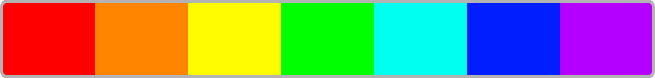
You should aim for hues that are not analagous because if they are too visually similar your audience will have a harder time differentiating them. Like in this map:
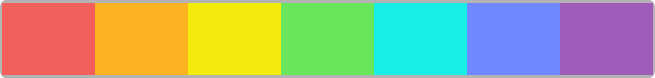
Notice how the different tornado routes are easier to identify in this map:
In fact if you have more than 12 categories it gets hard to choose colors that contrast enough. At that point we recommend grouping your data into fewer categories.
For a real challenge try to make a perceptual color palette! Some colors will appear more prominent even if you keep saturation and value the same for all your palette hues. That’s because some colors are inherently brighter in our perception. For example in the rainbow palette below, red stands out more than cyan.
Perceptual quantitative palettes take this into account. In perceptual palettes the properties of hue, saturation, and value are adjusted so that one color doesn’t look more dominant than another. This is valuable because one category’s data won’t be emphasized over another in your map. This perceptual example is more visually even:
This is where your color adjustment skills from the last lesson come in handy!
Quantitative color palettes
Use quantitative palettes if you’re trying to show rank in your data. There are two kinds: sequential and divergent.
Sequential palettes
You can use sequential palettes to show order by specific amounts, like in the choropleth at the beginning of this lesson.
Make your own
CARTO gives you a choice of light-to-dark or dark-to-light sequential palettes. Generally lighter colors are understood as less and darker colors as more. You can reverse that if you’re using a dark basemap and want your more values to stand out most. Make sure to use a legend.
You can also create your own palettes in CARTO! Enter the colors you want in your map’s swatch color pickers or CartoCSS code.
Since there are no exact rules for adjusting color to get the best palette, it requires experimentation and using your own judgement. There are guidelines though! According to Cynthia Brewer changes in lightness should be the most prominent difference across sequential palette colors. A good starting point is to pick one color and incrementally change it’s value for each swatch, while keeping hue and saturation the same.
A quick CartoCSS trick for this is lighten if you’re starting with a light color (there’s also darken for the opposite effect).
lighten(#006D2C, 10%);We used both in this map of Valencia, with data taken from the Data Observatory:
Notice we used a variable in this map’s code below, @grn. It makes editing more efficient because we can reuse this variable through out the code. CartoCSS variables must be prepended with an @ symbol.
@grn: #4c9b82;

#valencia_rented_dwellings{
  polygon-fill: #444444;
  polygon-opacity: 1;
  line-color: #444444;
  line-width: .8;
  line-opacity: 1;
  line-comp-op: overlay;
}
#valencia_rented_dwellings [ pct_of_total_dwellings_rented <= 47.3333333333333] {
   polygon-fill: darken(@grn, 20%);
}
#valencia_rented_dwellings [ pct_of_total_dwellings_rented <= 20.1834862385321] {
   polygon-fill: darken(@grn, 10%);
}
#valencia_rented_dwellings [ pct_of_total_dwellings_rented <= 13.5802469135802] {
   polygon-fill: @grn;
}
#valencia_rented_dwellings [ pct_of_total_dwellings_rented <= 9.2896174863388] {
   polygon-fill: lighten(@grn, 10%);
}
#valencia_rented_dwellings [ pct_of_total_dwellings_rented <= 5.55555555555556] {
   polygon-fill: lighten(@grn, 20%);
}
Explore other color-generating shortcuts with these CartoCSS parameters!
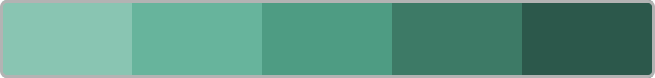
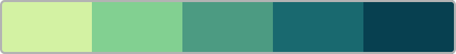
You should aim for equal value differences between sequential palette colors. The change in brightness between our map’s last two legend swatches looks more dramatic than between the first two:
You can check value (lightness) numbers for each swatch with tools like this browser extension. Then you can adjust those numbers in your preferred color picker tool, and paste the output color’s hex code into your map’s CartoCSS or swatch color picker. For example we edited the palette above so the value changed by 15 between each swatch:
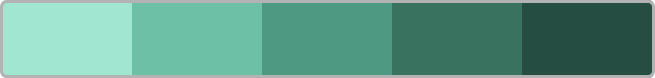
It’s easier to see the difference between polygons now. To make our swatches stand out from each other even more, we can adjust the saturation and hue. CARTO already has a default green sequential palette that works better:
This palette is better because it’s colors make it easier to differentiate our map’s polygons at a glance. Compare the map above to this one:
Divergent palettes
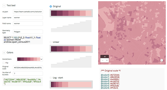
Use a divergent palette when you want to highlight a natural midpoint in your data, such as when you are mapping temperature and have values above and below zero degrees. Divergent palettes show two opposing hues radiating out from a neutral midpoint color. They are often used for election maps. Here’s a different kind of example showing the male vs. female percentage of total population in Spanish census tracts:
Make your own
A divergent palette is basically two sequential palettes. To pick the edge colors, let’s start with one hue and then use CartoCSS spin to get an opposing hue from across the color wheel.

We’re starting with red. If we spin by 180 degrees we get the color with maximum contrast from our starting hue: green.
spin(#da0057, 180);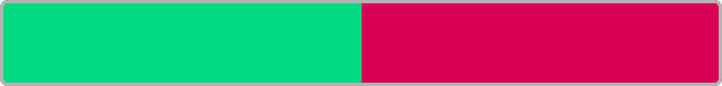
We want to avoid pure red/pure green combinations for our colorblind users though, so instead we can spin by a larger number of degrees. This gives us blue:
spin(#da0057, 225);
It’s ok to spin by more or less than 180 degrees since the opposing hues don’t need to have maximum contrast. Just try to avoid neighboring wheel colors.
Now we can pick a neutral color and use mix to find palette swatches between it and the red end of our palette. Our neutral is light gray: #ccc. This mix yields a color that has a higher percentage of red than gray:
mix(#da0057, #ccc, 66%);
This mix uses less red:
mix(#da0057, #ccc, 33%);
With a color picker we can find the hex value for our blue spin result. Then we can use it with mix for the blue side of our palette:
mix(#2279e9, #ccc, 33%);
mix(#2279e9, #ccc, 66%);
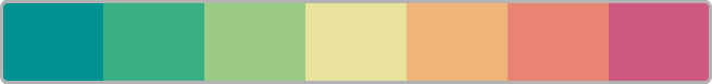
Here’s our whole sequential palette so far:

This palette works, but we can make it even easier to see differences between polygons using this if we tweak hue, saturation, and value as mentioned in the sequential palette section above. ColorBrewer has already researched a more optimal red and blue version for us:

CARTO also has a custom red and blue default palette available for you. It’s used in the map above. Notice we can even make our original blue hue closer to green. For color-blind viewers the resulting teal color is still distinguishable from the toned-down red at the other end.
Resources
Congratulations, you’ve just learned a lot about cartographic color palettes and some CartoCSS tricks! Here is a color picker tool to help you quickly preview color palettes, designed by one of CARTO’s Solutions Engineers. You can also edit hex colors in it to customize them:
We also have a feature called Turbo-Carto that provides color ramps for you, and makes writing CartoCSS conditions even easier. It calculates choropleth bins for you, so you can filter a dataset and have the bins/palette colors automatically change as needed. Learn more about it here.
/* Creating a color ramp with Turbo Carto */
marker-fill: ramp([your_column_name], colorbrewer(Greens));
/* Changing symbol sizes with Turbo Carto */
marker-width: ramp([your_column_name], 4, 18, 6 jenks));
/* Where 4 is the minimum size, 18 the max size, 6, the number of buckets, and jenks the quantification method */
For more tips about choosing map colors, check out this blog post.
Learn to refine your maps with even more advanced CartoCSS in our next lesson on composite operations.