Customizing Auto-Style Color Palettes
Customize widget auto style behavior to display a custom color scheme with CARTO Builder.
In some cases, you may want to define a custom color scheme when auto style is applied. This is useful if you want to use colors schemes as an interactive legend, or if you want to make a color scheme more observable over a basemap.
- When Auto style is applied to your widgets, the custom colors are applied to your filters and to your data!
- When Auto style is not applied, the map inherits the default (or defined) widget color.
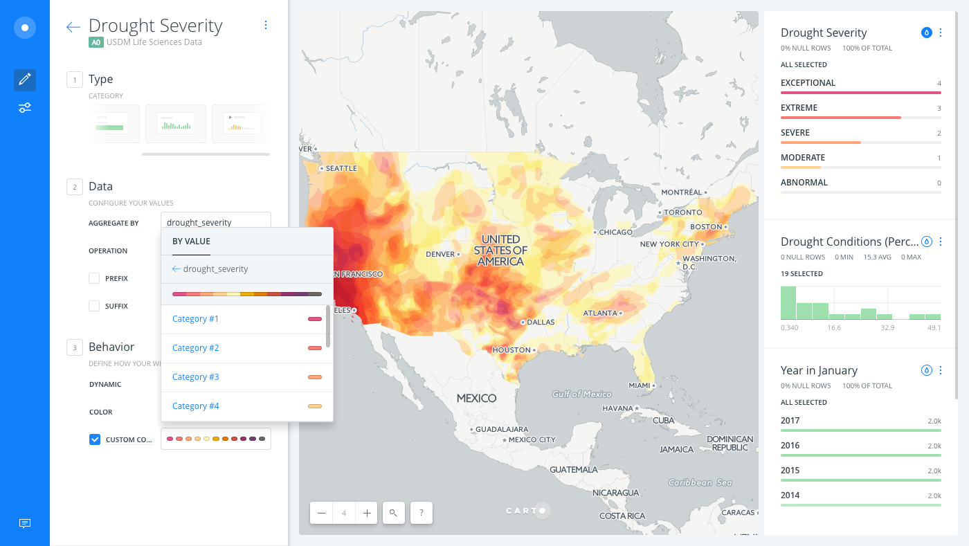
Depending on your data, custom color schemes can also be used to display expected patterns of visual perceptions. For example, this guide uses Drought Monitoring data to represent exceptional drought conditions based on location data. While default auto style clearly displays differences in data, we can apply our own “fiery” color scheme to visually represent high to low drought areas. This makes it easy to understand the severity of drought conditions.
Prepare your Map and Auto Style Widgets
For Category and Histogram widgets, a default color scheme is applied when Auto style is selected. The widget color scheme that appears varies, depending on your data.
-
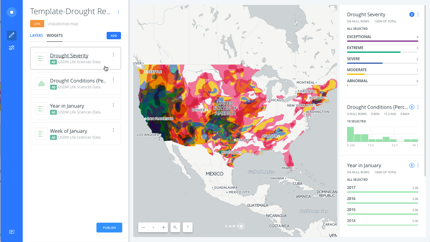
Unzip the template .carto file packaged from “Download resources” of this guide, and import it to your account to create the map. Builder opens with USDM Life Sciences Data as the first and only map layer.
View the blog, 3 Data Viz Hacks We Learned While Mapping Drought Data for the details behind the US Drought Monitor data. This map contains advanced TurboCARTO styling for defining thematic data.
-
Use the widgets and apply Auto style to view the default color schemes that are applied to your data.
While the widgets clearly visualize differences in data, let’s customize the auto style behavior to display custom colors.
Custom Colors for Category Auto Style
The custom auto style option appears under the widget behavior options in Builder. For Category widgets, you can customize the solid fill color of each category of data.
The categories that appear in Category widgets are dynamic and change, depending on your visualization. Builder currently enables you to customize up to ten category colors.
-
From the WIDGETS list in Builder, select the Drought Severity widget to edit the details.
-
From the Behavior options, click the checkbox next to CUSTOM COLORS, which enables you to represent the widget values with custom colors.
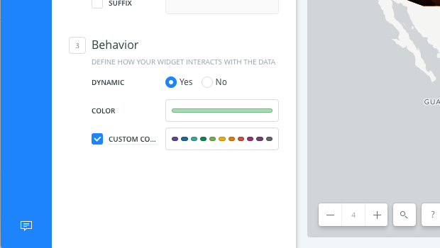
A qualitative color scheme is applied.
CHEATSHEET: Color Schemes
Choosing the right colors for your data aids storytelling, engages the map reader, and visually guides the viewer to uncover interesting patterns that may otherwise be missed. When styling by value, different types of color schemes appear, based on the selected data column from your map layer. Builder provides you with CARTOColor and ColorBrewer schemes, and enables you to customize your own color schemes.
- Sequential Scheme: Color schemes that use variations in lightness make these ideal for displaying orderable, or numeric data. The variations progress from low to high, using colors that range from light to dark (or vice versa).
- Qualitative Scheme: Color schemes that demonstrate categorical differences in qualitative data, which use different hues, with consistent steps in lightness and saturation.
- Diverging Scheme: Color schemes that highlight values above and below an interesting mid-point in quantitative data. The middle color is assigned to the critical value, with two sequential type palettes at either end, assigned to values above or below.
-
Click on the default color scheme to open the color picker.
-
Click each category and apply the following HEX input colors to define a custom color for each category of data.
- Category # 1
#e15383 - Category # 2
#f67b77 - Category # 3
#ffa679 - Category # 4
#ffd08e - Category # 5
#fef6b5
- Category # 1
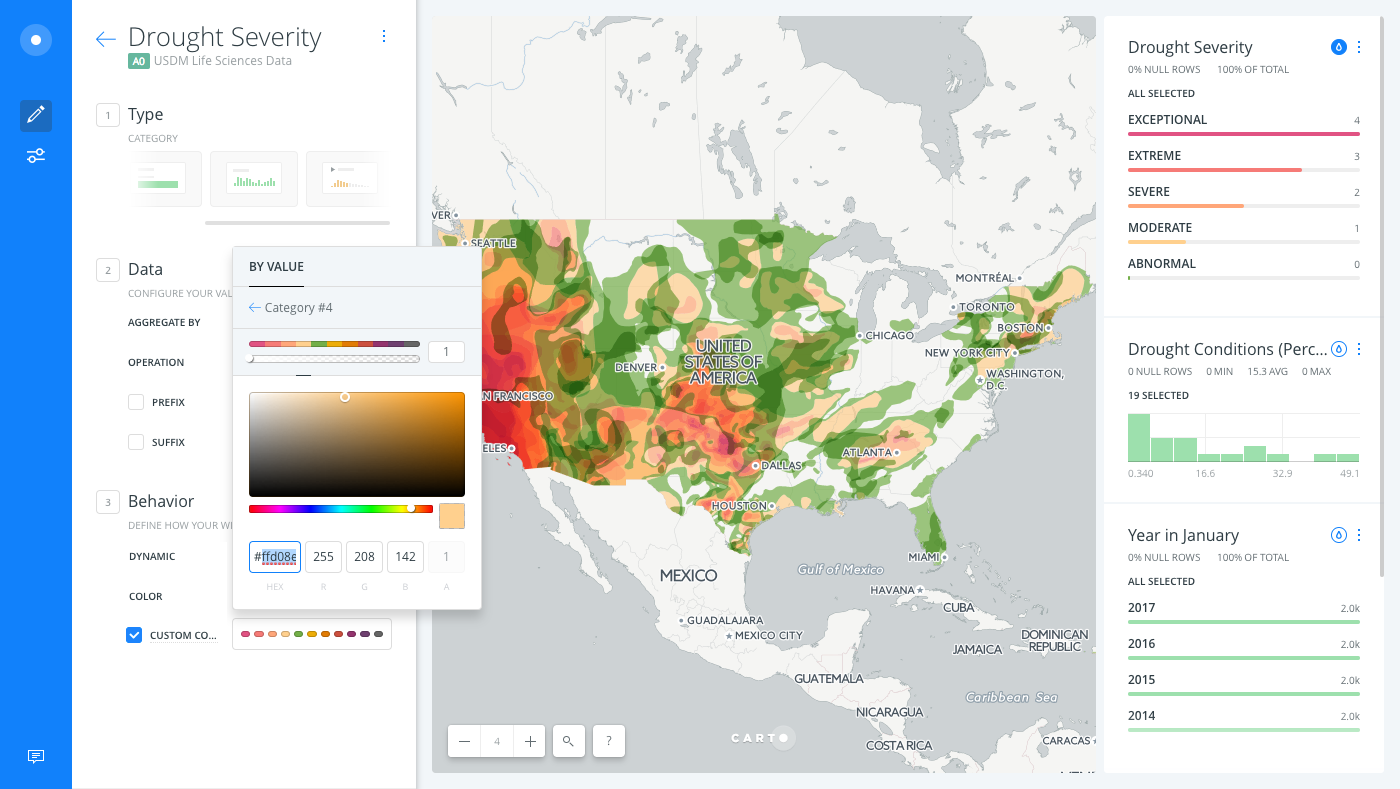
Notice how Auto style is starting to display a better color scheme for drought data, displaying dark colors for high drought values and light colors for low drought values. The choice of using a fiery color scheme is often visually perceived with dry weather conditions.
Custom Color Scheme for Histogram Auto Style
For Histogram widgets, you can select a custom color scheme (or apply a custom color set) for histogram data.
-
Click Auto style from the Drought Conditions (Percent Area) histogram widget.
For details about Histogram widgets, view the Understanding the Histogram Widget Guide.
-
From the WIDGETS list, select Drought Conditions (Percent Area) widget to edit the details.
-
From the Behavior options, click the checkbox next to CUSTOM COLORS, which enables you to represent the widget values with a custom color scheme.
A sequential color scheme is applied.
CHEATSHEET: Color Schemes
Choosing the right colors for your data aids storytelling, engages the map reader, and visually guides the viewer to uncover interesting patterns that may otherwise be missed. When styling by value, different types of color schemes appear, based on the selected data column from your map layer. Builder provides you with CARTOColor and ColorBrewer schemes, and enables you to customize your own color schemes.
- Sequential Scheme: Color schemes that use variations in lightness make these ideal for displaying orderable, or numeric data. The variations progress from low to high, using colors that range from light to dark (or vice versa).
- Qualitative Scheme: Color schemes that demonstrate categorical differences in qualitative data, which use different hues, with consistent steps in lightness and saturation.
- Diverging Scheme: Color schemes that highlight values above and below an interesting mid-point in quantitative data. The middle color is assigned to the critical value, with two sequential type palettes at either end, assigned to values above or below.
-
Click on the default color scheme to open the color scheme picker.
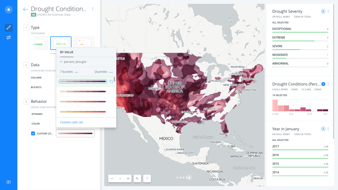
-
Modify the number of buckets to
5and keep the default the classification method to group data (to be applied when auto style is applied from the widget).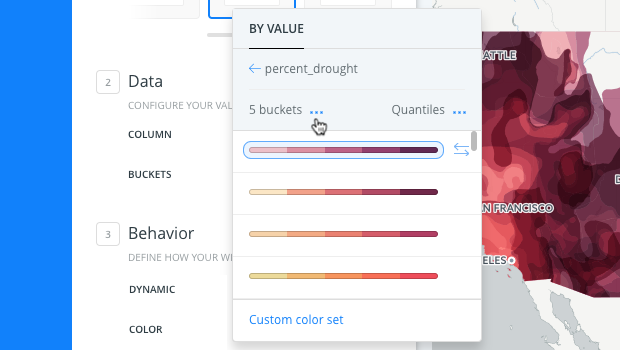
CHEATSHEET: Classification Methods
Classification methods group data into ranges. CARTO supports classifying numeric fields for graduated symbology through the following methods:
- Quantiles: A quantile classification is well suited to linearly distributed data. Each quantile class contains an equal number of features. There are no empty classes or classes with too few or too many values. This can be misleading sometimes, since similar features can be placed in adjacent classes or widely different values can be in the same class, due to equal number grouping.
- Jenks: Breaks the data into classes based on natural groupings inherent in the data. The groups are formed by decreasing the variance within classes and increasing the variance between different classes -- a 1D k-means. Since Jenks are data-specific classifications, they are not useful for comparing multiple maps built from different underlying data.
- Equal Interval: Divides the range of attribute values into equal-sized subranges. The class breaks specified by the number of buckets selected. Usually used for percentage values, it is best applied to familiar data columns such as temperature, ratios, and other relative attribute values.
- Heads/Tails: Best for data with heavy-tailed distributions, such as exponential decay or lognormal curves. This classification is done through dividing values into large (head) and small (tail) around the arithmetic mean. The division procedure repeats continuously until the specified number of bins is met, or there is only one remaining value left. This method, more than others, helps to reveal the underlying scaling pattern of far more small values than large ones.
- Category: Classifies a limited (or fixed) number of possible values, based on an attribute of a particular group, or nominal category.
-
Select a color scheme, or click Custom color set to build your own color scheme from scratch.
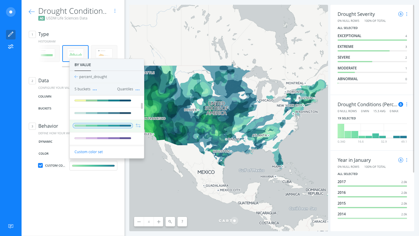
Notice how Auto style displays a custom color scheme of drought data, displaying light colors for low percentages and dark colors for high percentages of data.
Download the final .carto map from the “Download resources” of this guide, and to view the custom color schemes that were applied to all of the widgets.